Picture a real shoot moment on set. You have a massive tray of chilli crab sitting under soft window light. The rich reds of the sauce look deep and inviting, and the fresh green cilantro garnish pops perfectly.
You can style the dish flawlessly, but if the colours fight with the background, the photo feels messy. Understanding colour theory in photography helps you solve this problem instantly.
Today, we will share a few simple pairing rules that work beautifully for menus, social posts, and large marketing campaigns. Our team shoots for F&B brands across Singapore every single day. We know firsthand that nailing your colour harmony in photography is the fastest way to make your food look completely irresistible.
Quick Definitions Without Art-School Language
Applying colour theory in photography simply means guiding your customer’s attention and appetite by controlling relationships between colours. You do not need an art degree to get this right. You only need to understand three basic terms.
Hue is the actual colour you are looking at, like red or blue. Saturation is how intense or pale that colour appears. Luminance is how bright or dark the colour is within your frame.
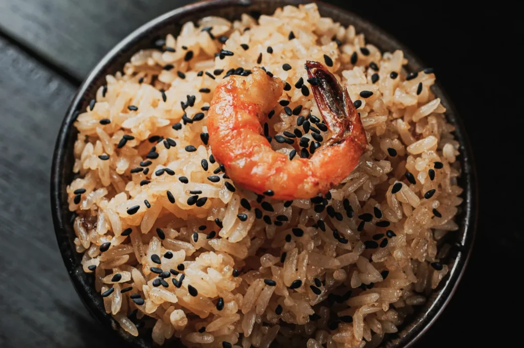
In Singapore, we rely heavily on memory colours to make local dishes look authentic. Your steamed white rice must look perfectly clean. Your fresh pandan greens should look vibrant and fresh. A rich chicken curry should never go grey or muddy.
The Food Harmony Toolkit
Building great colour palettes starts before you ever pick up the camera. You can create a simple, repeatable toolkit for every single dish on your menu.
Start by picking your hero colour, which is usually the main ingredient. Next, choose supporting neutrals for your plates and backgrounds to let the food stand out. Add exactly one intentional accent colour to create visual interest.
Decide your specific harmony type before you start styling. Finally, remember to control the intensity of your saturation and brightness so nothing looks fake or neon.
Analogous Harmony
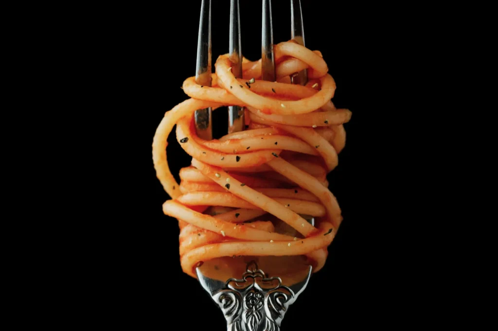
Analogous harmony uses colours that sit right next to each other on the colour wheel. This approach is incredibly safe, highly premium, and completely menu-friendly. It creates a soothing, sophisticated visual experience that makes the food look very natural.
A classic Singapore kaya toast set shot on a warm wooden table is a perfect example of analogous harmony. The golden brown toast, the soft yellow butter, and the warm brown kopi all blend beautifully. A plate of Hainanese chicken rice on a cream ceramic plate creates the same elegant, unified feel.
The best styling rule here is to use neutral backgrounds and add visual interest through texture instead of adding new colours. A common mistake is letting the food blend completely into the background. Fix this by ensuring your dish is slightly brighter than the surface it sits on.
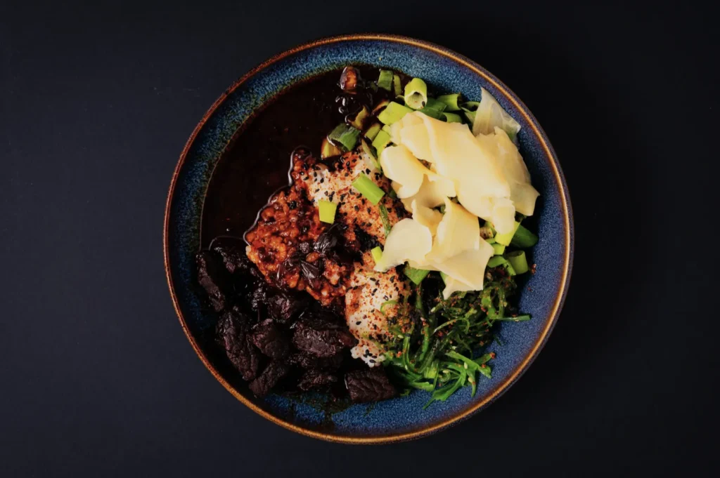
Complementary Harmony
Complementary harmony uses colours that sit directly opposite each other on the colour wheel. This creates high visual impact and is absolutely perfect for social-first marketing. The striking contrast immediately grabs attention on small mobile screens.
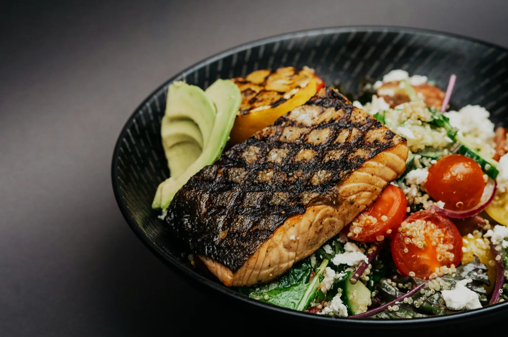
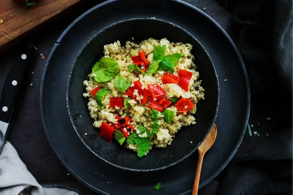
Think about a sizzling plate of sambal prawns garnished with bright green spring onions. The bold red and vibrant green create massive visual excitement. A cool green matcha dessert placed next to a single red strawberry offers the exact same striking effect.
The secret to complementary pairing is balance. Choose one dominant colour for the food and use the opposite colour purely as a smaller accent. Soften the background to keep the focus on the food, and watch carefully for unwanted colour casts bouncing onto your plates.
Triadic Harmony
Triadic harmony uses three colours that are evenly spaced around the colour wheel. This approach is highly playful and perfect for energetic, campaign-ready imagery. It works incredibly well when you want to show variety and abundance.
A vibrant spread of traditional Nyonya kueh naturally features bright pinks, vibrant greens, and bold yellows. A promotional campaign for a bubble tea brand might use a colourful blue background, a yellow mango drink, and a red prop.
To keep triadic harmony from looking like a messy circus, keep two of the colours quieter and less saturated. Let one colour be the bold hero. Use repetition across your props so the colour choices feel highly intentional rather than random.
Pairing Rules You Can Apply In 5 Minutes
You can use these quick pairing rules as a swipe file for your next restaurant shoot.
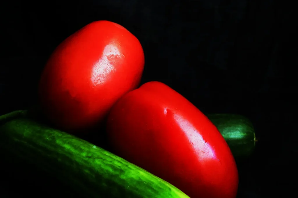
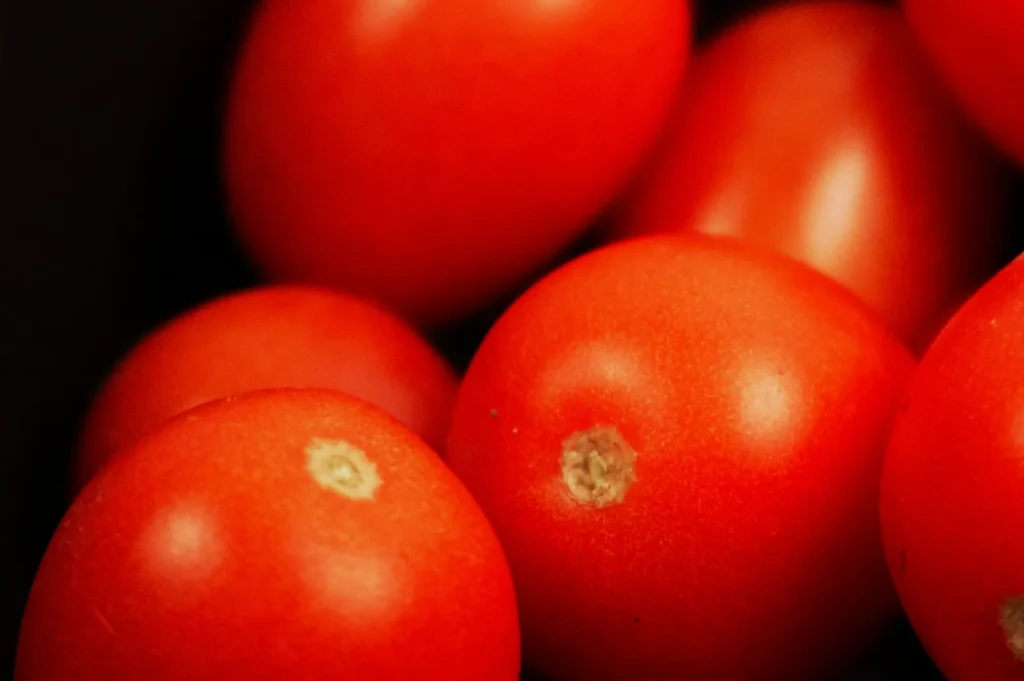
- Red food: Pair rich sambal, chilli sauces, or tomatoes with fresh green accents and clean white plates.
- Golden food: Contrast golden curries and fried items with cool blue ceramics or clean grey neutrals.
- Green food: Ground bright pandan, matcha, and fresh salads with warm brown woods or cream backgrounds. Add a tiny red accent.
- Dark sauces: Brighten soy braises and dark meats with strong luminance contrast. Use light plates and bright, fresh garnishes.
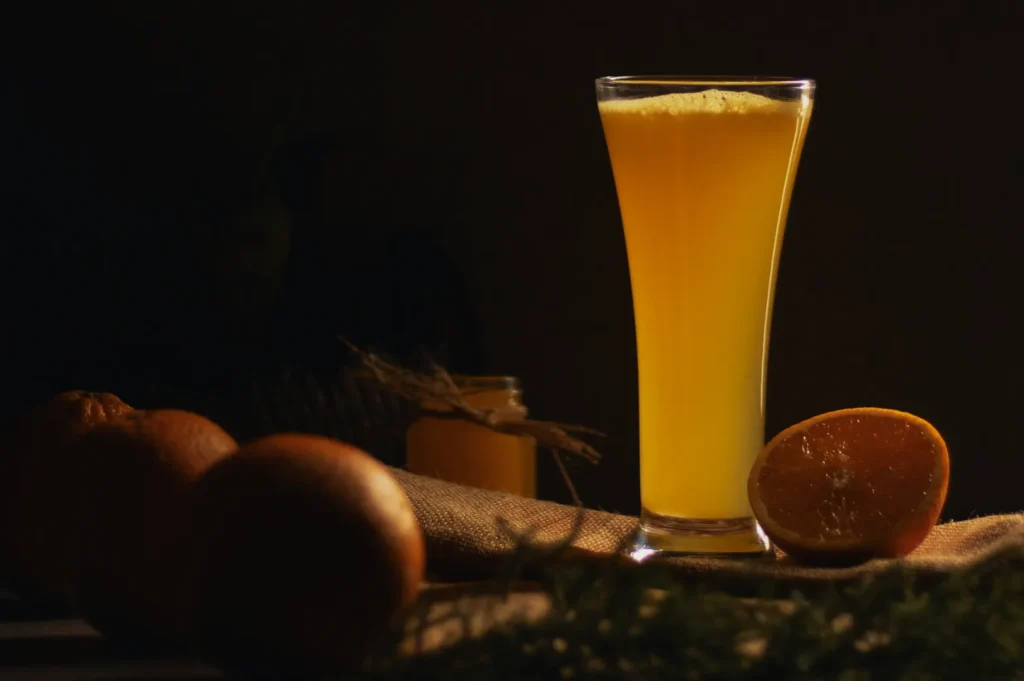
- White foods: Protect white rice, soft tofu, and creams by strictly controlling yellow and green light casts in your room.
Set-First Choices

Your editing software should never be a rescue tool for bad set design. Making smart choices on set guarantees your colour harmony in photography looks completely natural.
Always check your lighting first. You must avoid mixed lighting at all costs. Turn off the warm restaurant bulbs if you are shooting near a bright daylight window.
Choose your props by contrast rather than just picking your favourite plate. Always shoot a quick plate test with a white ceramic bowl to check for hidden colour casts. Finally, ensure your garnish strategy uses accents that actually make culinary sense for the specific dish.
Quick Editing Guidance
Keep your editing clean and believable to maintain maximum appetite appeal. Start by setting your white balance and tint intentionally to ensure your neutral tones are perfect.
Next, protect your appetising tones. Do not over-warm the entire image just to make a pastry look golden, as it will ruin your background colours. Adjust only your key colours using the HSL panel, focusing primarily on your reds, greens, and yellows.
Finish with local fixes. Use a brush tool to brighten dark plates, lift heavy shadows, and clean up grey highlights. You must avoid creating neon greens, oversaturated plastic reds, and muddy orange skin tones.
Mini Troubleshooting
Even with perfect planning, harmony sometimes breaks on set. Use these quick fixes to get back on track.
- Problem: Greens look grey and lifeless. Fix: Lift the luminance of the green channel in your editing software.
- Problem: Deep reds turn bright orange. Fix: Shift your red hue slider slightly toward magenta and cool down the white balance.
- Problem: Everything feels too colourful and chaotic. Fix: Desaturate your background and supporting props to let the hero food stand out.
- Problem: A warm dish on a warm background blends in completely. Fix: Add a bright, contrasting garnish or swap the background for a cooler grey tone.
Copy And Paste Checklist
Use this simple checklist for your upcoming shoots and content days to ensure perfect harmony.
- Identify the hero colour in the dish
- Choose 1 harmony type (analogous, complementary, triadic)
- Keep props mostly neutral
- Add one intentional accent colour (garnish or ingredient)
- Check for mixed lighting and colour casts
- Make one test frame, then adjust before shooting the full set
Putting It Into Practice For Your Next Shoot
Mastering colour transforms an average menu update into a highly profitable marketing asset. Simply choose your harmony type, control your colour intensity, and keep your props highly intentional. Small, deliberate choices on set will save you hours of frustrating editing later.
If you want to dive deeper into this topic, read our comprehensive guide on how colour transforms food photography for your business. Try applying just one complementary pairing rule during your very next shoot. When you are ready for professional, crave-worthy imagery that elevates your brand, the team at Food Photographer Studio is ready to help you succeed.