Picture a busy shoot day in a lively Singapore restaurant. You have a steaming plate of chilli crab styled perfectly on the table. However, when you take the shot, the rich sauce blends right into the warm wooden table, making the image feel completely flat.
The dish simply disappears when your color contrast food photography is weak. We see this happen constantly with menus, social media campaigns, and delivery app photos. You need a reliable way to make the hero ingredients pop off the screen immediately.
This guide provides a practical pairing playbook you can use on any set. As a team that shoots for local F&B brands daily, we know that complementary colors food photography is the absolute fastest way to build appetite.
Complementary Colors In Food Photography (The Simple Definition)
Complementary colors food photography refers to pairing colours that sit directly opposite each other on the colour wheel. You do not need an art degree to understand why this works. Opposites naturally push against each other, creating immediate visual separation and high impact.
This built in contrast instantly guides the viewer’s eye straight to the most important part of the dish. It is the secret behind why a simple garnish makes a bowl of noodles look so much more expensive.
You must remember one simple truth about dominance. One colour must always be the clear hero, while the opposite colour acts strictly as a supporting accent. If both colours fight for equal attention, the photo will look chaotic and messy.
The Food-First Rules (So Complementary Contrast Looks Premium, Not Loud)
Your styling choices should always elevate the dish rather than overpowering it. Bold colour contrast food photography looks incredibly premium when handled with restraint.
Always protect the memory colours of your ingredients. Your steamed rice must stay perfectly clean, your fresh herbs must look vibrant, and your rich sauces must never look muddy. If your styling choices change the natural colour of the food, you have gone too far.
Do a quick on set check before you start shooting. Look closely at the frame and ask yourself if the contrast feels like a natural part of the culinary story or a forced prop choice.
Pairing Playbook (Use These Complementary Combos With Real Dish Examples)
Red And Green (The Classic “Appetite” Contrast)
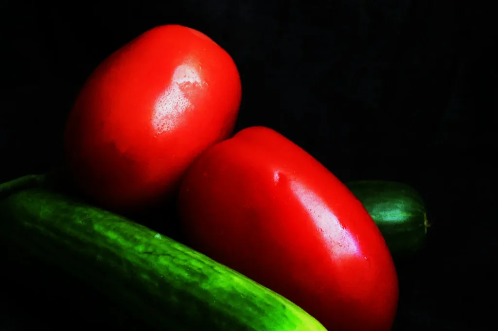
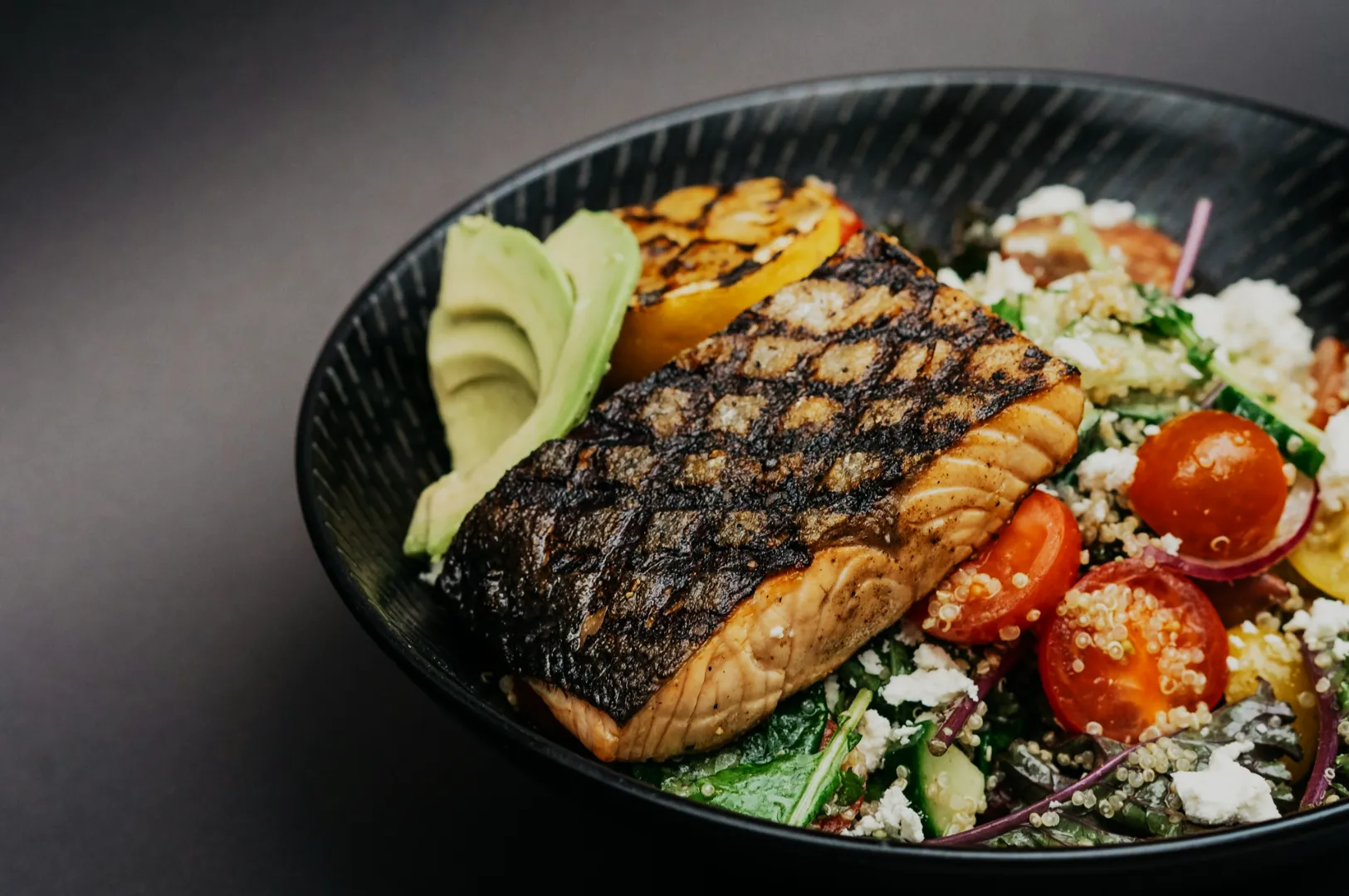
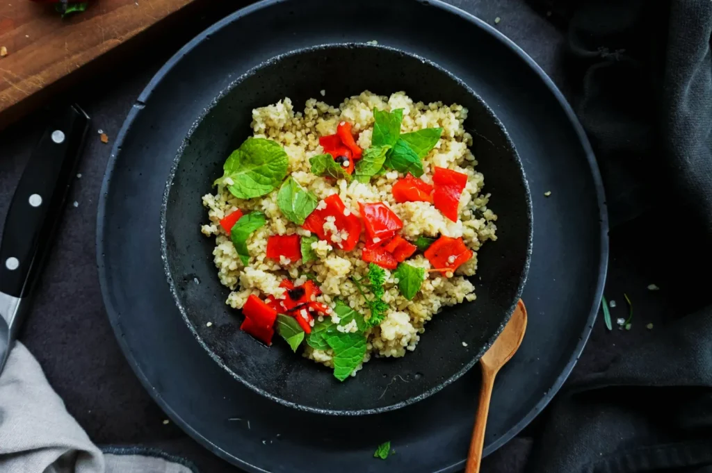
Red and green is the most powerful pairing for driving immediate appetite. This high energy contrast works perfectly for savory mains, spicy dishes, and traditional Asian comfort food.
A vibrant plate of chilli crab looks incredible when garnished with fresh green cilantro. Rich, dark char siew pops beautifully when placed next to a side of crisp bok choy. A traditional fruit rojak looks far more dynamic when the red sauce is balanced by green cucumber slices.
Use green selectively as a garnish or a soft background element while letting the red food dominate. A common mistake is using equal amounts of bright red and bright green, which makes the photo look like a Christmas card. Fix this by desaturating the green background slightly so the red dish remains the star.
For a premium look, use a muted olive green surface under your bright red dish. This softens the contrast so it looks highly controlled and sophisticated.
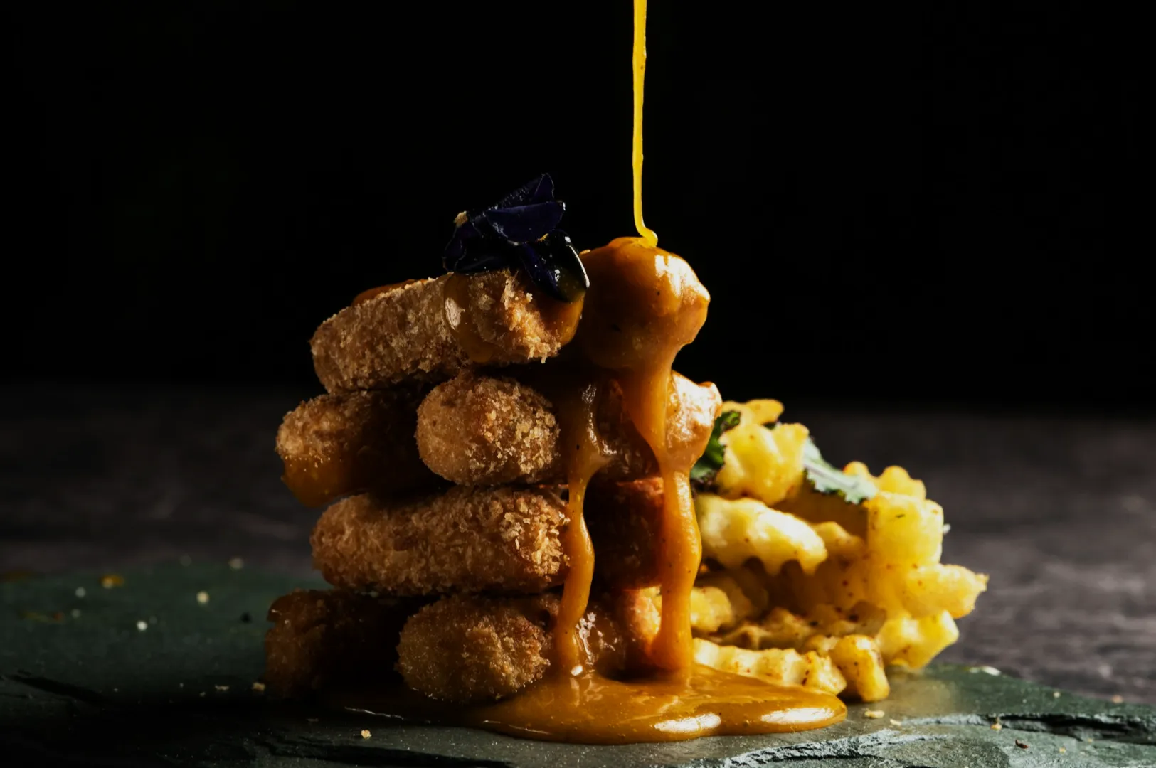
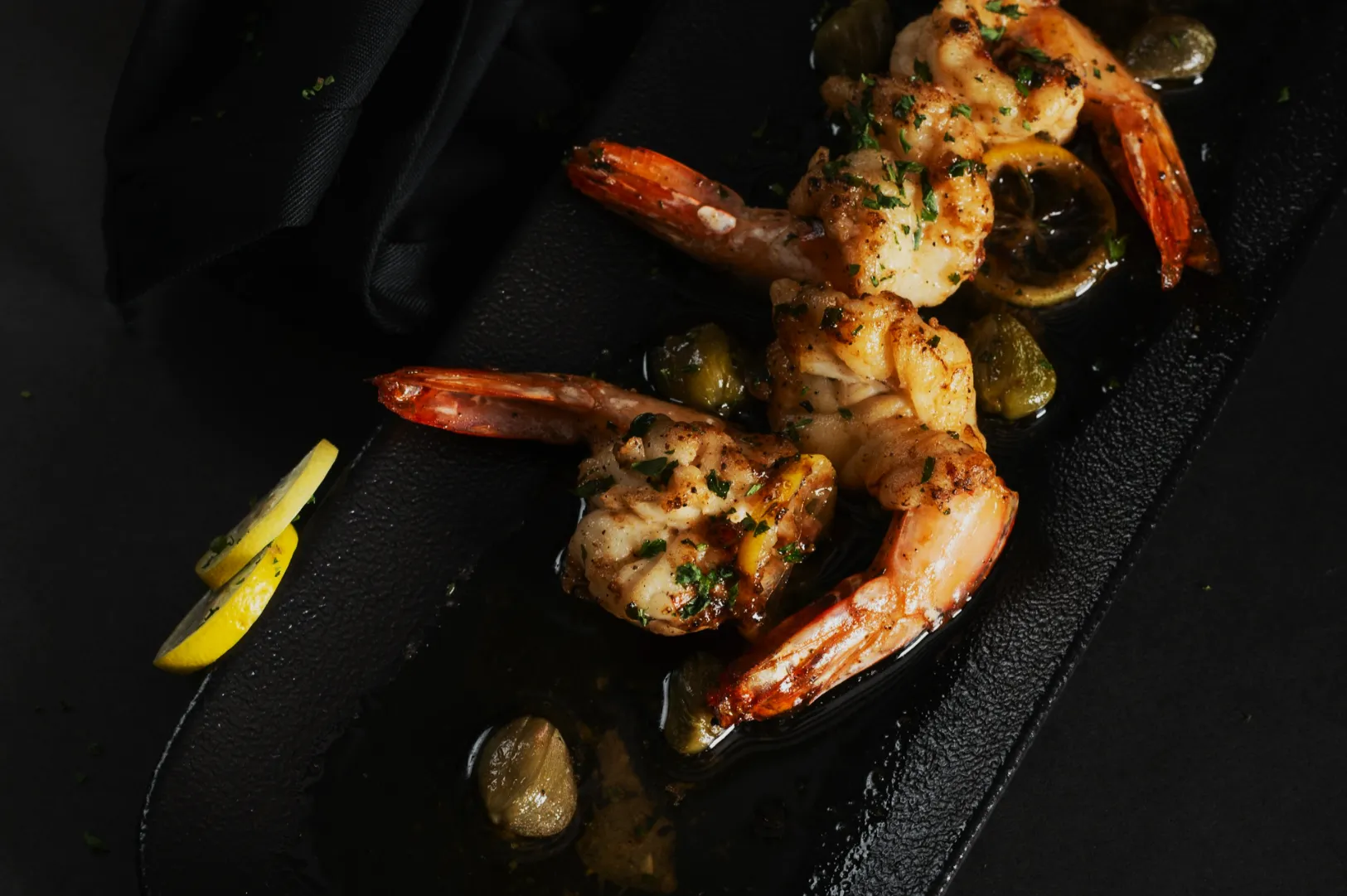
Blue And Orange (Clean, Modern, Beverage-Friendly Contrast)
Blue and orange creates a remarkably clean, refreshing aesthetic. This pairing is highly beverage friendly and works wonders for modern cafés and seafood concepts.
A tall glass of iced kopi with a golden orange tone looks stunning against a soft blue wall. A bright yuzu soda shines when styled with cool blue ceramic coasters. A rich, orange toned curry looks incredibly expensive when served in a dark navy bowl.
Keep your blue elements restricted to props, backgrounds, or linens. A common mistake is letting blue light spill onto the orange food, creating a deeply unappetising grey shadow. Fix this by using a white bounce card to keep the food properly illuminated.
To make this pairing look premium, lean into dark navy rather than bright cyan. A deep blue background makes orange food look rich, comforting, and highly intentional.
Yellow And Purple (Fast “Campaign Look” With Desserts And Drinks)
Yellow and purple provides a highly playful, energetic look. This combination is perfect for fast, eye catching social media campaigns featuring desserts and sweet drinks.
A bright yellow mango dessert pops off the screen when styled on a soft lavender backdrop. Golden pineapple tarts look beautifully elevated when placed near a deep purple napkin. Vibrant ube or taro drinks stand out perfectly against a warm yellow cafe counter.
Use the purple purely as a styling accent while letting the yellow dessert shine. A common mistake is using highly saturated neon purple, which makes the food look artificial. Fix this by softening the purple to a gentle pastel tone.
For a premium campaign look, use a very dark plum background behind a bright yellow lemon tart. The dramatic luminance contrast adds instant luxury to the frame.
Green And Magenta (Tricky, But Great For Pandan And Matcha When Done Cleanly)
Green and magenta is a tricky pairing, but it looks incredibly striking when executed well. It is highly effective for highlighting fresh, botanical flavours like pandan and matcha.
A slice of vibrant pandan chiffon cake looks stunning with a small magenta orchid in the background. A cold matcha latte stands out beautifully next to a dark pink dragonfruit pastry. Herb forward noodles or salads look incredibly fresh when styled near a muted magenta ceramic cup.
Keep the magenta element very small and physically separated from the green food. A common mistake is letting magenta props reflect pink light onto your green desserts. Fix this by moving the prop further back in the frame.
To achieve a premium version of this pairing, desaturate the magenta until it looks like a soft blush pink. This allows the fresh greens to dominate the photo gracefully.
How To Choose The Right Pairing In 30 Seconds (A Mini Decision Tree)
You do not have time to overthink your prop styling on a busy content day. Use this mini decision tree to pick your complementary pairing in thirty seconds.
- If the dish is red and spicy, reach for subtle green garnishes or muted olive backgrounds.
- If the dish is golden and fried, choose cool blue ceramics or navy linens.
- If the dish is bright yellow or dessert focused, find a soft purple or plum accent.
- If the dish is green and fresh, add a tiny pop of muted magenta or soft pink.
Keeping your decisions fast and practical ensures your food stays fresh on set.
Set-First Execution (So Editing Stays Small)
Start With One Dominant Light Source
Your colour contrast food photography will only work if your lighting is clean. You must start with one dominant light source, whether that is a large bright window or a single controlled studio light.
Mixed lighting is incredibly common in restaurants and cafés. Mixing warm indoor bulbs with cool window daylight destroys your colour contrast instantly. Turn off the overhead practical lights before you start styling your dish.
Do The White Plate Test
You should always perform a fast white plate test before bringing the food to the table. Place a clean white ceramic plate exactly where your dish will sit and take a test shot.
Look closely at the image on your camera screen. If you see yellow whites, a sickly green cast, or excessively blue shadows, your lighting environment is contaminated. Fix the light before you waste time styling the food.
Control Color Cast Culprits
Colour cast culprits are everywhere in a busy commercial environment. Common Singapore culprits include bright green cafe walls, glowing neon signage, and highly saturated floor tiles.
These surfaces bounce ugly, contaminated light directly onto your beautifully styled plate. Fix this by moving your table away from the coloured wall. You can also use a large black foam board to physically block the neon signage from hitting your set.
Editing Notes (Keep Complementary Contrast Appetising)
Your editing workflow should strictly enhance what you captured on set. Begin by correcting your white balance and tint so your neutral tones look flawlessly clean.
Next, adjust your overall exposure and contrast before touching any specific colours. Use the HSL panel to gently refine your two key complementary colours, leaving the rest alone. Finally, apply local adjustments to brighten the plate and lift heavy shadows.
- Do this: Desaturate your background colours slightly so the hero food stands out.
- Not that: Do not boost the global saturation slider, as it makes the contrast look cartoonish and fake.
- Do this: Use luminance to create separation between your two paired colours.
- Not that: Do not push the hue sliders so far that the food stops looking like the real recipe.
Remember to keep your edits minimal and believable. Good complementary contrast relies on smart styling, not heavy digital filtering.
Make Contrast A Choice, Not An Accident
Mastering complementary colors food photography is about making deliberate, highly intentional choices. By understanding the colour wheel, controlling your light, and keeping your styling restrained, your dishes will always look incredible.
If you want the deeper “why” behind these pairings, read our practical colour in photography framework for making food photos look appetising: our practical colour in photography framework for making food photos look appetising.
If you want a consistent image library built around clean contrast and believable colour, Food Photographer Studio can help: Food Photographer Studio. Pick just one pairing from this playbook and test it on three of your best selling dishes during your next content day.