Picture a familiar Singapore content day where you are shooting a classic chicken rice set. The dish looks absolutely mouth-watering in person, but the photo feels completely flat because the background is too similar to the food. You can style the chicken perfectly, but bad colour choices will instantly ruin the shot.
Props can easily steal attention away from the hero dish. They create ugly colour casts or cause the food to blend right into the table. You need a fast, repeatable way to pick your food photography backgrounds colours (and a disciplined prop strategy) so your frames look amazing before any editing begins.
In this article, we will share exactly how to build a prop styling colour palette that works for any menu. As a team that shoots for local F&B brands daily, we know that smart colour choices save hours of frustrating editing time.
What “Colour Palette Planning” Means For Food Photography
Colour palette planning in food photography is not about interior decorating. You are building a simple, reliable colour system designed purely for appetite and clarity. This approach ensures your customer looks exactly where you want them to look, making the food the obvious star of every frame.
Every item in your frame has one of three colour jobs. You have your Hero Colour, your Supporting Neutrals, and your Accent Pops.
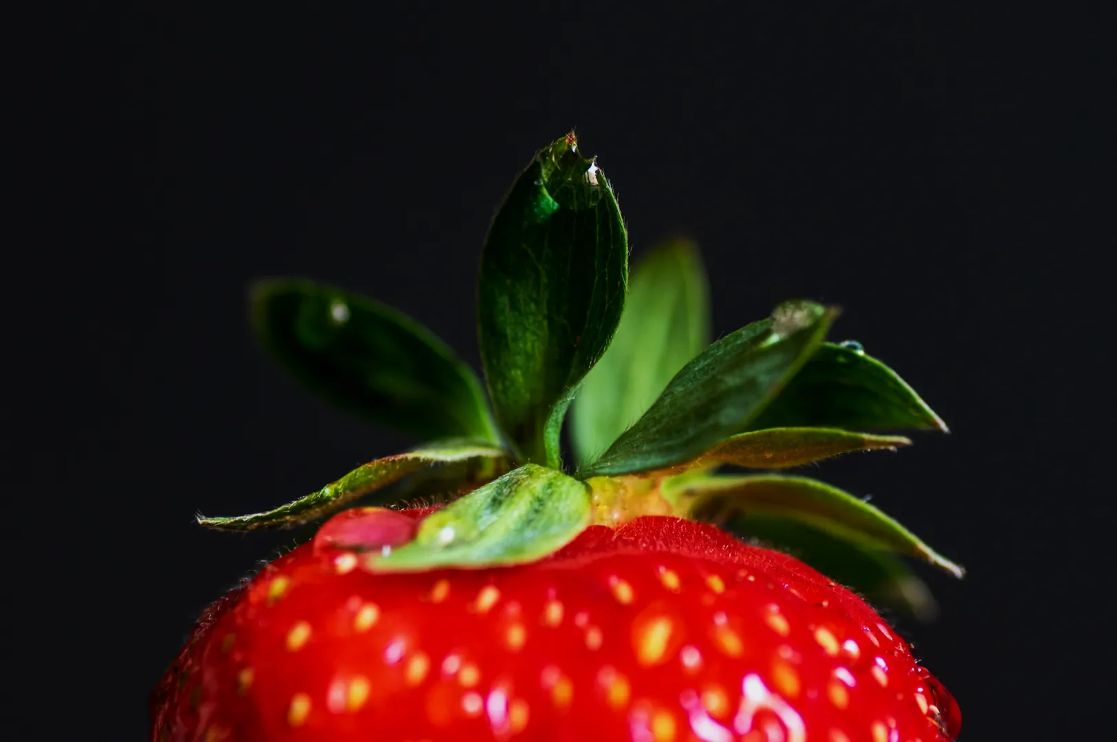
You must always protect the memory colours of your dish. Steamed rice and ceramic plates must look flawlessly clean. Fresh herbs need to look vibrant, and a rich curry should never look dull or grey. If your memory colours are off, the entire shot loses appetite appeal.
Start With The Dish, Not The Props
Identify The Hero Colour In 10 Seconds
You must identify the dominant colour of your food before you touch a single prop. Stop and look at the dish: ask yourself what colour immediately grabs your eye.
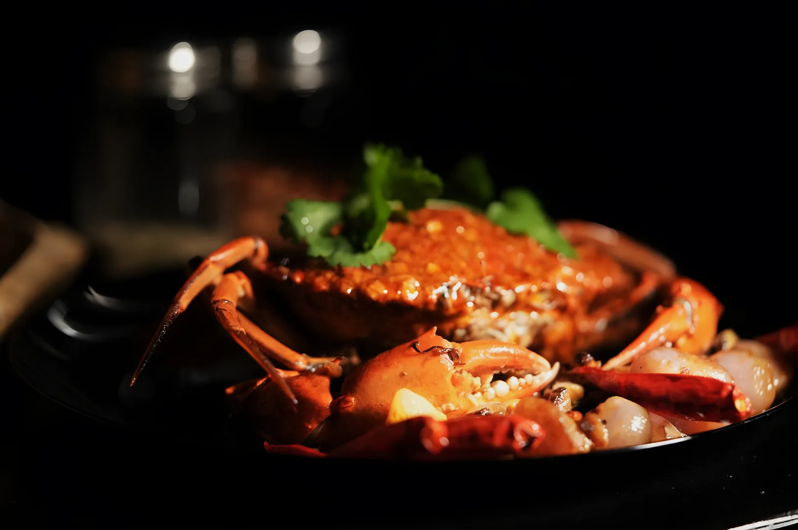
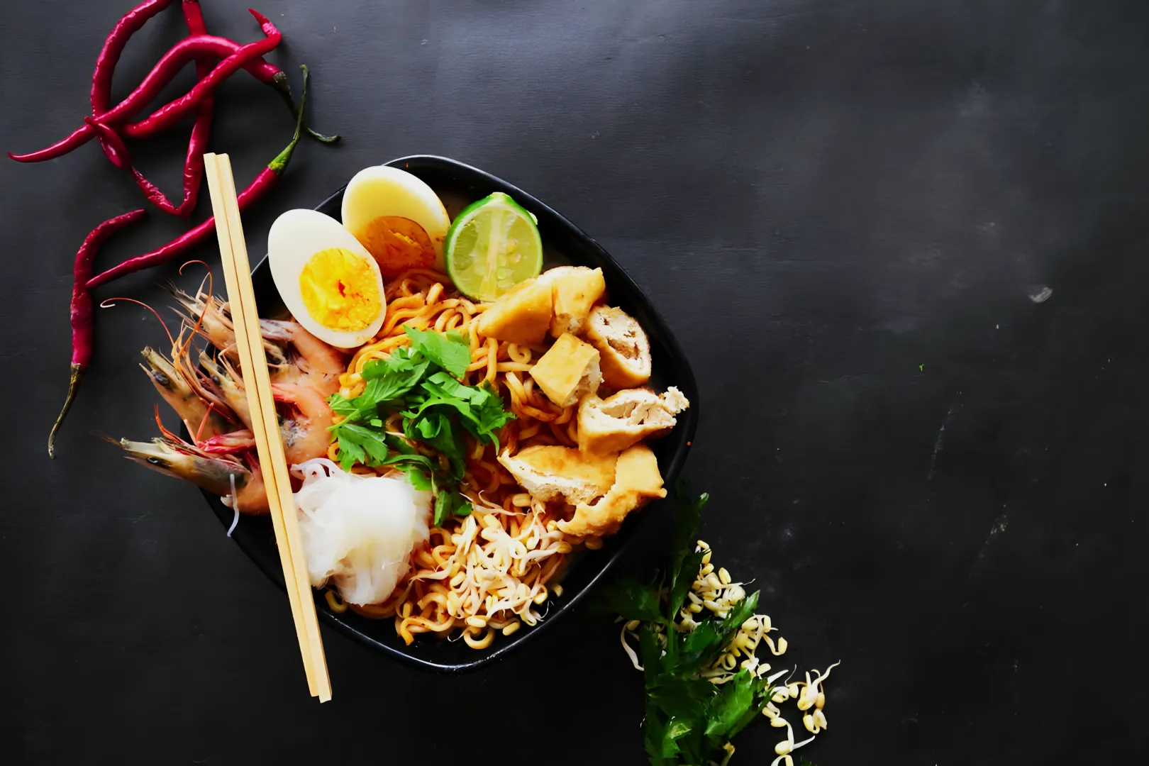
A steaming bowl of laksa has a strong orange hero colour. A slice of pandan chiffon cake is obviously green, while a plate of chilli crab is a deep, fiery red. An iced kopi provides a rich, dark brown hero colour that anchors the frame.
Decide The Mood Before You Pick A Surface
You have to decide the emotional mood of the photo before you pick your shooting surface. A bright and airy mood works perfectly for a clean, modern café menu refresh. A warm and cosy feeling is much better for a traditional hawker style marketing campaign.
Dark and premium moods elevate a sophisticated beverage launch for a high-end bar. Making this decision early dictates the exact food photography backgrounds colours you need to pull from your prop room.
The Background First Rule (Because It Controls Contrast)
Choose Backgrounds By Contrast, Not By “Matching”
Never try to match your background exactly to your food. Always choose your backgrounds based on contrast: this is the fastest way to make sure your dish stands out clearly in the frame.
A dark soy-braised pork dish needs a lighter background to prevent it from turning into a black hole. Golden fried items look incredibly appetising against cool, dark grey surfaces that make the warm tones pop.
Pick A “Neutral Family” For The Whole Set
Picking one neutral family for your entire shoot instantly makes your feed look highly professional and visually consistent. Whether you choose warm woods, cool greys, bright whites, or dark slates, sticking to one background family unifies your frames and strengthens your brand.
Using the same neutral family across a project ensures your menus, social carousels, and weekly content days look consistent. It stops your restaurant’s Instagram grid from looking like a chaotic, random scrapbook.
Avoid Colour Cast Traps (The Stuff That Wastes Editing Time)
Colour casts from bad background choices will waste hours of your editing time. Watch out for the usual suspects: bright green cutting boards, glossy red tabletops, saturated napkins, and neon light spill from restaurant signs. These can all throw your colour off and make post-production a real headache.
You can fix these traps instantly on set. Move your set away from coloured walls, use a neutral placemat under the food, or bounce clean light with a white card. Sometimes simply rotating your shooting angle eliminates the bad colour reflection entirely.
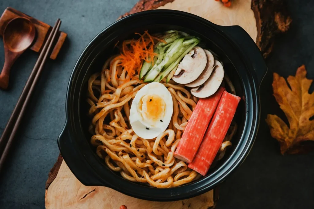
Props With A Job (Not Props For Decoration)
Supporting Neutrals That Make Food Look Expensive
Your props must have a specific job, and most of them should be supporting neutrals. Clean ceramics, matte silverware, and simple glassware all count as excellent supporting neutrals. Supporting neutrals let the food shine and add a sense of luxury without distracting from the hero dish.
A classic kaya toast set looks incredibly expensive when styled with a simple white saucer and a matte silver spoon. A plate of Hainanese chicken rice shines brightest when the surrounding bowls do not compete for visual attention.
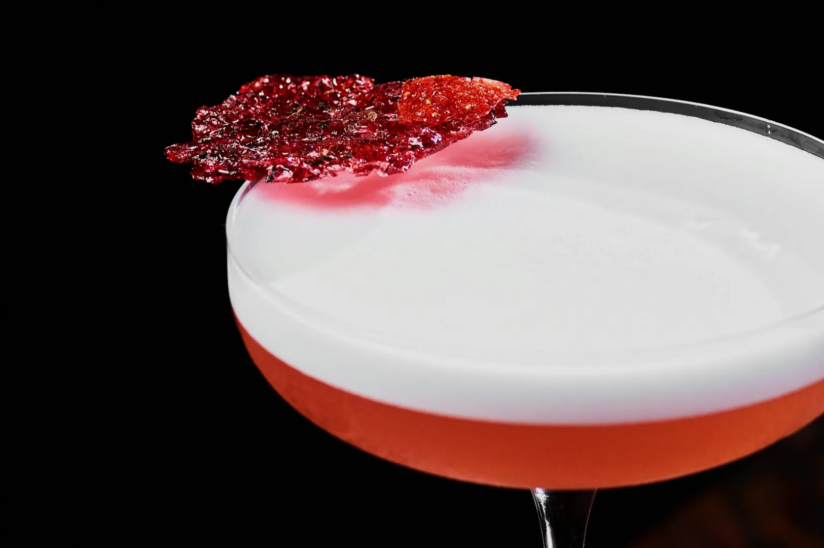
Accent Pops That Look Intentional, Not Chaotic
Your prop styling colour palette should only include one intentional accent colour. This rule is essential for maintaining focus on the main dish. One accent keeps the composition deliberate and prevents the frame from looking messy and chaotic.
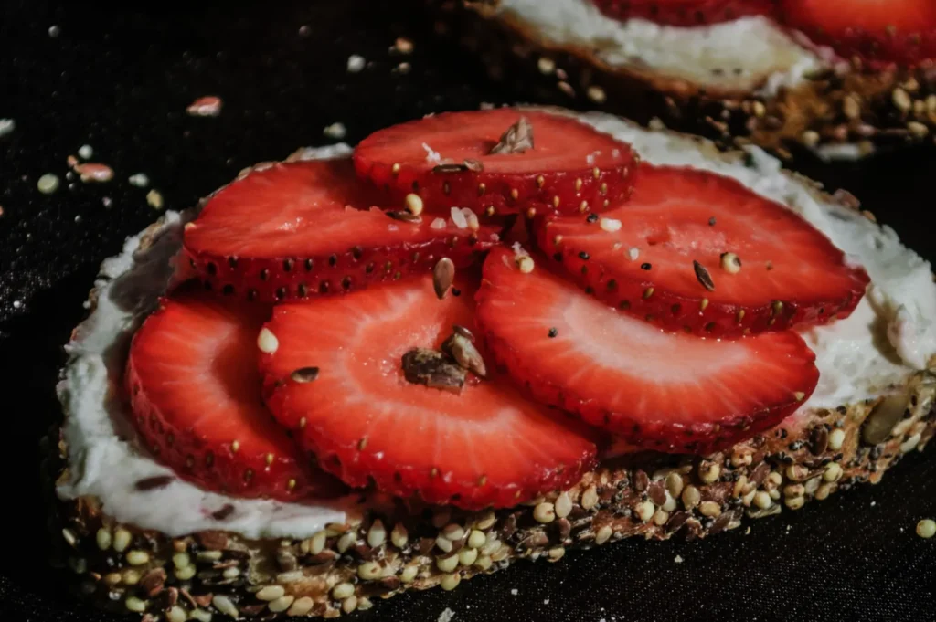
The accent usually comes directly from a natural garnish, a drink element, or one very small prop. A rich sambal dish only needs a tiny pop of fresh green cucumber to look complete. A green matcha dessert pairs beautifully with just one small red strawberry.
Texture Over Colour (When You Need More Interest)
When a photo feels slightly boring, you should add texture instead of adding new colours. Texture is your best friend for enhancing depth and making the shot more appetising, without risking a chaotic palette.
Texture creates visual interest without breaking your carefully planned colour harmony.
A rough linen weave adds beautiful detail to a flat tabletop. You can also use a speckled ceramic glaze, weathered wood, or a woven rattan tray to make the shot feel layered and rich.
Three Palette Recipes You Can Use Immediately
Clean And Minimal (Menu-Friendly)
This palette relies on a white or light grey background with white ceramic plates. The effect is crisp, modern, and always lets the food shine. It is perfect for busy menus because the food is the only thing the customer sees. A vibrant plate of nasi lemak looks incredibly fresh and modern against this minimal backdrop.
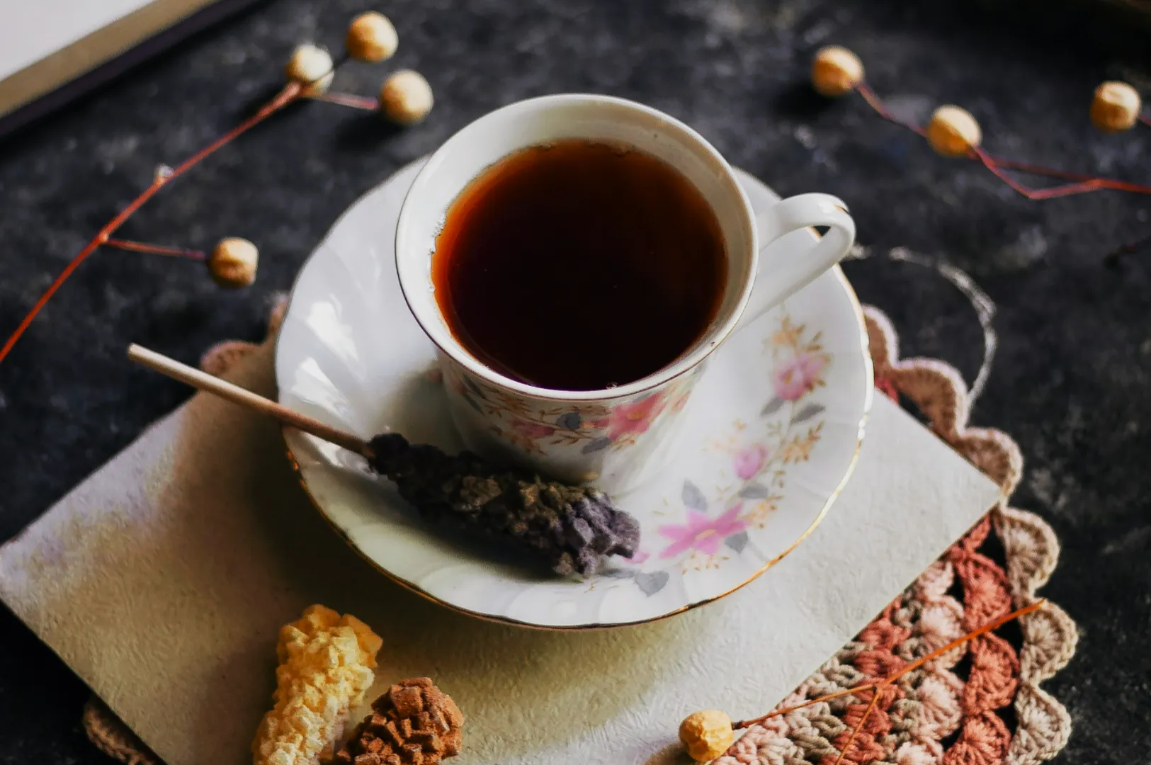
Warm And Cosy (Café And Comfort Food)
This palette uses warm wooden boards, cream linens, and off-white plates to create a space that feels welcoming and familiar. A warm and cosy palette is the fastest way to evoke comfort, nostalgia, and appetite: making comfort food look even more inviting. A hot bowl of prawn mee or a freshly baked curry puff looks perfectly at home in this warm setting, drawing customers in before they even take a bite.
Dark And Premium (Night Service And Luxe Campaigns)
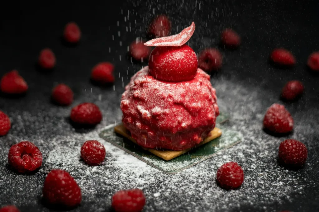
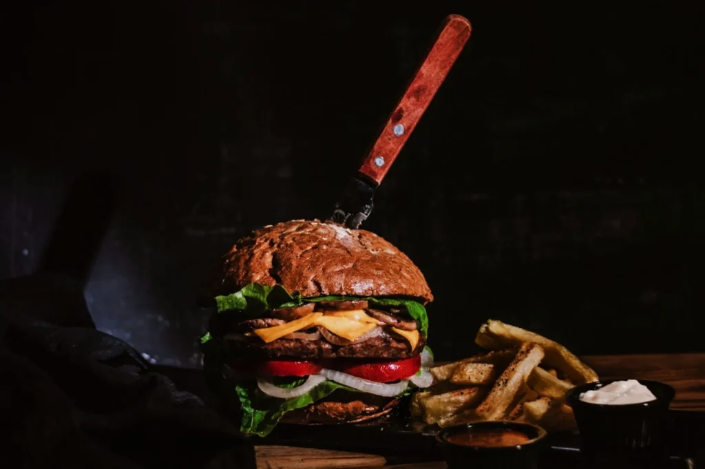
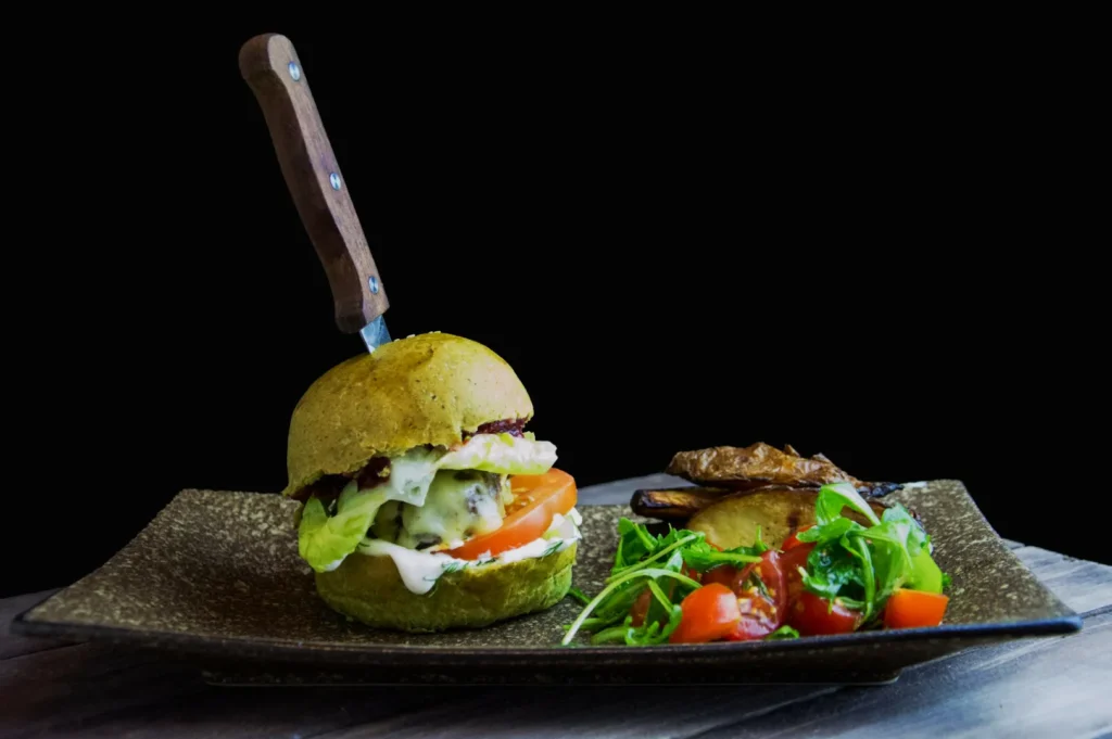
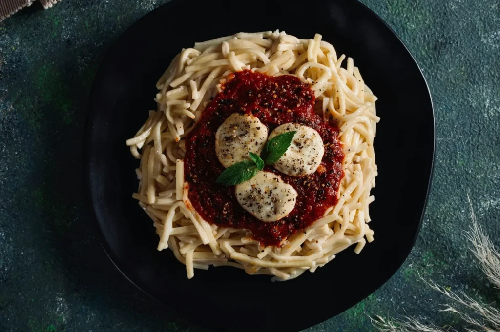
This palette features dark slate surfaces, matte black plates, and deep shadows for instant drama. It signals premium, expensive dining the moment the shot appears on screen. A perfectly seared wagyu steak or a colourful craft cocktail becomes the hero against these bold, luxurious tones.
A Fast On-Set Workflow (So You Decide Once, Then Shoot)
The 5-Minute Palette Plan
- Look at the dish and name the hero colour aloud.
- Pick one neutral background family based on contrast.
- Select two supporting neutral props.
- Choose exactly one accent colour for the garnish.
The White Plate Test (For Background And Cast Checks)
Always use the white plate test before you start shooting: the most reliable way to catch sneaky colour casts is to place a plain white plate on your chosen background first. Take a quick test photo to check for hidden colour bounces sneaking into your shadows. This instantly reveals if your surface is secretly tinting everything green or pink, so you can fix it before the food is even on set.
Quick Editing Guidance (Only After The Palette Is Right)
Correct Neutrals First
You must always correct your white balance and tint first: this is non-negotiable for clean, believable images. Getting your neutral whites and greys to look perfectly clean sets the base for everything else.
Touch Only The Colours That Matter
Focus your editing purely on the hero colour and your single accent colour: these are what drive appetite and clarity in your frame. Always avoid neon greens, oversaturated reds, and muddy oranges: these colours kill appetite and make food look fake. Keep the colours believable so the food actually looks edible.
Common Prop And Background Mistakes (And The Fix)
- Problem: The background is too close in colour to the dish.
Fix: Swap the surface for a contrasting neutral to create visual separation. - Problem: The props are louder than the food.
Fix: Remove brightly coloured props and replace them with matte neutrals. - Problem: The whites look yellow in the photo.
Fix: Cool down your white balance or remove warm practical lights from the room. - Problem: The fresh greens look dirty and grey.
Fix: Lift the luminance of the green channel during your edit. - Problem: The frame feels incredibly busy and distracting.
Fix: Remove everything except the food and one supporting prop.
Background And Prop Choices That Make The Food The Hero
Choosing the right food photography backgrounds colours is the single fastest way to make your dishes look irresistible in every shot. A disciplined prop styling colour palette ensures your food always stays the undisputed hero, never overshadowed by clutter or distracting tones.
If you want to understand the foundational rules behind these choices, our theory-to-styling bridge for colour in food photography is the perfect next read. When you are ready for professional, crave-worthy imagery that perfectly represents your restaurant, the team at Food Photographer Studio is here to help. Try doing the five-minute palette plan on your very next content shoot to see immediate results.