Picture a late night shoot in a bustling Singapore restaurant. You are capturing a vibrant bowl of laksa or a delicate cocktail style dessert, and you want to add some dramatic mood lighting. You add a blue or red gel to your flash, but suddenly the white noodles look dirty, the fresh herbs look sickly, and the entire scene feels completely artificial.
Coloured light can easily destroy the natural appetite appeal of any dish. However, it can also elevate an ordinary photo into a stunning marketing asset when used correctly. We are going to share a simple system for when to add colour, where to place it, and how to keep the dish looking completely believable.
Our team shoots for F&B brands across Singapore every single day. We know exactly how to balance food photography lighting colour so it looks highly professional and never fake.
What "Coloured Light" Really Means In Food Photography
Adding coloured light simply means using a controlled colour bias to shape the mood of your photo. You are absolutely not trying to repaint the food with bright neon colours. Using gel Lighting food photography is a subtle technique designed to make the viewer feel a specific emotion.
Coloured light generally has two specific jobs on set. It either acts as a mood light to set the overall atmosphere, or it acts as a separation light to highlight specific textures.
If the food’s hero colours stop looking like the real dish, the lighting choice is too strong. The food must always remain the undisputed hero of the frame.
When Coloured Light Works Best (And When It Does Not)
Good Use Cases For Singapore F&B
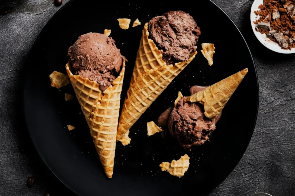
Coloured light works beautifully for establishing a late night supper mood. A subtle warm glow makes grilled satay and soy glazed mains look incredibly rich and inviting.
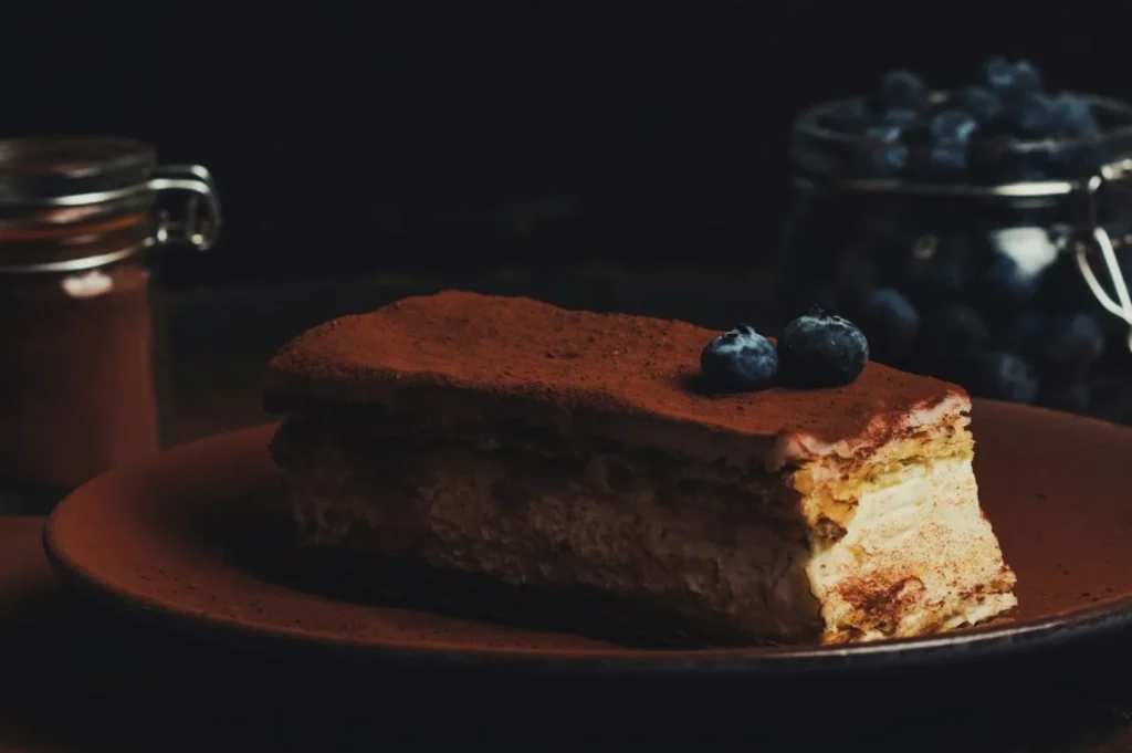
It is also highly effective for dramatic beverage launches. A cool blue backlight makes a glass of iced kopi or a vibrant cocktail look intensely refreshing. Dessert campaigns featuring dark chocolate tarts or vibrant matcha creations also benefit greatly from a touch of coloured mood lighting.
Situations Where You Should Keep It Neutral
You should strictly avoid coloured gels when shooting a standard menu refresh. Your customers need absolute colour accuracy to know exactly what they are ordering.
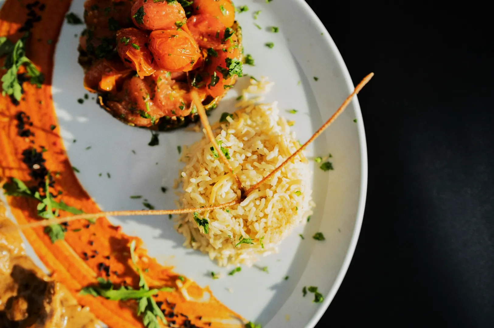
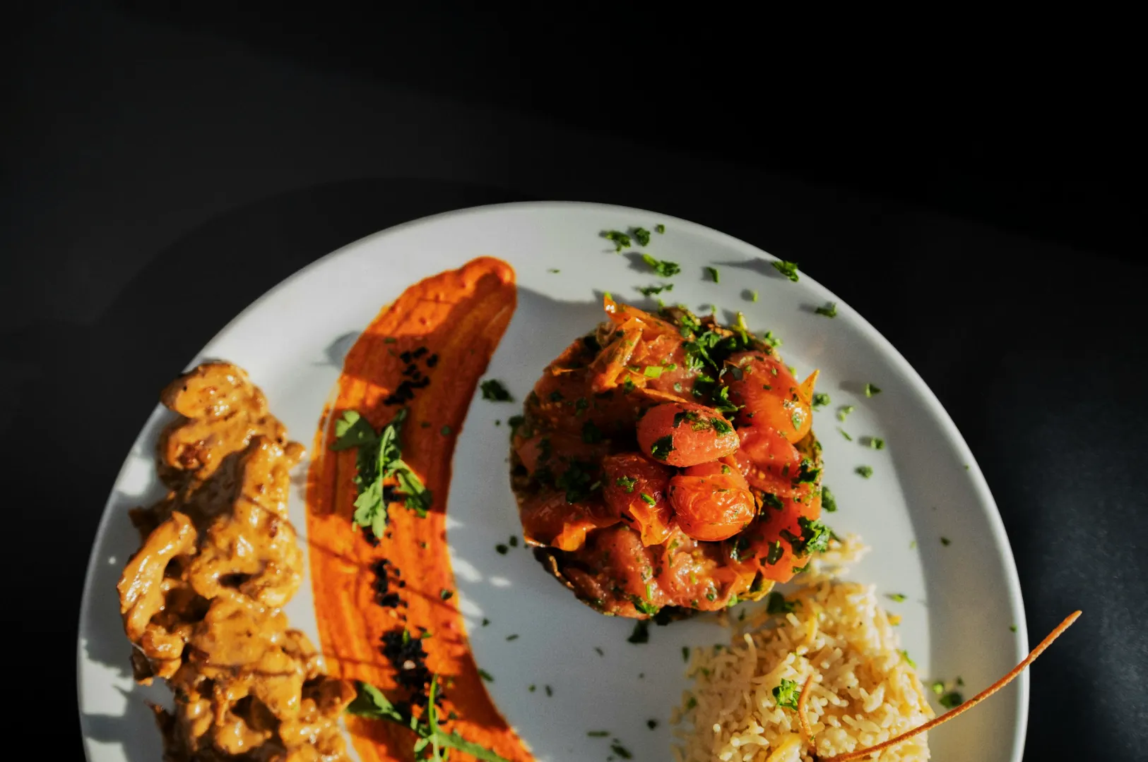
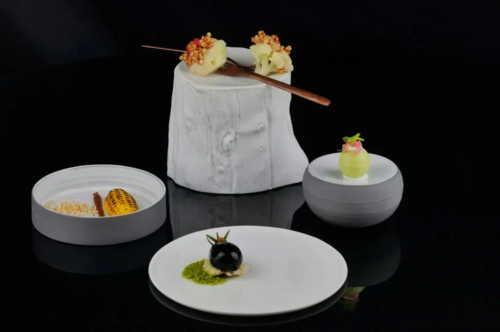
Packaging forward product shots also require perfectly clean, neutral lighting to protect the brand identity. You should also skip the gels if your scene contains lots of white elements, like steamed rice or bright ceramic plates, unless your colour application is extremely subtle.
The Food-First Lighting Rule (So It Never Looks Fake)
Choose Your Neutral “Truth” Light First
You must start with a clean main light that makes the dish look perfectly correct. This neutral truth light can come from a bright window, one continuous LED, or one daylight strobe.
Get one clean frame first, then add colour as a second step. Establishing your baseline ensures the food looks delicious before you start experimenting with creative atmospheres.
Pick One Colour Goal Per Frame
You should only pick one specific colour goal for your lighting setup. Decide if you want warmth and comfort, cool freshness, night premium contrast, or a specific brand accent colour.
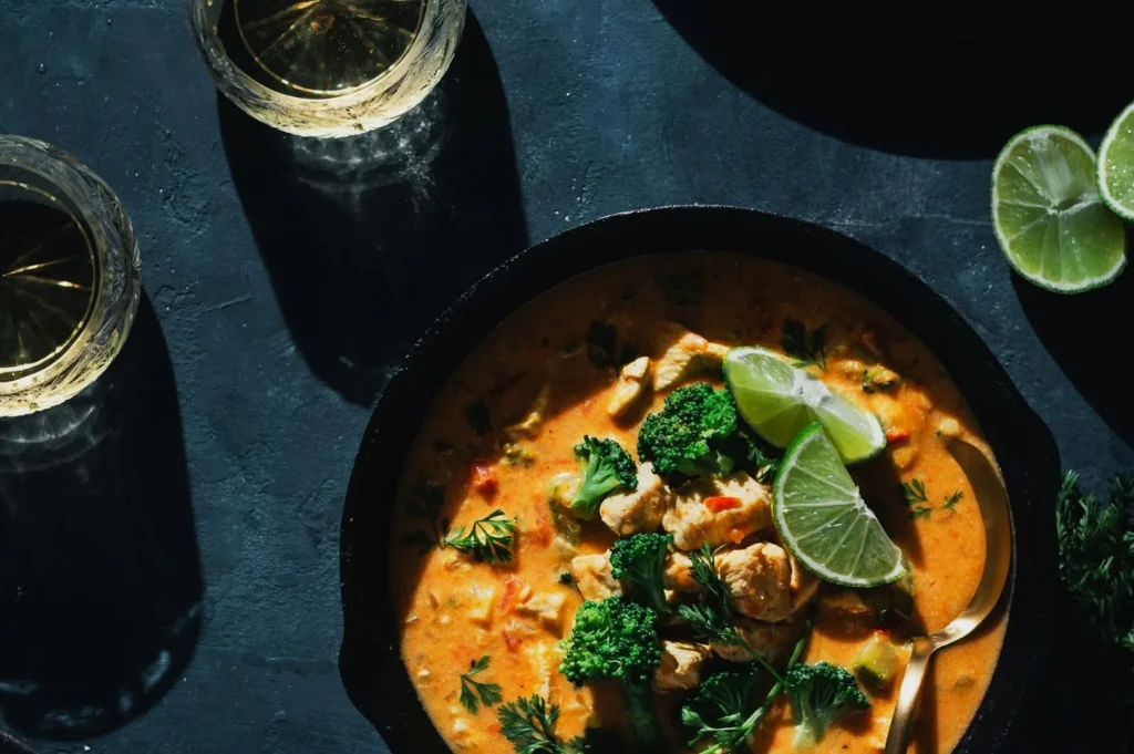
If you are shooting a rich plate of chilli crab, adding a warm, subtle backlight enhances the steam and the glossy sauce. Mixing three different coloured lights on that same dish will just make it look like a chaotic nightclub.
Three Safe Ways To Add Colour (Without Colouring The Food)
Coloured Background Light (The Safest Start)
Lighting the background is the absolute safest way to introduce food photography lighting colour. You aim your gelled light strictly at the wall or surface behind the food, keeping it completely off the dish itself.
This technique creates a beautiful, glowing atmosphere without ruining the natural tones of the ingredients. A warm amber light splashed on a dark wall behind a plate of Hainanese chicken rice creates instant drama while keeping the chicken looking perfectly clean.
Coloured Edge Light (For Separation)
A coloured edge light is used to catch the extreme edges of your subject. It works perfectly for highlighting rising steam, crisp garnish edges, glass edges, and shiny sauces.
You must keep the intensity of this rim light very low. A faint blue edge light on a cold craft beer glass makes the condensation pop beautifully without turning the golden beer green.
Practical Lights Used On Purpose
Practical lights include warm table lamps, glowing neon signs, or illuminated restaurant signage. You must treat these practicals like props with serious visual consequences.
Position them carefully so they add a warm, inviting glow in the background. Use small black cards to block their light from spilling directly onto your hero food.
How To Choose Gel Colours That Still Look Appetising
Warm Gels That Make Food Look Rich, Not Yellow
Warm gels should make your food look deeply comforting and freshly cooked. Use subtle amber or light orange gels to enhance the golden crust of hot curry puffs or toasted kaya toast.
You must be careful not to use intensely yellow gels. A heavy yellow light will make beautiful char siew look terribly unnatural and highly unappetising.
Cool Gels That Make Food Look Fresh, Not Grey
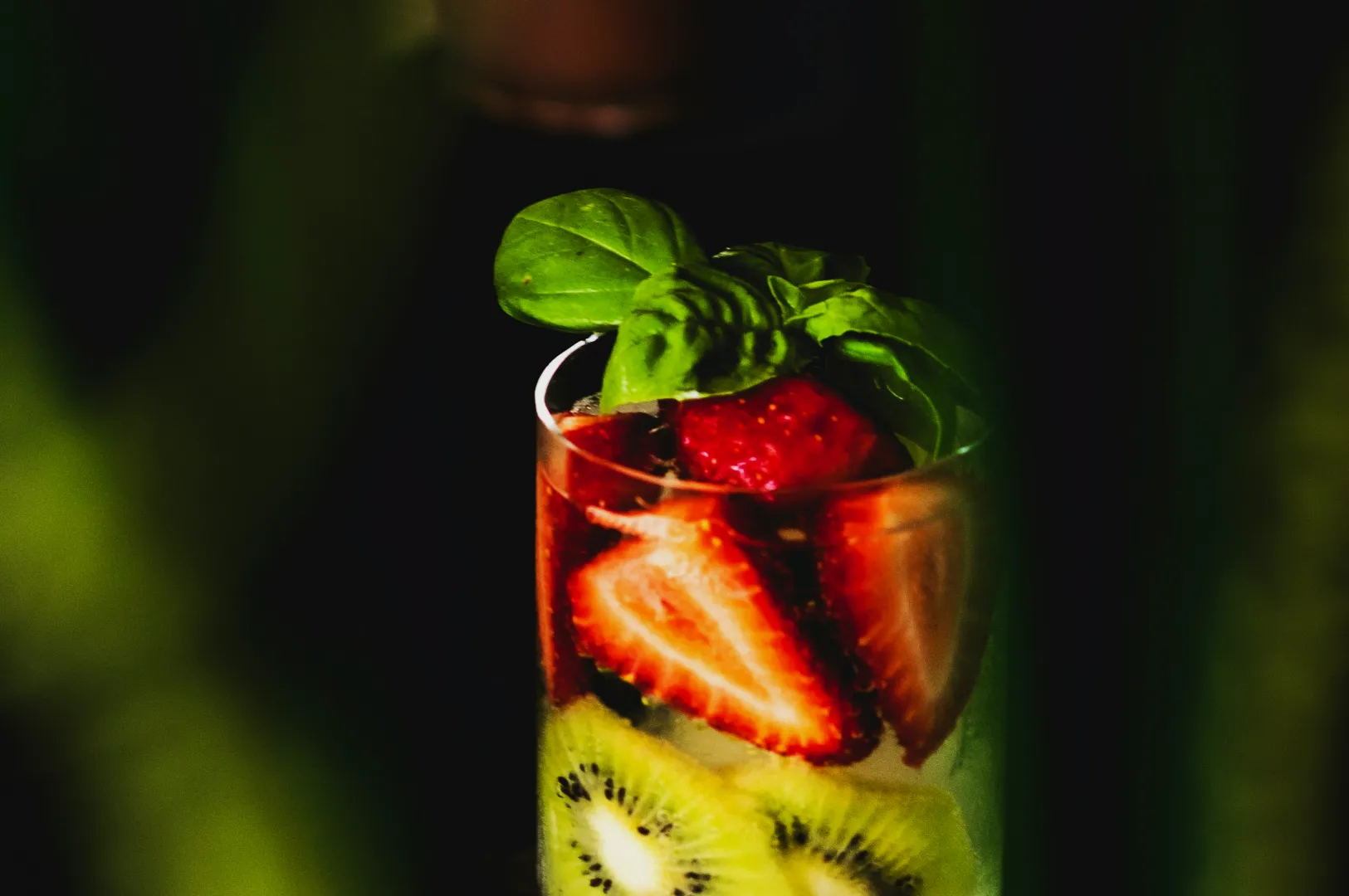
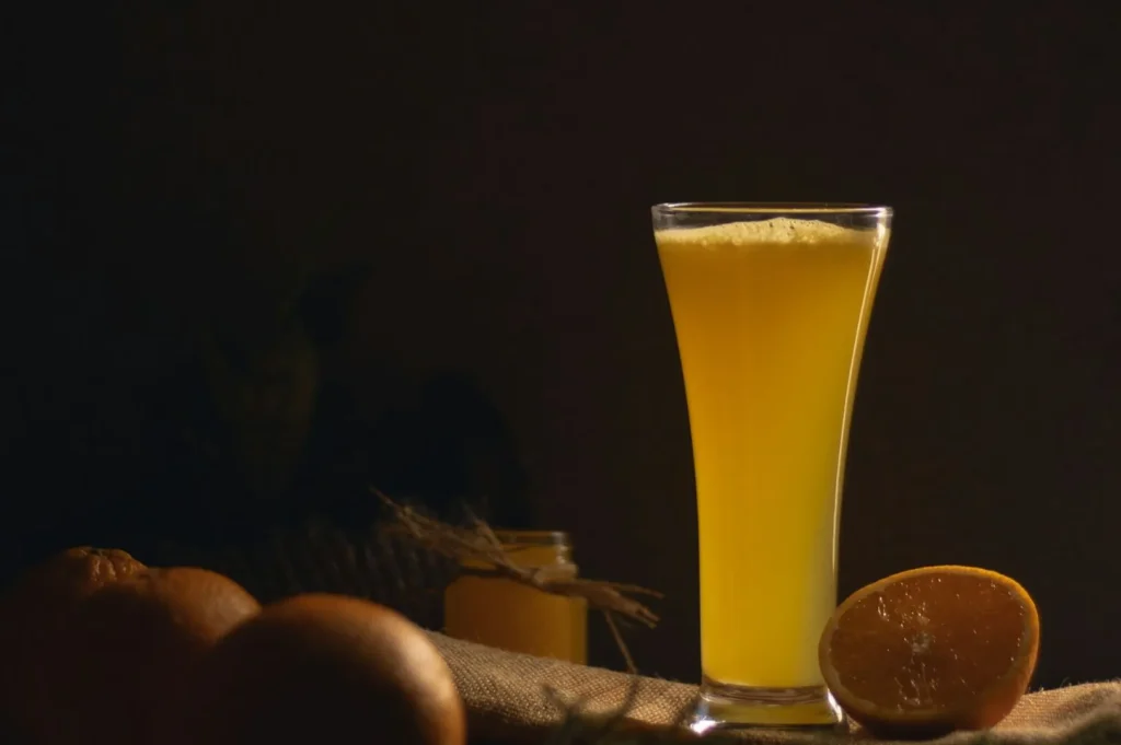
Cool gels are perfect for communicating a chilling, refreshing sensation. Light blue or cyan gels work wonderfully as background lights for icy yuzu drinks or cold shaved ice desserts.
Avoid heavy, dark blue gels that spill onto the food itself. Dark blue light will instantly make a premium sashimi platter look grey and completely spoiled.
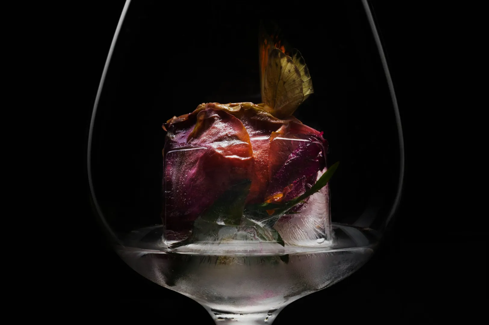
Accent Colours
Using vibrant brand colours like pink or purple requires massive restraint. You must treat these strong gel lighting food photography colours exactly like a delicate garnish.
If you notice the gel before you notice the food, it is too much. The colour should be a subtle hint in the shadows or the background, never the main attraction.
Placement And Control (The Difference Between "Moody" And "Messy")
Keep Coloured Light Off Neutrals
You absolutely must keep your coloured lights off the neutral elements in your frame. Your white plates, steamed rice, coconut milk, and white napkins need to remain perfectly clean.
Always do a fast white plate test before you start shooting. Place a plain white saucer on the table and check to see if your gel is accidentally tinting it pink or blue.
Control Spill With Distance And Flags
Controlling light spill is what separates professional studio work from amateur photography. You can easily reduce the intensity of a gel by moving the light stand further away from the table.
Change the angle of the light so it grazes the background rather than hitting the food directly. Use simple black foam boards as flags to physically block coloured light from reaching the front of your dish.
Watch For Bounce From Coloured Surfaces
Coloured light loves to bounce off shiny tables and bright walls. If you blast a strong red light at a glossy background, that red light will bounce right back onto your food. Move your subject further away from the background to fix this common issue instantly.
A Simple White Balance Approach For Coloured Light
Set White Balance For The Food, Not The Gel
Your camera will often get confused when you introduce strong coloured lights into the scene. You must set your white balance for the neutral truth light hitting the food. Decide what part of the dish should be perfectly neutral, and let the gel act purely as a creative, secondary layer.
Tint Is The Hidden Problem
The tint slider controls the green and magenta balance in your image. When using coloured gels, unwanted green spill often ruins the shadows of your food. Watch your tint carefully and push it slightly towards magenta if your dishes start looking strangely olive toned.
Quick Editing Guidance (Polish, Not Rescue)
Clean Neutrals First
Your editing process should only polish a great photo, not rescue a bad lighting setup. Always fix your white balance and tint first so your clean neutrals look perfect.
Touch Only The Colours That Matter
Once your neutrals are clean, touch only the colours that actually matter to the dish. Focus your adjustments strictly on the reds, oranges, yellows, and greens of the natural food ingredients. Do not boost the global saturation, or your coloured gels will look highly radioactive.
Keep One Reference Frame
Choose one gold standard image where the lighting and colours look absolutely flawless. Keep this reference frame open on your screen and match the rest of your gallery to it for perfect consistency.
Coloured Light That Feels Like Atmosphere, Not A Filter
Mastering food photography lighting colour allows you to create stunning, atmospheric images that instantly grab attention. By lighting your backgrounds carefully and protecting your clean neutrals, your dishes will always look highly premium and totally craveable.
To truly understand how these choices impact appetite, review our core colour framework for food photography before your next shoot. When your F&B business is ready for dramatic, professional imagery that stands out in a crowded market, the experts at Food Photographer Studio are ready to help. Try using a subtle background gel on your very next content day to see how easily it transforms the mood of your menu.