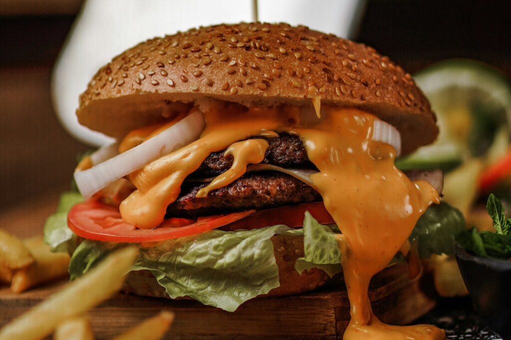
We’ve all seen the “just-post-it” shot: overhead, harsh light, zero mood, and a plate that looks like it’s waiting for a passport photo. It technically shows the food but it doesn’t hold anyone. In Singapore’s fast-moving F&B world, where diners are visually fluent and new openings appear weekly from the CBD to Katong, that kind of documentation fades into the noise.
Transitioning from functional content to fine art photography is not about being “fancy.” It’s about shifting how your brand is perceived. Thoughtful fine art photography signals intention: craft, atmosphere, and a point of view. It can justify premium pricing, support PR, and build a visual identity that feels like it belongs in the broader art world, not just another feed.
This article walks you through the mindset and techniques behind that transition: how to move from simply showing what a dish looks like to conveying how it feels in real life.
Understanding the Starting Point: Commercial Photography vs Artistic Photography
Commercial photography is built for clarity. It performs in menus, ordering pages, and promotions where the goal is fast comprehension: “This is the dish, this is what you get.” Lighting tends to be even, styling is controlled, and the photographic image is measured by conversion.
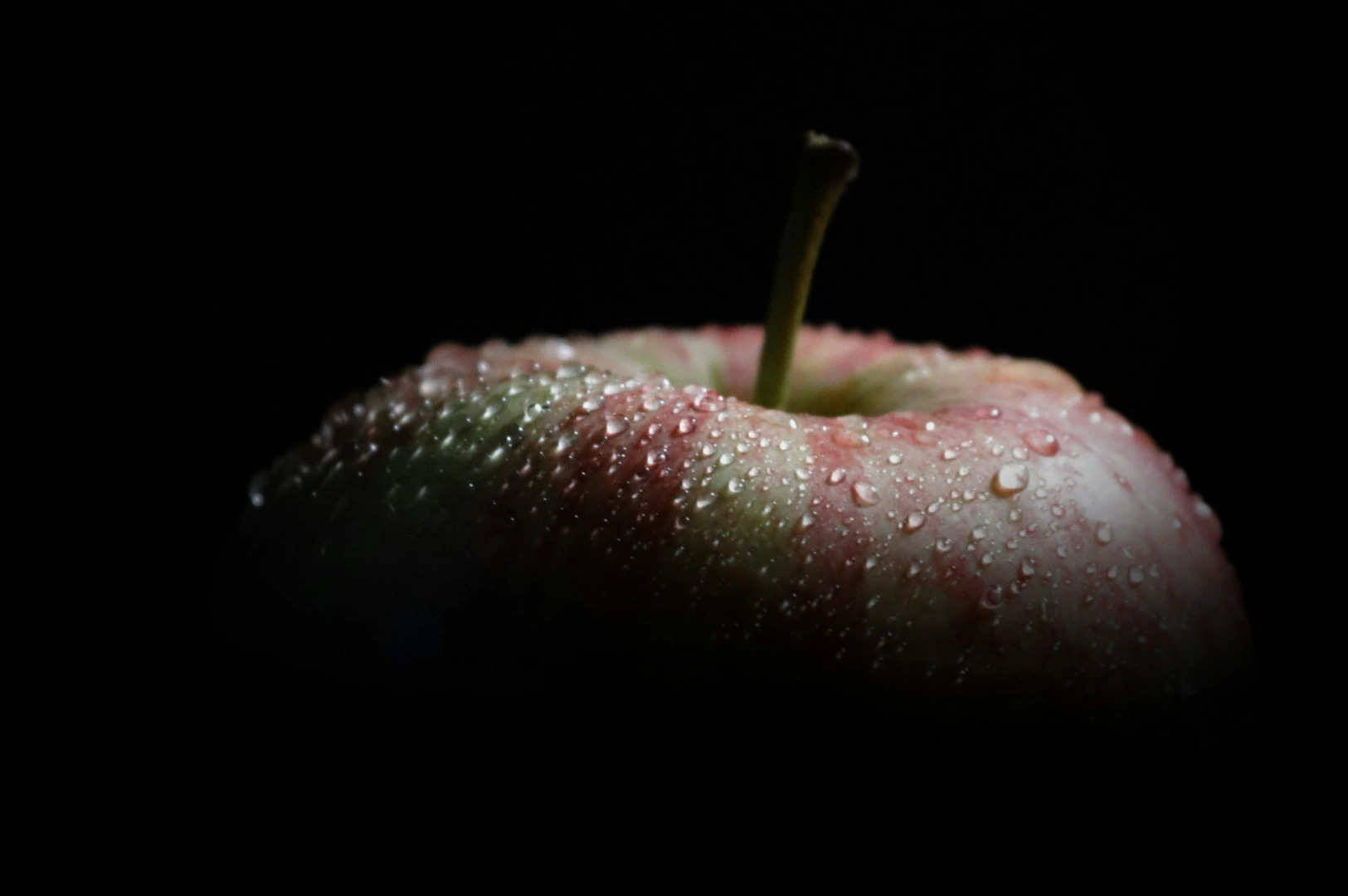
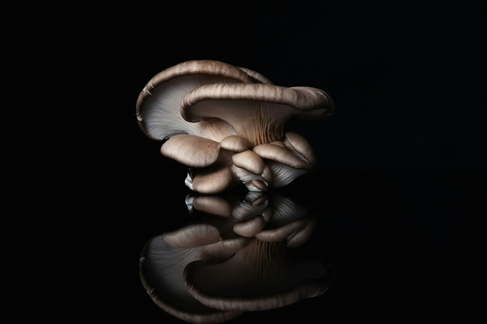
Artistic photography works differently. It’s less transactional and more interpretive: closer to art photography as a visual language. A shadow might hide part of the dish to create wonder. A close crop might focus on texture, form, or a single ingredient. A frame might feel like still life rather than product documentation.
The shift is a mindset change:
From “Is the brand colour accurate?” to “Does this image carry a mood?”
From “Remove every crumb” to “What does the crumb convey?”
From perfection to the human condition of cooking—hands, heat, time, and movement
That’s where fine art begins: not in gear, but in intention.
If you want a clearer decision framework first, read our breakdown of fine art photography vs commercial photography and how each style supports different F&B goals.
Core Principles of Fine Art Photography for Food
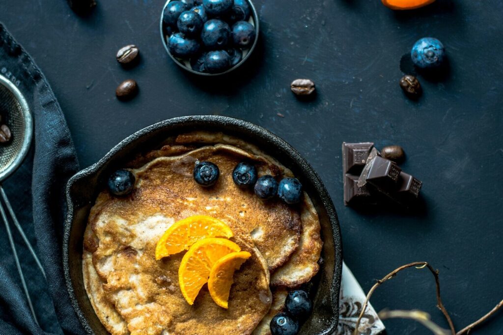
Intentional composition: using space on purpose
In fine art photos, composition isn’t a default template. It’s the point. Negative space creates breathing room. Cropping can create tension. A centered subject can feel formal; an off-balance placement can feel modern, restless, alive.
In Singapore’s context, this matters because your audience is used to strong visuals. If your composition is predictable, your work becomes scrollable.
Emotional storytelling and the “why” behind the shot
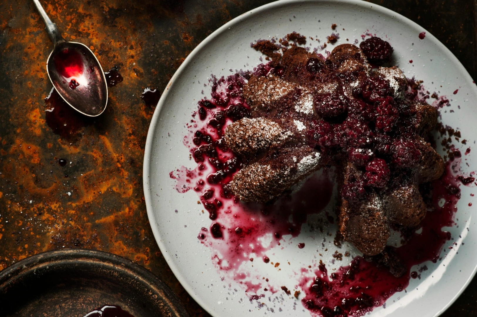
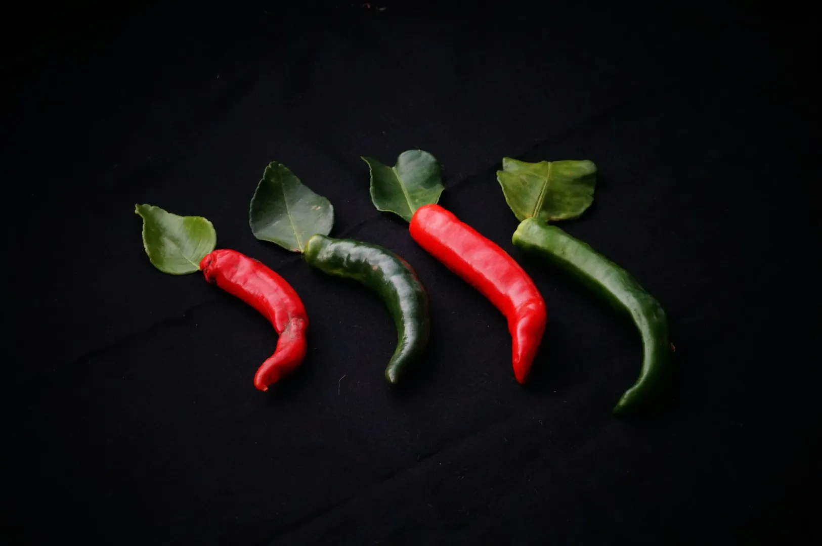
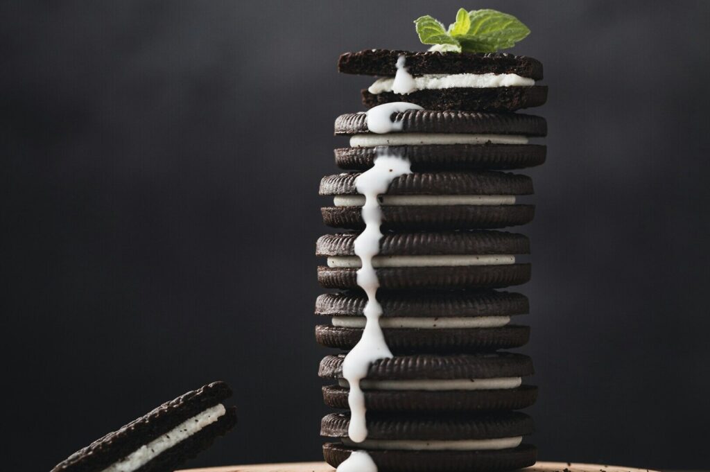
Fine art images lean on emotion: nostalgia, comfort, heat, freshness, restraint. Colour, texture, and light become vocabulary. The same dish can communicate different ideas depending on how it is photographed.
A cool-toned scene can feel like early morning at a wet market. Warm amber light can suggest a late-night bowl of soup after a long day. That’s creating images with intent, not just capturing food.
Embracing imperfection without losing professionalism
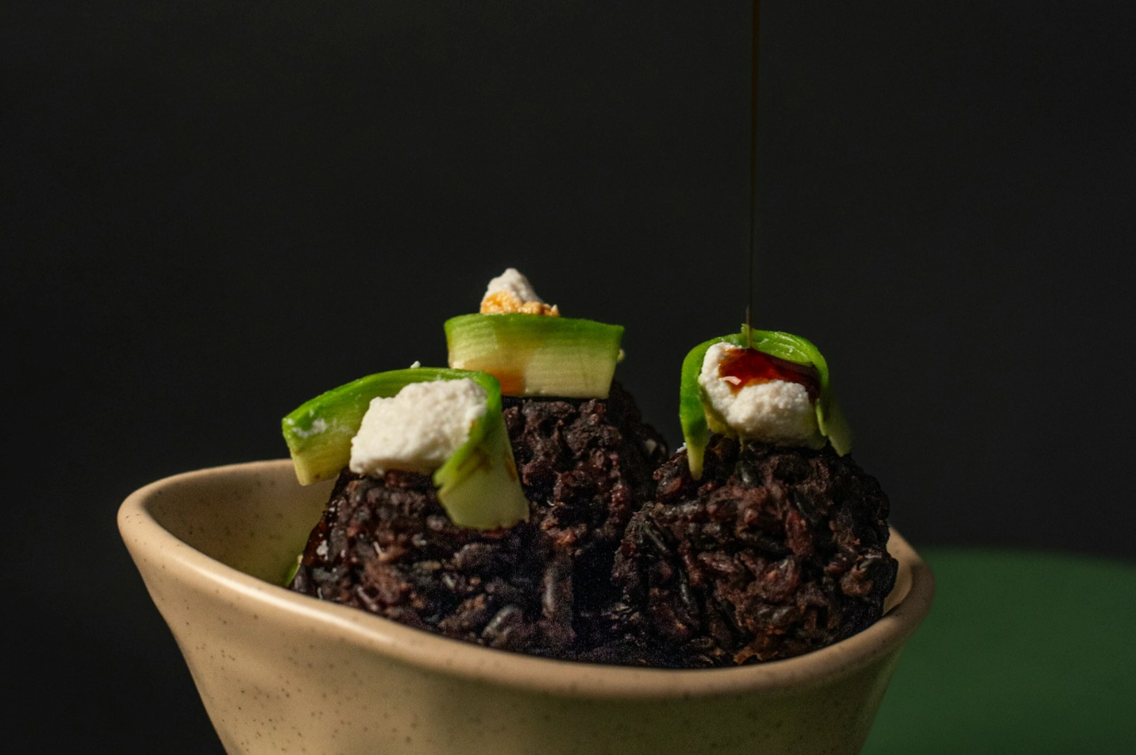
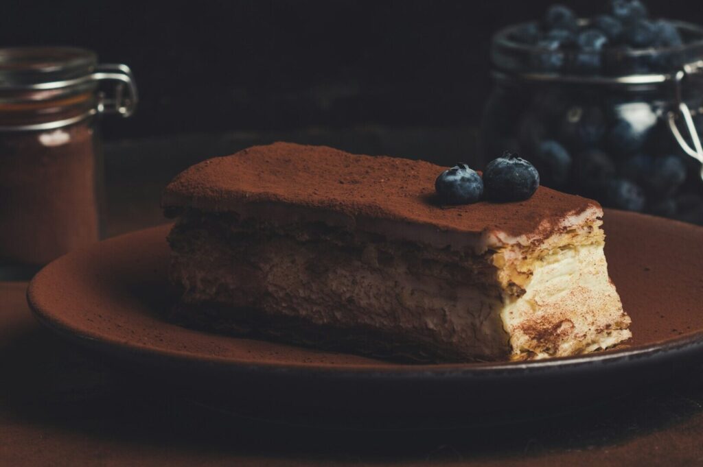
Fine art photographs don’t need to look messy. They need to look real. A smear of sauce, a torn herb, a slightly uneven edge. These details add life and signal authenticity. When done deliberately, “imperfection” looks like craft, not carelessness.
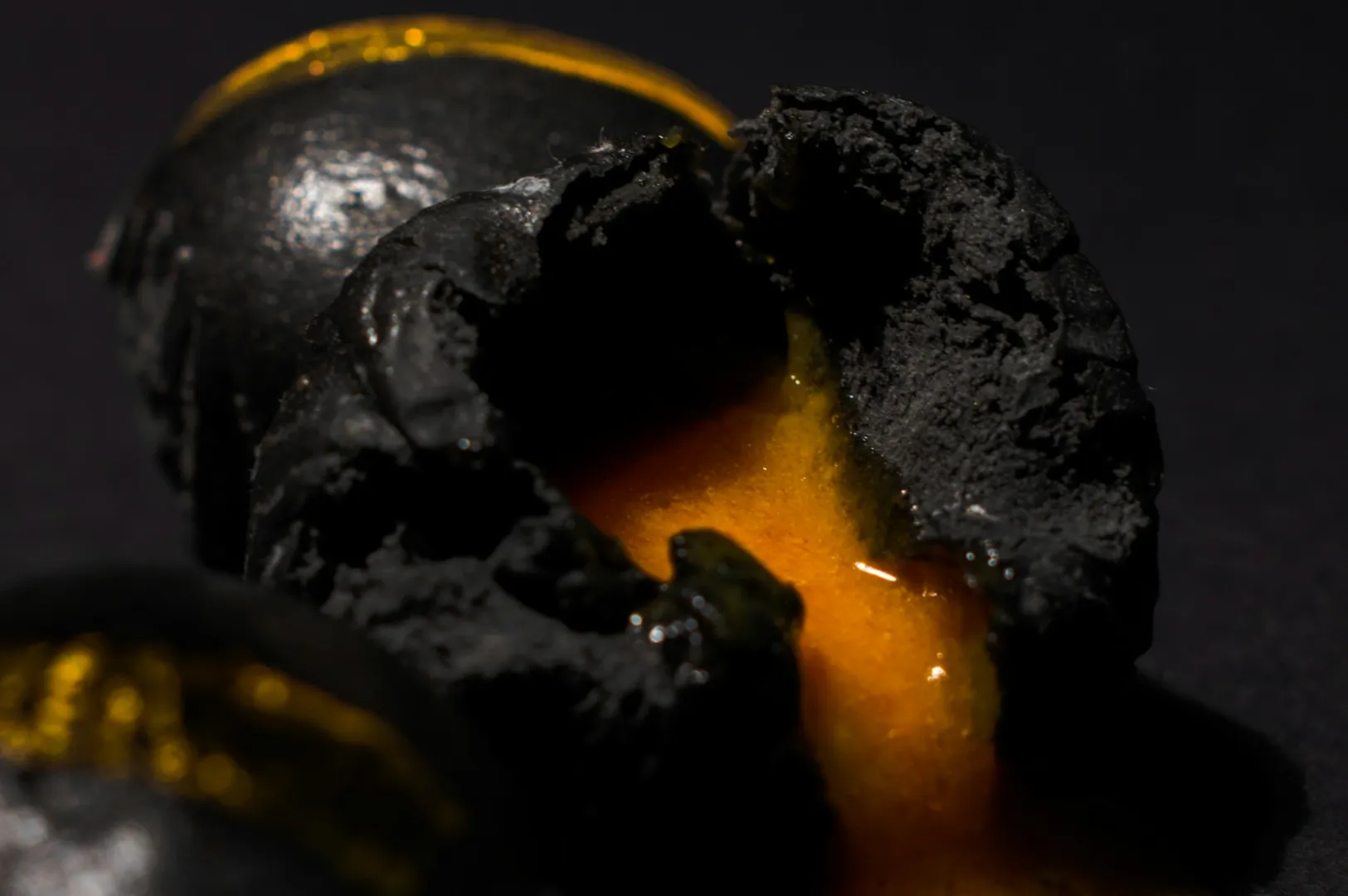
Lighting, Depth, and Texture: Making a Photographic Image Feel Three-Dimensional
Commercial lighting often aims for visibility. Fine art lighting aims for shape. Think of it as sculpting the subject like the way painting uses shadow to model form.
From flat to dimensional light
Side light and backlight create depth. They carve out texture, separate the subject from the background, and add mood. This is one of the simplest transitions you can make in your next shoot: stop lighting everything equally.
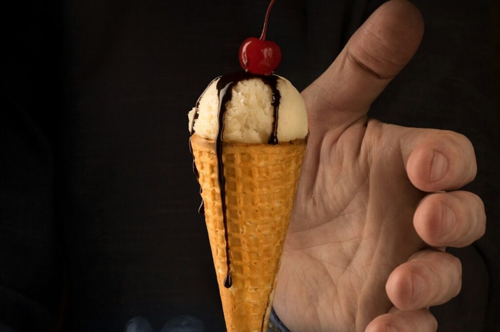
Depth of field and focus as a storytelling tool
Shallow focus can isolate a detail (salt crystals, oil sheen, the edge of a crust) while the rest fades into atmosphere. This turns your dish into a scene rather than a catalogue entry.
Texture as the “hook”
Texture is a shortcut to appetite and memory: steam, condensation, crisp edges, glossy sauces. If you want your audience to feel the dish, start by making them feel the surface.
The Styling Evolution: From Props to Meaning in Fine Art Photographs
In commercial work, props often “complete the frame.” In fine art, props carry meaning. They help define culture, time, and place.
Narrative-driven styling: build a world
If you’re photographing a Peranakan dish, let the styling acknowledge heritage: a worn spoon, antique porcelain, textured fabric. If you’re shooting a modern bistro plate, keep it clean and architectural.
This is how you develop a distinctive voice. Your visuals stop looking like borrowed trends and start looking like your brand.
Symbolic prop selection
Every element should earn its place. A knife can suggest interruption or anticipation. A half-folded napkin can imply someone just sat down. A glass with condensation can hint at heat, humidity, and relief.
Fine art isn’t about adding more. It’s about adding the right things.
Developing an Artist’s Vision That’s Still Useful for F&B
Here’s the truth: you don’t need to become an art historian to shoot like an artist. But you do need references beyond food blogs.
Look outside food: art world inputs that sharpen your eye
Study landscape photography to understand tonal control and patience. Many photographers cite Ansel Adams for this reason. Look at fashion photography to learn confident colour and shape. Visit an art gallery or museums and pay attention to how visual arts guide the eye through space.
Even conceptual movements (sometimes tied to feminist art, portraiture, or photojournalism) teach you how images can acknowledge identity, culture, women’s stories, politics, and place. You’re not required to “make a statement,” but seeing how artists approach meaning will expand your toolkit.
Find your signature
Do you lean toward dark, cinematic scenes? Bright minimalism? Tight crops? Overhead still life? Repetition is not boring! it’s branding. A recognizable approach turns random posts into a coherent body of work.
Still Life Thinking: The Shortcut to Creating Fine Art Photos
Still life is a powerful bridge between restaurant content and fine art photography. It’s controlled, deliberate, and perfect for food because it lets you build a scene without needing a full dining room.
Try this:
One dish
One surface
One supporting element
One light direction
One emotional idea (comfort, heat, calm, nostalgia)
This is how you create fine art photos without overhauling your entire workflow. It’s also how you move from “we took a photo” to “we created an artwork.”
Post-Production: From Correction to Creating Fine Art
Commercial editing corrects. Fine art editing interprets. It’s the difference between “accurate” and “intentional.”
Colour grading for mood
Fine art photos often use palette choices like muted tones, monochrome leaning, or warm/cool separation. You’re shaping feeling. This is where your image starts to resemble a crafted print—some photographers reference the discipline of a C print era mindset, where each decision mattered.
Let shadows exist
In commercial work, shadows are often lifted. In fine art photography, shadows create depth, mystery, and focus. You’re guiding the eye by deciding what to reveal.
Protect your brand truth
Even when you grade artistically, avoid turning your dish into a different dish. Your goal is elevated reality, not fantasy.
Practical Transition Strategies for Singapore Brands
You don’t need to switch everything overnight. In fact, a gradual approach usually performs better.
Start with one series
Pick one signature dish. Shoot it in three moods across three weeks. Track engagement, saves, and comments. This gives you evidence for stakeholders and builds confidence.
Build a dual visual system
Keep commercial photos for menus and ordering. Use fine art images for:
Website hero banners
PR kits and media pitches
Posters and prints on your wall
Brand storytelling posts
This is how many premium brands balance sales needs with long-term brand equity.
Not sure how to split assets between menus and storytelling? Our guide on choosing the right photography style for your brand explains what to use where and why.
Educate partners and teams
If someone asks, “Why is it darker?” explain it simply: it’s meant to convey mood, not just information. That’s a business decision: brand positioning, not personal taste.
Conclusion: From Snapshots to Fine Art, One Decision at a Time
The transition into fine art and photography is not about turning your restaurant into a gallery overnight. It’s about intention. When you start thinking like an artist (composition, light, still life discipline, mood, meaning) you stop producing forgettable photos and start building a visual identity with longevity.
You don’t need decades of experience or a university course to start. Pick one technique: directional light, negative space, tighter focus, or mood grading. Apply it to your next shoot. Then refine.
If you’re ready to elevate your visuals while keeping commercial clarity where it matters, Food Photographers Studio can help you bridge that gap in creating images that sell today and build brand equity for the long run.