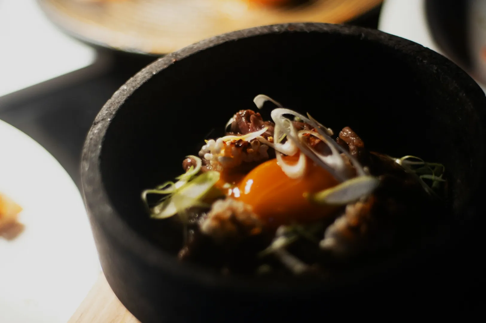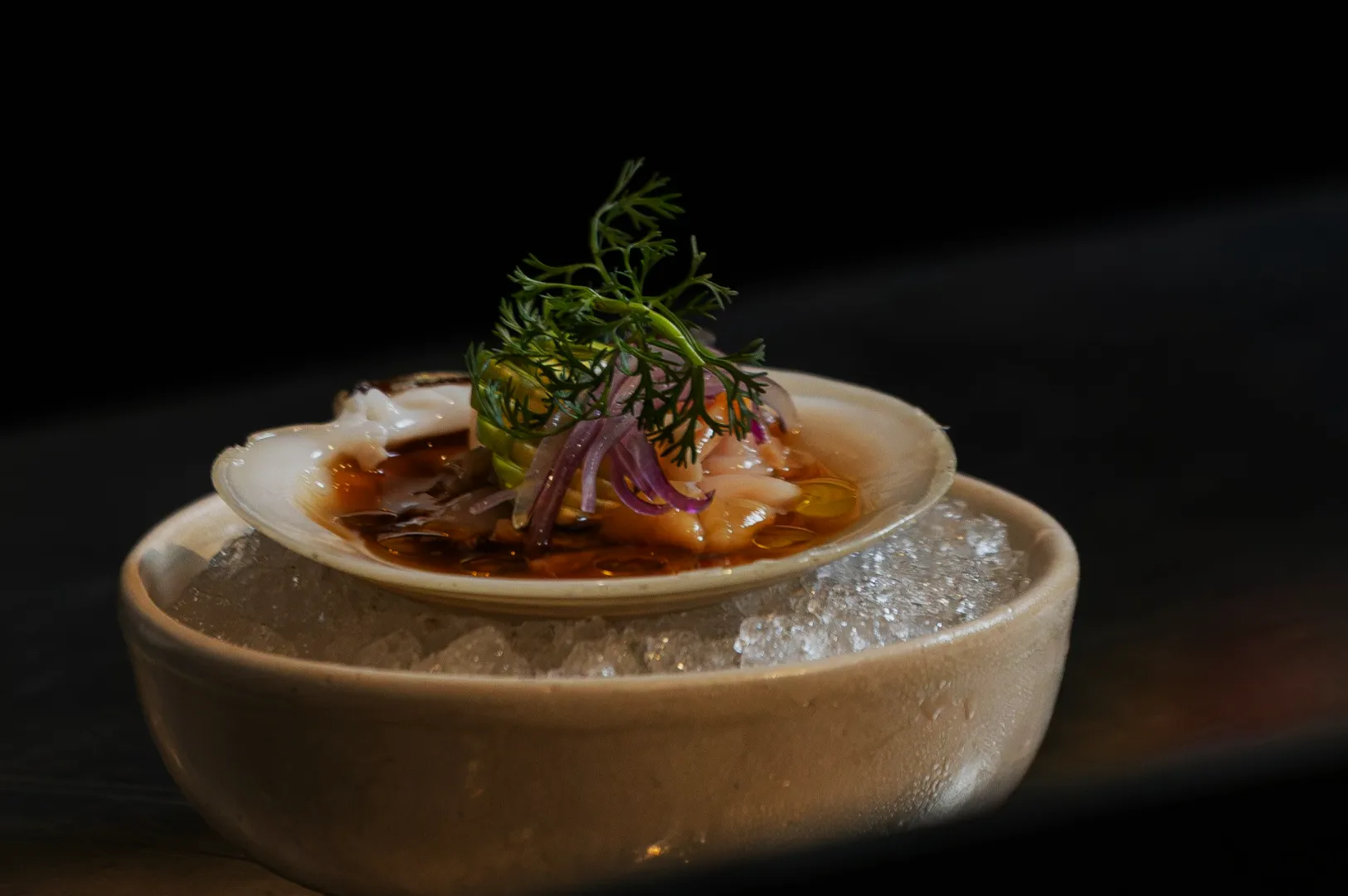
Rice, bread, and pastry look simple until the texture disappears.
A plate of chicken rice can look plain if the grains merge into one soft block. Kaya toast can look ordinary if the edges do not feel crisp. A croissant can look dense if the layers are not visible. Curry puffs, tarts, Danish pastries, sourdough, brioche, burger buns, and fried rice all depend on small visual details to feel appetising on screen.
That is what makes bread texture photography and pastry food photography more delicate than people expect. These foods do not always need dramatic styling. They need grain, crumb, crust, flakes, folds, and edges to be readable.
When those details show clearly, customers can imagine softness, chew, crispness, warmth, and freshness before they order.
Why Bread, Rice, And Pastry Need Texture To Look Appetising
Carb-heavy foods rely heavily on texture cues because many of them are naturally plain in colour. Rice, bread, pastry, and cakes often sit within beige, brown, cream, or pale yellow tones. Without visible detail, they can look dry, dense, or ordinary.
Rice needs separation and shape so it does not look clumped. Bread needs crust and crumb to suggest freshness. Pastry needs flakes and layers to suggest lightness. Cake needs interior structure so it does not look heavy or stale.
These details may seem small, but they change how customers read the food. A good rice photo says fluffy. A good bread photo says warm. A good pastry photo says crisp, light, and freshly baked.
Texture is what turns a simple carb into something worth craving.
Rice Texture: Make Grains Look Separate, Not Clumped
Rice is one of the most common foods in Singapore, but it is also easy to make visually flat.
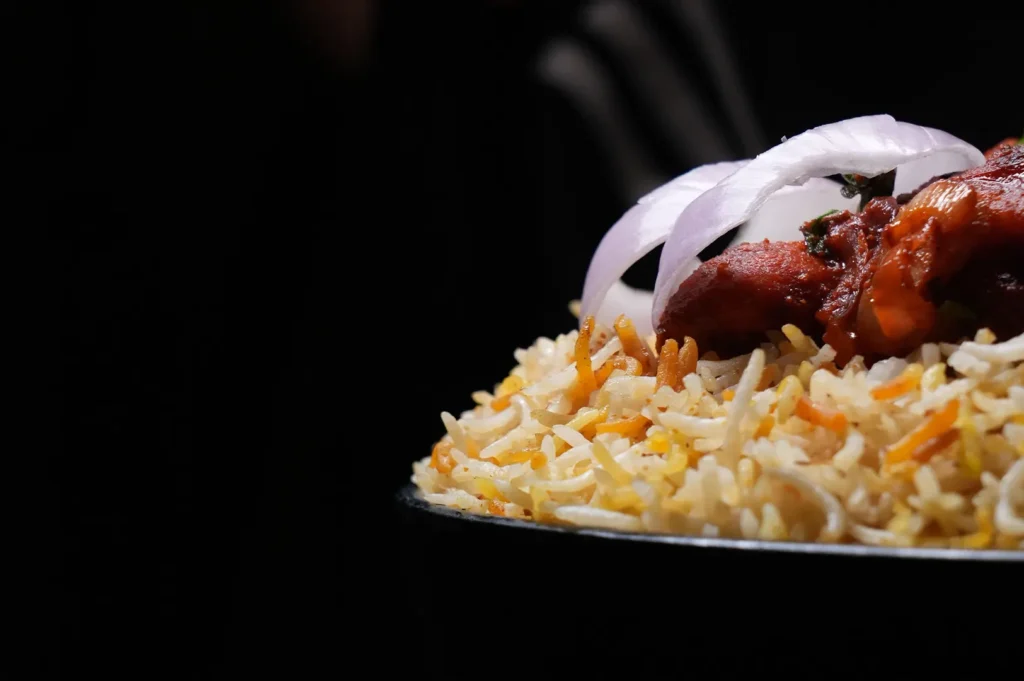
Chicken rice, nasi lemak, fried rice, donburi, briyani, and claypot rice all need some level of grain definition. The rice should not look like one compressed block unless that is truly how the dish is meant to be served. Even when the rice is soft, it still needs shape.
For chicken rice, the grains should feel tender and fragrant, not mushy. For nasi lemak, the rice should support the sambal, egg, cucumber, and fried elements without disappearing under them. For fried rice, small ingredient contrast matters because egg, spring onion, charred bits, and protein help break up the colour.
Rice bowls need balance too. The topping and rice should feel connected, but not messy. If everything is piled without structure, the dish becomes difficult to read. If the rice is too exposed and flat, the bowl can feel empty.
Good rice texture photography is about making the staple feel cared for, not like background filler.
Bread Crust: Show The Bite Before The Customer Takes It
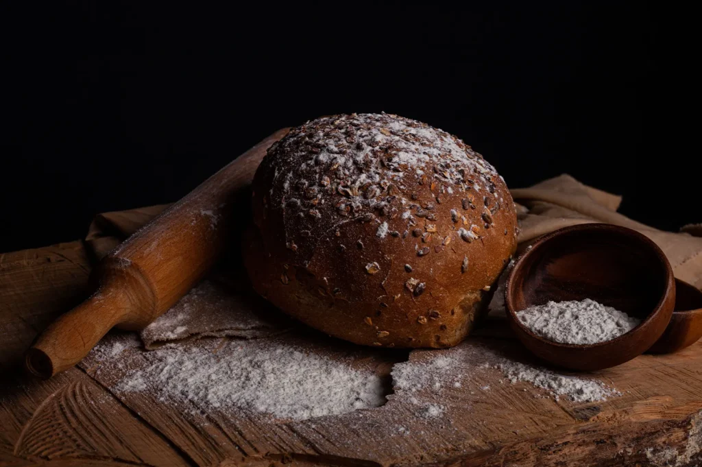
Bread crust carries a lot of appetite information.
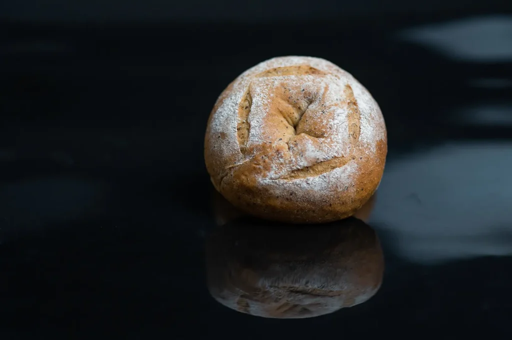
Kaya toast needs crisp edges. Sourdough needs a crust that suggests chew and depth. Burger buns should look soft but not limp. Garlic bread should feel warm and biteable. Baguette and focaccia need browning, cracks, bubbles, and uneven texture to show bake quality.
A dull crust can make bread look stale even if it is freshly baked. A good crust photo should make the customer imagine the bite: the first crack, the chew, the warm centre behind the browned edge.
This is not the same as photographing fried food. Baked crust is more subtle. It is not only about crunch. It is about warmth, structure, and freshness.
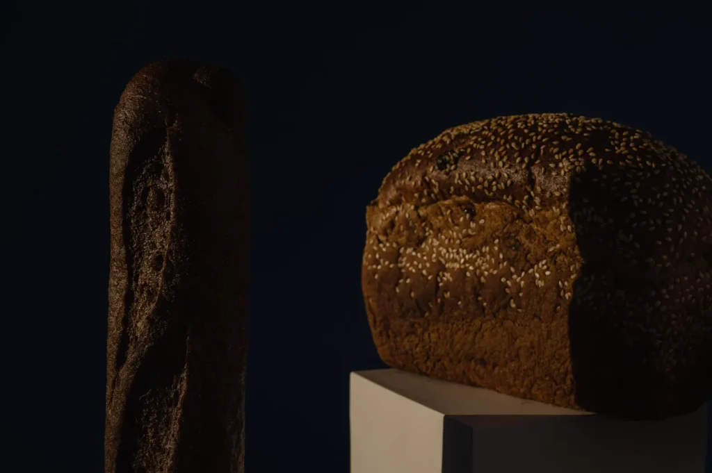
Small imperfections often help. A few cracks, blistered patches, sesame seeds, or toasted edges can make bread feel more real. Bread should not look too perfect. Too perfect can start to feel processed.
Crumb Structure: Why The Inside Matters
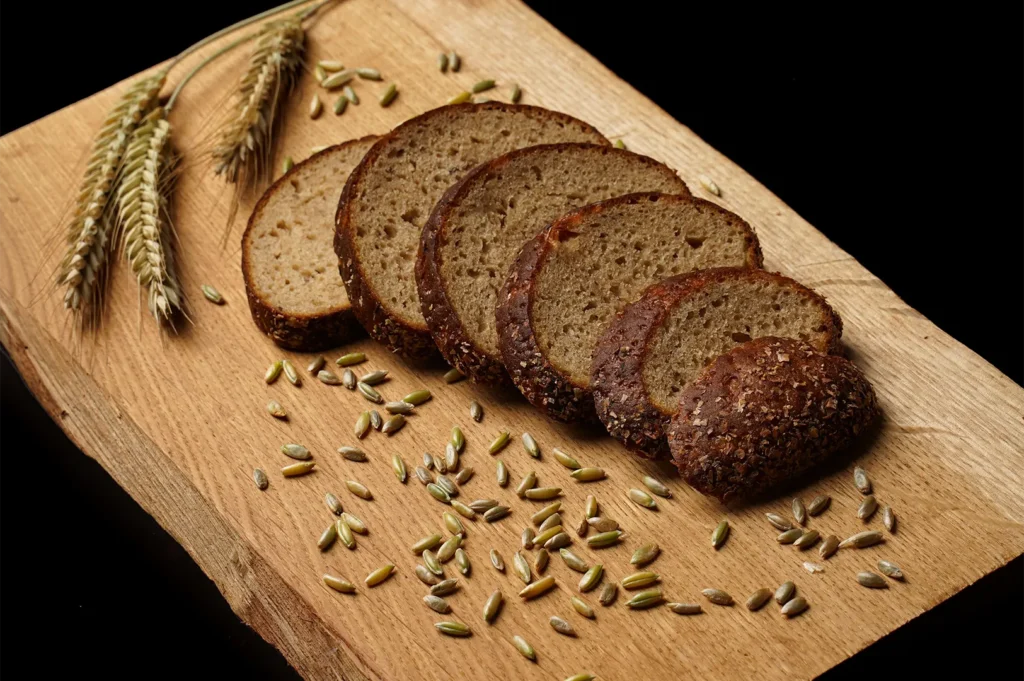
For bakeries and cafés, the inside of bread and cake often sells the product better than the outside.
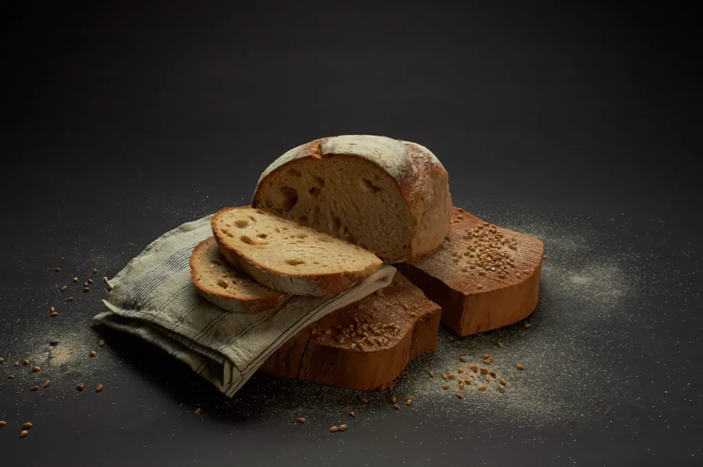
A sourdough loaf becomes more convincing when the crumb shows air pockets. Brioche should show softness and richness. Muffins, pound cake, banana bread, soft rolls, and cake slices need a visible interior so customers understand density, moisture, and freshness.
A clean cut helps reveal structure. It tells the customer whether the product is airy, soft, moist, dense, or dry. But the cut should still feel natural. If the crumb looks too smooth, the product can feel processed. If it looks too dry or broken, it may feel old.
Crumb detail works because it makes the food feel open and honest. Customers are not only seeing the product from the outside. They are seeing what the bite might feel like.
For breads and cakes, the inside is not a secondary detail. It is often the proof.
Pastry Layers: Flakes, Folds, And Edges That Sell Craft
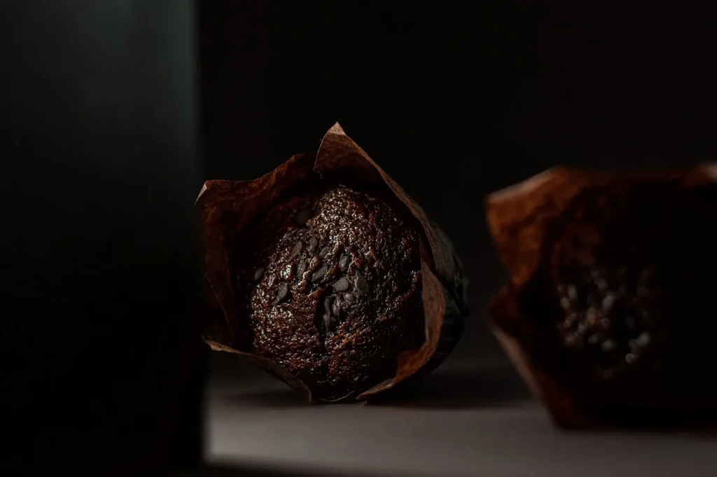
Pastry food photography depends on structure.
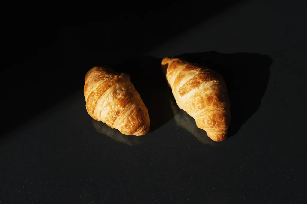
Croissants, Danish pastries, curry puffs, puff pastry tarts, egg tarts, mille-feuille, and layered kueh all need visible layers, folds, edges, or flakes to communicate craft. A pastry that looks too smooth can appear dense. A pastry with visible lift and separation feels lighter and more carefully made.
Flakes are useful, but they need control. A few flakes around a croissant or tart can suggest freshness. Too many can make the frame feel messy. A broken edge or cut section can help show the inside, especially when the pastry has filling, lamination, or a soft centre.
For curry puffs, the crimped edge and flaky shell matter. For egg tarts, the contrast between the tart shell and custard matters. For croissants, the layered edge is often more persuasive than the whole pastry alone.
The goal is not to make pastry look dramatic. The goal is to make the craft visible.
The Problem With Beige Food On Beige Backgrounds
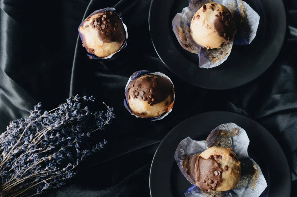
Many rice, bread, and pastry items sit in a narrow colour range. Beige food on beige backgrounds can make texture disappear completely.
This is especially common with toast, buns, pastries, rice dishes, cakes, and cream-coloured desserts. The image may look tasteful, but the food loses separation from the surface.
Contrast does not need to be loud. It can come from a plate, a darker shadow, a filling, a topping, a cut edge, or a supporting ingredient. Kaya toast can use the kaya layer and toast edge. Fried rice can use egg and spring onion. Pastry can use a darker tray, a cut section, or gentle shadow.
The food still needs to be the focus. The background should help the texture show, not compete with it.
Texture Details That Should Look Natural, Not Messy
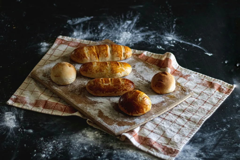
Crumbs, flakes, seeds, grains, and crust cracks can make food feel fresh and real. But they need intention.
A few crumbs near a sliced cake can suggest softness. A few flakes around a pastry can suggest crispness. Seeds on a bun can add texture. Loose rice grains can make a dish feel natural if they look placed with care.
Too much detail becomes visual noise. Too many crumbs can feel careless. Too many flakes can make the pastry look shattered. Rice grains scattered around a bowl can look messy instead of appetising.
Texture should feel alive, not dirty. The best detail looks like it happened naturally, even when it was controlled.
How Bread, Rice, And Pastry Photos Work Across Platforms
Bread, rice, and pastry photos need to work differently across platforms.
Menus need clear product recognition. Customers should immediately understand whether they are looking at toast, rice, pastry, bread, cake, or a full set. Delivery apps need texture that reads in small thumbnails, which means strong separation and obvious structure matter. Social media can lean more into appetite details, such as crumb, crust, flaky edges, and torn bread. Websites can use these textures to communicate craft, comfort, and quality.
For F&B brands that want the wider framework behind texture, light, angle, and platform use, our guide to texture photography explains how texture should work across a full visual system.
How Food Photographer Studio Approaches Carb-Heavy Textures
At Food Photographer Studio, we treat grain, crumb, and crust as appetite cues. The goal is not to make every rice grain or pastry flake look dramatic. The goal is to make the food feel fresh, crafted, and worth ordering.
Rice, bread, and pastry need different handling from sauces, fried food, or soft textures. They depend on small details that can disappear quickly if the frame is too flat or too busy. We focus on making those details clear without making the dish look overworked.
Small Texture Details Carry Big Appetite Signals
Bread, rice, and pastry may look simple, but they depend heavily on texture.
Grain separation, crumb structure, crust colour, pastry flakes, and layered edges all affect how customers read freshness, softness, chew, crispness, and craft. When these details are handled well, carb-heavy food feels more real and more desirable on screen.
A good photo does not only show rice, bread, or pastry. It helps customers imagine the bite.