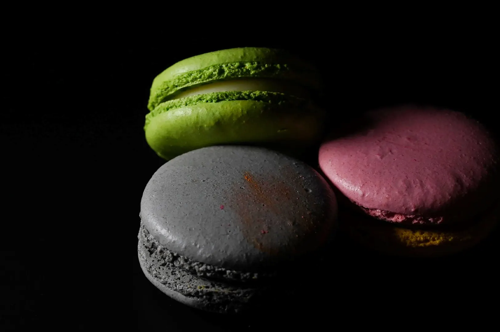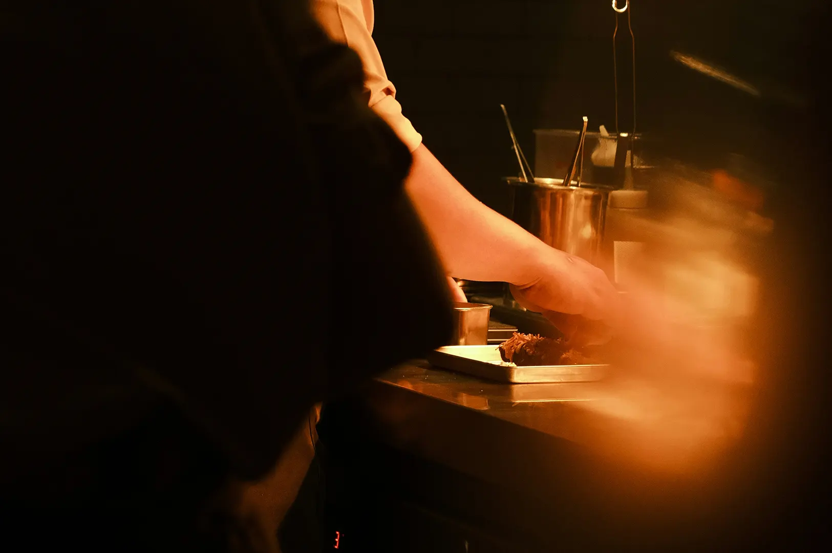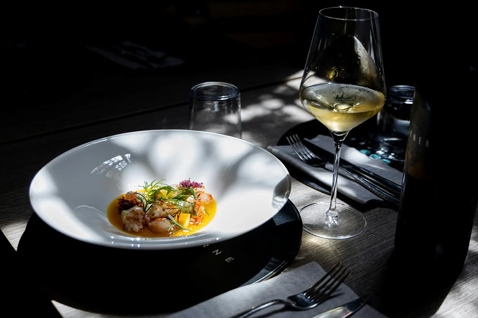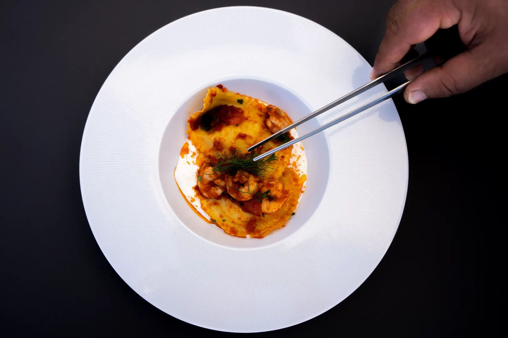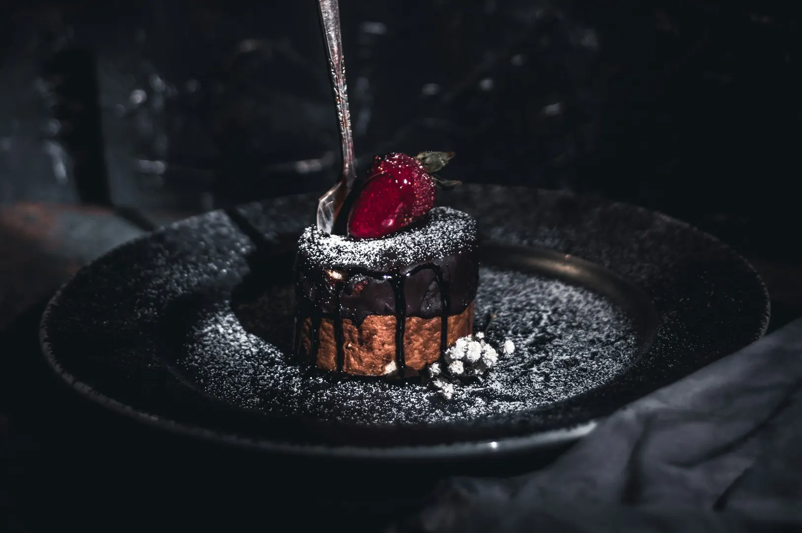
Minimalism is one of those styles that looks “easy” until you try to shoot it yourself.
A clean plate. A calm background. Plenty of empty space. Then you take the photo and the dish somehow looks smaller, flatter, or oddly lonely. That is the trap. Minimalist aesthetic photography is not about removing things until nothing is left. It is about removing things until what remains feels intentional.
In Singapore, minimalism has quietly become the visual language of modern cafés, fine-casual concepts, dessert bars, and even some hawker brands that want a cleaner, more premium look. Why? Because negative space helps a viewer decide faster. It tells them where to look. It makes the dish feel “considered” instead of “random”.
If you want a consistent style across your website, menu, and social posts, start here: learn how to use negative space properly. It is one of the fastest ways to make food feel premium without doing anything fake.
If you are building a more consistent look across your brand, you may also want to reference our aesthetic photography style system for Singapore F&B brands. It helps you decide what “minimal” should look like for your concept, not just what looks nice on Pinterest.
Why Minimalist Food Photos Sell “Premium” So Quickly
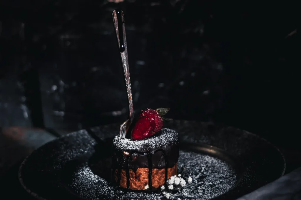
Minimalism works because it reduces friction.
When people scroll, they are not looking for a lesson. They are looking for signals: quality, care, value, vibe. A cluttered photo forces the brain to sort through props, backgrounds, hands, drinks, cutlery, and messy edges before it even lands on the food. Negative space does the opposite. It gives the eye a clear path.
Minimalist aesthetic photography also borrows from how premium dining is plated in real life. Think about fine dining portions on a large plate. That space is not “empty”. It is a frame. It tells you the kitchen is confident. It tells you the dish is the point.
The same psychology carries into photography. If your dish is surrounded by noise, it reads like a casual snapshot. If it is framed with restraint, it reads like a deliberate brand.
Negative Space Is Not “Empty”. It Is Design.
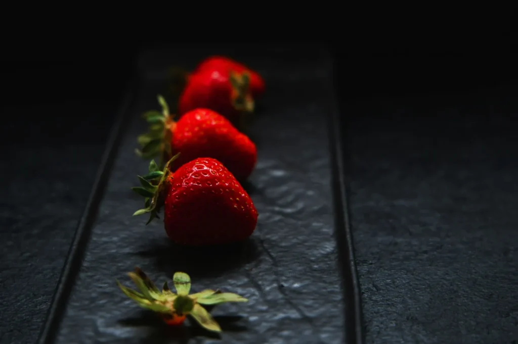
Negative space is the area around your subject that is intentionally left quiet. It can be a blank tabletop, a clean wall, a smooth plate, or even a blurred background.
The key word is intentional.
Good negative space does three jobs at the same time:
- It creates hierarchy. The dish becomes the main character. Everything else becomes supporting cast or disappears.
- It controls mood. More space usually feels calmer and more premium. Less space usually feels busier and more casual.
- It creates flexibility. Clean space lets you crop for different platforms and add text overlays without covering the food.
A simple checkpoint we use on real shoots: if you squint and the dish is not the first thing you “feel”, your negative space is not working yet.
The Minimalist Setup That Makes Food Feel Expensive

Minimalist photography is often won or lost before you even press the shutter. The wrong plate, wrong surface, or wrong light will make the dish look dull, no matter how much space you leave.
1) Choose One “Quiet” Surface That Does Not Compete
For Singapore F&B, the safest minimalist surfaces are:
- matte light stone (off-white, grey, warm beige)
- dark charcoal (for contrast-heavy shots)
- clean light wood (if your brand is warm and natural)
Avoid anything glossy. Glossy surfaces do not look “premium-minimal”. They look reflective, which reads as messy in photos.
2) Use Plates That Photograph Like a Brand Asset
Minimalist shots expose everything. If your plate has a loud pattern, the pattern becomes the headline. If your plate is cheap and shiny, the glare becomes the headline.
Matte ceramic in white, cream, or stone-grey usually wins. You can still use colour, but treat colour like an accent, not the base.
3) Give The Dish a Strong Visual Anchor
Minimalism fails when the food has no structure. That is when it looks lost in the frame.
Anchors can be:
- height (a stacked toast, a tall cake slice, a burger)
- a clean shape (a neat bowl rim, a rectangular plate, a centred sauce swoosh)
- contrast (dark sauce on a light plate, bright garnish on a neutral base)
You are not “making it fancy”. You are giving the dish a clear shape so the viewer knows what to pay attention to.
4) Light It Like You Mean It
Minimalism needs good light because there are fewer distractions to hide behind.
For most restaurants, the best approach is:
- soft side light from a window
- a simple white card (or foam board) to bounce light back
- keep overhead downlights off near the shooting area if possible
Hard light can work too, but only if you are using it intentionally to create shadows that feel graphic and clean. Hard light plus messy styling is where photos start to look “accidentally harsh”.
Composition That Feels Premium, Not Empty
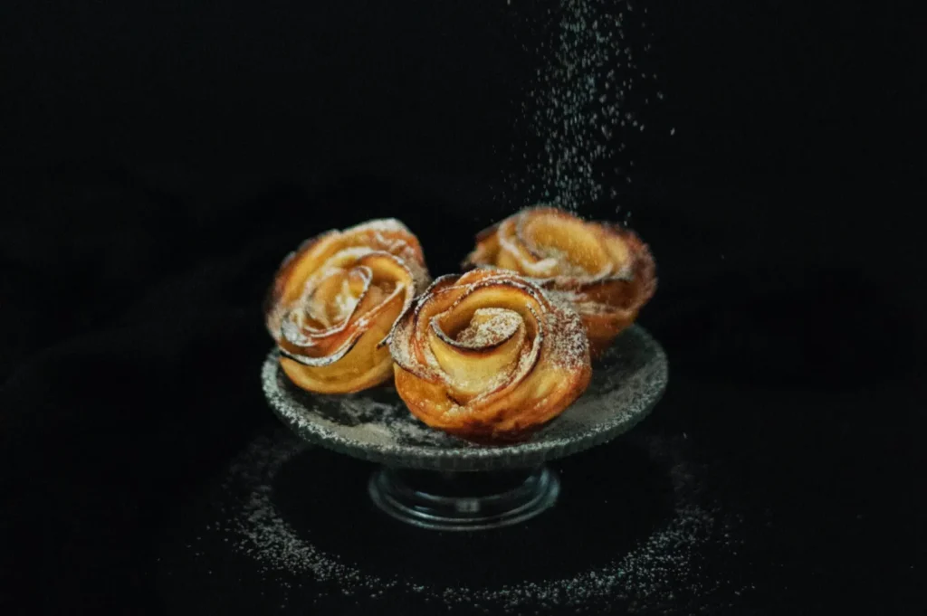
Minimalist composition is basically three decisions: where the dish sits, how much space you leave, and how the frame holds together.
Place The Dish Off-Centre (Most of the Time)
Centred can work, but it often looks like “catalog”. Slightly off-centre feels more editorial and modern. It also gives you negative space that is useful for menus, posters, and paid ads.
Use One Supporting Element, Not Five
A minimalist shot can still have a supporting prop, but it needs a reason to exist. For example:
- a single spoon for a bowl-based dessert
- a linen corner to soften the frame
- one ingredient cue (like a lime wedge for a grilled dish)
If you add a second prop, ask yourself what story it tells that the first prop did not. If there is no clear answer, remove it.
Let Texture Do the Talking
Minimalist aesthetic photography can feel “premium” even with a simple dish if the texture is clear.
Crisp edges, glossy sauce (controlled, not blown out), steam, condensation, micro-grain on a ceramic plate. These are small details that carry the image when there is lots of space.
Minimalism for Real Singapore Use Cases
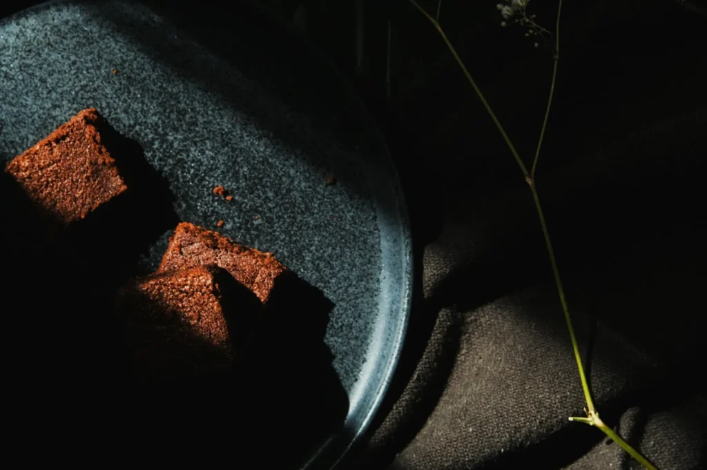
Minimalist photography is not just for cafés. It can work across segments if you match it to the dish and the brand.
Delivery Menu Covers and Thumbnails
This is where minimalism earns its keep. When the image becomes a small thumbnail, clutter dies first. A clean overhead or 45-degree shot with breathing room keeps the dish readable.
Premium Add-Ons and High-Margin Items
If you are trying to sell a premium topping, signature dessert, or higher-margin set, minimalism helps communicate value. It feels “intentional”, which makes pricing feel more believable.
Restaurant Websites and Menu PDFs
Minimalism looks strong on a website because it matches how modern web design works: clean spacing, clear hierarchy, strong focal point.
Common Mistakes That Make Minimalism Look Cheap
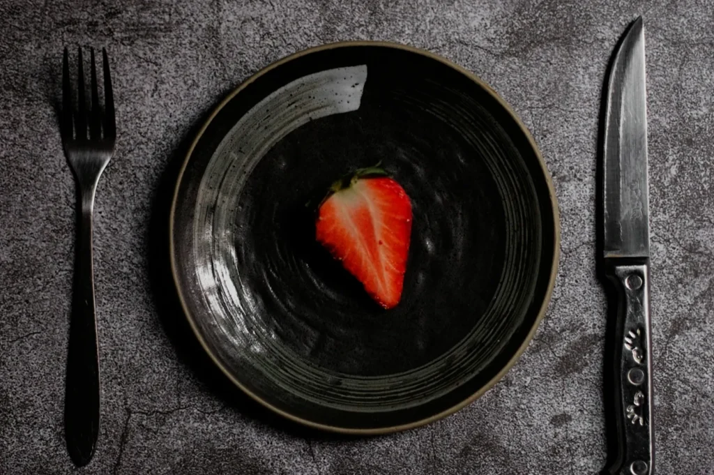
If your minimalist shots are not landing, it is usually one of these:
- Too much empty space with no anchor. The dish looks small and sad, not premium.
- Flat lighting. Minimalism without shadow or texture looks dead.
- Glossy plates and glare. The highlight becomes the main subject.
- Over-cleaning the scene. A sterile frame can feel like packaging photography, not food you want to eat.
- No consistency across dishes. One minimalist shot looks great. Ten shots with different angles, different crops, and different colour tones look like chaos.
Minimalism is a style. Style only works when it repeats with intention.
Minimalism Is Confidence, Not Lack of Effort
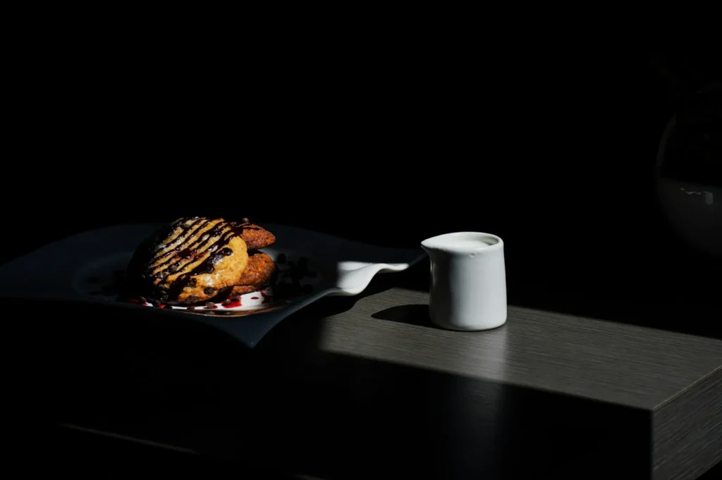
Minimalist aesthetic photography is not about doing less work. It is about doing the right work, then stopping at the right time. When negative space is used well, food feels premium because it looks considered. It looks like the brand knows what it is doing.
If you want help building a minimalist style that stays consistent across 20 to 40 menu items, this is exactly the kind of system work we do at Food Photographer Studio. Not just a “nice shot”, but a repeatable visual language that fits your concept and sells your food without shouting.