Picture this familiar Singapore scene on a busy shoot day. You have a beautiful plate of Hainanese chicken rice sitting perfectly styled on the table. You take the shot, but the whites go yellow, the cucumber garnish goes grey, and the whole frame looks off even when the styling is right.
One small shift in your camera settings dictates whether that dish looks fresh and premium or dull and unappetising. Mastering white balance for food photography is the absolute quickest way to solve this frustrating problem.
Today, we will share a practical workflow that works flawlessly for menus, social posts, and fast-paced content days. Our team shoots for F&B brands across the island every week. We know exactly how quickly colour confidence speeds up client approvals and makes your food look irresistible.
What White Balance Actually Does
White balance simply means deciding what should look perfectly neutral in your frame. Once you set that neutral baseline, every other colour naturally falls into its proper place.
This simple setting directly controls your customer’s appetite and trust. Your steamed rice should look incredibly clean, your coconut milk should not look muddy, and your fresh prawns must never look grey.
Once you understand how colour in photography works, setting your white balance becomes a simple decision rather than a random guess.
The Two Dials You Control

Colour Temperature
Adjusting your colour temperature photography settings is about setting the mood and realism of the dish. It is not about finding one mathematically correct number.
Warm temperatures make hot, comforting food look deeply inviting. A steaming bowl of laksa, rich chicken curry, or freshly grilled satay looks amazing with slightly warm tones.
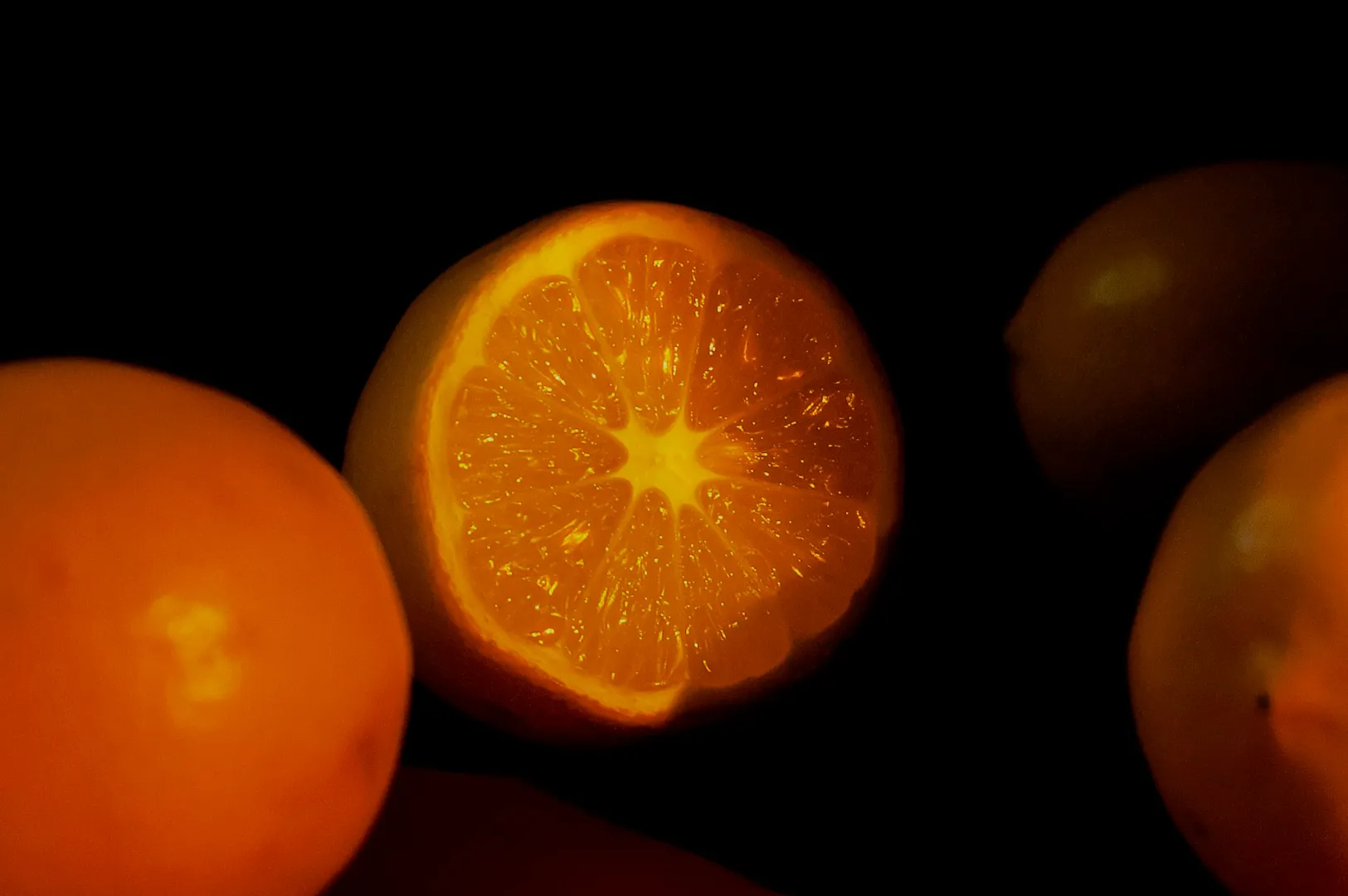
Cool temperatures communicate freshness and crispness. You want cooler tones for a premium platter of salmon sashimi, crisp green salads, or bright iced desserts.
Tint
Tint controls the balance between green and magenta in your image. It is usually the hidden culprit when food simply looks unappetising.
Green casts destroy the appeal of almost any dish. Common Singapore causes include green bounce light from café plants, painted walls, or coloured kitchen tiles. Mixed LED lighting in restaurants also frequently introduces ugly green colour casts to your plates.
Start On Set: Fix 80 Percent Before Editing
Choose One Dominant Light Source
One main light beats three almost matching lights. You must take control of your environment before you press the shutter.
You can use natural window light, one continuous LED light, or one simple strobe setup. Turn off the warm practical lights in the ceiling. If you must keep the room lights on, make them the deliberate hero of the shot rather than an accidental distraction.
Do the White Plate Test
Shoot a quick frame with a plain white plate or a white paper napkin exactly where the food will sit. This fast test requires zero extra equipment.
Look closely at the resulting image on your screen. Check if the plate looks distinctly yellow or green. Notice if the shadows look strangely blue or if the highlights look totally different from the midtones. Adjust your camera settings to neutralise these issues before you shoot the full set.
Watch for Coloured Bounce
Your environment constantly reflects unwanted colours onto your food. Call out common culprits like red table tops, green cutting boards, or bright promotional menus sitting nearby.
A vibrant red table will make a delicate plate of nasi lemak look unnaturally pink. Swap to neutral linens whenever possible. You can also add a simple white foam board to bounce clean light back onto the dish. If the environment is too chaotic, physically move the set away from brightly coloured walls.
Three Repeatable White Balance Workflows
Workflow 1: Kelvin Starting Points
Dialling in a specific Kelvin number gives you incredible speed on set. Use these simple starting points and fine-tune the look by eye.
For bright window daylight, start around 5,200K to 6,000K. For warm indoor tungsten bulbs, start much lower around 3,200K. For mixed restaurant LEDs, start around 4,000K to 4,800K, then use your tint dial to correct any green hues.
Imagine shooting kaya toast near a café window with warm counter LEDs shining down. You must pick either the window or the LEDs as the truth, then set your Kelvin to match that specific source.
Workflow 2: Custom White Balance with a Grey Card
This workflow is mandatory when colour accuracy truly matters. Menu refreshes, new product packaging, and multi-day shoots require absolute consistency.
Place your grey card exactly where the dish will sit on the table. Take one reference shot under the exact lighting conditions you plan to use. Set a custom white balance in your camera menu, or use that reference shot later in your RAW editing software. This guarantees fewer client approval rounds because the colour stays perfectly consistent.
Workflow 3: Shoot RAW and Set WB in Post
Shooting in RAW format gives you massive flexibility during the editing process. However, you should never treat RAW as permission to ignore bad lighting on set.
The rule is simple: set a clean neutral baseline first, then style your warmth intentionally. Capturing a decent white balance in camera makes this post-processing work significantly faster.
Common Food Colour Problems in Singapore Shoots
Whites Look Yellow
Warm café bulbs, mixed lighting, and an overly warm white balance easily ruin your neutral tones. Your white rice, ceramic plates, and coconut milk desserts will look heavily yellowed.
To fix this, cool down your temperature slider slightly in your editing software. Reduce your yellow saturation just a touch. Finally, lift the yellow luminance carefully so the food looks clean but not neon.
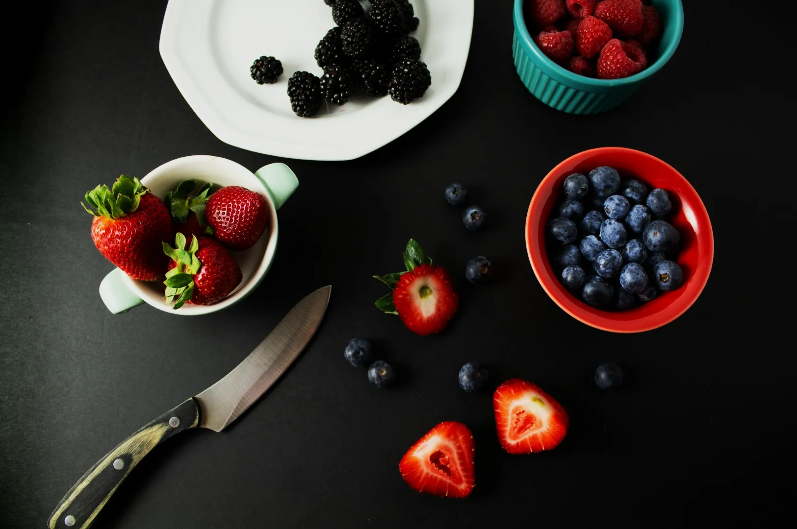
Greens Look Grey or Muddy
Pandan leaves, fresh herbs, and vibrant salads often lose their pop. The causes usually include a white balance that is too warm, hidden green casts, or slight underexposure.
Adjust your tint slider slightly toward the magenta side to cut through the mud. Lift your green luminance to make the herbs look fresh. Reduce yellow contamination slightly if your greens feel too olive coloured.
Reds Turn Orange
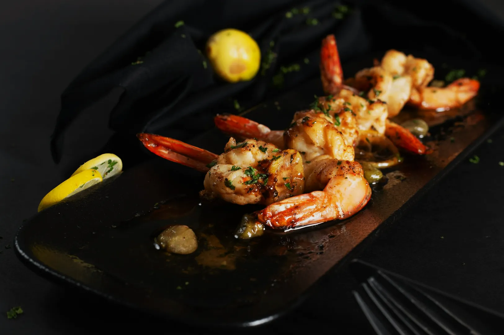
Rich chilli crab, spicy sambal, and glossy char siew demand perfect red tones. An overly warm white balance, orange light spill, or heavy saturation edits will make these dishes look radioactive.
Nudge your white balance cooler to bring back the true reds. Pull back your overall orange saturation before touching the red sliders at all. Keep your highlights perfectly clean so the red sauces do not bleed into the reflections.
Blue Shadows from Window Light
Shooting next to a bright window often creates strong daylight contrast with deep, blue-tinted shadows. This makes the dark areas of your food look very cold and unappetising.
Add gentle fill light with a simple white bounce card on set. You can warm up the shadows slightly in post-production, but make sure you keep the bright whites looking perfectly neutral.
Mixed Lighting
Mixing window light with warm indoor bulbs and bright neon signage is the fastest way to get weird colours. Your camera simply cannot balance three different colour temperatures at once.
Turn off what you can before you start shooting. Move the set closer to the window to overpower the indoor bulbs. If you are bringing your own lights, match your bulbs to the ambient daylight. Use black flags to block unwanted light spill from bright neon signs.
A Clean Editing Workflow
Set a Neutral Reference
Always start your edit by choosing one neutral target in the frame. This could be a white plate, a clean napkin, or a known neutral ingredient like steamed rice.
Decide the Mood Warmth
Warmth is always a creative choice after your neutral baseline is set. A slight touch of warmth works beautifully for morning kopi and toast. A cleaner, cooler neutral is much better for fresh sushi, crisp salads, and iced beverages.
Fix Tint Before HSL
You must fix your tint before adjusting individual colours. If the frame has a heavy green cast, your HSL edits will constantly fight against you.
Touch Only the Colours That Matter
Most food frames rely heavily on reds, yellows, and greens. Focus your edits on these specific tones to enhance the appetite appeal. Avoid over-correcting your background colours first, as the food must always remain the hero.
Keep a Consistency Reference
Establish one gold standard image for your entire photo series. Match all your new shots to this single reference frame so every menu page looks highly cohesive and professional.
Quick Rules of Thumb
- Neutral first, mood second.
- If your whites are wrong, everything else in the frame is wrong.
- Fix the light on set before you try to fix the sliders on your computer.
Copy and Paste Checklist
Use this quick checklist for your upcoming shoots and content creation days.
- Pick one dominant light source
- Do a white plate test shot
- Set WB intentionally
- Check tint for green casts
- Shoot a quick reference frame
- Edit WB and tint before HSL
White Balance and Colour Temperature in Food Photography
Mastering white balance for food photography is incredibly straightforward when you follow a system. Simply pick a neutral target, control your tint, and always shoot with one dominant light source.
When you are ready for stunning, colour-accurate imagery that makes your menu shine, expert help is just a click away. Contact Food Photographer Studio today to elevate your visual marketing and attract more customers to your tables. Try doing the white plate test before you snap the first hero frame on your very next shoot.