Imagine scrolling through Instagram on a busy Singapore afternoon and instantly recognising a café before you even read the name. You know exactly whose feed you are looking at because the visual style is unmistakably theirs.
When colours shift wildly from post to post, your feed feels random and the food looks terribly inconsistent. You can easily solve this by creating a simple system to translate your brand colours into backgrounds, props, lighting choices, and editing. As a team that shoots daily for local F&B brands, we know firsthand that consistent colours build massive customer trust and drive appetite.
What White Balance Actually Does
Brand colour photography is not about making every single item in your frame the exact same colour. It is simply about making your overall colour mood highly predictable and intentionally designed.
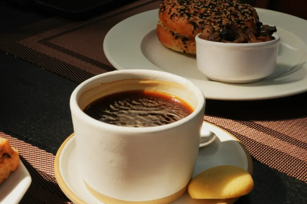
You will typically see your brand colours show up in three distinct places. They appear in your physical space and packaging, such as your wall tiles, coffee cups, and takeaway boxes. They show up in your styling choices through plates, linens, and table surfaces. Finally, they come through in your edit via white balance, saturation, and contrast.
If your whites and neutrals are inconsistent, your brand colours will never look consistent.
Start With The Brand, Not The Preset

Identify Your Brand Colour Roles
You must map your brand palette into three specific roles before you start shooting. These roles are your Hero, your Support, and your Accent colours.
A modern Singapore kopi bar might use dark roasted brown as a hero, cream as support, and a vibrant green logo as the accent. A fresh açai or salad concept might use bright white as the hero, light wood as support, and deep purple as the accent. Defining these roles keeps your restaurant branding photography tightly focused.
Build A “Do And Don’t” Palette In 10 Minutes
You can easily build a simple do and don’t list for your backgrounds, plate tones, and napkins. Write down three approved background textures and strictly ban anything that clashes with them.
Keep this palette small enough that your staff can actually remember it during a busy content day. A clear list prevents someone from accidentally using a bright red napkin that completely ruins your cool, minimalist café aesthetic.
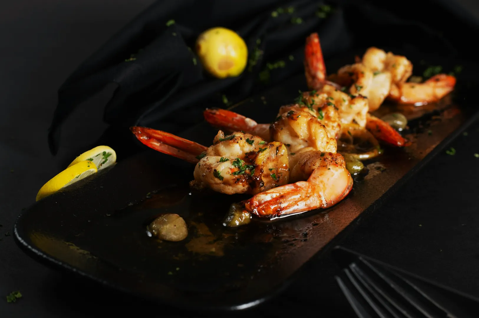
Translate Brand Colours Into Set Choices (So The Food Still Wins)
Backgrounds And Surfaces That Support The Menu
Your background must support your menu items rather than competing for the viewer’s attention. Decide whether your brand is bright and minimal, warm and cosy, or modern and bold.
A comforting plate of traditional chicken rice looks incredibly authentic on a classic, warm wooden hawker table. A premium kaya toast set feels much more modern when shot on a bright, minimalist marble surface.
Props And Plates That Repeat Without Looking Staged
Creating a cohesive look requires props that repeat naturally across your entire grid. We always propose building a simple prop kit for your restaurant branding photography.
Buy a set of plates in two neutral tones that perfectly match your brand palette. Using the exact same plate family across multiple shoots creates immediate visual harmony without looking overly staged.
Packaging Colours And Signage Without Ugly Colour Casts
Your branded takeaway boxes and bright neon signs are great for marketing, but they often ruin your food colours. A bright red takeaway box will bounce a horrible pink colour cast directly onto your white rice.
You can fix this easily by moving the colourful packaging slightly further away from the actual food. You can also use a small white card to block the coloured light from hitting the dish directly.
Lighting And White Balance For Brand Consistency

Choose A Signature Light Mood
You must decide on a signature light mood for your brand and keep it completely consistent. A moody speakeasy should always use dark, dramatic shadows to convey its atmosphere. A bright brunch café should rely entirely on soft, airy window light to communicate morning freshness.
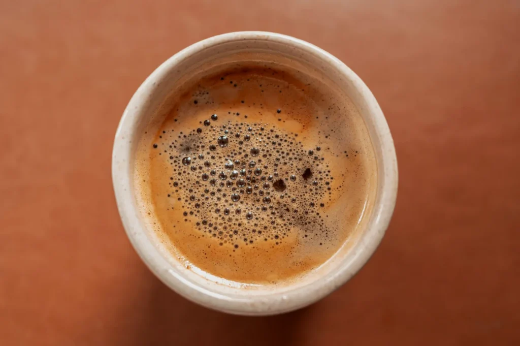
Lock In A Repeatable White Balance Approach
Locking in your white balance guarantees your brand colours look identical across every single photoshoot. You can use Kelvin starting points for speed or a custom white balance for a major menu refresh.
Shooting in RAW with a grey card reference frame gives you the ultimate flexibility in post-production. Understanding exactly why colour balance matters in food images will completely change how you approach your restaurant photography.
Styling Rules That Keep The Feed Cohesive

Use Colour Roles In Every Frame
You must apply your defined colour roles to every single frame you capture. Always include one hero colour, rely mostly on neutrals, and add one intentional accent.
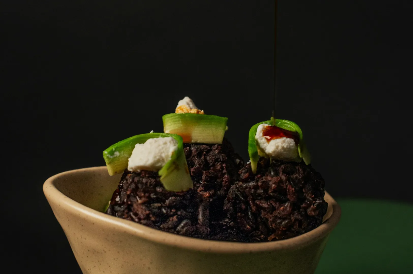
A steaming bowl of laksa already has a strong orange hero colour, so you should use a highly neutral bowl. A dark, rich plate of chilli crab needs a bright white plate to provide the necessary contrast.
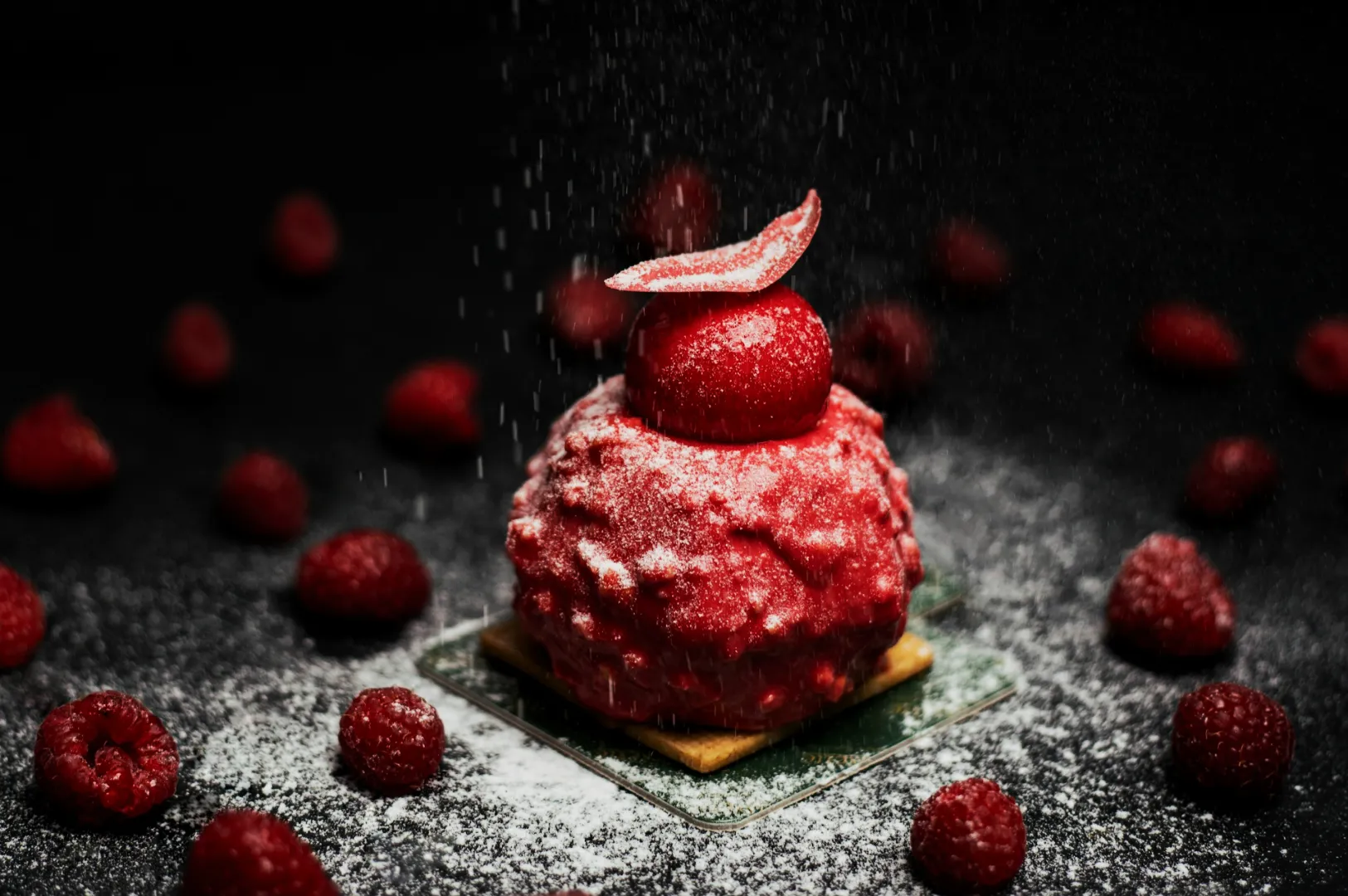
Keep Garnish And Ingredients Brand-Appropriate
Your choice of garnish should always align with your overall brand aesthetic. A fine dining restaurant might use incredibly minimal, precise micro-herbs to convey elegance. A casual family hawker stall should use generous, colourful garnishes to communicate abundance and flavour.
Editing Guidelines That Protect Your Brand Colours
Set Neutrals First, Then Protect The Brand Palette
Your editing workflow dictates whether your brand colour photography looks professional or amateur. Always set your white balance and tint first to ensure your neutral plates look perfectly clean.
Next, adjust your overall exposure and contrast before you touch individual colours. Use the HSL panel to adjust only your specific key brand colours, leaving the rest of the image alone. Fix colour casts before you chase “style.”
Create A Reference Image And Match Everything To It
You should edit one gold standard reference image that perfectly captures your brand colours. Keep this image open on your screen while you edit the rest of your photoshoot. Match every new photo to this exact reference so your final grid looks completely unified.
Common Brand Colour Problems (And Quick Fixes)
- Problem: Brand greens look grey and lifeless. Fix: Lift the green luminance in your HSL panel.
- Problem: White plates look yellow. Fix: Cool down the colour temperature slightly.
- Problem: The food blends into the background. Fix: Swap to a lighter, neutral surface to create separation.
A Simple Content Plan For A Cohesive Restaurant Feed
The Three-Post Rhythm
A predictable posting rhythm naturally reinforces your brand colour photography strategy. Cycle through one hero dish, one environment moment, and one close-up product detail. This stops your grid from looking like a repetitive, boring menu catalog.
A Nine-Post Grid Template (So It Looks Intentional)
You can plan your Instagram grid in blocks of nine to ensure perfect visual balance. Aim for four light posts, three medium posts, and two darker accent posts. This specific ratio keeps your feed looking highly dynamic but completely intentional.
Copy And Paste Checklist (For Content Days)
- Confirm the hero brand colour and one accent colour for the day
- Choose two neutral backgrounds that match the brand mood
- Use the same plate family for the full set
- Control colour casts from packaging, walls, and signage
- Set white balance intentionally and capture one reference frame
- Edit neutrals first, then adjust only the key colours
- Compare every export to the brand reference image before posting
Brand Colours That Make Customers Recognise You Faster

Using consistent brand colours across your menu and social media builds massive visual trust. Translating your palette into smart props, clean lighting, and disciplined editing makes your restaurant instantly recognisable.
When you need flawless, cohesive imagery that perfectly captures your restaurant’s unique identity, professional help makes all the difference. Reach out to Food Photographer Studio to elevate your visual marketing and attract more customers today. Start by applying the simple three-post rhythm to your social media strategy this week.