A “cool photoshoot” does not start with props. It starts with light. In Singapore, that sounds obvious until you are actually doing it in a real restaurant, where the windows are bright at 11am, the kitchen is greenish at 3pm, and dinner service is basically a warm cave with spotlights.
Most food photos fail for one reason: the light is telling the wrong story. The dish might taste great, but the light makes it look flat, sweaty, or oddly coloured. When diners scroll, they do not analyse your lighting. They just feel “yes” or “no” in half a second.
The goal is not cinematic drama for the sake of it. The goal is appetite clarity: texture you can almost feel, colour that looks honest, and a mood that matches your brand. If you want the full framework for what makes a cool photoshoot work end to end, read our guide here.
Start With The Only Question That Matters
Before you touch a camera setting, decide what the light is meant to do.
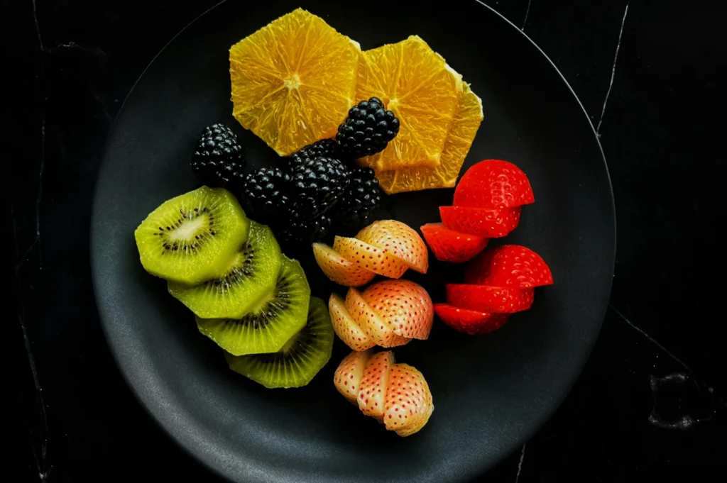
- If your concept is bright, clean, daytime, you want soft, open light with gentle shadows. Think cafe, brunch, desserts, salads.
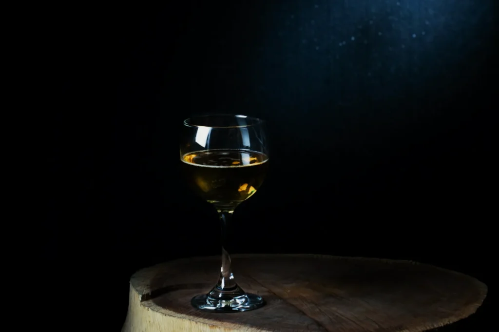
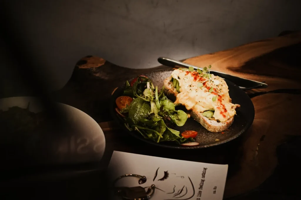
- If your concept is moody, premium, intimate, you want directional light with controlled fall-off. Think steak, wine bars, tasting menus, late-night comfort food.
A common mistake is mixing the two. For example, shooting a cosy claypot dish in flat bright light can make it feel like a product catalogue. Shooting a colourful acai bowl in heavy shadow makes it look less fresh than it is.
Natural Light Is Still The Fastest Way To Look Expensive
If you have a window, you already have a studio. Not perfect, but usable.
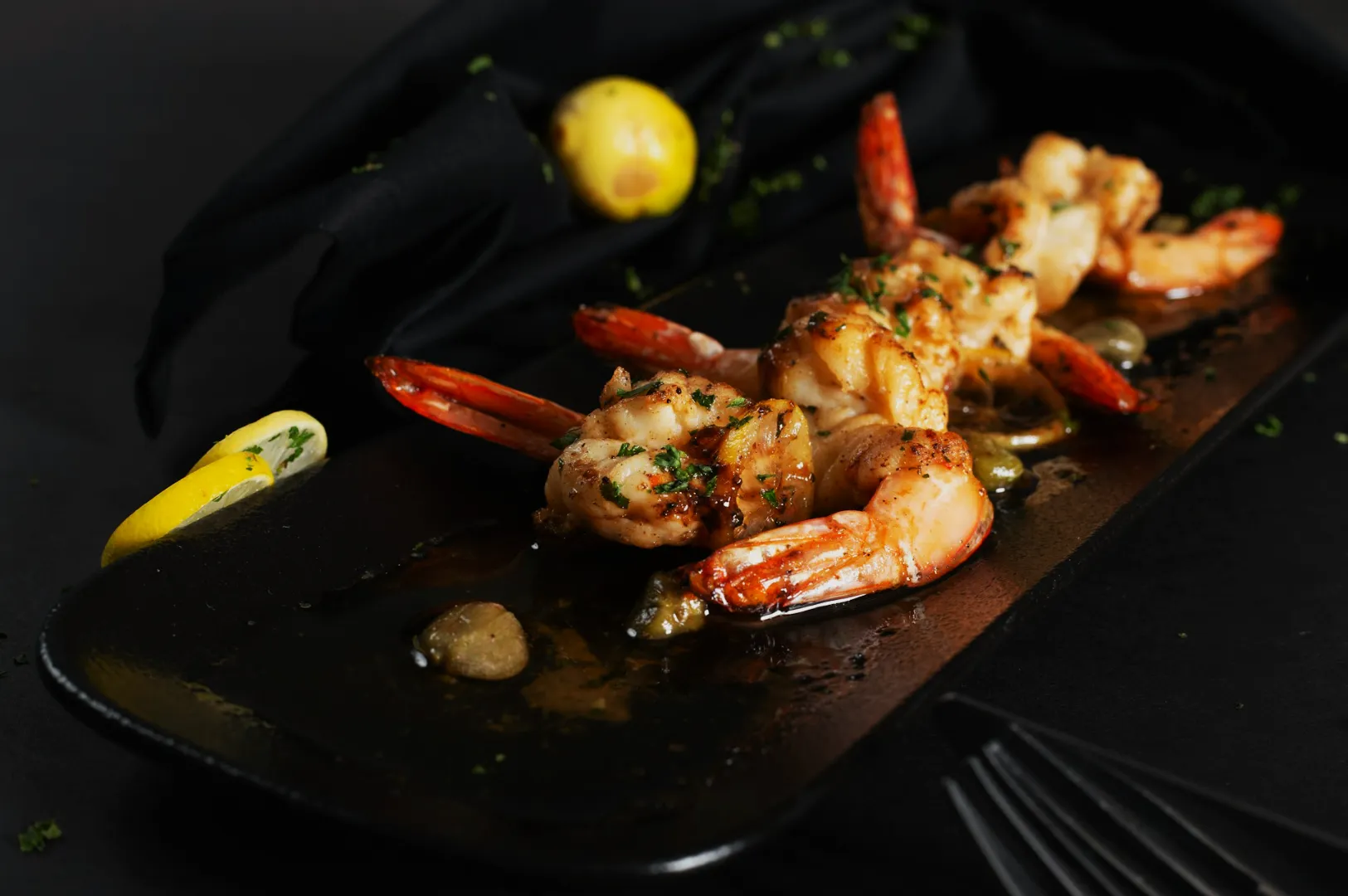
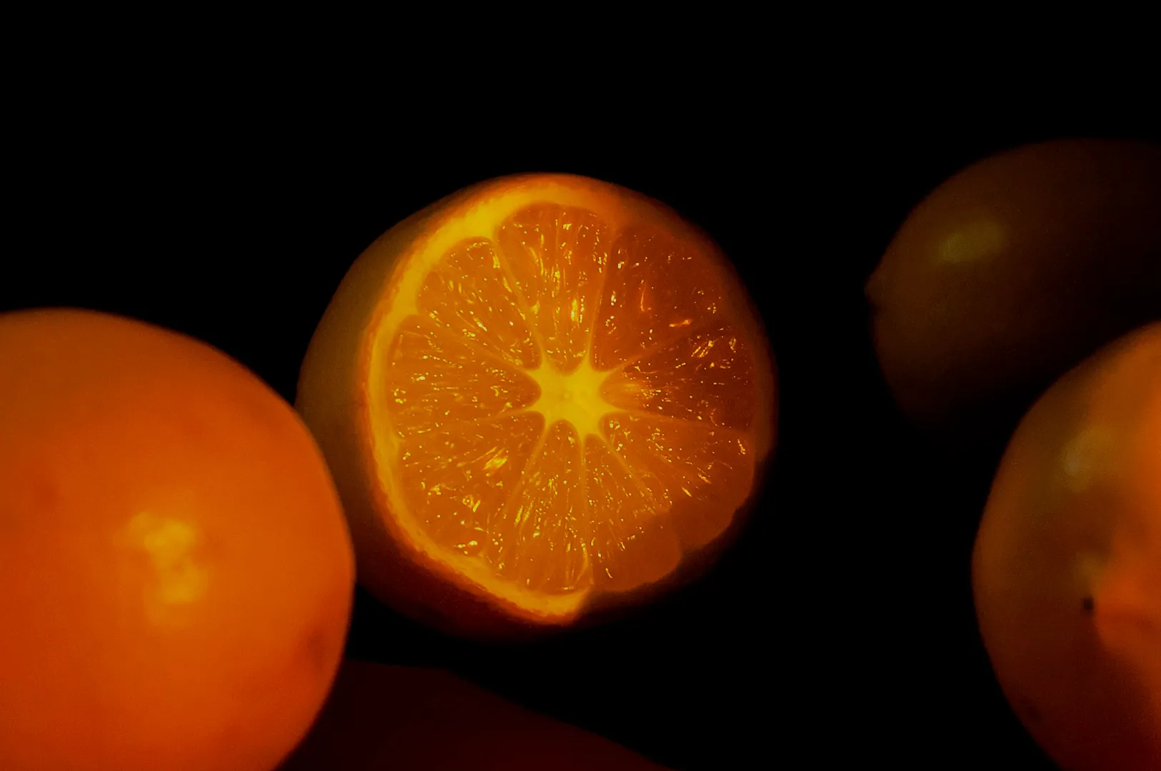
The trick is direction, not brightness. Side light gives texture. Back light gives glow and steam. Front light kills depth.
When we shoot in a cafe, we often place the dish near the window and rotate it until the highlights land where they should. Glossy sauces, crispy edges, flaky pastry layers. That is the “premium” signal. It is not a filter.
If the sun is too harsh, do not fight it. Diffuse it. Sheer curtain, frosted glass, even a clean white sheet of baking paper taped lightly. You are not making the scene dim. You are making it kinder.
If you want to see how we approach restaurant lighting setups in real Singapore spaces, our portfolio examples sit across different concepts at Food Photographer Studio.
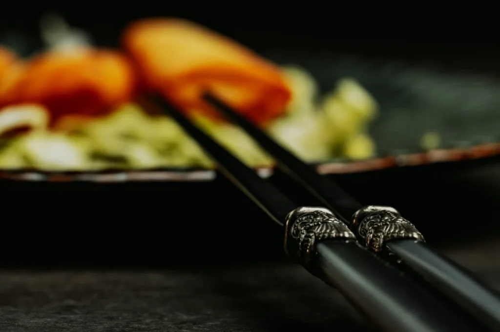
Artificial Light Is Not The Enemy, Bad Artificial Light Is
Most restaurants rely on mixed lighting: warm downlights, cool kitchen tubes, neon signage, maybe a daylight window in the corner. Your camera reads that as chaos. Your whites go yellow, your greens go sickly, your food loses colour confidence.
A simple approach that works is to pick one main light source and make everything else irrelevant.
If you use an LED light, keep it consistent. Same position, same distance, same direction. Then control the mood with shadow, not random exposure.
Also, watch shiny surfaces. Soup, curry oil, lacquered meat, glossy plates. Hard direct light creates glare that looks like sweat. Softened light creates controlled shine that looks delicious.
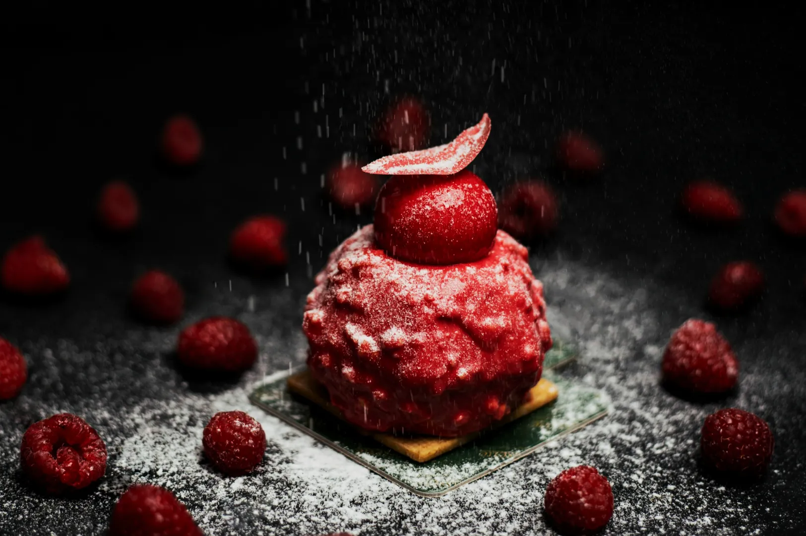
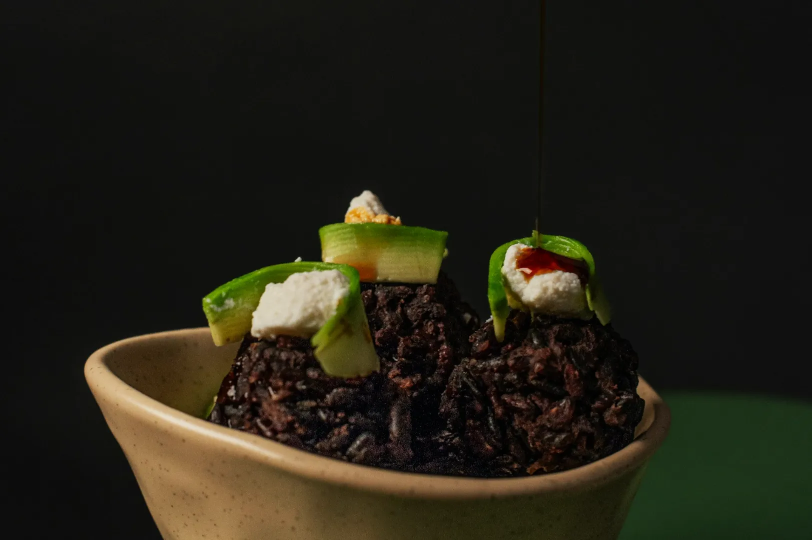
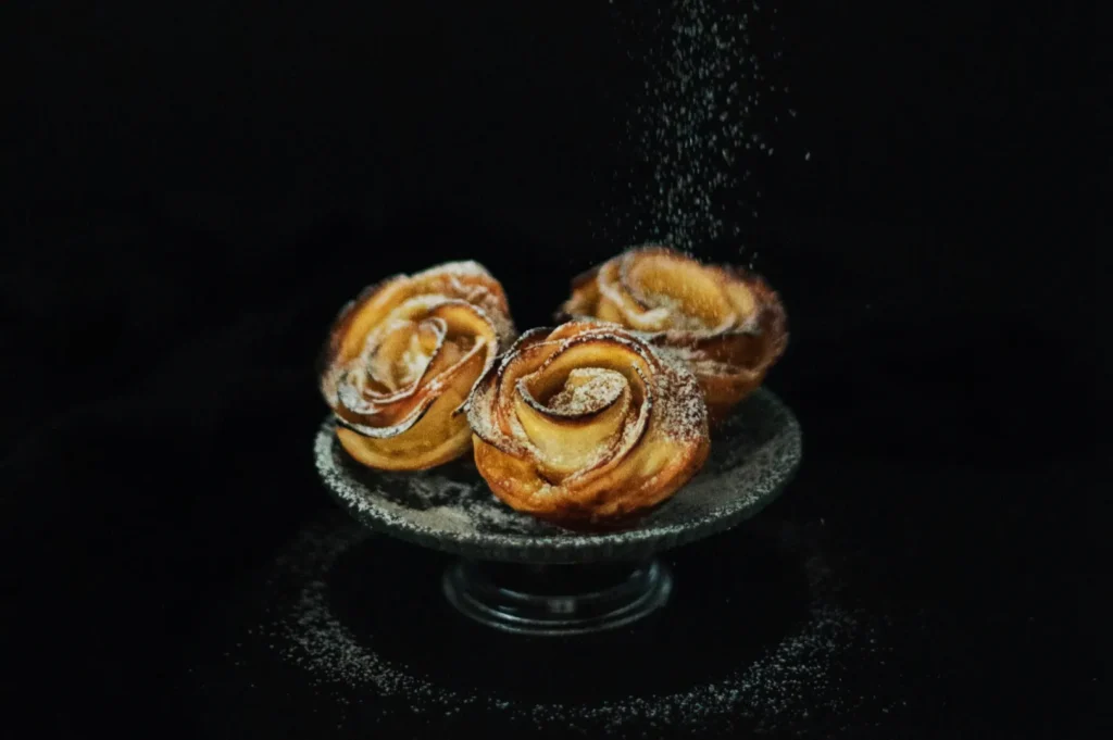
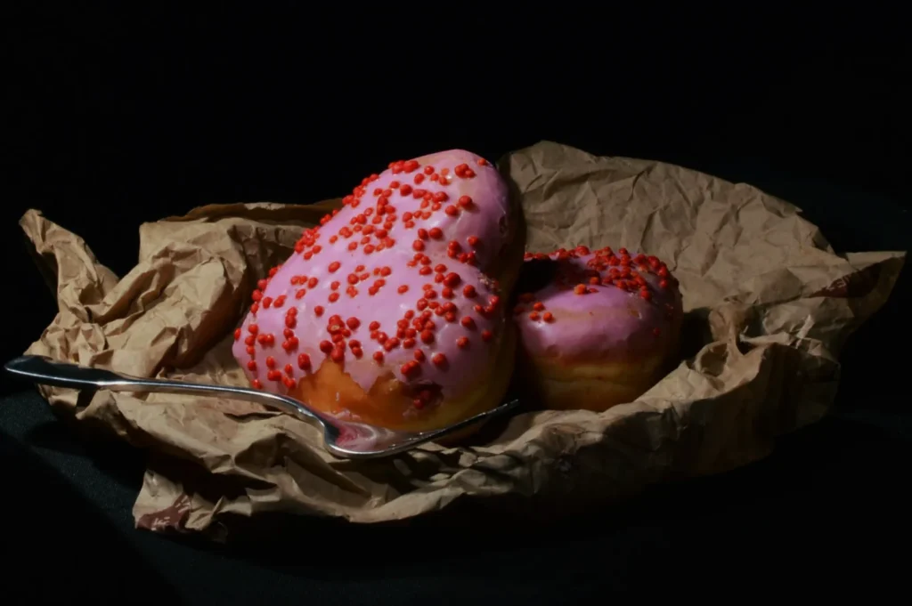
The “Cool” Look Is Often Just Better Shadow Control
People talk about “moody” photos like it is a style choice. Most of the time it is just shadow discipline.
- Shadows add shape. Without them, your dish looks like a sticker.
- Too much shadow hides ingredients and makes diners hesitate.
- The sweet spot is shadows that describe, not shadows that confuse.
If you want a premium feel, let the background fall darker while keeping the hero dish readable. That is how you get depth without turning everything into a black hole.
A Quick Note On White Balance
If your food looks wrong, it is often white balance. Not your plating. Not your props.
Do not overthink it. Set a consistent white balance when shooting, or correct it once in editing and apply it consistently across the set. What matters is that the chicken rice looks like chicken rice, not like it was shot under a tanning lamp.
Light Is The Shortcut To A Stronger Brand
A cool photoshoot is not about making food look “better than it is.” It is about making food look like itself, at its best moment, under light that respects it.
When you are ready to stop guessing and want a lighting approach that works across real Singapore service conditions, we can help you build a consistent look that holds up on menus, delivery thumbnails, and social.