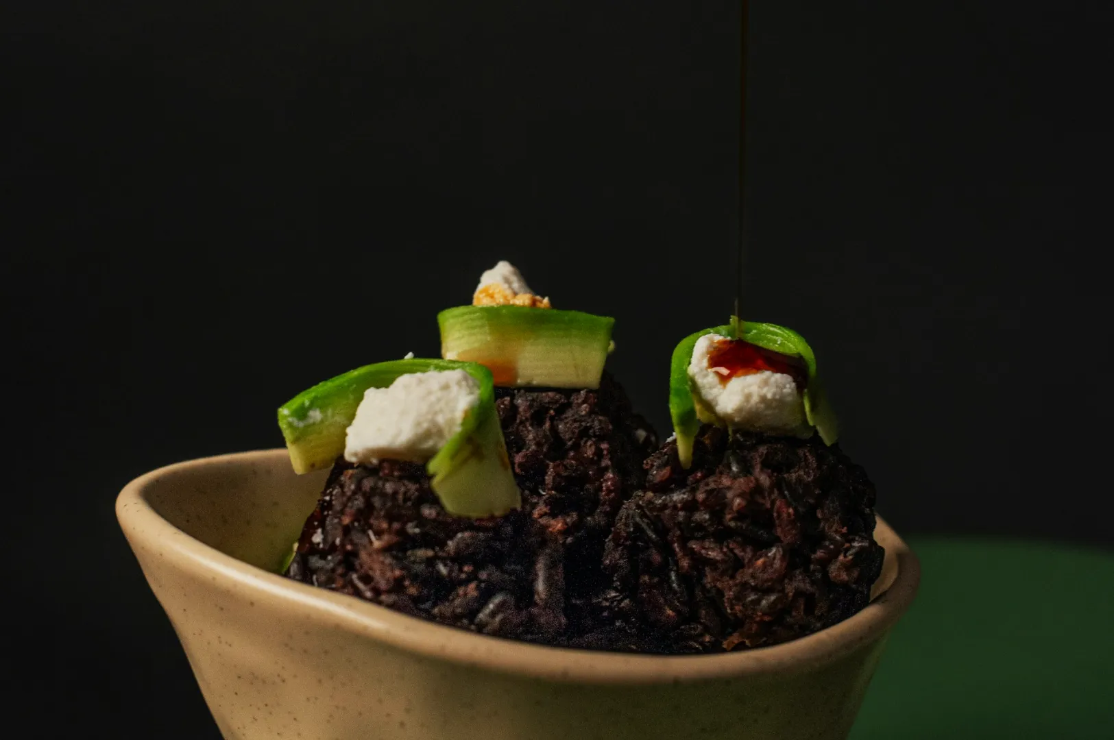
Most brand inconsistency is not dramatic. It is subtle.
One dish is warm and orange. The next is cool and grey. One is bright. The next is moody. Over time, your feed feels like different restaurants.
A simple style guide fixes this. It also makes your cool photoshoot strategy easier to execute because you stop reinventing the look every time.
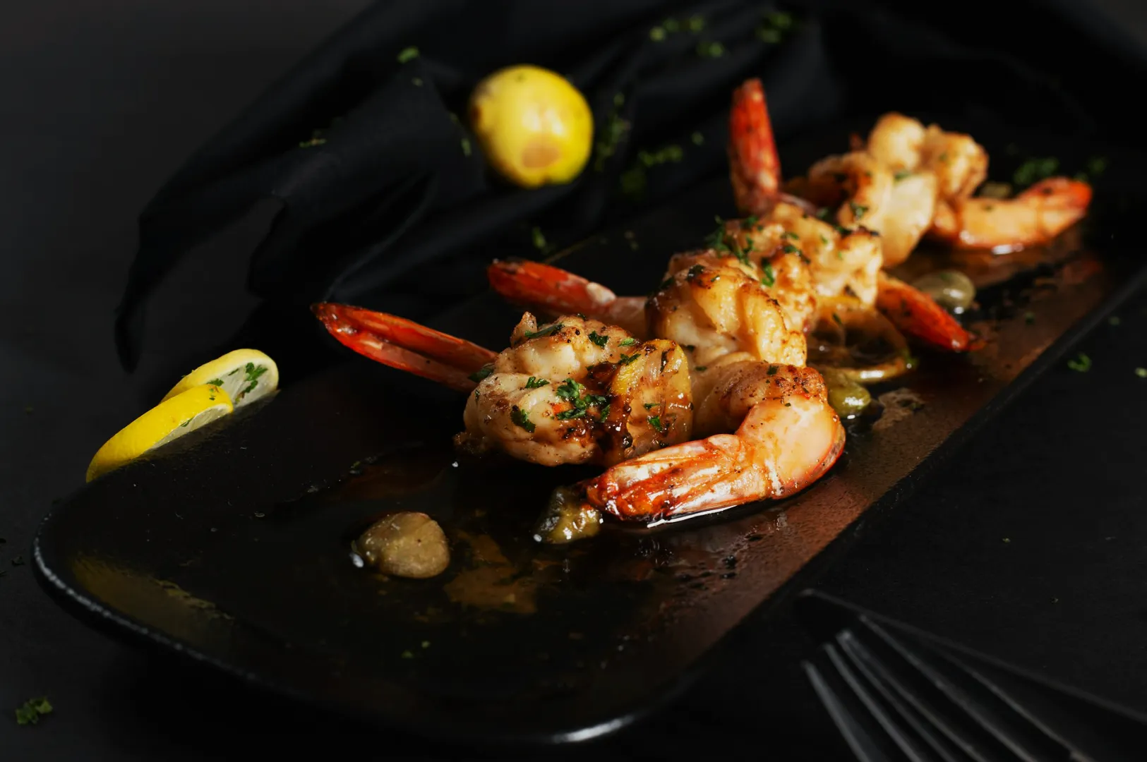
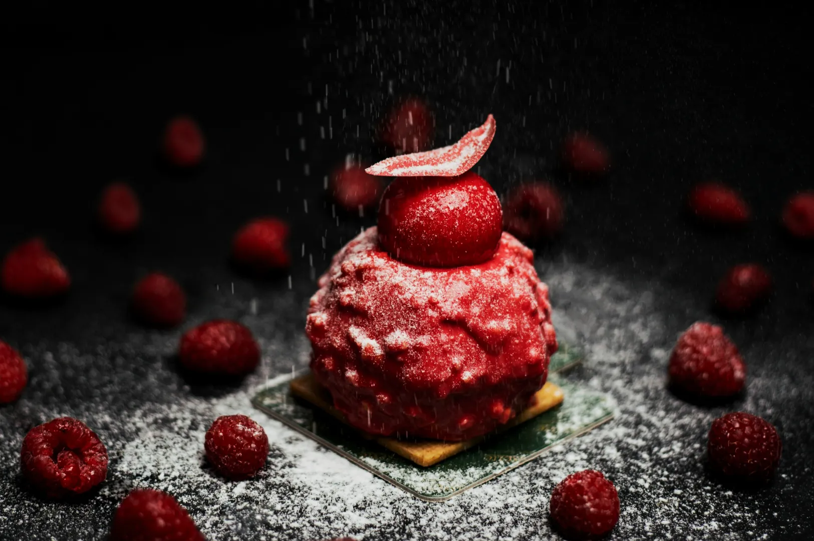
1) Pick A Light Direction And Stick To It
Choose your default: side light, back light, or soft front light.
Consistency in direction makes your photos feel like a set, even across different dishes.
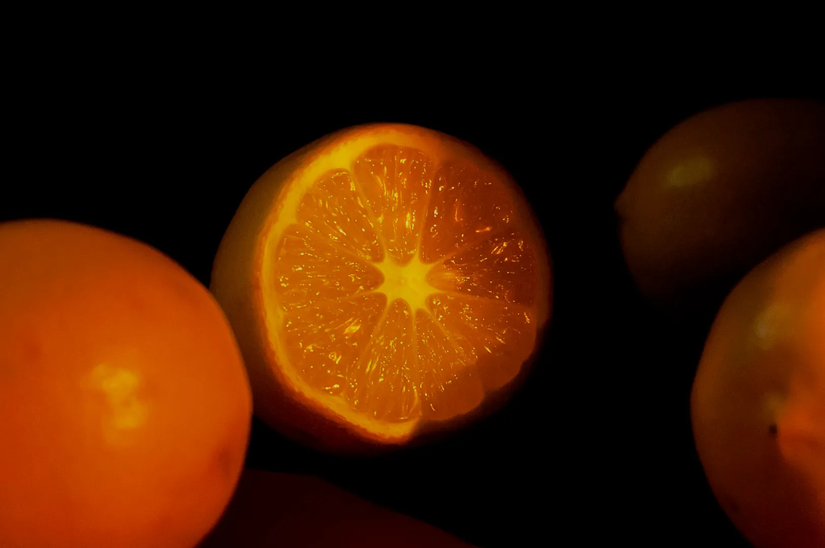
2) Set Your Colour Rules
Decide what “neutral” means for your brand. Warm neutrals? Cool neutrals?
Then keep white balance consistent. Your food should look honest, but your brand should look intentional.
3) Define Your Crops For Each Platform
If you always shoot only one crop, you will struggle later.
Have a rule: shoot wider than needed, then crop for:
- menu and delivery thumbnail
- Instagram feed
- stories and reels covers
4) Create A Simple Editing Baseline
Editing is not where you invent a style from scratch. It is where you protect consistency.
Make one baseline adjustment set, then apply it across the batch.
5) Decide What You Never Do
This is underrated. Your “no list” protects brand quality.
For example: no heavy filters, no over-saturated reds, no neon shadows, no random prop explosions.
If you want a style guide that matches Singapore dining realities and still looks premium, that is exactly the work we build with clients at Food Photographer Studio.
A Style Guide Makes “Cool” Repeatable
Cool is not luck. It is repeatable decisions.
Once your style is consistent, your photos start to feel like one brand, even when the menu changes.