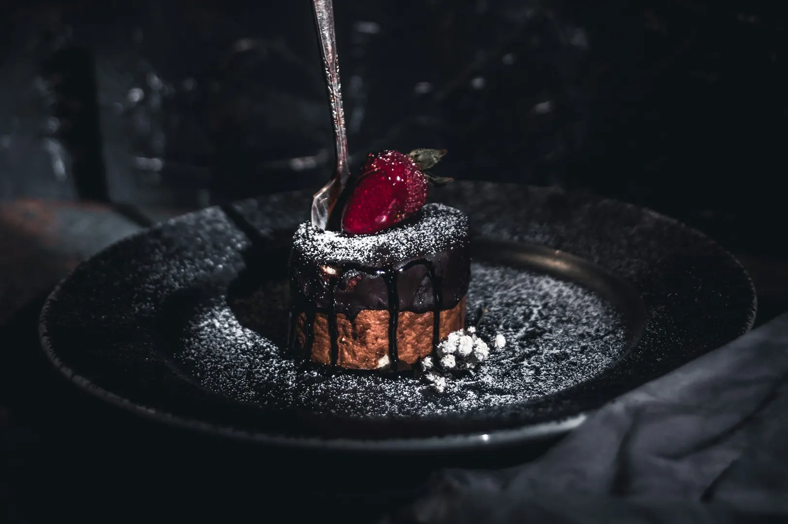
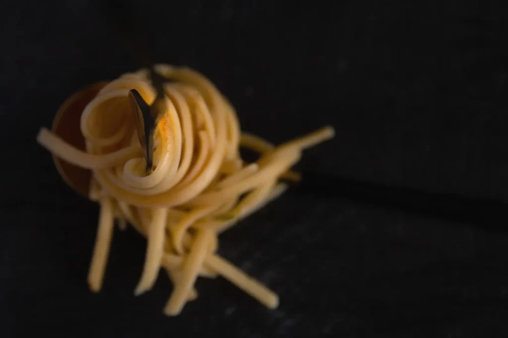
Soft food is comforting to eat, but surprisingly difficult to photograph well.
A good chawanmushi feels delicate. Tofu should look silky. Soft scrambled eggs should feel warm and tender. Cream pasta should look rich without looking heavy. Custard desserts, mousse cakes, mashed potato, kaya fillings, and cream-based dishes all rely on texture that is quiet rather than obvious.
That is the challenge. Soft textures do not have the dramatic cues that crispy, charred, or layered food gives you. There are no sharp edges, deep cracks, or obvious grill marks. If handled badly, soft food can look flat, dull, lumpy, shapeless, or overly processed.
Creamy food photography needs subtle control. The goal is not to make soft food look loud. The goal is to help customers imagine smoothness, comfort, and richness before they order.
Why Soft Textures Look Flat On Camera
Soft foods often have smooth surfaces and low contrast. That means the camera has fewer details to work with.
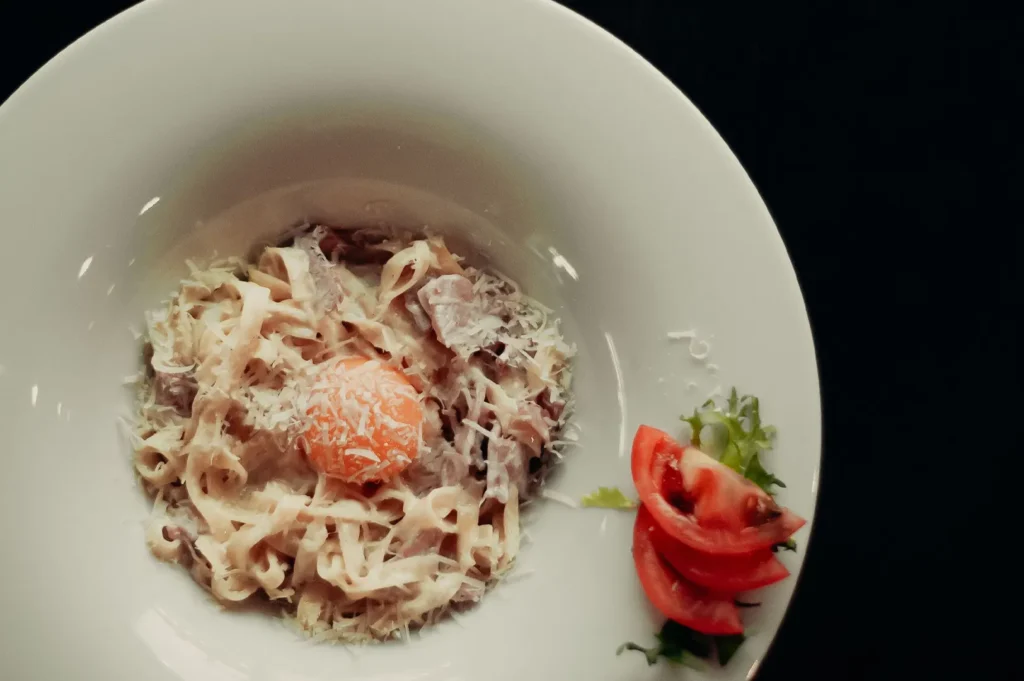
A bowl of cream soup can become one pale surface. A mousse cake can look like a block. A cream pasta can lose shape if the sauce covers everything too evenly. Tofu can look bland if there is no gentle highlight across the surface.
The human eye understands softness easily in real life because we see movement, temperature, depth, and context. A camera freezes all of that into one frame. If there are no small highlights, shadows, folds, or surface changes, the food becomes visually quiet in the wrong way.
This is also why over-editing soft textures is risky. Too much smoothing makes food look artificial. Too much sharpness makes it look rough. The balance has to be careful.
The Goal Is Not Sharpness, It Is Soft Definition
Soft food should still look soft.
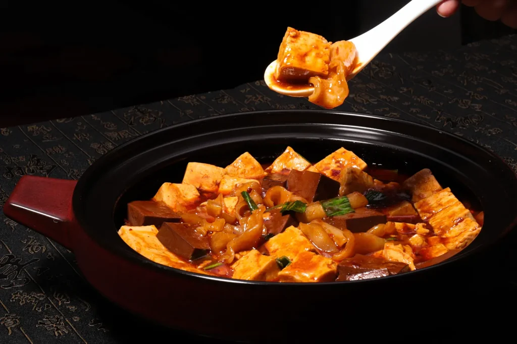
A silky tofu should not look grainy. A mousse should not look dry. A custard should not look rubbery. A cream sauce should not look clumpy just because the photo needs “more texture”.
The goal is soft definition. That means enough shape for the customer to understand the dish, but enough smoothness for the food to still feel comforting and appetising.
Soft food needs quiet detail, not aggressive detail.
Think of a spoon mark across mashed potato, a gentle fold in soft scrambled eggs, or the slight curve of cream on a dessert. These details do not shout, but they tell the eye that the food has body. They make the dish feel real without changing what it is.
Use Gentle Highlights To Show Creaminess
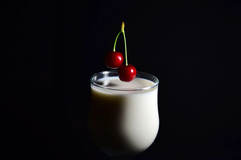
Creamy textures depend heavily on highlights.
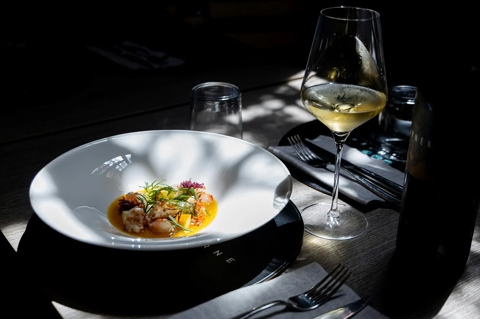
A small highlight across a surface can make food feel smooth, moist, and fresh. It helps customers understand that the sauce has body, the custard is soft, or the tofu is silky. Without that highlight, soft food can look matte and tired.
But the highlight must be controlled. Harsh highlights can make cream look greasy or uneven. No highlights can make the dish look dull. The best creamy food photography usually finds a middle ground: a soft shine that follows the natural shape of the food.
For example, carbonara sauce should look like it is clinging to the pasta, not flooding it. Soft scrambled eggs should have a gentle sheen, not a wet glare. Custard tart filling should look smooth and set, not rubbery. Tofu should show a clean surface with slight light movement, not a blank white block.
That small difference is what makes soft texture readable.
Give Soft Food Something To Contrast Against
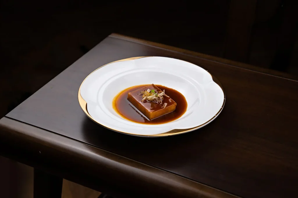
Soft textures become easier to understand when they sit beside another texture.
A smooth custard looks better when the tart shell gives it structure. Creamy pasta becomes more appetising with herbs, cheese, or pasta ridges to break the surface. Soft tofu feels more complete when soy dressing, spring onion, or sesame gives the eye something to hold. A mousse cake becomes clearer when the crumb base or cut edge shows contrast. Kaya feels richer when it sits against toast edges rather than disappearing into a flat spread.
The important thing is that the contrast should belong to the dish. It should not feel like decoration added just to rescue the photo.
This is where restraint matters. One useful contrast point is often enough. If everything is added for visual excitement, the dish starts to lose its own personality.
Shape Matters When Texture Is Subtle
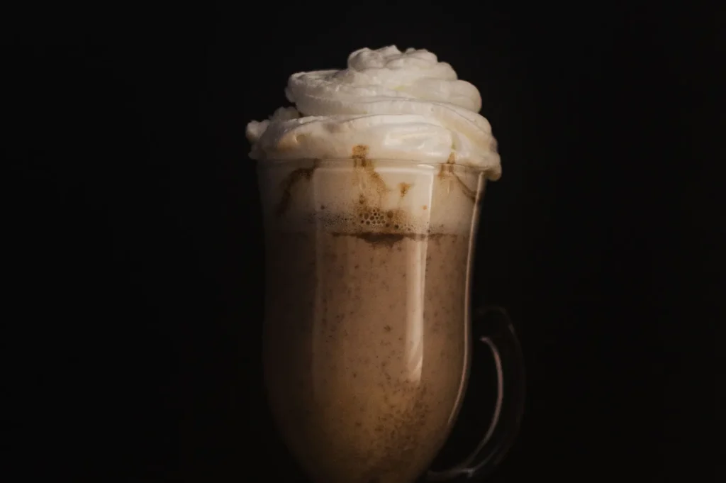
When texture is soft, shape becomes important.
Soft food without shape can become a puddle, blob, or beige patch. This is why natural movement matters. A swirl in cream, a fold in egg, a spoon mark in mash, a curved surface on mousse, or a slight twist in pasta can make the food feel dimensional.
The shape should look natural, not forced.
Soft eggs on kaya toast should still feel casual and warm. Tofu with soy dressing should look delicate, not over-handled. Mashed potato should have gentle movement, not a perfectly smooth surface that looks like plastic. Dessert creams and puddings should show softness without collapsing into the plate.
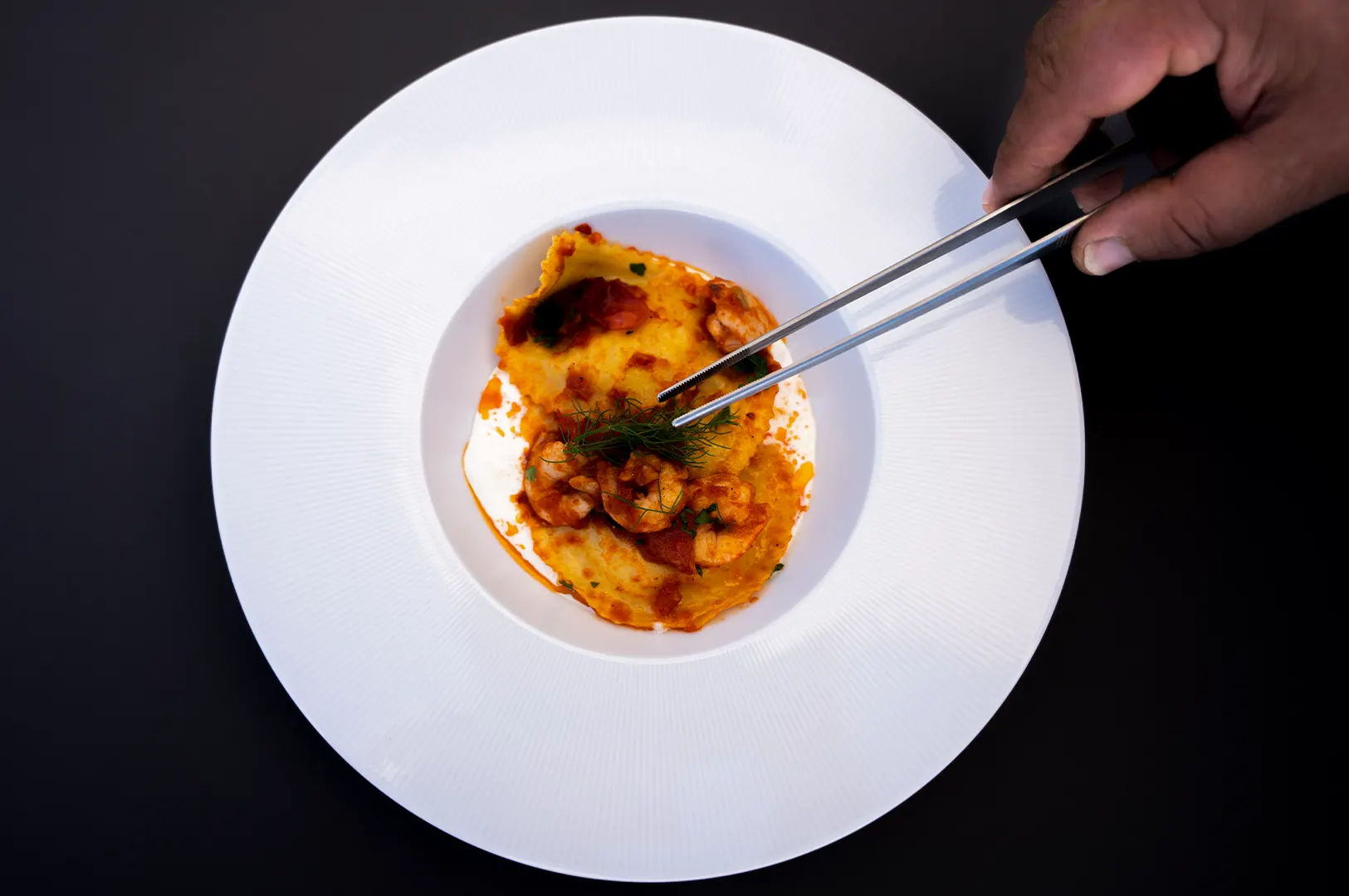
For cream pasta, the pasta itself should still hold shape. If the sauce hides the noodles completely, the dish becomes heavy. If the pasta has movement and the sauce sits naturally around it, the food feels richer and more edible.
The Risk Of Making Creamy Food Look Too Heavy
Creamy does not mean excessive.
This is one of the biggest mistakes in photographing soft food. More sauce does not always make food look more generous. Sometimes it makes the dish look cloying, flat, or difficult to finish.
Large areas of beige or pale food need balance. Cream pasta, dips, soups, custard desserts, mashed potato sides, and cream-based dishes can all look overwhelming if the frame is too tight or the surface has no break.
The customer should be able to imagine eating the dish comfortably. If a creamy dish looks too thick, too wet, or too dense, it may create hesitation instead of appetite.
This is why portion clarity matters. Let the viewer understand what they are looking at. Creaminess should support the dish, not bury it.
Soft Texture Across Menus, Delivery Apps, And Social Content
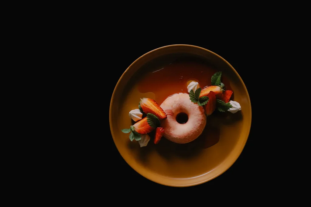
Soft textures need to be handled differently across platforms.
On menus, creamy dishes should look clear and recognisable. A customer should know whether they are looking at pasta, soup, tofu, egg, dessert, or sauce-based sides. The texture should help the dish feel appetising, but not confuse the order.
On delivery apps, soft food needs enough contrast to survive as a thumbnail. A pale creamy dish on a pale background may disappear completely. The dish may taste excellent, but if the photo reads as one flat colour, it will struggle to compete.
On social media, soft texture can be more emotional. Spoon shots, cut-throughs, soft surfaces, and creamy movement can create strong appetite cues. The image can focus more on feeling than full menu clarity.
On websites, soft texture can suggest comfort, calmness, and premium quality, especially for cafés, dessert brands, bakeries, and restaurants with refined plating.
For a wider guide on how texture works across different food types and platforms, our article on how texture in photography shapes appetite explains the bigger visual system for Singapore F&B brands.
What To Avoid When Photographing Soft Textures
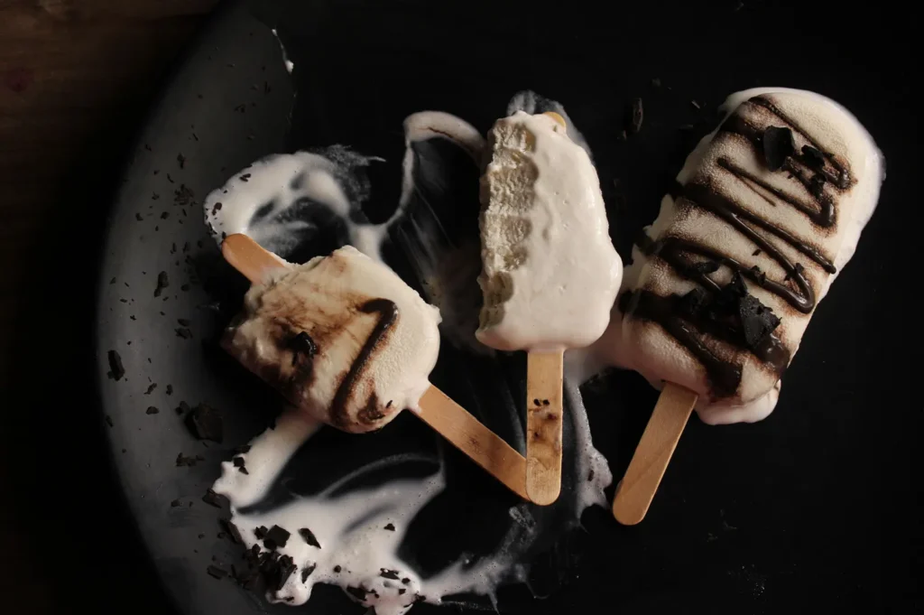
There are a few common reasons creamy food photos fail.
Over-smoothing the surface is one. When everything looks too perfect, the food starts to feel artificial. Soft does not mean lifeless.
Over-sharpening is another. It can make custard, tofu, mousse, or cream look rough when they should feel smooth.
Timing also matters. Creamy food that sits too long can thicken, dry at the edges, or lose its natural sheen. Soft eggs collapse. Sauces settle. Desserts sweat. Even a short delay can change the texture.
Beige food on beige backgrounds is another problem. It may look tasteful in theory, but it often removes appetite. The dish needs enough contrast to be readable.
Cropping too close can also hurt. If the viewer cannot understand what the dish is, the texture becomes abstract instead of appetising.
Finally, avoid garnish that does not belong. A random herb or flower may add colour, but if it feels unrelated to the dish, it distracts from the food rather than helping it.
How Food Photographer Studio Thinks About Soft Textures
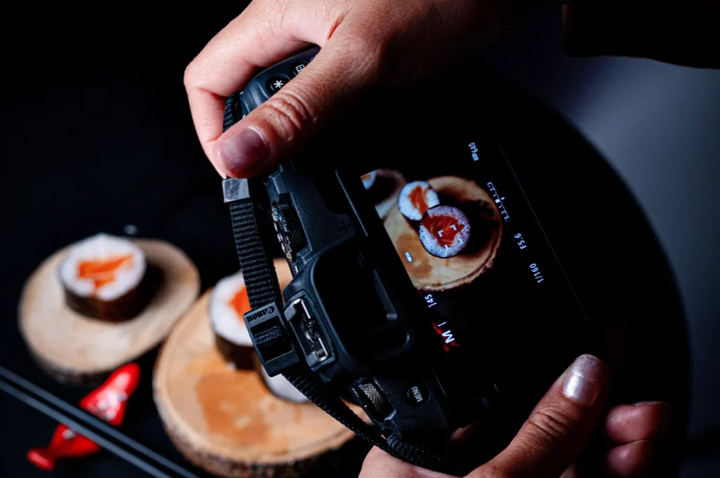
At Food Photographer Studio, we treat soft textures with restraint because the goal is not to make everything look dramatic. The goal is to make the dish feel smooth, fresh, and worth ordering.
Creamy, silky, and soft foods need a different approach from fried, grilled, or layered dishes. They need quiet shape, controlled highlights, and enough contrast to stay readable.
The image should preserve the dish’s natural feel. A tofu dish should still feel delicate. A mousse cake should still feel soft. A cream pasta should still feel rich, but not heavy. Good photography helps the customer understand that softness without exaggerating it.
Soft Food Still Needs Texture
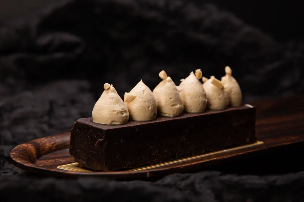
Soft textures are not boring. They are just easier to flatten on camera.
Creamy food photography depends on subtle cues: a gentle highlight, a natural fold, a clean surface, a useful contrast point, and enough shape to keep the dish alive. When these details are handled well, soft food does not need to shout.
It can feel smooth, calm, rich, comforting, and believable.
The best soft food photos make customers imagine the texture before they taste it. That is the whole point. A creamy dish should not just look presentable. It should feel like something worth ordering.