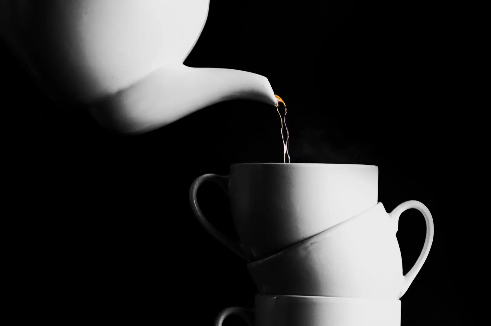
Picture a high stakes packaging shoot for your newest Singapore product line. You review the files, but the pandan green looks completely dull, the chilli red has shifted orange, and your crisp white label looks yellow online. These small colour shifts quickly turn into massive brand problems.
Inaccurate colours lead to endless approval rounds, customer returns, loss of brand trust, and expensive reshoots. You need a reliable calibration workflow that your team can repeat every single time.
For the broader creative context behind accuracy decisions, our colour in photography workflow explains how we think about colour from set to export. As a studio shooting for local F&B brands daily, we know that getting your colours right the first time saves everyone countless hours of frustration.
What “Colour Accuracy” Means In Product Photography (In Normal Words)
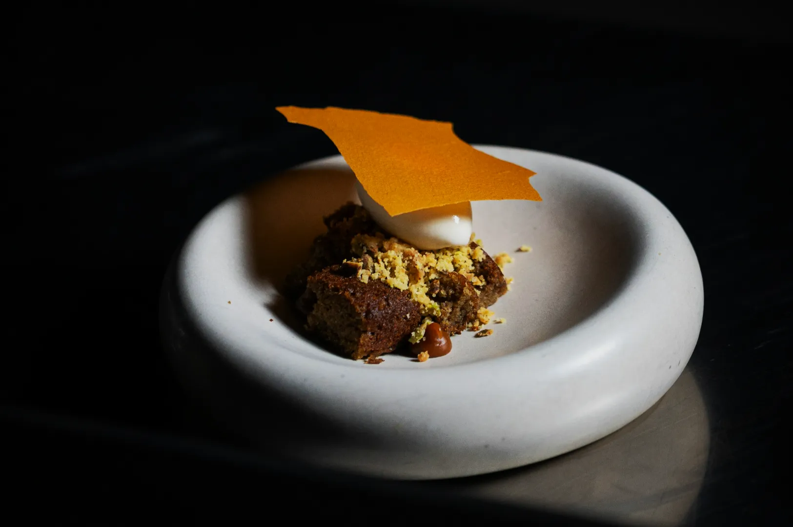
Accurate colors product photography simply means capturing the product exactly as it looks in real life. It does not mean making the image look flat or boring. It means your customer receives exactly what they saw on their screen.
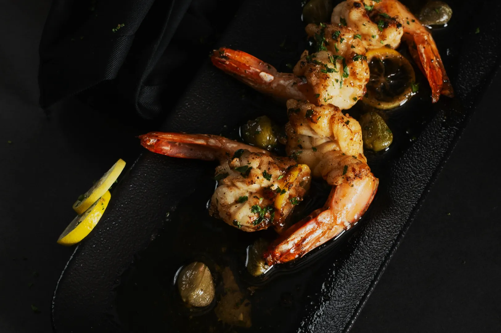
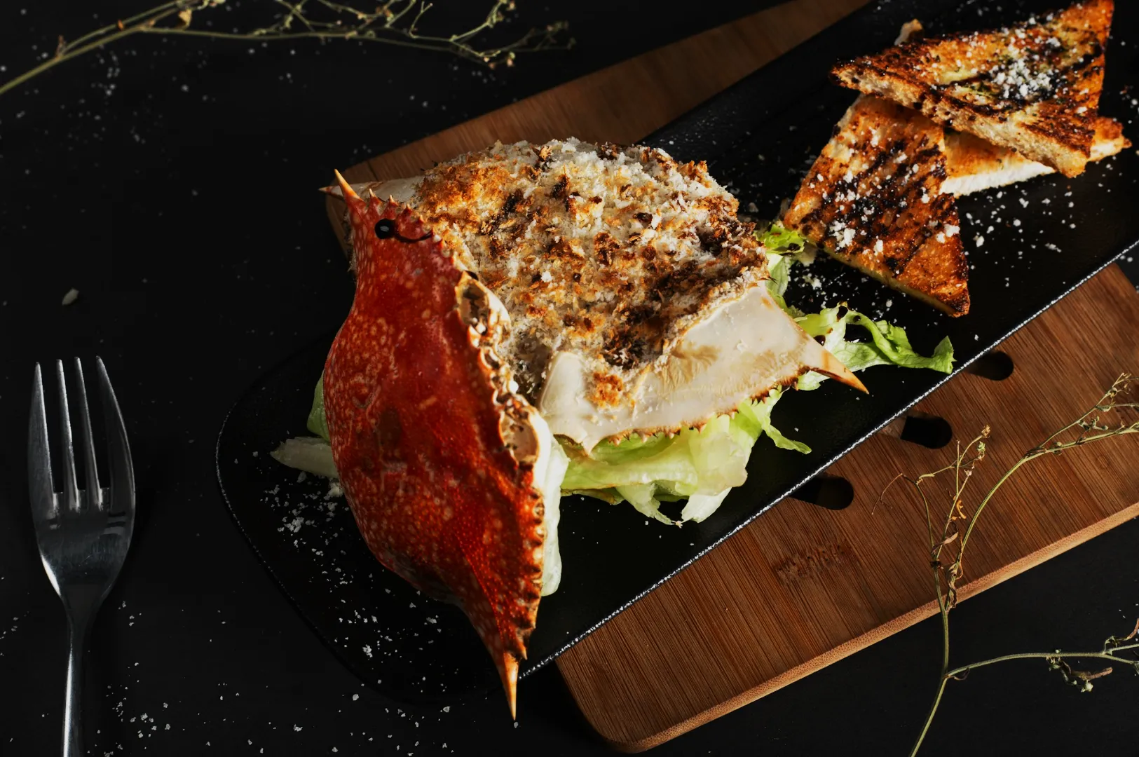
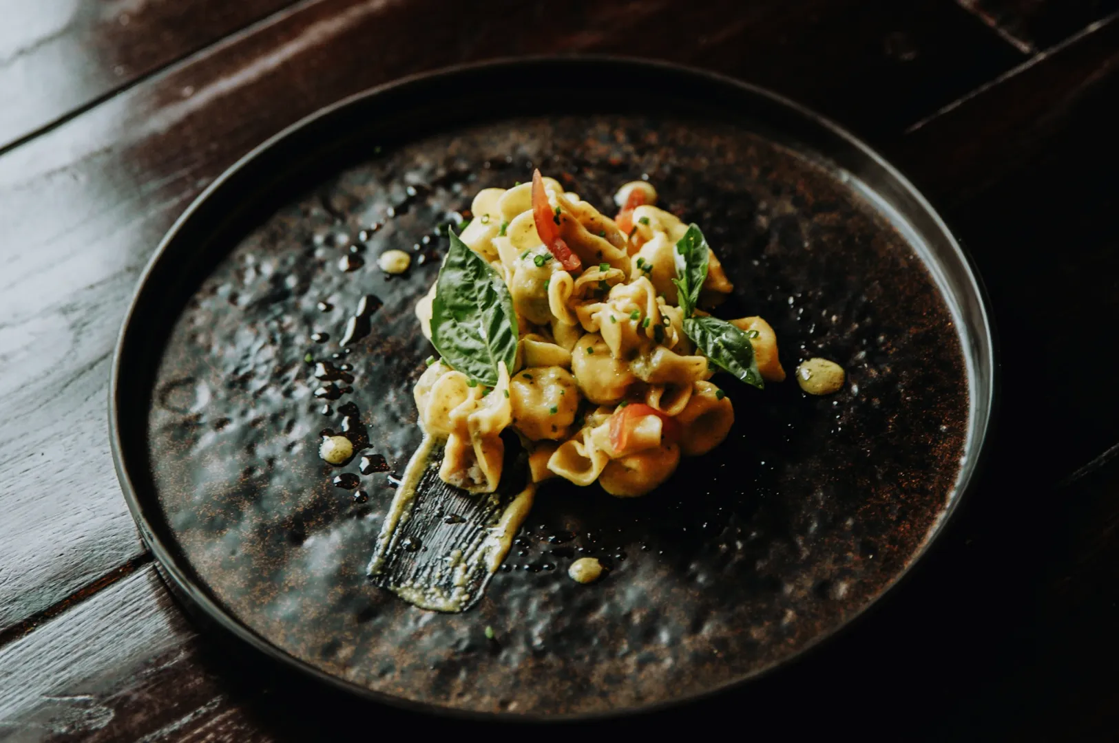
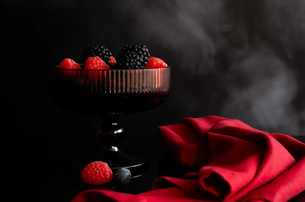
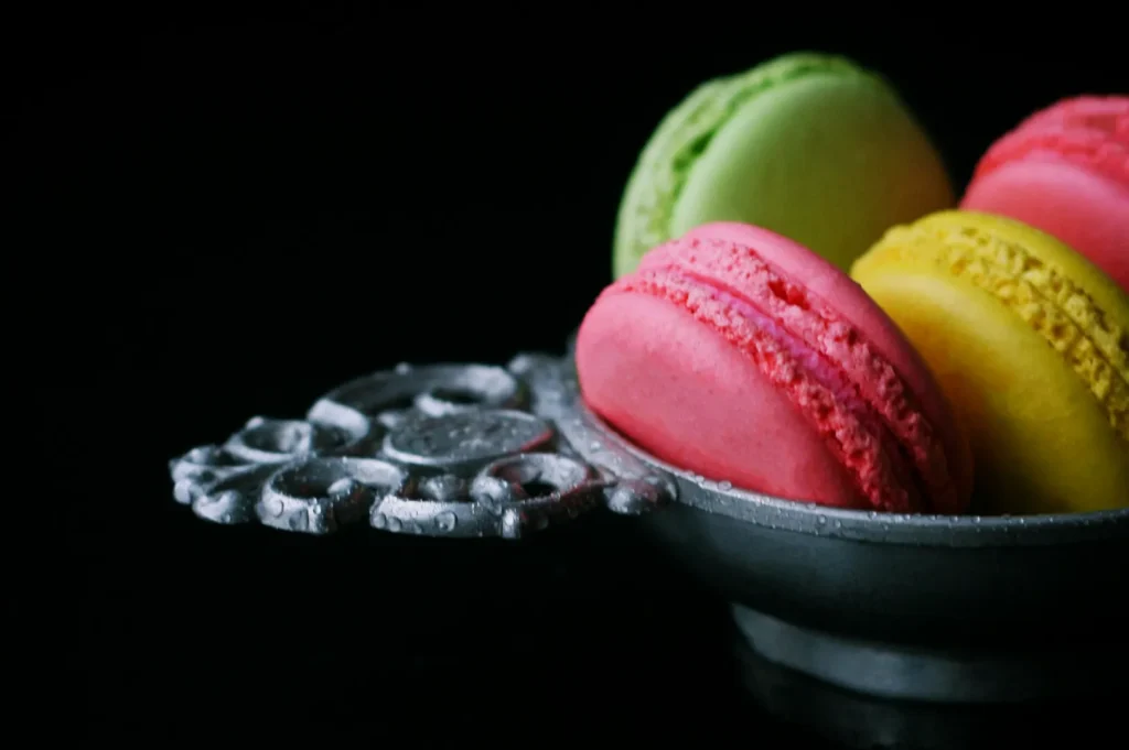
You must always protect the memory colours of your ingredients. Your coconut milk should look creamy and clean, your steamed rice must look pure white, and your fresh herbs need to look vibrant.
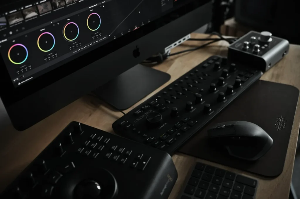
If your monitor is wrong, every edit decision after that is guesswork. You cannot fix colour problems if your screen is lying to you from the start.
The Calibration Stack (Where Colour Can Go Wrong)
The Four Failure Points
Colour accuracy can easily fail at four distinct points in your workflow. These failure points are the capture on set, the reference tools used, the editing process, and the final file delivery.
The “Good Enough” Goal For Most Brands
Your primary goal should be consistency across your product listings and campaigns. You are not aiming for mathematical perfection theatre that slows down your entire marketing team. A practical color calibration photography workflow keeps your brand looking highly professional without overcomplicating the shoot.
Step 1: Control The Light First (The Biggest Accuracy Lever)
Choose One Dominant Light Source
You must choose one dominant light source to achieve true accurate colors product photography. Use a daylight balanced strobe, a continuous LED, or strictly controlled window light. Never mix ambient room lighting with your studio lights, as this creates impossible colour casts.
Keep The Set Neutral On Purpose
Your shooting environment must remain completely neutral. Use a neutral white or grey sweep for your background, and bounce light using only clean white foam boards. You must actively flag any coloured bounce light to protect your packaging.
Singapore Reality Check (Common Cast Sources)
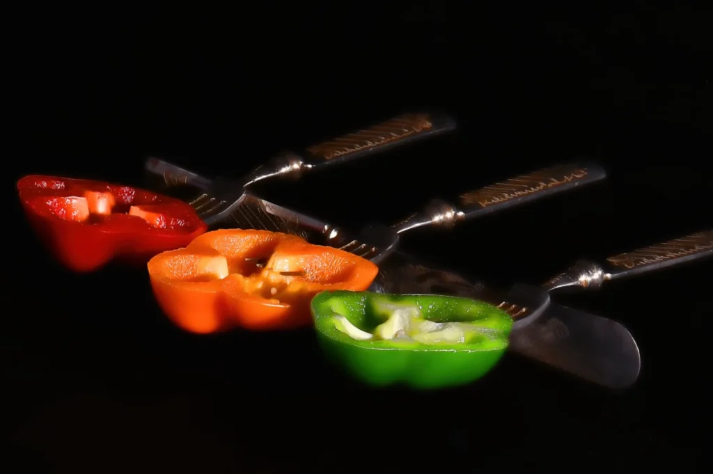
Singapore commercial spaces are filled with hidden colour traps. Warm retail LEDs, bright green café walls, vibrant potted plants, and glowing neon signage will ruin your product shots. You must physically block these light sources from hitting your set.
Step 2: Set White Balance With A Real Reference (Not By Guessing)
The Grey Card Workflow (Fast And Repeatable)
Using a simple grey card is the fastest way to guarantee accurate colours. Place the card exactly where your product will sit and take one reference photo under your final lighting setup. You can easily click this grey patch in your editing software later to achieve perfect neutral balance.
When You Should Set Custom WB In Camera
You should set a custom white balance directly in your camera for multi-day shoots and high volume SKUs. This ensures absolute team consistency when multiple photographers are working on the same project.
White balance is the foundation. Calibration is how you lock it.
Step 3: Use A ColorChecker When Brand Colour Must Match Print
What A ColorChecker Solves (Practical Version)
A ColorChecker passport provides a physical patch reference of known mathematical colours. It helps build a custom camera profile that drastically reduces colour drift across different lenses and sensors. This tool is mandatory when your digital marketing assets must perfectly match your physical printed packaging.
How To Shoot It So It Actually Works
You must shoot the ColorChecker under the exact same light as your final product. Ensure the card faces the camera directly to avoid any harsh glare on the colour patches. The card needs to cover enough of the frame so your editing software can read the patches accurately.
Where It Matters Most For Food Brands
This strict color calibration photography matters most for signature brand colours. Your specific pandan greens, deep chilli reds, and multi-SKU sets must align with your strict brand guidelines. A ColorChecker guarantees your curry paste labels look identical across your entire ecommerce catalogue.
Step 4: Calibrate Your Monitor (So You Stop Chasing The Wrong Colour)
Why Monitor Calibration Is Non-Negotiable
Monitor calibration is absolutely non-negotiable for professional food brands. Uncalibrated screens cause endless team arguments, constant eye adaptation issues, and wasted approval cycles. You will never achieve accurate colors product photography if your marketing manager and your retoucher are looking at different versions of reality.
Simple Target Settings (Keep It Team-Friendly)
Keep your calibration target settings simple and team friendly. Set your calibration tool to D65 for the white point and gamma 2.2 for the tone curve. Ensure your screen brightness matches your actual room lighting, and calibrate on a strict monthly schedule.
Edit In A Stable Environment
You must edit your photos in a highly stable lighting environment. Control your ambient room light by closing the blinds and turning off mixed overhead bulbs. Avoid editing in rooms with strong wall colours, as the reflected light will completely trick your eyes.
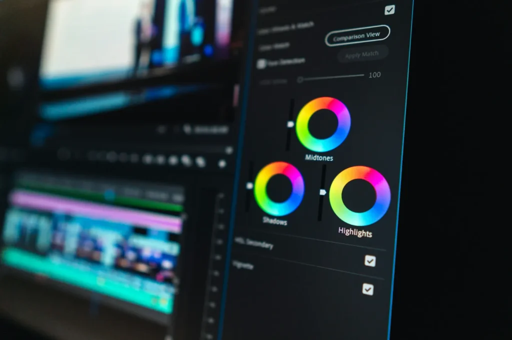
Step 5: The Editing Workflow (Correction First, Then Style)
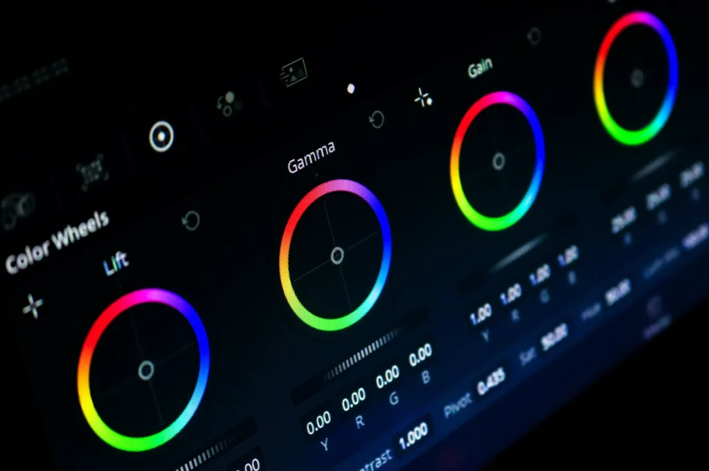
The No-Regrets Editing Order
You must follow a strict editing order to protect your product colours. Always fix your white balance and tint first, then adjust your exposure and highlights. Neutralise your backgrounds, apply your camera profile, use HSL only for specific problem colours, and finish with sharpening.
The “Appetising But Accurate” Rule
Your food packaging needs to look appetising but completely accurate. Enhance the texture and contrast gently to make the dish look delicious while keeping the brand colours stable. You must strongly avoid using global saturation sliders, as they will instantly make your labels look radioactive.
Two “Do This, Not That” Examples
Follow these specific rules when editing tricky Singapore F&B products.
- Do: correct label background locally, not global warming.
- Not that: Do not warm up the entire image just to make the food look golden, as your white label will turn yellow.
- Do: fix oranges before reds when chilli labels shift.
- Not that: Do not push the red saturation first, as this usually destroys the subtle roasted tones in the dish.
Step 6: Export Settings That Keep Colour Consistent
Choose Colour Space Based On Use
You must choose your export colour space based on where the image will live. Always export in sRGB for web listings, ecommerce stores, and social media platforms. If the image is for physical print, confirm the exact CMYK specifications with your local printer.
Build Two Export Presets
Build two distinct export presets in your editing software to avoid daily confusion. Create one preset specifically for compressed ecommerce listings and another high resolution preset for major campaign assets.
Platform Reality (And How To Reduce Surprises)
Every mobile device and laptop screen displays colour slightly differently. You cannot control platform reality, but you can reduce nasty surprises. Always keep a printed reference image nearby during final approvals to ensure the digital file matches the physical product.
Troubleshooting (Common Colour Problems In Packaging Shots)

Use this quick troubleshooting guide when your color calibration photography breaks down.
- Problem: Whites look yellow.Likely Cause: Warm ambient room light is mixing with your studio strobe.Fix: Turn off all overhead café lights and rely strictly on your flash.
- Problem: Greens (pandan or matcha) look dull or grey.Likely Cause: The tint slider is pushed too far towards magenta.Fix: Pull the tint slightly towards green and lift the green luminance channel.
- Problem: Reds turn bright orange.Likely Cause: Global saturation is too high, clipping the red channel.Fix: Lower the orange saturation slightly before adjusting the red hue.
- Problem: Metallic packaging inconsistency.Likely Cause: Uncontrolled reflections from the room.Fix: Use large black or white foam boards to control exactly what the foil reflects.
- Problem: Looks right on your screen but wrong on others.Likely Cause: Your monitor calibration has expired.Fix: Recalibrate your monitor immediately using a hardware device.
Accurate Colour Builds Trust Faster Than Any “Style”
Accurate colour builds customer trust infinitely faster than any trendy editing style. Mastering color calibration photography ensures your Singapore F&B brand looks highly professional across every single platform.
Take immediate action by buying a simple grey card before your very next shoot. Implement this practical workflow, and your team will never have to guess about accurate packaging colours again.