Picture a busy Singapore afternoon where someone is scrolling through their feed and instantly recognises your café before even reading the account name. That level of instant recognition is the ultimate goal for any food brand.
Unfortunately, we often see colors shift wildly from post to post, making the grid feel entirely random. When your lighting and props change daily, your beautiful food looks highly inconsistent and loses its premium appeal.
You need a simple system to build a cohesive instagram color palette that any team member can easily repeat. As a team shooting for local F&B brands every week, we know exactly how to turn a messy feed into a highly polished restaurant instagram aesthetic.
What A Restaurant Instagram Color Palette Actually Is (And What It Is Not)
An instagram color palette simply means having predictable color roles that repeat across all your social media posts. It provides a visual anchor that guides your customer’s eye and builds immediate brand trust.
This does not mean making every single photo the exact same color. It also does not mean slapping one heavy vintage preset over all your food photos. A professional palette shows up naturally in your chosen backgrounds, your physical plates, your café interiors, and your disciplined editing choices.
If your whites and neutrals are inconsistent, your brand colours will never look consistent. You must master your neutral tones before you worry about anything else.
Start With The Brand, Not The Preset
Identify Your Brand Colour Roles
You must identify three specific color roles before you shoot your next menu item. You need a dominant hero color, supporting neutral tones, and one intentional accent color.
A modern Singapore kopi bar might use dark roasted brown as the hero, cream ceramic cups as support, and a vibrant green logo as the accent. A fresh salad concept might rely on bright white as the hero, light wood as the support, and deep purple as the accent.
Build A “Do And Don’t” Palette In 10 Minutes
Take ten minutes to write a fast do and don’t list for your styling props. Specify exactly which backgrounds, plates, and linens are allowed on set.
Ban any colors that actively clash with your restaurant instagram aesthetic. Keep this list small enough that your staff can actually remember it during a chaotic weekly content day.
Translate The Palette Into Set Choices (So The Food Still Wins)
Backgrounds And Surfaces (The Fastest Way To Look Consistent)
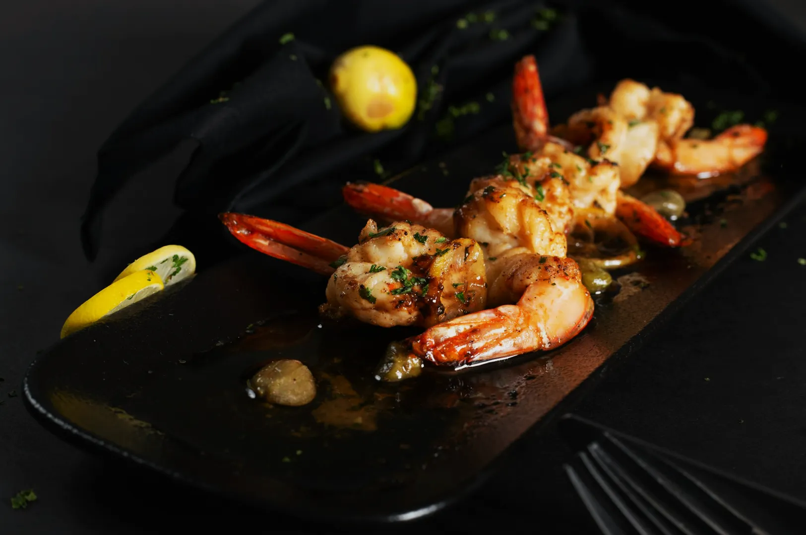
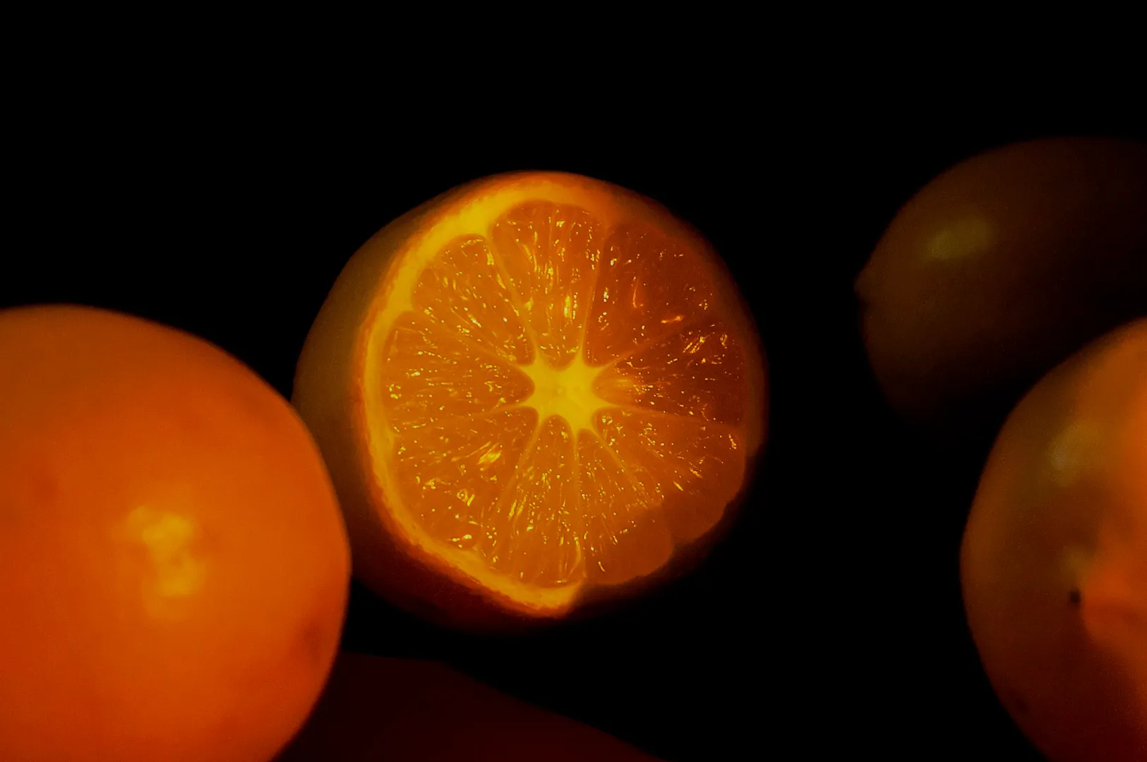
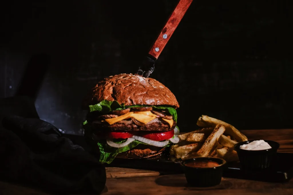
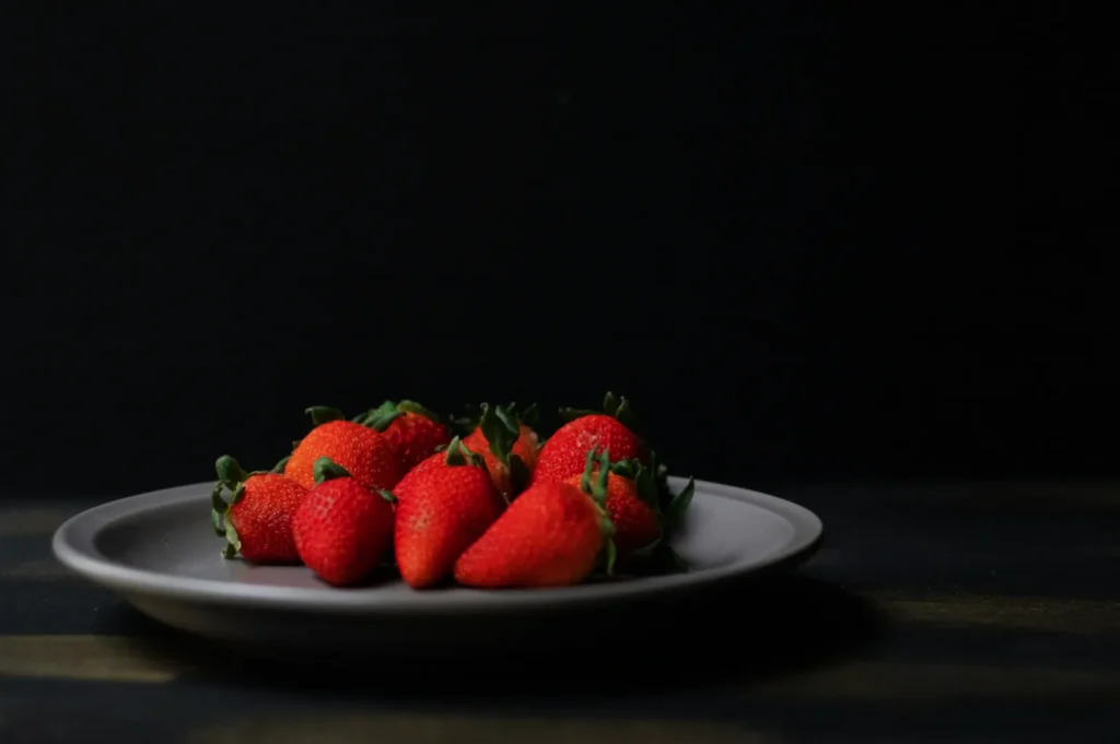
Your choice of surface is the fastest way to make your feed look consistent. A good rule of thumb is to place warm dishes on cooler or neutral bases to create natural separation.
Dark soy based sauces need lighter surfaces so they do not disappear into the background. Avoid using backgrounds that exactly match the tone of your dish. A plate of Hainanese chicken rice looks incredibly clean on a warm wooden board, while kaya toast pops beautifully against a cool grey marble table.
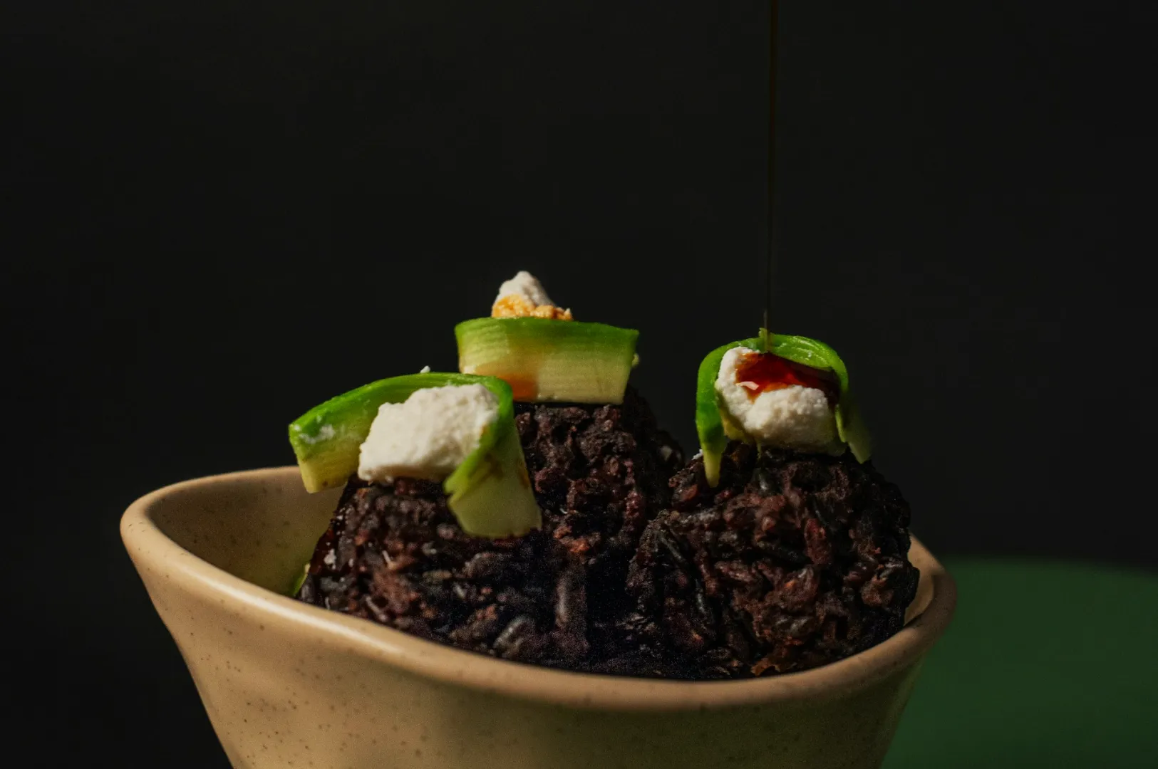
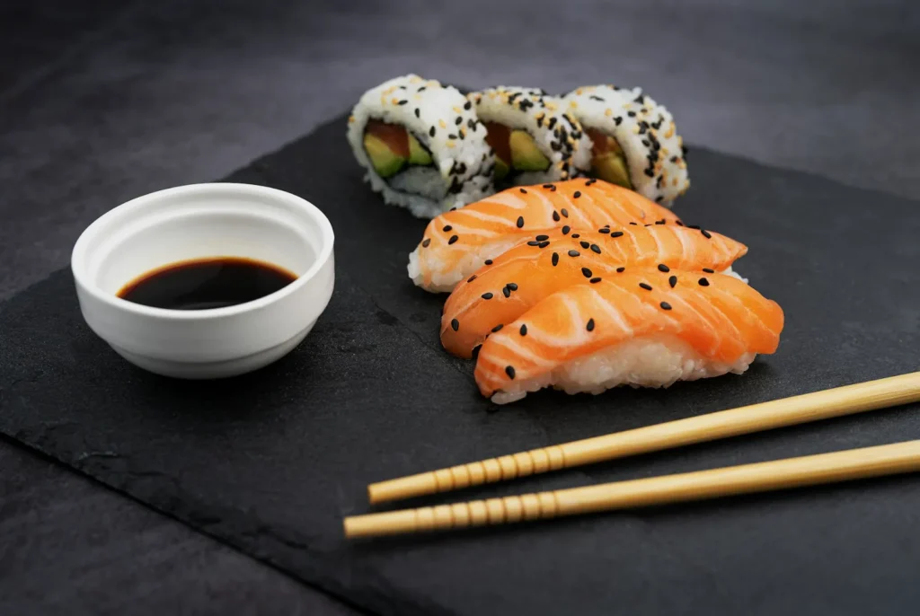
Plates, Props, And “Repeatable Pieces”
You need a simple prop kit that your team uses for every single shoot. Choose two plate styles, two linen tones, and one signature element like a specific water glass.
Repetition is what makes the grid feel designed. When customers see the same beautiful ceramic bowl in multiple posts, your brand feels established and intentional.
Packaging, Interiors, And Signage Without Ugly Colour Casts
Your physical space often creates massive problems for your color consistency. Bright green painted walls, saturated floor tiles, and glowing neon signage will quickly contaminate your food with ugly color casts.
You must physically block these light sources from hitting your hero dish. Move your shooting table away from brightly colored walls or use a white foam board to bounce clean light back onto the food.
Lighting And White Balance Rules For A Cohesive Restaurant Instagram Aesthetic
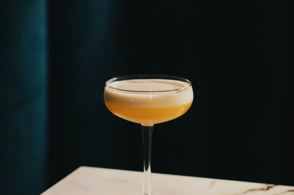
Choose A Signature Light Mood
Your lighting choices dictate the entire emotional feeling of your instagram color palette. You should choose one signature light mood and stick to it strictly.
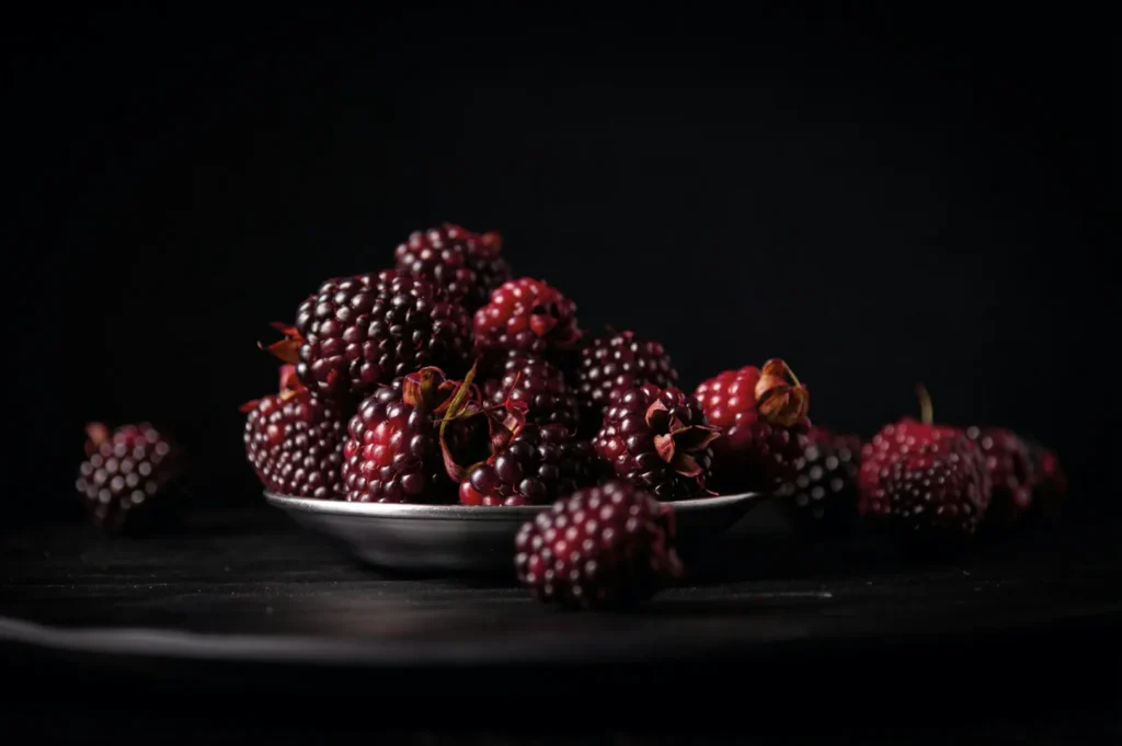
A bright and airy mood works perfectly for a daytime brunch café. A warm and cosy style suits a heritage hawker brand perfectly. A dark and premium mood elevates a high end cocktail bar. Maintaining one style prevents your grid from looking like a confusing scrapbook.
Lock A Repeatable White Balance Approach
You must lock in a repeatable white balance approach so your colors match every single time. Use specific Kelvin starting points for speed or set a custom white balance for major menu refreshes. Shooting in RAW and capturing a reference frame gives you the ultimate control.
If you want the broader context behind these colour decisions, our photography workflow breaks down how we keep colour consistent from set to export.
Styling Rules That Make The Grid Feel Cohesive (Without Killing Creativity)
Use Colour Roles In Every Frame
You must enforce your specific color roles in every single frame you capture. Ensure there is always one clear hero color, mostly clean neutrals, and only one intentional accent.
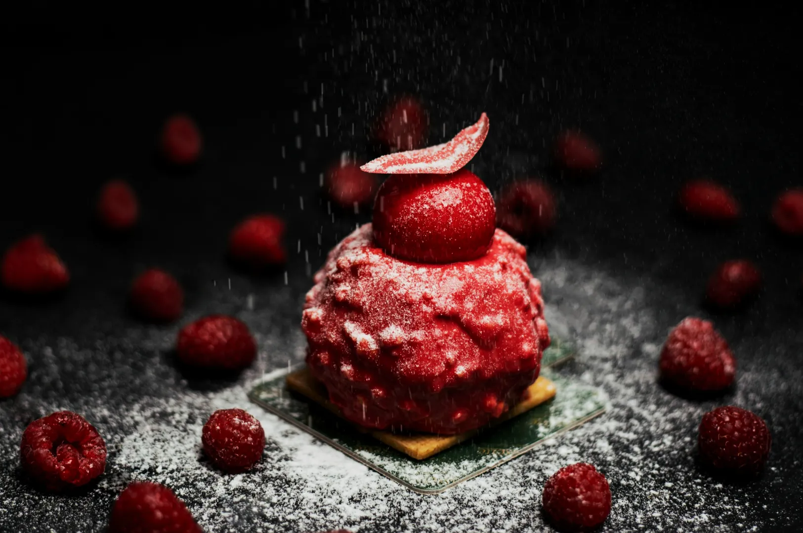
A fiery plate of chilli crab needs simple neutral surroundings to truly shine. A green matcha dessert pairs beautifully with just one small, subtle pink prop. A rich sambal dish requires a clean white plate so the deep reds remain the absolute focus.
Garnish And Ingredients Should Match The Brand Mood
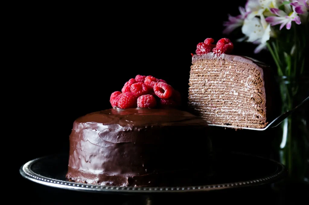
Your choice of garnish should always support your overarching brand mood. A premium fine dining brand should use highly minimal, precise garnishes to convey luxury. A playful fast casual campaign can use larger, brighter garnishes to communicate abundance and fun.
Editing Guidelines (So Your Palette Survives Different Days And Different Shooters)
Edit Neutrals First, Then Protect The Palette
Your editing workflow must follow a strict order to protect your carefully planned palette. Always edit your white balance and tint first to ensure your plates and rice look perfectly clean.
Adjust your overall exposure and contrast before you touch individual colors. Use the HSL panel to adjust only your specific key brand colors, and then apply local fixes where needed. Fix colour casts before you chase “style.”
Set “Saturation Limits” For The Brand
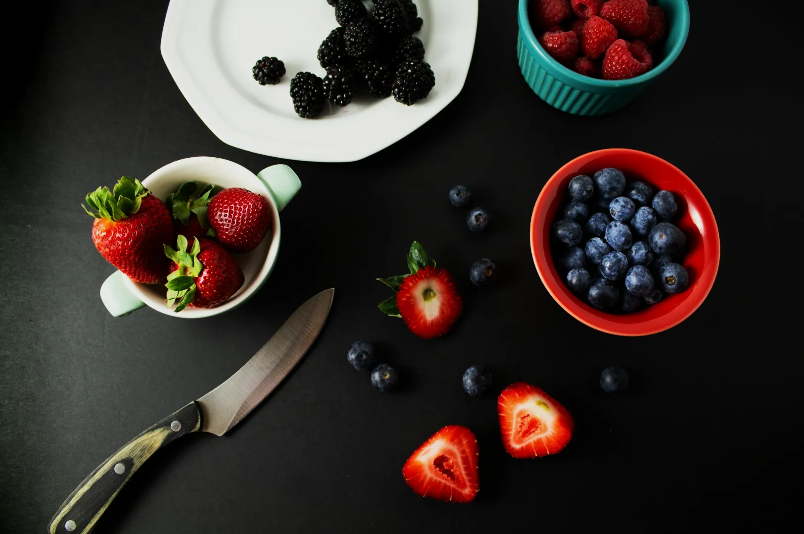
You must set practical saturation limits for your most common ingredients. Decide exactly how bright your greens, reds, and yellows are allowed to get. Keep the colors believable so the food actually looks edible and naturally appetising.
Use One “Gold Standard” Reference Image
Choose one flawless image that perfectly represents your restaurant instagram aesthetic. Keep this gold standard reference image open on your computer screen while you edit. Match every future post directly to this file so your overall grid stays completely cohesive.
The 9-Post Grid Template (A Simple Restaurant Content Plan That Looks Designed)
The Three-Post Rhythm
A predictable posting rhythm naturally reinforces your brand visual identity. Cycle through one hero dish, one human environment moment, and one close up product detail. This rhythm beautifully balances appetite appeal, your brand world, and customer trust.
A 9-Post Layout You Can Copy
You can easily plan your grid in blocks of nine to ensure perfect visual balance. Aim for four light neutral posts, three medium tone posts, and two dark accent posts.
Place your hero brand color strategically across four or five of these posts. Let your accent color appear very subtly in just two or three posts. This layout keeps your feed looking dynamic but highly disciplined.
Post Captions And Visual Consistency (One Practical Tip)
Visual consistency extends slightly beyond just the photo itself. Keep your video Reel covers entirely consistent with your photo style. Use recurring phrasing in your captions and maintain a very simple, predictable call to action style.
A Cohesive Grid Is A System, Not A Filter
Building a professional instagram color palette is about using a reliable system rather than a trendy digital filter. When you control your props, manage your lighting, and edit with discipline, your restaurant instagram aesthetic will instantly attract new diners.
Take one small step today to improve your brand. Pick just one signature background surface and reshoot three of your best selling dishes using the exact same light and white balance.