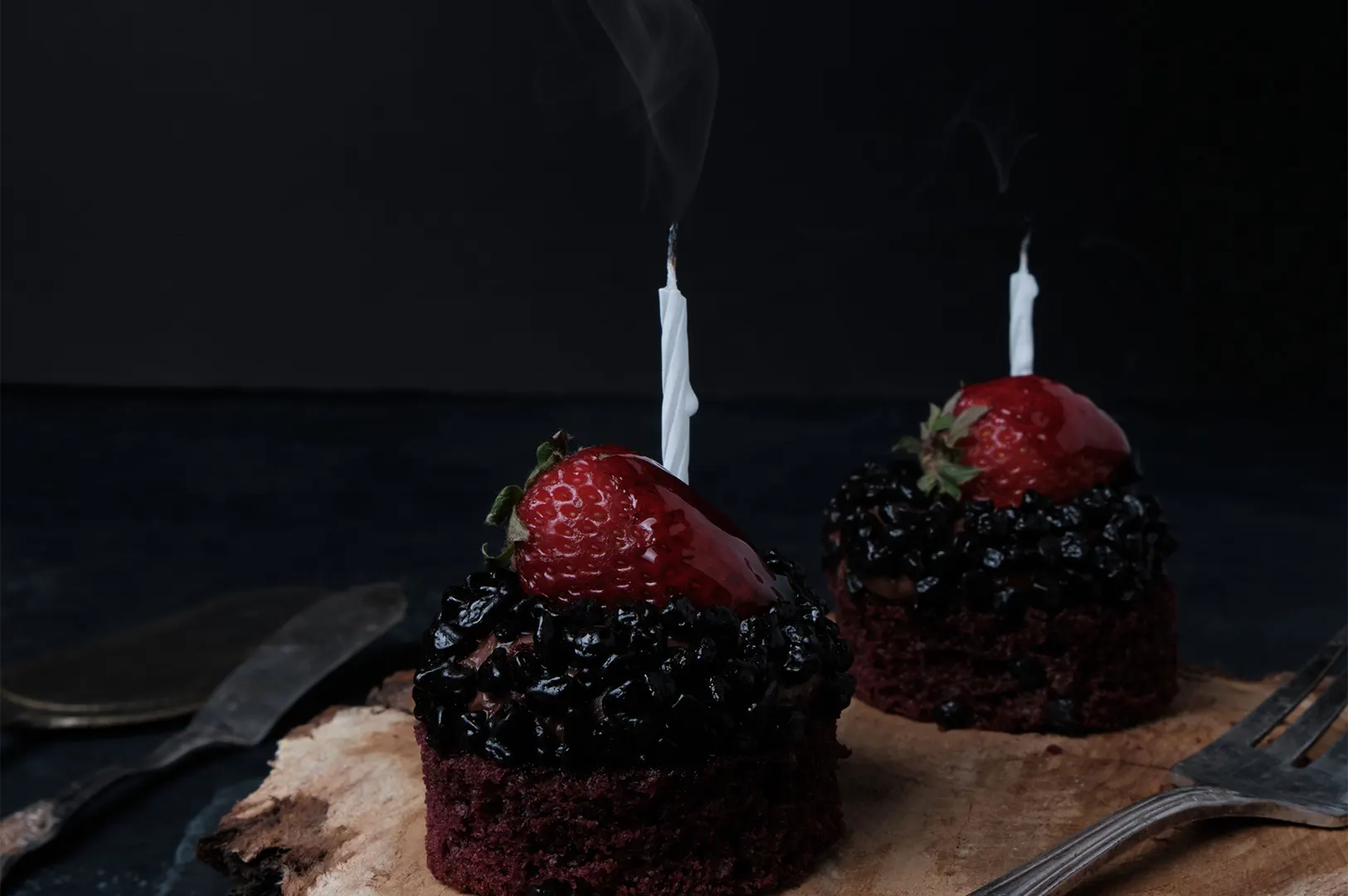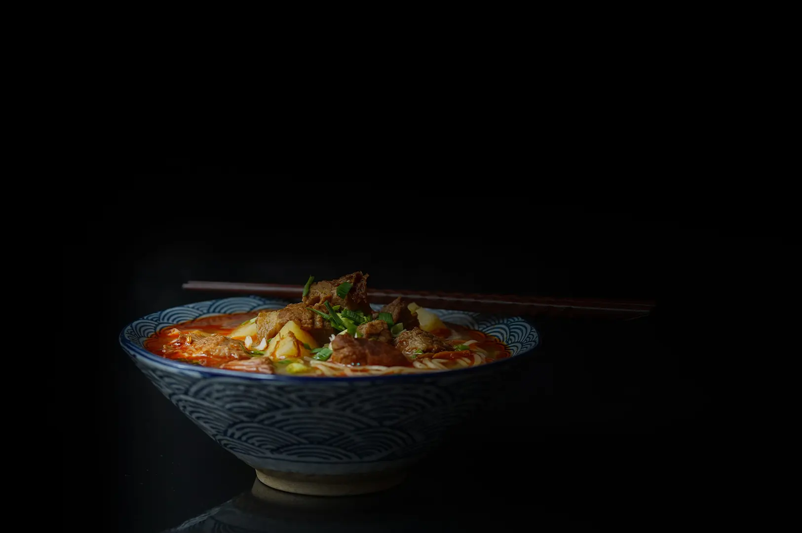
There is a version of “pretty” that looks impressive on screen, but quietly damages trust. You know it when you see it. The noodles are piled too high, the sauce looks like lacquer, the garnish makes no sense, and the dish arrives looking nothing like the photo.
Aesthetic food styling is not about turning your food into a fantasy. It is about making the dish look like itself, only better. Cleaner, clearer, fresher, more intentional. The kind of photo that makes a customer stop scrolling, and then still feel happy when the plate lands on the table.
In Singapore, this matters more than people admit. Diners here are visually literate. They know what chicken rice should look like. They know what laksa broth should read like. They know when a café plate is styled to feel “premium” versus when it is styled to feel fake. So the job is not to impress. The job is to make your food look irresistibly true.
If you want to build a consistent aesthetic across your menu and content, this connects directly to how we approach aesthetic photography as a system, not a one-off look.
What “Aesthetic” Actually Means for F&B Photos
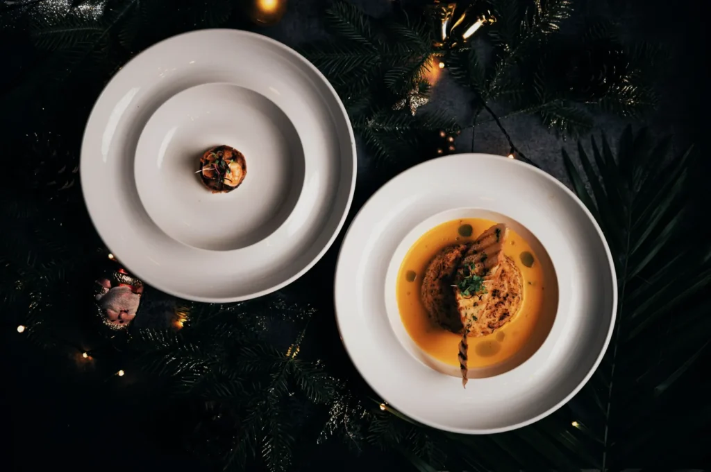
For restaurants, “aesthetic” is often confused with “minimalist” or “Instagrammable.” Those can be styles, but aesthetic food styling is bigger than that. It is a set of decisions that make your dish readable and desirable in one glance.
We usually break it into three checks:
1) Truth
Does the photo still look like what you serve? If a customer orders based on this image, will they feel misled?
2) Clarity
Can someone understand the dish quickly? What is the protein? What is the texture? Is it dry or saucy? Is it spicy or mild? You do not need to show everything, but you must show the right things.
3) Mood
Does the photo match your brand? A hawker-style concept and a Keong Saik bistro can both be “aesthetic,” but their styling language should not look identical.
Once you get those right, you can push beauty. Not the other way around.
Start With the Dish, Not the Props
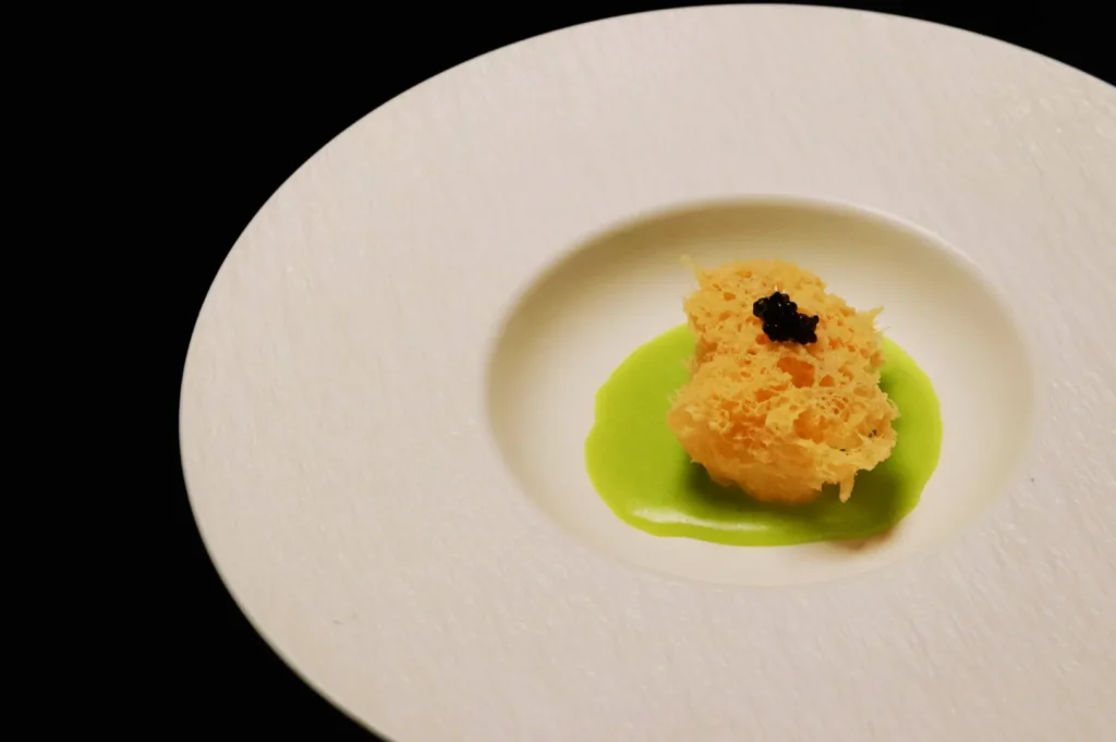
The fastest way to style food well is to identify what makes the dish itself appetising, then protect that in the frame.
Ask one simple question: What is the “selling texture”?
That is the surface or detail that triggers appetite.
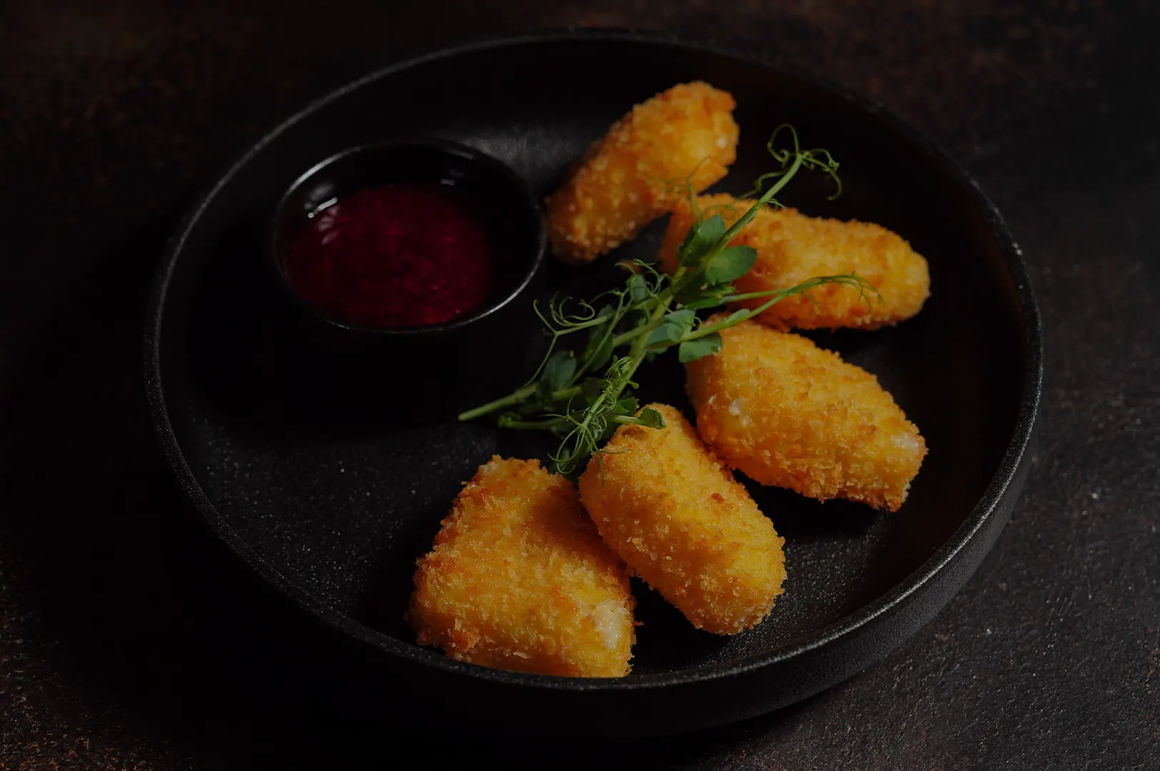
- For fried food, it is crisp edges, bubbles, and dry crunch.
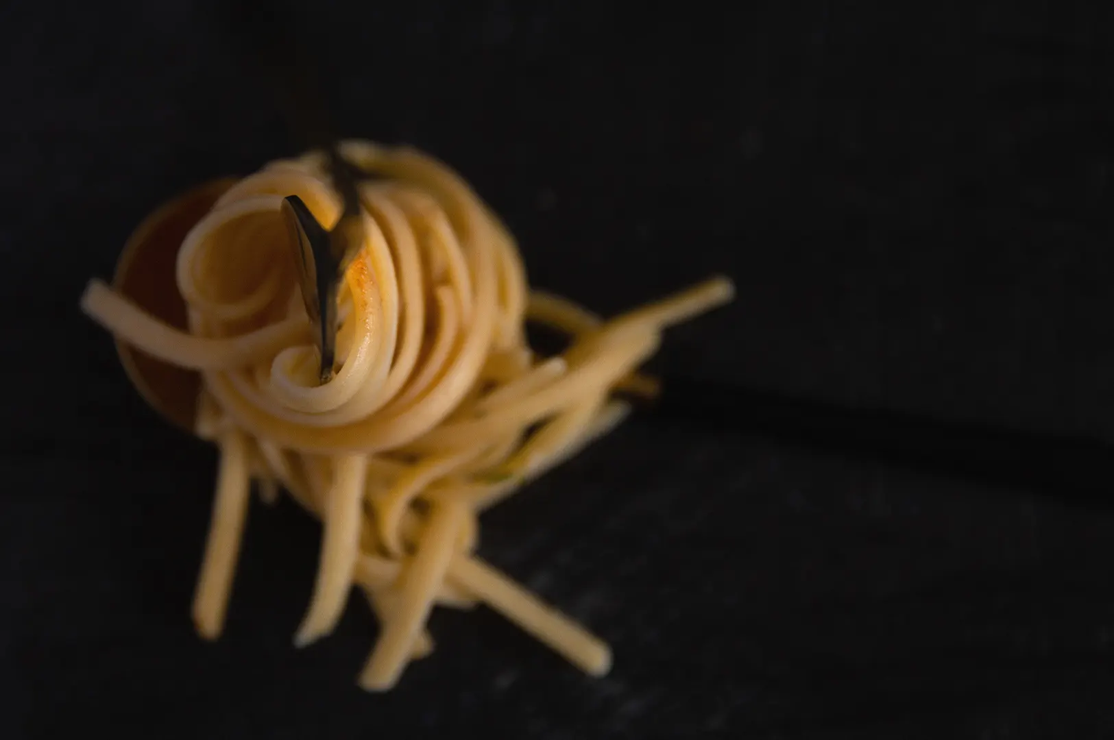
- For rice and noodles, it is separation and sheen, not a clumped mass.
- For soups, it is visible ingredients and a surface that looks alive.
- For desserts, it is layers, softness, and clean cuts.
- For drinks, it is coldness, foam, and clarity.
Once you know the selling texture, styling becomes practical. You do not add random garnish. You do not over-prop. You simply build a frame that makes the selling texture obvious.
Example: Chicken Rice That Looks Like Chicken Rice
Chicken rice fails on camera when it becomes beige-on-beige. The styling fix is not “add more.” It is contrast and definition.
- Fluff the rice so grains separate and catch light.
- Brush a controlled sheen on the chicken skin so it reads moist, not greasy.
- Keep chilli bright and textured, not a dark blob.
- Add cucumber only if it helps colour balance, not because it is “standard.”
The photo still looks like chicken rice. It just looks like the best version of your chicken rice.
“Only Better” Styling Moves That Keep It Real
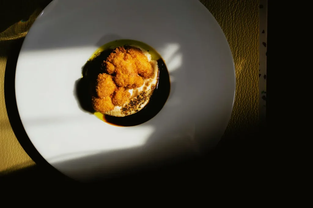
These are the small moves that create big impact without changing the dish’s identity.
1) Portion Control That Looks Honest
Camera portions are tricky. Too small looks stingy. Too big looks messy. The goal is believable abundance.
- Use the plate size to control perception. A slightly smaller plate can make a normal portion look generous.
- Avoid stacking food unrealistically high unless that is how you serve it.
- Keep the dish’s natural shape. Do not turn a comforting bowl into a sculpture.
2) Sauce Placement That Guides the Eye
Sauce is where many photos die. Either it floods the plate, or it looks dry.
- Place sauce where it catches light, not where it makes a mess.
- For thick sauces, use a spoon or brush to tidy edges. You want intention, not perfection.
- For soup, make sure key ingredients sit above the surface. A bowl that reads like a flat mirror looks dead.
3) Garnish Logic, Not Garnish Habit
Garnish should explain flavour, not decorate.
- Herbs work when they belong to the dish’s actual taste profile.
- One strong garnish beats five random ones.
- Fresh herbs go on last. In Singapore heat, they wilt quickly and kill the “fresh” signal.
4) Shine Control, Not Shine Removal
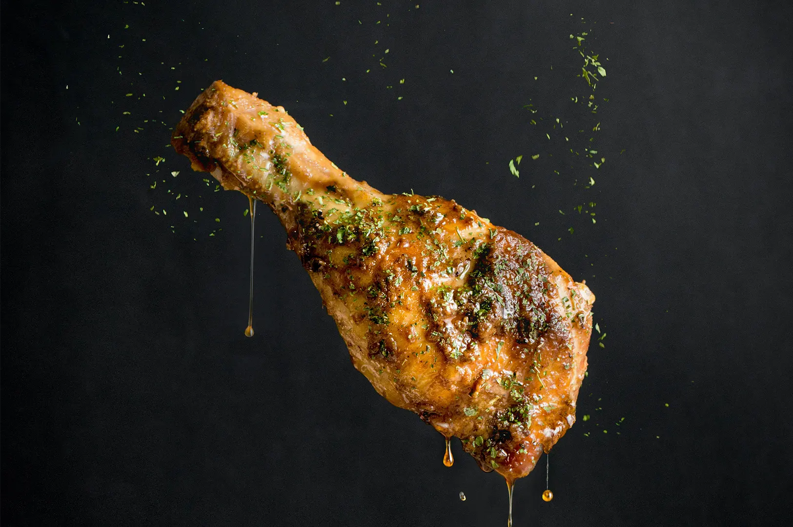
Aesthetic styling does not mean matte food. Shine is appetite. Shine signals moisture and richness. The trick is controlling highlights so they do not look like glare.
- Change the angle of light, not the dish.
- Use diffusion to soften harsh reflections.
- Keep shine on edges and curves, not across the centre of the food.
5) Clean Edges Make Everything Look More Premium
This is the least glamorous tip, but it is the one that instantly upgrades a food photo.
- Wipe plate rims.
- Remove crumbs that do not add story.
- Straighten cutlery if it is in frame.
- Check the background corners for distractions.
Aesthetic food styling is often just ruthless cleaning.
Build an Aesthetic System for Menu Consistency
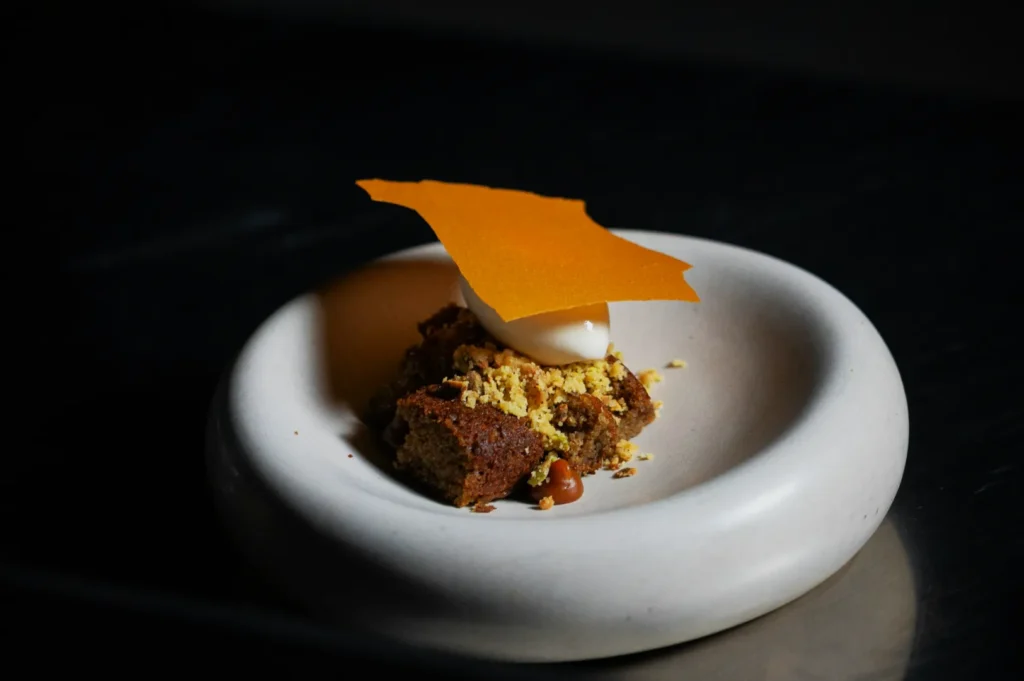
If you want your menu to look like one brand, you need repeatable styling choices. Not new ideas every shoot.
Pick a “Surface Trio”
Most menus only need three surfaces to cover 80 percent of dishes:
- A light neutral (off-white, pale stone, light wood)
- A dark neutral (charcoal, dark wood, slate tone)
- One brand surface (a signature colour, tile, or texture that matches your space)
This stops your photos from looking like random Pinterest experiments. It also speeds up shooting, because you are not re-inventing the set every time.
Keep Props Secondary
Props are supporting actors. If your props feel louder than your dish, you are styling the wrong thing.
Use props for:
- scale (spoon, chopsticks, glass)
- context (kopitiam cup, claypot, shared plates)
- mood (linen, wood, ceramic texture)
Avoid props that create cultural mismatch. Singapore diners notice. If the dish is heritage, your styling should respect that, even if the photo is modern.
When DIY Styling Is Enough, and When It Isn’t
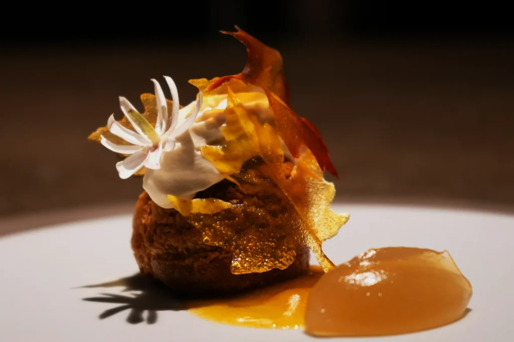
DIY aesthetic styling works well for:
- daily specials
- behind-the-scenes content
- quick social posts where speed matters
Professional food styling and menu photography becomes worth it when:
- you are refreshing the whole menu
- you are launching a new concept
- you need consistent images across 20 to 60 dishes
- your brand pricing depends on premium perception
That is where Food Photographer Studio helps. Not by “making it pretty,” but by building a consistent visual system across menu, website, and platforms, with the kind of repeatability you can rely on when you scale.
Aesthetic Styling Is Trust, Not Decoration
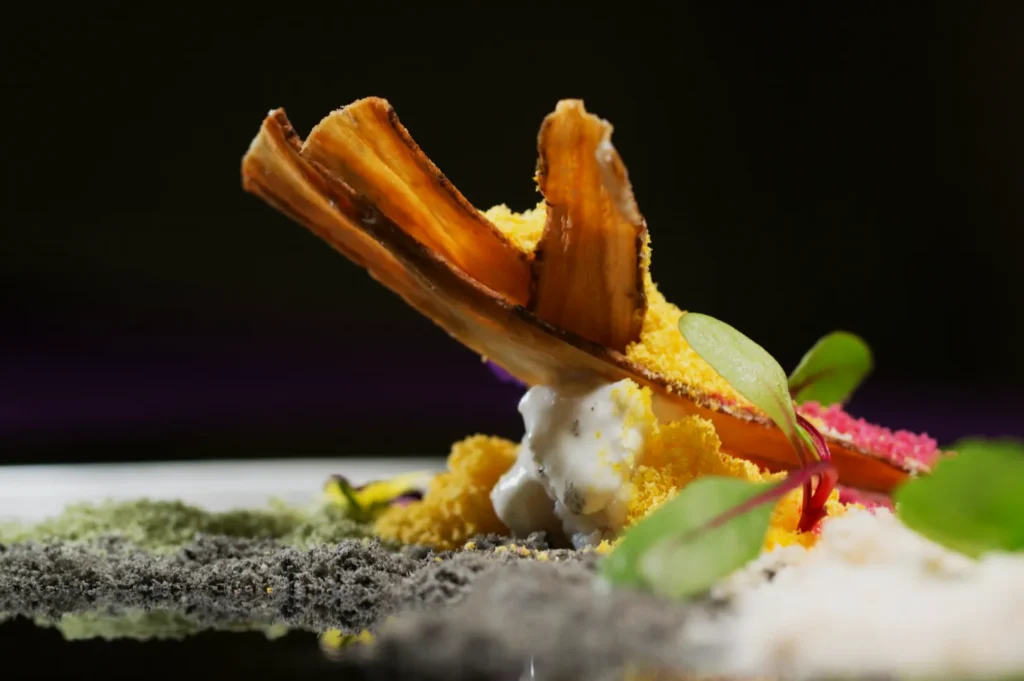
Aesthetic food styling is not about making food look expensive. It is about making food look true, clear, and irresistible. When you style a dish to look like itself, only better, you get more than a nice photo. You get less hesitation, more confidence, and fewer expectation gaps when the dish arrives.
If you want your visuals to feel consistent, believable, and unmistakably yours, start by tightening your styling choices and building a repeatable system. When you are ready to apply that system across a full menu, we can do the heavy lifting and keep the food looking real.