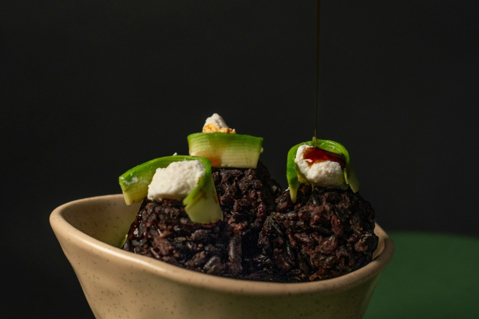
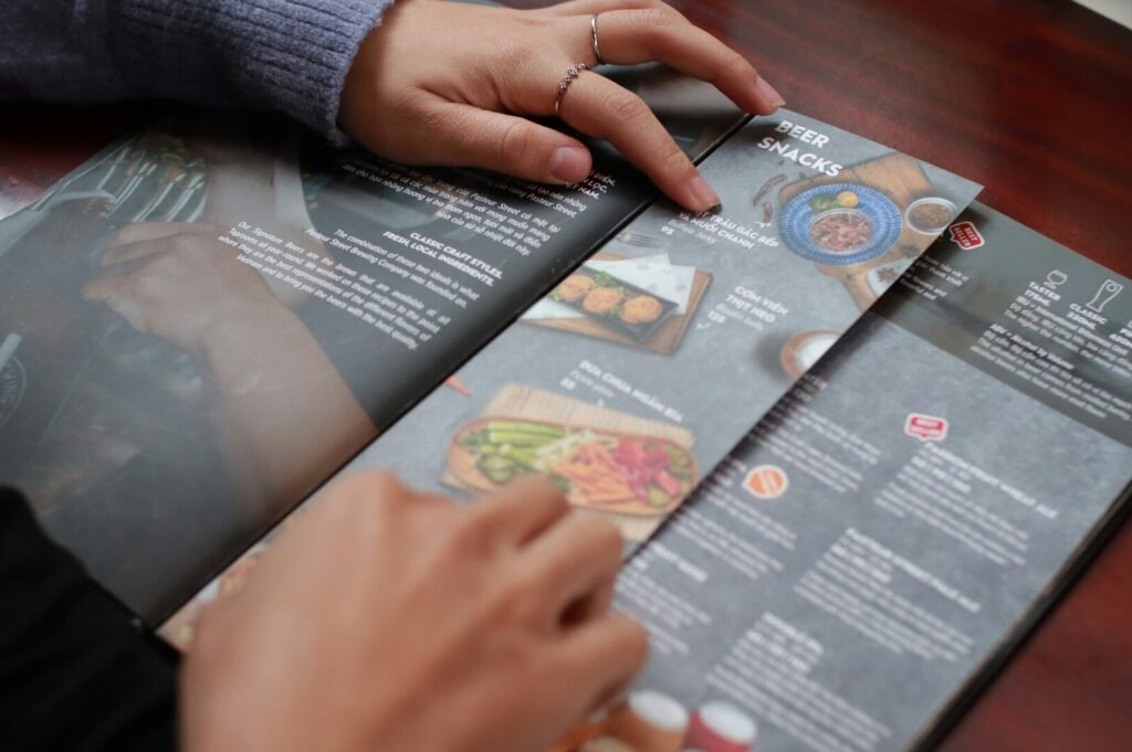
A diner rarely studies your menu like a novel. They scan, they compare, and they decide based on what feels obvious in the moment. That split-second judgment is why the art of photography matters in menu design. It’s not “extra”. It’s the part that turns a dish from text into a craving.
Menu photography sits in an interesting place between business and art form. It has to be clear enough to reduce doubt, but strong enough to shape mood, value, and expectation. In Singapore, where diners are visually sharp and choices are endless, the image often does the first round of persuasion before the description even lands.
This article gives you practical, usable takeaways: how brains process food images, where photos should sit on your menu, what composition choices make food feel more worth it, and the biggest challenges that quietly cost sales if your visuals don’t match reality.
Art of Photography in Menu Design: Why Diners Decide Fast
People “read” food photos with pattern recognition. The brain looks for signals: freshness, richness, portion, and quality. That’s why the most important thing isn’t having a fancy camera. It’s knowing how to quickly compose an image that makes sense instantly.
In Singapore, this plays out every day:
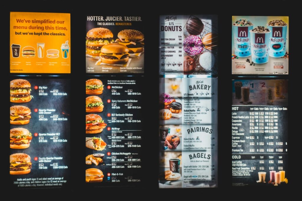
A coffee shop pastry photo that shows flaky layers and a clean print layout feels premium.
A bowl of laksa with no visible texture can feel flat, even if the real dish is excellent.
A menu portrait of a signature dish that’s too dark or too warm can make customers feel uncomfortable because they can’t tell what they’re buying.
Good menu photography respects attention. It doesn’t ask diners to work hard. It guides the eye, then lets appetite do the rest.
The Art Form of Menu Photography Psychology: How the Brain Processes Images
The “Appetite Shortcut” in Your Customer’s Head
When people look at food photographs, they don’t process them like neutral objects. The brain reacts to cues that suggest taste and reward. That’s why lighting, texture, and contrast matter even more than props.
Composition, Perspective and Attention
Composition is the tool that controls decision-making. If you’ve ever watched other photographers break down framing, you’ll hear the same point: composition is not decoration, it’s direction.
Use these principles:
Perspective: A top-down shot clarifies items like sharing platters. A 45-degree angle often sells height and layers (burgers, cakes, stacked toast).
Focus: Decide what detail carries the message: crispy edges, glossy sauce, steam, or filling. Then make that the sharpest point.
Depth: Even a small depth shift helps a dish look more “real” instead of like flat catalog imagery.
Color, Light, and Mood
Color influences appetite. Warm tones can feel comforting; cooler tones can feel fresh. The key is control. If your light is inconsistent, your food can shift away from reality: greens turn dull, meat turns grey, sauces look muddy.
A useful habit is to treat light like a sculptor treats form. It’s not just “enough brightness.” It’s where the highlights land, where the shadows sit, and what that does to mood.
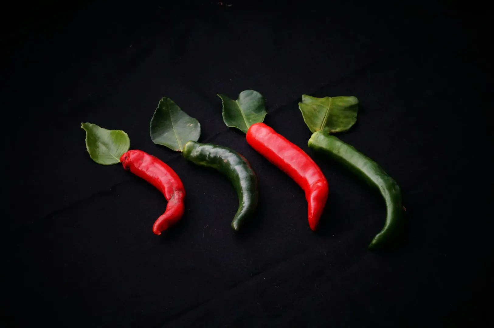
Singapore Examples That Show The Effect
Chicken rice: pale dishes need deliberate contrast, or they look washed out.
Chilli crab: reds pop best when the background and plate don’t compete.
Thosai: texture sells such as crispy edges and shadow detail matter more than a wide shot.
Creative Expression: Where Photography Art Matters Most on a Menu
Strategic Placement Without Overthinking It
Menus are scanned in patterns. While exact hotspots vary by layout, the principle is stable: place your best-performing, highest-margin items where eyes land early.
Use photography art in these areas:
Category openers (the first dish in a section)
Signature dishes (the “we’re known for this” plate)
High-margin items that need a nudge (set meals, premium add-ons)
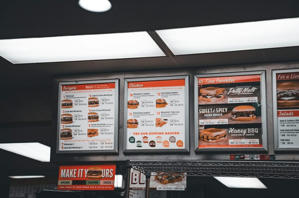
The Balance Between Photographed and Text-Only Items
If everything has a photo, nothing feels special. A clean approach is:
1-2 hero images per category.
A few supporting images for bundles or seasonal items.
Text-only for “utility” dishes unless they drive add-ons.
This is also where creative expression must stay disciplined. Your image can be beautiful, but it still needs to behave like a menu tool.
If you’re deciding how far to push mood versus clarity, this breakdown of fine art photography vs commercial food photography for F&B brands will help you choose the right approach for menus, campaigns, and brand storytelling.
Different Restaurant Types, Different Priorities
Fine dining: fewer images, more control, stronger mood.
Casual dining: clarity + value cues win.
Cafe: consistency across pastries and drinks is the important thing.
Digital Photography for Modern Menus: Print vs Screen Reality
Digital photography changed how menus behave. A screen crops tighter, highlights glare faster, and makes color casts more obvious. Your lens choice (or smartphone focal length) affects distortion, especially with wide angles.
For digital menus:
Keep framing consistent so the menu feels intentional.
Avoid extreme shadows that hide ingredients.
Make sure the image still reads on a small screen.
For print menus:
You can include slightly more atmosphere because the viewing distance is different.
Image quality matters more than people think—low-resolution photos look cheap in print, even if they looked “fine” online.
A good practical step: test your images on the actual medium. Don’t judge from the editing screen alone.
Shooting Film Mindset: Composition Techniques That Drive Orders
You don’t need to be shooting film to learn from it. Film forces intention because you can’t spray-and-pray forever. That mindset helps menu photography: fewer shots, stronger decisions, better results.
What Makes a Hero Shot Work
A hero shot should:
Show the dish clearly
Communicate portion and value
Capture a moment that feels appetising and believable
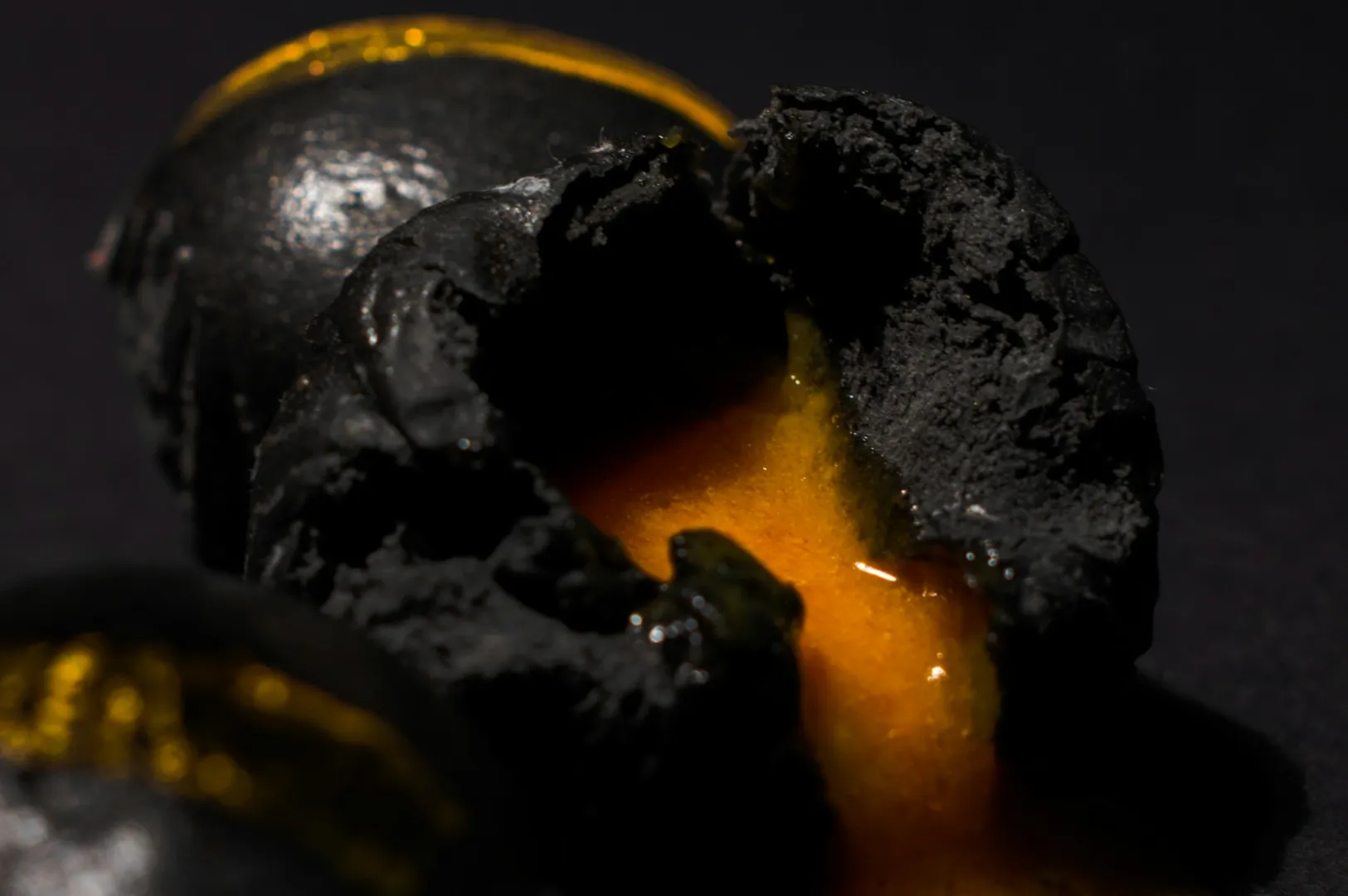
A hero shot is not a fantasy. If the real plate arrives and looks nothing like the photo, trust DROPS.
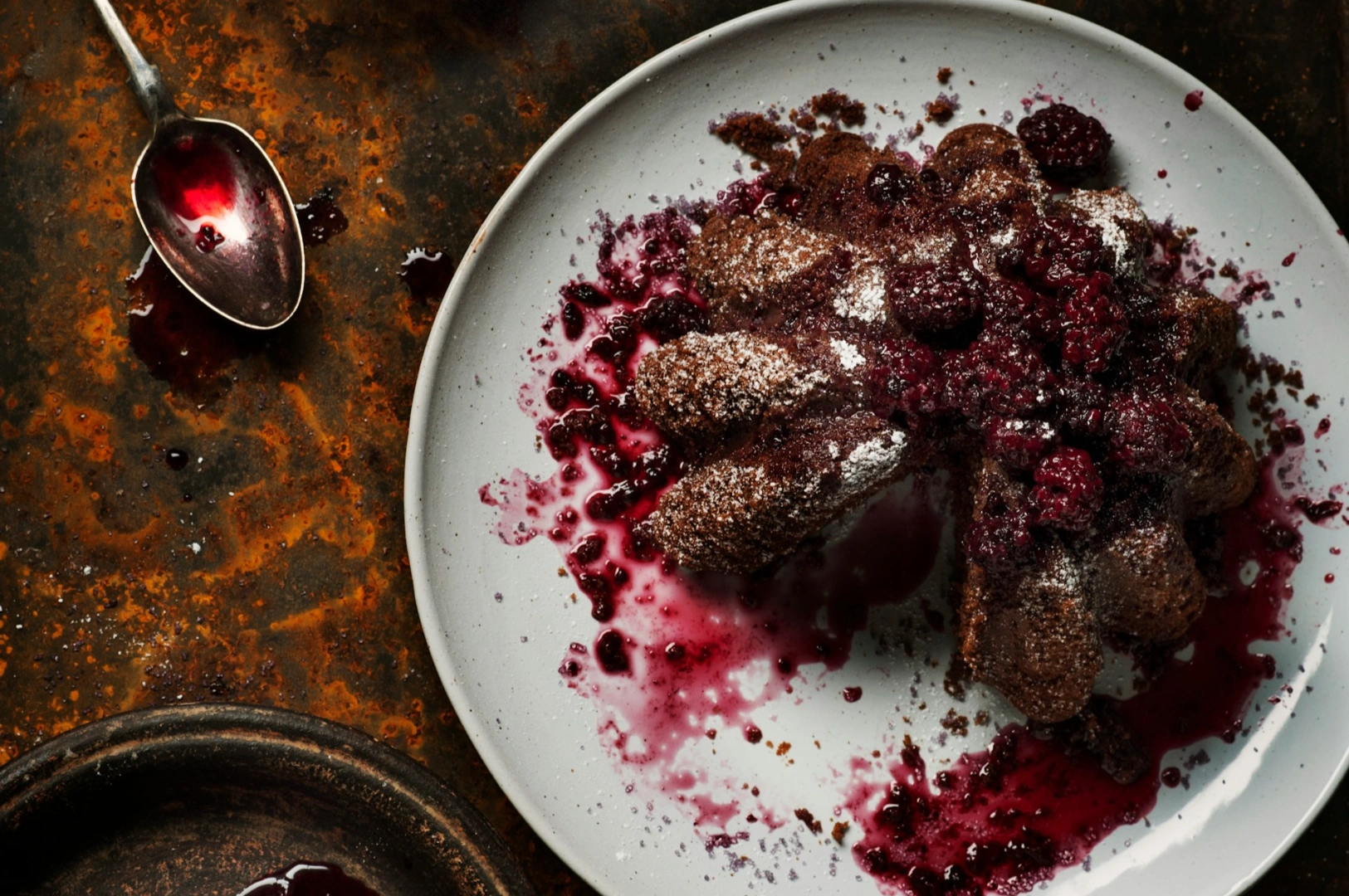
Honest Beauty vs Unrealistic Styling
The “perfect shot” is not the same as a useful menu photo. A bit of imperfection can signal life and warmth. The goal is to match the customer’s expectation, not to win a styling contest.
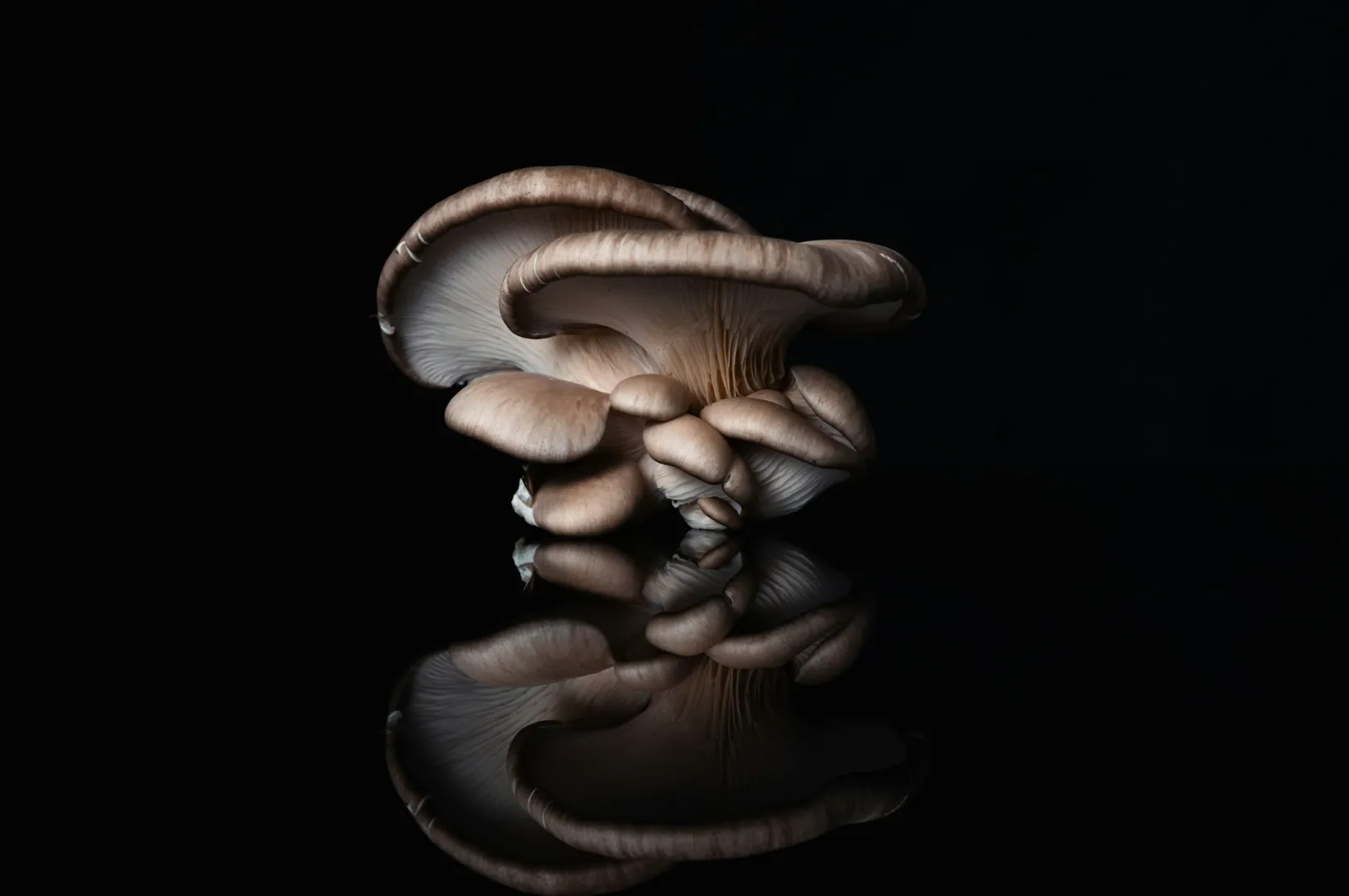
Black and White and When It Makes Sense
Yes, black and white can be powerful. BUT it’s rarely right for a selling menu image because color communicates freshness. Where black and white works:
Brand pages, story sections, chef features, or wall prints
A portrait of the team, a hands-at-work moment, or a moody kitchen scene
That’s where photography crosses into great art: less “order now,” more “this is who we are.”
Ted Forbes, Ansel Adams, and Henri Cartier-Bresson: Balancing Art and Business
If you’ve watched Ted Forbes videos or flipped through photography books in your free time, you’ll hear the same lesson repeated with different examples: your tools DON’T create the vision, your choices DO. The camera is a tool; the image comes from knowledge and intent.
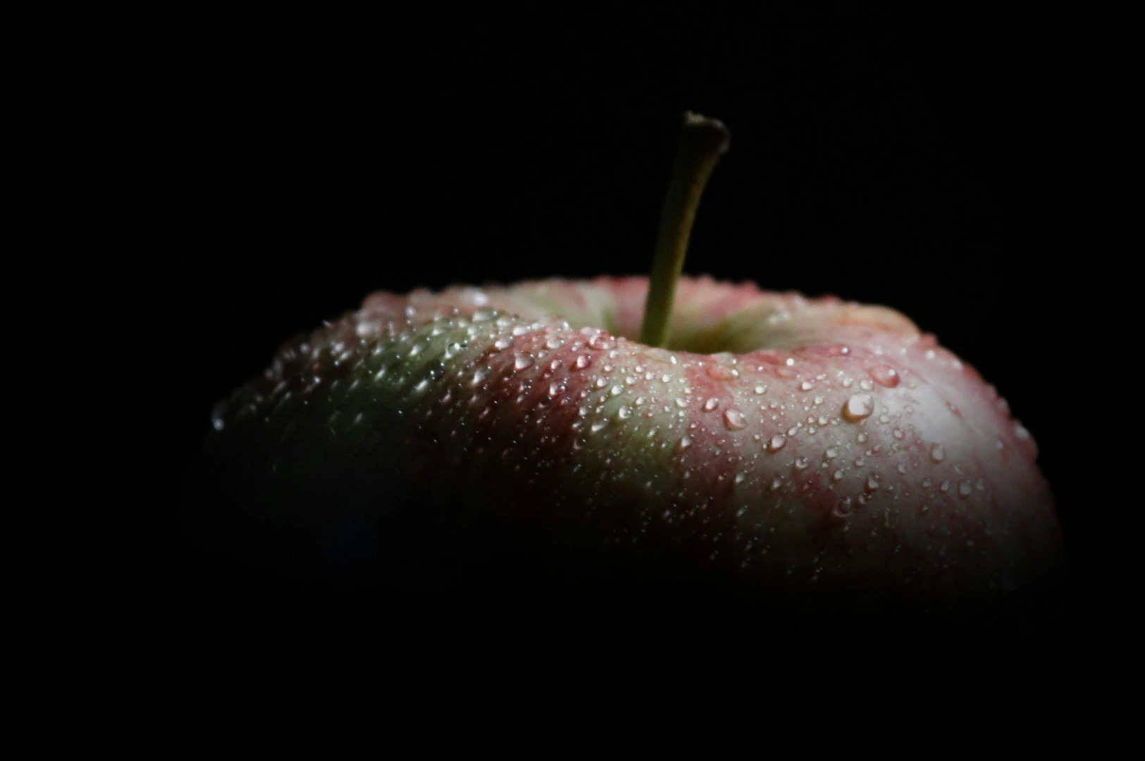
Ansel Adams showed how light and tonal control can shape emotion, especially in landscape work. That discipline transfers to food: highlights and shadows can make texture feel tactile.
Henri Cartier-Bresson is famous for the decisive moment. The idea that timing and framing happen together. In food, that might be the steam lift, the sauce pour, the first cut, or the split second before ice melts.
For menus, you’re not trying to be “artsy.” You’re trying to be effective. That’s the practical challenge: letting artistic thinking improve sales without drifting into confusing visuals. When you need a clearer decision framework, use this guide to fine art photography for restaurants (and when commercial imagery performs better) so your visuals stay aligned to what customers need at the point of order.
Two quick case examples:
Successful: a modern bistro uses clean, consistent menu images for ordering, but uses more artistic images on the website to tell stories.
Unsuccessful: a casual concept goes too moody on the menu: customers can’t see ingredients, so they play safe and avoid unfamiliar dishes.
Menu Photography Mistakes That Cost Sales
These are common, and they happen even to experienced operators:
Over-styling: the dish arrives and looks smaller or simpler than the photo → disappointment and refunds/complaints.
Inconsistent look: different lighting and editing styles → brand confusion.
Bad light: glare, green casts, muddy shadows → food looks less fresh.
Too many photos: cluttered layout → slower decisions and less appetite response.
Too few photos: unfamiliar dishes don’t move because customers can’t imagine them.
Each mistake has the same business impact: more hesitation, fewer confident orders.
Measuring Success: Does Your Menu Photography Actually Work?
Treat menu photography like a real operational change:
Track sales per item before and after photo updates.
For digital menus, A/B test a hero image or reorder a category and compare results.
Collect feedback in simple ways (staff notes on what customers ask most).
Watch behavior: do diners choose signature dishes faster? Do add-ons increase?
Good measurement turns “opinion” into clarity.
Conclusion: Photography Art That Helps Your Menu Sell
Menu photography is where photography meets business reality. When the art of photography is applied with discipline (using key elements like composition, light, and perspective combined with honesty) you get images that do what they’re supposed to do: reduce doubt, increase appetite, and build trust. This creative approach draws inspiration from the world around us and harnesses the ability of photography to connect diners emotionally with the food.
If you want next steps, start with one category. Choose one hero dish, plan the image properly, and see what happens to orders. Then scale.
If you’re looking to elevate your F&B business’s visual presence, consider working with experienced food photography professionals who understand Singapore’s dining culture and menu design constraints. Visit our website to see how expert food photographers can transform your menu and marketing materials.