A dish can be perfect in real life (glossy sauce, fresh greens, that final garnish placed with care) yet the photo still feels… off. If you’ve ever looked at your own post and thought, “Why does this look flatter than what we served?”, you’re not alone. More often than not, the issue isn’t your food, your creative vision, or even your natural light. It’s the food photography background you chose without thinking.
The best background for food photography does three jobs at once: it supports the food story, controls contrast, and keeps the overall look clean enough that the viewer notices the dish first not the backdrop. For Singapore’s F&B brands, that’s not just aesthetics; it affects clicks, saves, and whether someone decides your menu looks worth trying.
This guide breaks down surfaces, textures, and colours (yes, the colour wheel matters), with practical examples for local cuisines so your next food shoot looks intentional, polished, and very easy to repeat.
Understanding the Best Background for Food Photography: The 3 Fundamentals
A perfect food photography background isn’t “pretty.” It’s useful. We judge backgrounds using three fundamentals:
Texture: adds depth and realism, but shouldn’t compete with the food.
Colour: shapes mood, appetite, and how ingredients pop.
Material / finish: matte vs glossy can make or break quality.
Here’s the rule we keep repeating on set: if you notice the background before the food, the right background wasn’t chosen. A great surface frames the dish, supports other elements (like props and plates), and helps your images feel consistent across posts.
Food Photography Background Materials: When to Use What
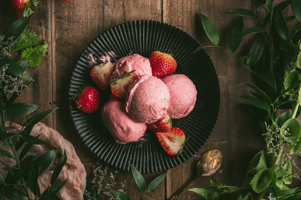
Wood: the go-to for warmth and “real life” comfort
Wood is a reliable go to because it instantly feels familiar. A clean plank or worn tabletop helps hawker classics and hearty dishes look grounded. Dark wood adds mood; light wood keeps things bright and fresh. If you’re using a board, use an entire board large enough so it doesn’t end abruptly in an overhead frame.
Marble: polished, premium, and bright
Marble is crisp and clean. It’s popular for desserts and café plating because it reflects “quality” without shouting. Just watch reflections, choose matte accessories where possible so the surface doesn’t steal attention.
Concrete / stone: modern, matte, and super easy to control
Concrete-style food photography backdrops are loved for a reason: matte finish, subtle texture, and fewer ugly hotspots. They suit modern concepts (Jalan Besar cafés, fusion bowls, craft drinks) and don’t fight bold colours.
Fabric and linen: soft texture that adds life
A linen backdrop or napkin adds softness and depth, especially when you want a scene that feels lived-in. Keep it in several colors that suit your brand (oat, grey, muted blue). Avoid loud patterns unless you’re very careful.
White surfaces: clean menu documentation
For consistent menu images, white can be the best food photography backdrops choice. It keeps the dish readable and the portion clear. Use matte white if you can—glossy white can still glare.
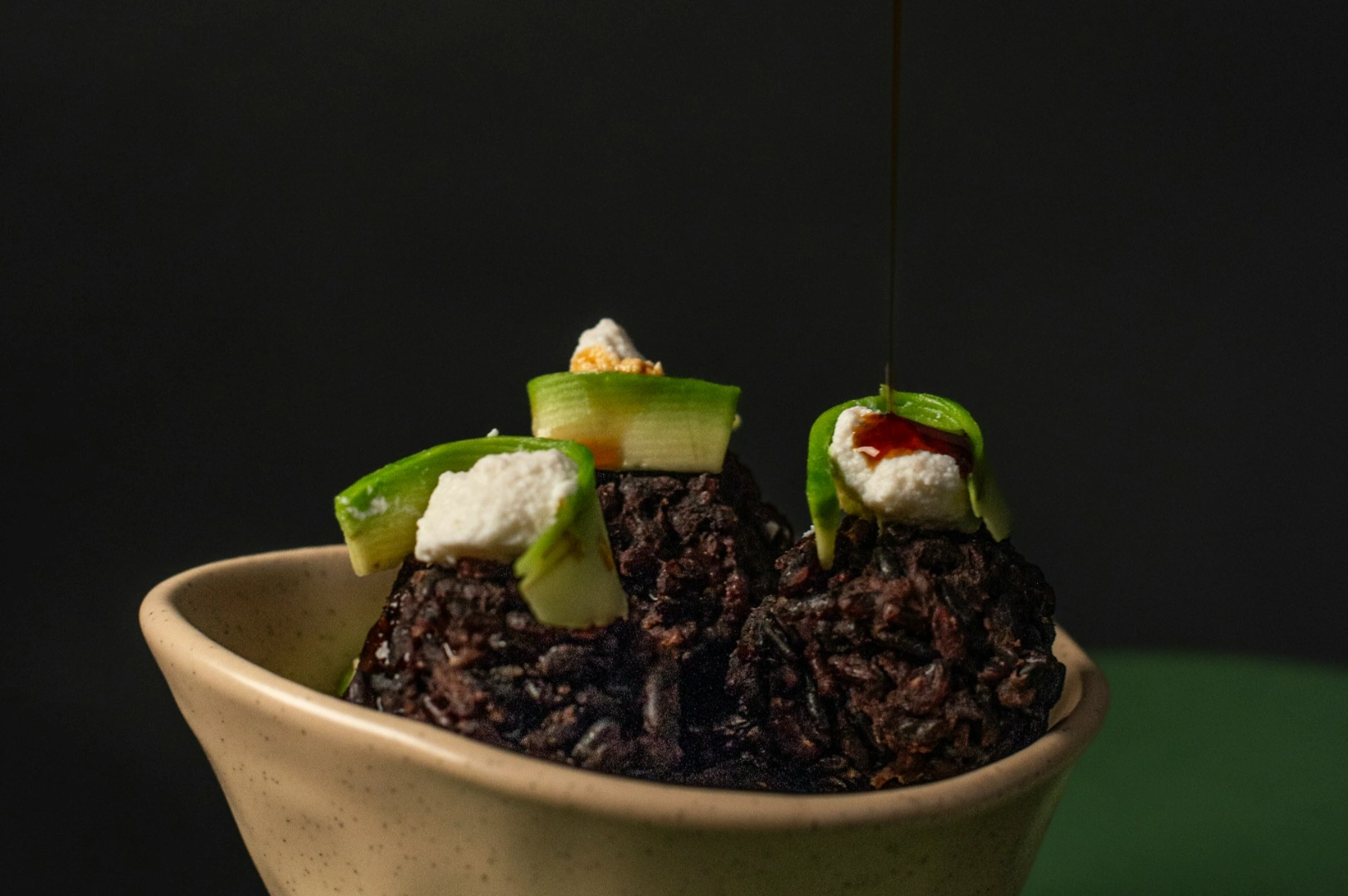
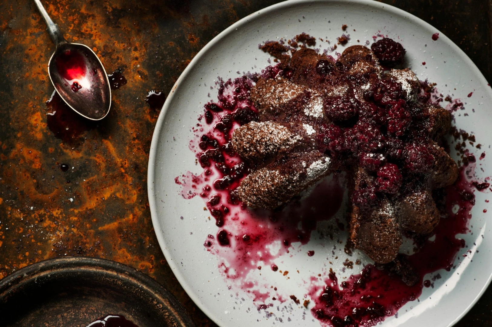
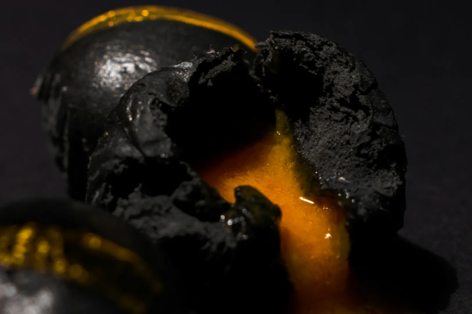
Dark surfaces: moody drama that highlights steam and shine
Dark slate, matte black, and deep charcoal create contrast that makes herbs, sauces, and glossy textures pop. This background is excellent when you want a premium, dinner vibe—just ensure you have enough light.
Food Photography Backdrops You Can Actually Reuse and Store
If you’re shooting regularly, you need backdrops that don’t become a storage nightmare. This is where vinyl backdrops shine.
Vinyl backdrops: wipeable, affordable, and consistent
Roll-up designs for easy storage
Some are double sided, which is a smart purchase if you want two looks in one board
Look for matte finish to avoid glare
If you’ve seen “CBL backdrops” (some vendors label them this way), the key is the same: matte + neutral + consistent colour over trendy prints
A good backdrop should be a practical tool, not a fragile art piece you’re scared to use.
If you’re setting up a repeatable workflow on a budget, our food photography diy guide walks you through simple tools, light placement, and a basic home setup.
Photography Backdrop Colour Theory That Makes Food Pop
Colour is appetite psychology. It’s also physics; colour casts can ruin how food looks.
Use the colour wheel to plan contrast
Orange-rich dishes (laksa, curry, chilli crab) pop against cool tones like muted blue and slate.
Green-forward dishes (salads, herb-heavy bowls, veggie plates) look fresh against warm neutrals and wood.
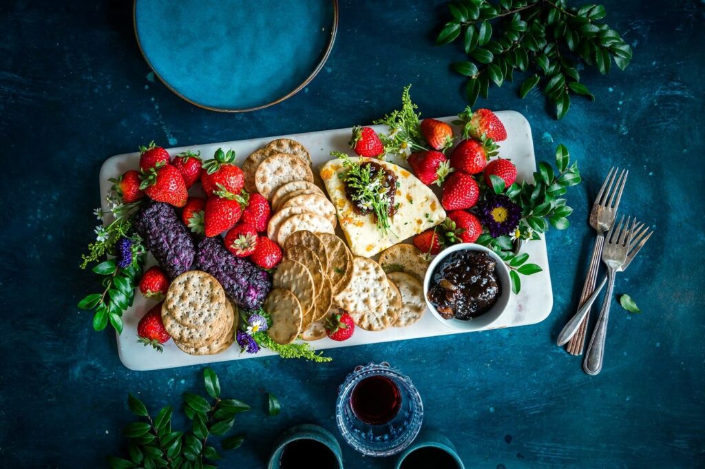
Neutral vs colourful backgrounds
Neutral backgrounds (grey, white, beige, brown, matte black) are the safest. Colourful backgrounds can work, but they’re risky. Strong colour reflects onto your dish and changes how proteins and sauces appear.
Light vs dark
Light backgrounds = fresh, daytime, airy.
Dark backgrounds = intimate, premium, serious.
If you’re undecided, start neutral. You can always add colour with small props, not the entire surface.
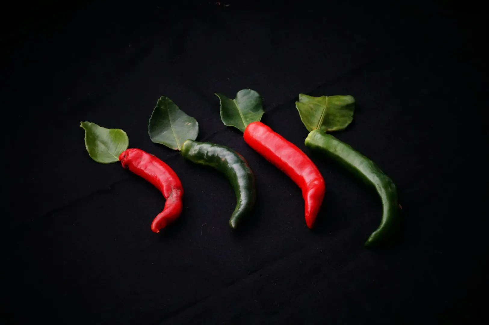
Photography Backgrounds Matched to Singapore Cuisines
Hawker and local classics
Chicken rice, char kway teow, bak kut teh. Tthese look most believable on wood, vintage tile, or weathered metal. Avoid loud yellow or neon surfaces unless your brand identity is intentionally playful.
Chinese dishes
Chilli oil, soy glazes, deep browns—dark wood and stone backgrounds help these dishes look rich. If your dish is already dark, introduce contrast with lighter plates and a matte surface.
Western café fare
For flat whites, croissants, brunch plates: marble, light oak, terrazzo, and clean neutral backgrounds keep the scene bright and “weekend-friendly.”
Fine dining
Premium plating benefits from restraint: solid colours, polished surfaces, minimal patterns. A high-end surface signals value before the diner reads the caption.
Texture: The Quiet Upgrade Most Brands Forget
Texture adds dimension without extra clutter. Think: pores in concrete, grain in wood, weave in linen. That subtle variation helps your images feel real instead of flat.
But texture should whisper. Busy patterns such as strong geometric tiles, loud prints, pull attention away from the dish. If you want patterns, keep them muted and out of focus, so the main subject stays dominant.
Sourcing Food Photography Backdrops in Singapore
You don’t need to import expensive materials.
Hardware shops: boards, tiles, laminates (good for creating a portable surface)
Art supplies stores: paper textures, backdrops, matte sprays
Online: vinyl, roll-up backdrop sets (look for matte + neutral + good size)
Second-hand finds: trays, worn boards, old panels that add character—just clean them properly
If you’re building a starter setup and want a simple, repeatable method, your DIY guide is a great companion read (see link placements below).
Common Background Mistakes That Make Photos Look Amateur
Busy patterns: the background competes with the food
Glossy surfaces: harsh reflections ruin detail
For a straightforward way to avoid glare and messy backgrounds, start with this DIY setup for better food photos before you invest in new surfaces.
Inconsistency: breakfast looks “brand A,” dinner looks “brand B”
Poor colour matches: red pasta on a red background disappears
Wrong size: background too small for overhead shots (you see the table edge and it breaks the scene)
Conclusion: The Right Background Sells the Dish Before the Caption Does
The best background for food photography is the one that supports your dish, protects your colours, and makes your menu look consistent across channels. Once you understand materials, texture, and colour contrast, you’ll stop guessing—and start building a repeatable system that makes your food photos look more premium with less effort.
If you’re ready to tighten your visual workflow, start with one surface you can reuse, one matte neutral backdrop, and a lighting spot you trust. Then build from there, one smart purchase at a time.