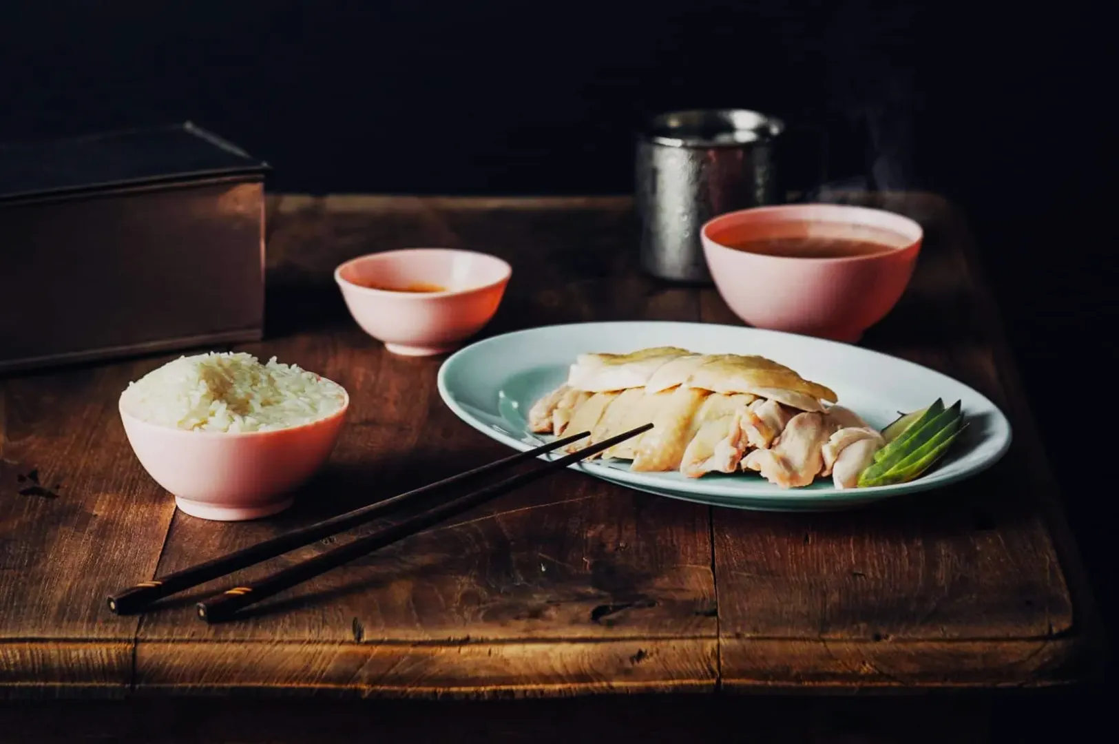
Picture a familiar Singapore scenario after a long shoot. You capture a stunning bowl of laksa or a fresh plate of chicken rice, but straight out of the camera, it looks yellow and dull. The food tastes absolutely great, but the photo looks muddy, too warm, or strangely green.
Getting your food to look irresistible on screen requires a reliable post-production process. We are going to share a workflow that works flawlessly in Lightroom, Capture One, and even advanced phone editors. As a studio shooting daily for local F&B brands, we know exactly how to turn flat RAW files into craveable images quickly.
What Colour Grading Actually Means For Food (In Normal Words)
Colour grading food photography simply means shaping the mood and appetite appeal after the image is already colour-correct. It is very different from basic colour correction, which only aims to fix obvious lighting mistakes. Grading is where you add your restaurant’s unique signature style and make the dish look truly mouth-watering.
You must always correct the image before you start adding creative grades. If your whites and neutrals are wrong, the whole dish feels wrong. Editing food photos colours requires discipline to ensure the final result still looks like real food.
The Three Food Colour Goals You Should Grade For
Your first goal is achieving perfectly believable neutrals. The white plates, napkins, and rice must look clean so the viewer trusts the image.
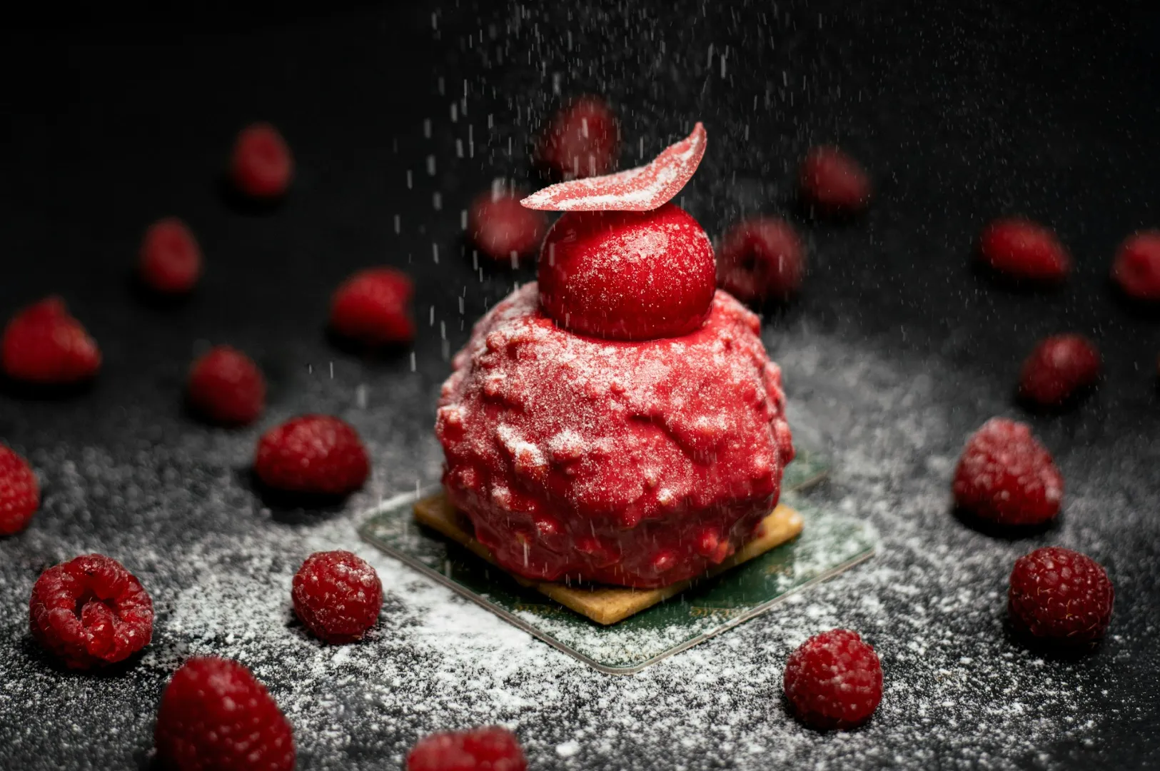
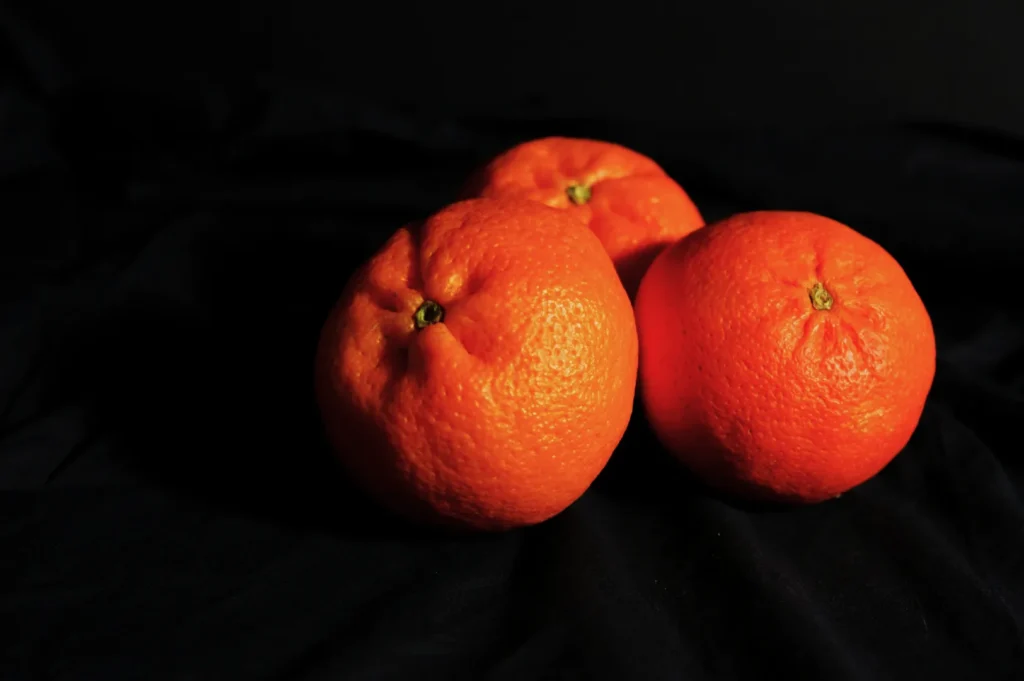
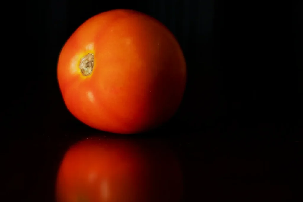
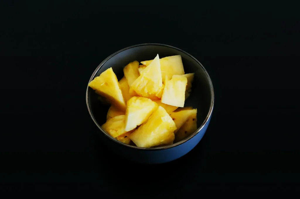
Your second goal is creating appetising hero colours. You want the chilli crab red to look rich and the pandan cake green to look vibrant and fresh. The laksa coconut milk should look creamy rather than heavily tinted by the room lights.
Your final goal is ensuring series consistency across the entire gallery. Every image must look like it belongs to the same restaurant and was shot on the same day.
Start With A Clean Base (Before You Touch Any “Style” Sliders)
Set White Balance And Tint Intentionally
You must set your white balance using a clear neutral reference in your frame. A white ceramic plate or a bright paper napkin works perfectly for this task.
If your image looks too yellow, pull the temperature slider slightly towards blue. If the shadows look strangely green, push the tint slider slightly towards magenta until the plate looks clean.
Fix Exposure So Colour Has Room To Look Good
You cannot properly grade a dark or underexposed file. Pushing colours on a dark image immediately causes muddy and unappetising colour shifts.
Lift your overall exposure until the brightest parts of the food look vibrant and natural. You must also protect the bright highlights on glossy sauces and iced drinks so they do not blow out into pure white blobs.
The Editing Workflow (Do This In Order Every Time)
Global Adjustments First (The “No Regrets” Moves)
Always start with your global contrast and tone curve guidance. Adding a gentle “S” curve builds natural contrast that makes the food pop off the plate.
Be incredibly careful with texture, clarity, and dehaze sliders. Pushing clarity too high makes natural food look gritty, dry, and highly artificial.
Colour Mix And HSL (Touch Only The Colours That Matter)
You only need to adjust two to four colours to make a massive impact on your final image. Prioritise your reds, oranges, yellows, and greens, as these represent 90 percent of all food ingredients.
Fix oranges before you push reds. Orange usually controls the roasted tones and fried batters, so balancing it first prevents your reds from looking like glowing plastic.
Local Adjustments (Rescue The Problem Areas Without Ruining The Whole Photo)
Local adjustments allow you to fix specific problem areas without changing the entire scene. Use a brush tool to clean up yellow casts on white plates.
You can also use a targeted mask to reduce harsh highlights on oily broths. If a green wall bounces ugly light into the corner of your frame, simply brush over that area and lower the saturation.
Calibration, Profiles, And Look (One Subtle “Signature” Is Enough)
Camera calibration and colour profiles give your images a final unified polish. Applying one subtle signature profile helps tie all your different lighting setups together. Keep the intensity low so the food retains its natural, realistic appeal.
Do This, Not That Rules For Clean, Appetising Colour
- Do: Reduce your background saturation first to let the hero dish stand out.
- Not that: Do not boost the global vibrance slider, as it makes everything look radioactive.
- Do: Keep your fresh greens lifted in luminance so they look crisp and healthy.
- Not that: Do not push green saturation so high that vegetables look fake.
- Do: Protect the clean whites on your ceramic plates and steamed rice.
- Not that: Do not let warm editing presets turn your whites yellow or orange.
- Do: Keep your reds deep by controlling orange tones and highlight clipping.
- Not that: Do not overexpose red sauces until they lose all their rich texture.
Common Singapore Food Problems (And The Fast Fix)
- Problem: Hainanese chicken rice looks excessively yellow and oily.
Fix: Cool down the white balance and slightly desaturate the yellow channel. - Problem: Pandan desserts and fresh herbs look grey and lifeless.
Fix: Lift the luminance of the green channel in your HSL panel. - Problem: Rich chilli crab turns bright orange.
Fix: Shift the red hue slider slightly towards magenta to restore the deep red. - Problem: A bowl of curry looks muddy and lacks definition.
Fix: Add a targeted exposure brush to lift the shadows and boost local contrast. - Problem: The whites on your ceramic plates look distinctly green.
Fix: Push your global tint slider towards magenta until the green cast disappears.
Make The Whole Set Match (Menus, Carousels, And Weekly Content Days)
Build One Reference Frame
You must build one gold standard image that serves as your benchmark. Edit your best, most balanced photo first until the colours look absolutely perfect. Keep this reference frame open on your screen and match every subsequent edit to it.
Keep Skin Tones And Wood Tones Believable
Your environment colours dictate whether the food looks premium or cheap. If the wooden café table goes bright orange, the whole frame immediately looks heavily filtered and amateur. Ensure your wood tones and any visible hands in the frame look completely natural.
Copy And Paste Checklist (For Editing Days)
- Set WB and tint using a neutral reference
- Lift exposure until whites look clean
- Global tone first, style second
- Adjust only key colours (usually reds, oranges, yellows, greens)
- Use local adjustments for plates and casty corners
- Compare every export to one reference image
Clean Colour That Makes The Food Look Like It Tastes
Mastering colour grading food photography guarantees your images look as delicious as the dishes taste. Building a reliable editing workflow transforms frustrating post-production into a fast, repeatable process.
To understand the foundational theories behind these editing choices, review the core colour principles for food photography to sharpen your eye. If your F&B business needs professional, crave-worthy imagery that perfectly represents your brand, the team at Food Photographer Studio is ready to help. Try creating your single reference frame on your very next editing day to see how much faster your workflow becomes.