Imagine the rich steam rising from a freshly poured bowl of laksa or the glossy red glaze on a perfect plate of char siew. If the broth looks slightly green or the meat appears gray, all that mouth watering appeal vanishes instantly. Great food can look completely flat and unappetizing when the colours are off. Yellow whites, dull reds, and neon oversaturation are common issues that plague many restaurant menus.
Understanding colour in photography is the secret to making your culinary creations look believable and craveable. We will walk you through a practical framework from set styling to final export. As a team that works closely with local F&B brands, we know that colour is a fast lever for shaping appetite and brand perception.
What Colour in Photography Actually Means
Colour in photography goes far beyond simply applying a bright filter to your image. It comes down to managing Hue, Saturation, and Luminance in a way that feels natural to the human eye. Hue refers to the actual colour itself, saturation is the intensity of that colour, and luminance is how bright or dark it appears.
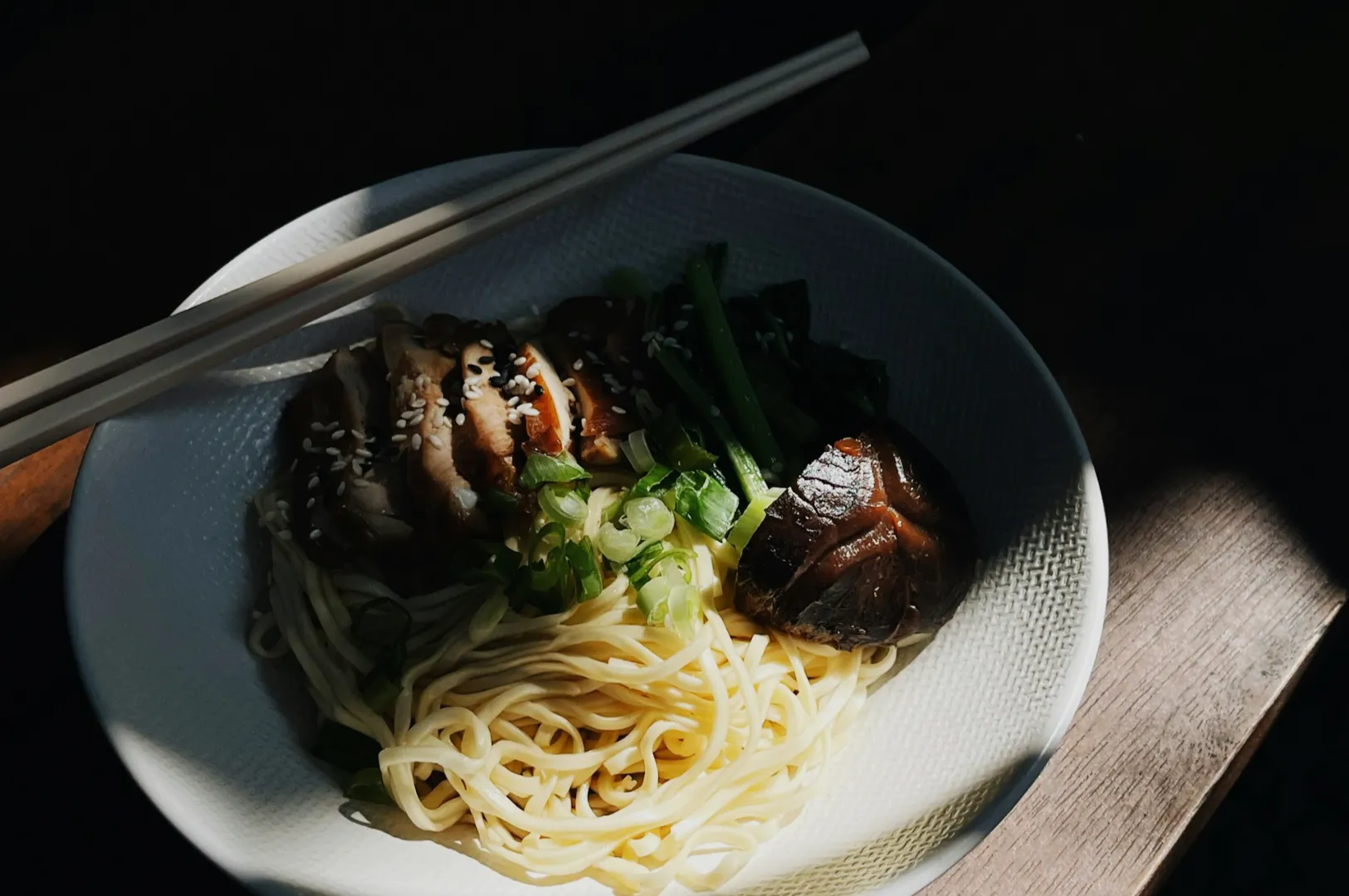
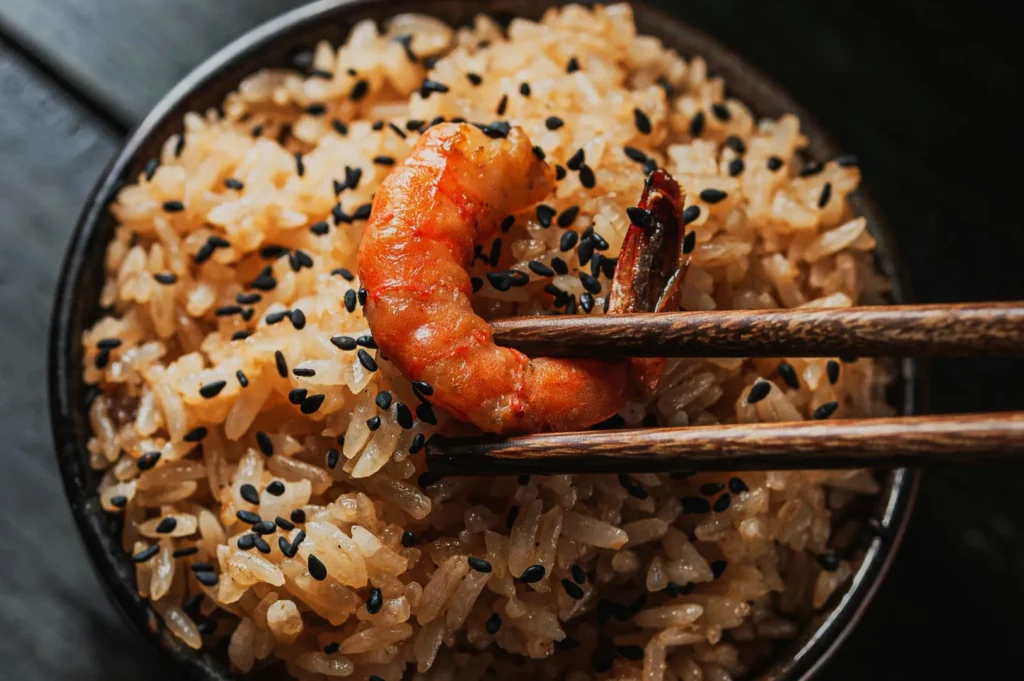
When photographing food, we rely heavily on “memory colours” to trigger an appetite response. We expect clean white plates, fresh green herbs, non-gray meats, and rich savory sauces.
- Quick Takeaway: If the colour feels believable to the viewer, the food instantly feels delicious. Master the natural look before adding stylized edits.
The Food Colour Framework
Creating a repeatable approach to colour ensures your food always looks its best. You need a clear model that handles the most important aspects of visual appeal. Here is our simple four part framework for mastering food colours.
Managing Colour Temperature
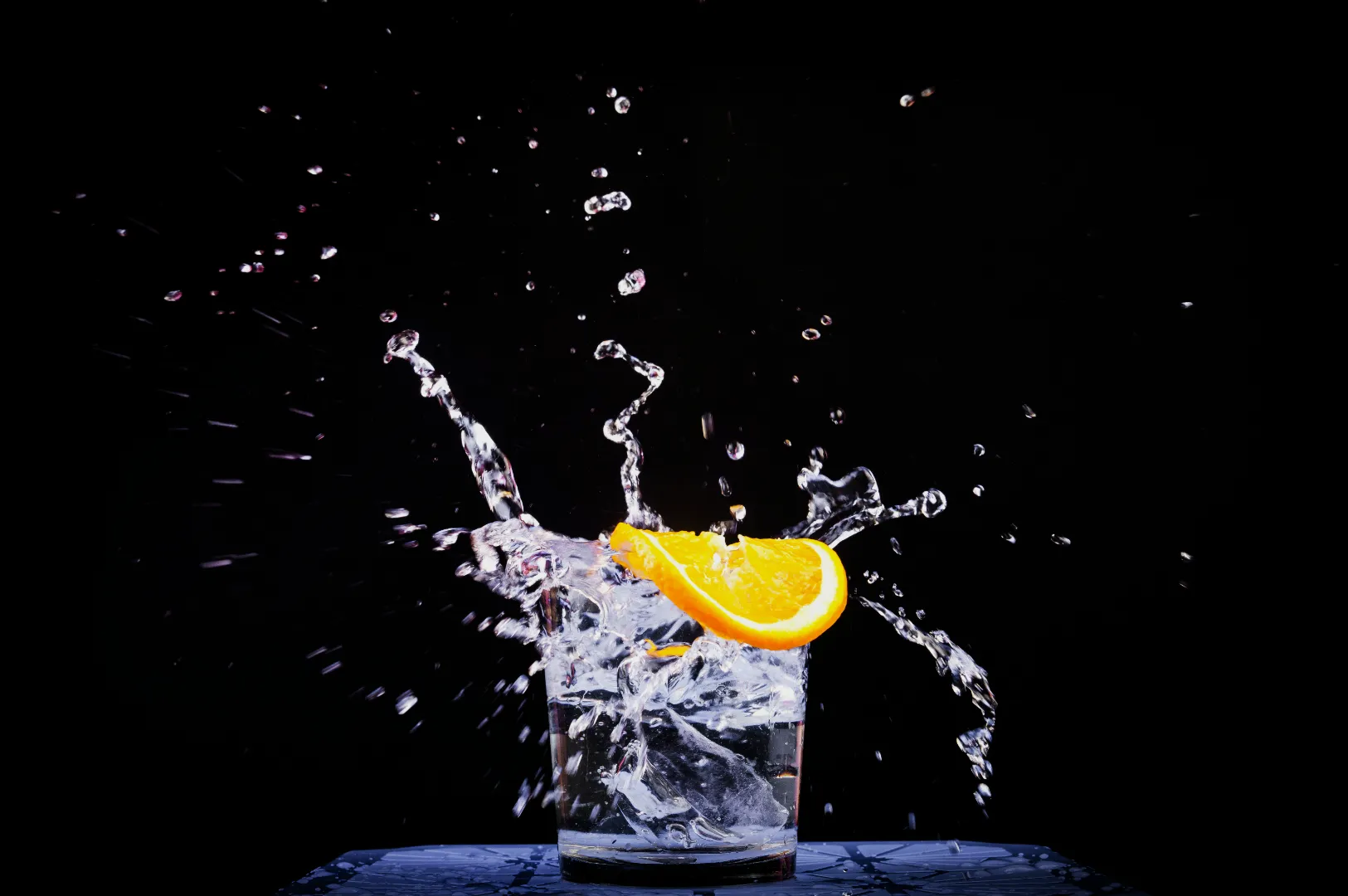
Colour temperature dictates whether your image feels warm and inviting or cool and refreshing. Warm tones work beautifully for a hearty bowl of beef rendang or freshly baked pastries. Cool tones are perfect for making an iced lemon tea look crisp and thirst quenching.
Achieving Colour Harmony
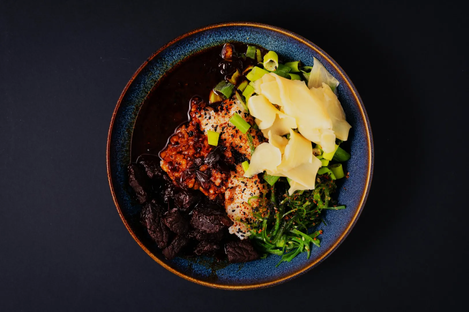
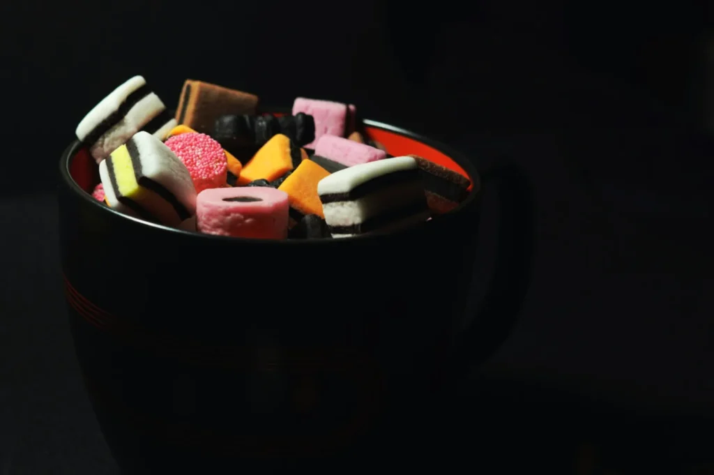
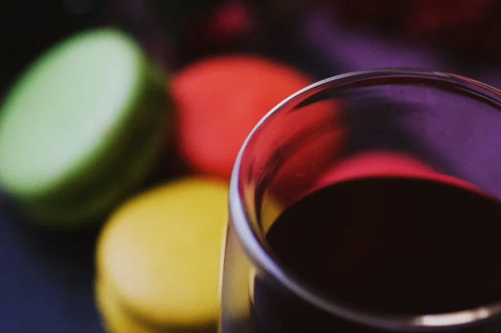
Harmony happens when the colours in your frame naturally belong together. You can use analogous colours, which sit next to each other on the colour wheel, for a smooth and sophisticated look. A triadic colour scheme works well when you want vibrant, balanced energy across a busy table setting.
Creating Contrast
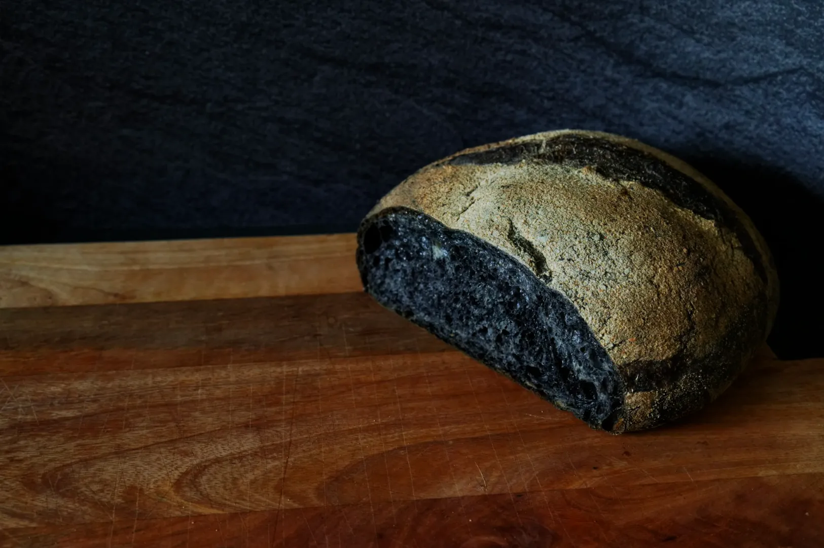
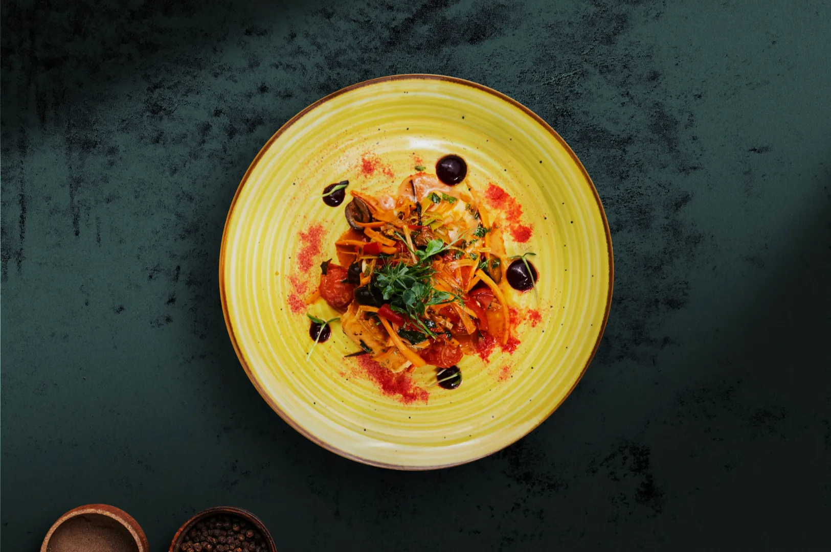
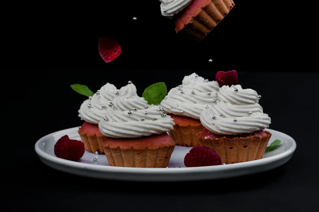
Contrast helps the hero ingredient stand out from the background and supporting props. Hue contrast places opposite colours together, like a bright green pandan leaf next to a red chili. You can also use luminance contrast by placing a bright white bao bun on a dark slate board.
Maintaining Brand Consistency
Your colour choices must align with your overall restaurant identity. A moody, dark café will use a very different colour palette than a bright, family friendly hawker stall. Keeping your colours consistent helps build strong brand recognition across all your marketing channels.
Control Colour on Set Before Editing
The best editing workflow always starts with capturing perfect colours on set. Lighting is the real source of most colour problems in commercial food photography. Mixed lighting and ugly colour casts happen when indoor restaurant bulbs mix with natural window light.
You must establish one dominant light source and turn off any conflicting practical lights in the room. Watch out for coloured bounce light reflecting off bright yellow or red walls near your table. We always recommend doing a quick white plate test shot to see if the plate actually looks white on camera.
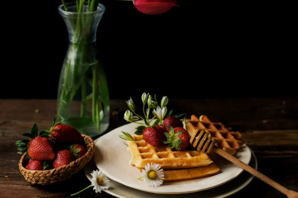
Styling with deliberate colour roles is a fast way to make the food pop naturally. Define your hero colour first, then add supporting neutrals and small accent pops. For a rich yellow chicken curry, use a neutral ceramic bowl and add a tiny pop of fresh green cilantro.
Backgrounds and props should always be chosen by contrast, not just personal taste. A warm dish generally looks better against a cooler or neutral background to create separation. Avoid using brightly coloured props that create unwanted colour casts on your food unless it directly matches your brand identity. Remember that negative space helps your brightest colours read much better in the final composition.
White Balance Made Simple
Setting your white balance is a deliberate decision about what should look perfectly neutral in your frame. It removes the guesswork from capturing accurate food tones. If your white balance is wrong, your rice might look yellow or your fresh vegetables might look blue.
You can use in-camera Kelvin starting points for a quick baseline. Window light is usually around 5500K, while warm tungsten bulbs hover around 3200K. For precise commercial work like menus or product packaging, a custom white balance or a gray card is absolutely essential. Shooting in RAW format gives you the ultimate advantage, allowing you to fix white balance easily during editing.
Common issues require quick and confident fixes on set. If your whites look yellow, lower your Kelvin temperature until the plate looks clean. If your shadows look too blue, warm up the scene slightly or adjust your tint slider.
Colour Harmony and Contrast for Food
Understanding colour theory makes your dishes look highly professional and intentional. Analogous and complementary colour schemes are your best tools for creating visual interest. The “premium look” trick used by many fine dining restaurants involves lower saturation, clean whites, and gentle contrast.
Contrast is what ultimately sells the dish to the viewer. You can rely on hue contrast, luminance contrast, or saturation contrast to draw the eye. The rule of thumb is to pick one main contrast type and keep the rest of the image supportive.
If you have high saturation contrast, keep the brightness levels relatively similar to avoid overwhelming the viewer. If you want high luminance contrast, keep the colours simple and monochromatic.
Editing Workflow for Delicious Colours
Position your editing workflow as a final polish, not an emergency rescue mission. A clean, believable, and consistent edit elevates your brand immediately.
Follow this step by step workflow for perfect results:
- Correct your white balance and tint to establish a clean baseline.
- Adjust your global tone by fixing exposure, highlights, and shadows.
- Tweak your HSL and colour mix, focusing carefully on the reds, greens, and yellows.
- Make local adjustments to clean up plates, brighten napkins, and lift dark shadows.
- Apply optional camera calibration profiles to unify the overall colour palette.
You must avoid the temptation to push sliders too far. Oversaturated reds look like plastic, and radioactive greens make vegetables look toxic. Muddy oranges ruin the appeal of fried foods, and crushed shadows destroy beautiful textures.
Brand Consistency for F&B Marketing
Making colour work for your marketing is vital for any modern F&B business. When a customer scrolls through your social media feed, they should instantly recognize your visual style. A simple brand colour checklist helps maintain this signature mood.
Determine your approved background tones, your specific accent colours, and ensure all skin and wood tones look believable. This consistency is crucial when planning a menu refresh, launching a seasonal campaign, or introducing a new product. A cohesive colour story builds trust and makes your establishment look highly professional.
Troubleshooting Common Colour Problems
Even with great planning, you will encounter tricky colour scenarios. Here are some quick fixes for the most common issues:
- Yellow whites -> Lower your colour temperature or use a gray card to set a custom white balance.
- Dull greens -> Increase the luminance of the green channel slightly in your HSL panel.
- Reds looking too orange -> Shift the red hue slider slightly towards the magenta side.
- Mixed lighting casts -> Turn off indoor overhead lights and rely entirely on one clean light source.
- Muddy sauces -> Add a targeted exposure brush to lift the shadows and boost local contrast.
On-Set Colour Checklist
Use this simple copy and paste checklist to ensure your colours are perfect before you start shooting.
- One dominant light source is established.
- White plate test shot looks perfectly clean.
- Hero colour is clearly visible and appetizing.
- Background supports the food and does not compete.
- One main contrast choice is utilized.
- White balance is set intentionally with Kelvin or a gray card.
Conclusion
Mastering colour in photography transforms an average plate of food into a stunning visual experience. By controlling your lighting, understanding contrast, and editing with restraint, your dishes will always look incredible. We encourage you to practice these techniques during your next menu update to see the difference immediately.
When you need flawless, colour consistent images for your menus, social content, or upcoming product launches, expert help is available. The team at Food Photographer Studio knows exactly how to capture the mouth watering essence of your brand. Contact us today to elevate your culinary visuals and attract more hungry customers to your tables.