We’ve all seen it: a restaurant menu where the food photos look cramped, chaotic, and unappetizing. The dishes might be delicious, but the images are cluttered, leaving your eyes with nowhere to rest. Compare that to a clean, well-composed shot where a single dish shines against a textured background, making you instantly crave a bite. That visual difference isn’t accidental; it’s the result of deliberate composition techniques in food photography. It begins with a deeper understanding of what is negative space in photography and how it shapes visual balance, especially in commercial food imagery.
For Singapore restaurant owners and F&B marketers, mastering the art of balancing your frame is crucial. It’s the difference between a customer scrolling past your Instagram post or stopping to hit “Order Now.” Food photography composition techniques serve as the practical bridge between understanding abstract concepts like negative space and actually applying them to your menus and marketing materials. By learning to create negative space intentionally, you can transform your food photos from messy snapshots into powerful sales tools.
Understanding Food Photography Composition Techniques for Commercial Use
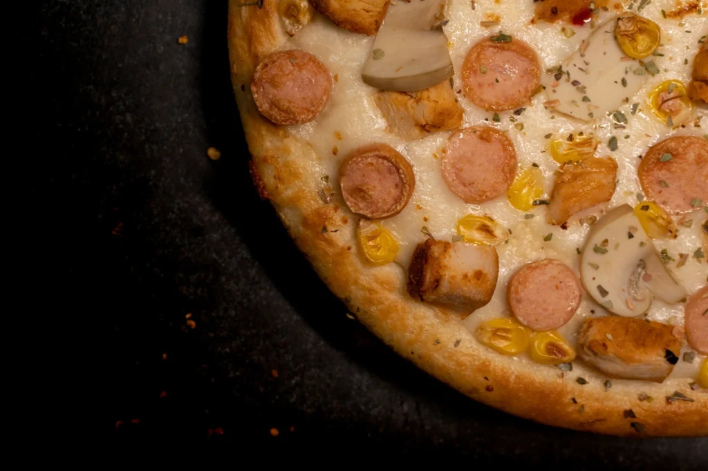
Commercial food photography composition focuses on directing the viewer’s eye to the most profitable part: the food. Effective composition techniques boost conversion rates, social engagement, and elevate brand perception.
Negative space plays key roles: providing white space for text overlays, decluttering the frame to highlight positive space (the food), and creating visual interest that stops the scroll. Food photographers ask, “Where will the logo go?” and “Does the eye go straight to the main ingredient?” to optimize compositions.
Essential Composition Techniques Food Photographers Use
To create balanced, effective food images, professionals use key composition techniques.
Rule of Thirds
Use a 3×3 grid and place your subject along lines intersecting for a dynamic, balanced image.Golden Ratio/Golden Triangle
These guide the viewer’s eye with natural spirals or diagonals, enhancing flow beyond the rule of thirds.Leading Lines
Create parallel lines with utensils, table edges, or ingredients to direct the viewer’s eye to the main dish.Repeating Patterns
Rows of similar elements add rhythm and visual interest; break patterns with negative space to avoid clutter.Depth of Field
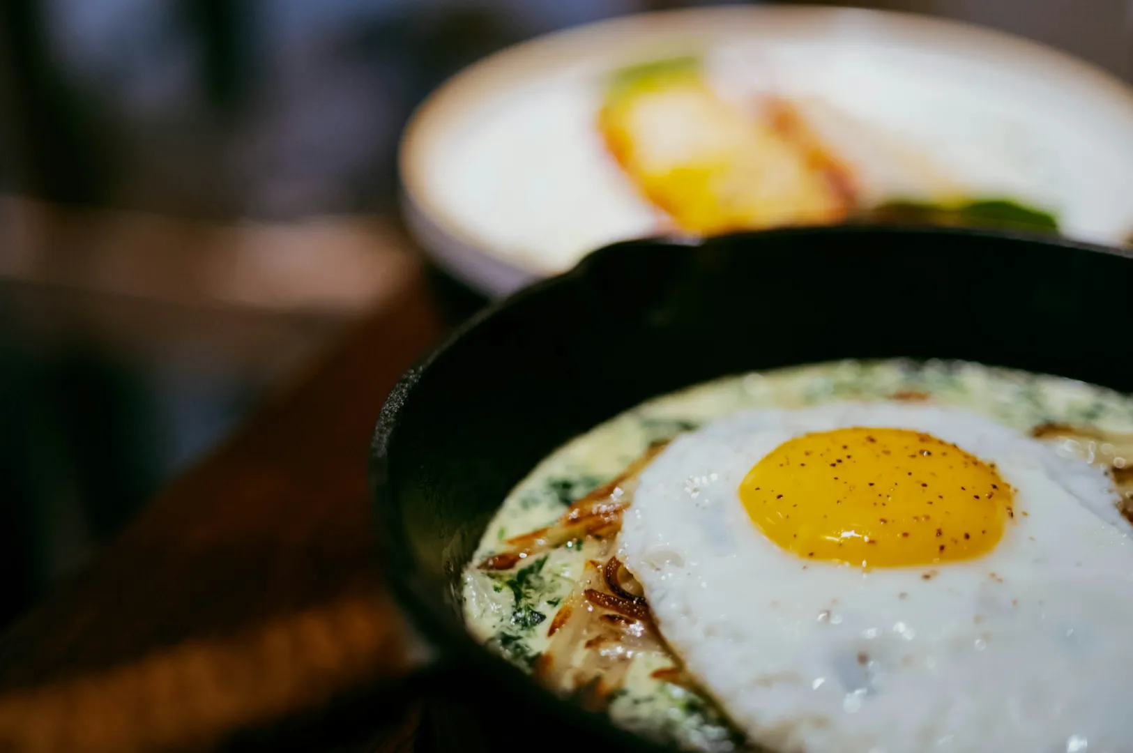
Control focus with aperture (f stop). A shallow depth (smaller aperture number like f/2.8) isolates the hero ingredient by blurring the background.Camera Angles
Angles affect negative space and perception. Overhead shots maximize space for text; 45-degree angles balance depth and context.
Ultimately, these techniques help you organize all the elements in your frame to tell a clear, appetizing story.
Camera Angles and Negative Space: Choosing the Right Perspective
Your chosen angle affects negative space and how the food is perceived.
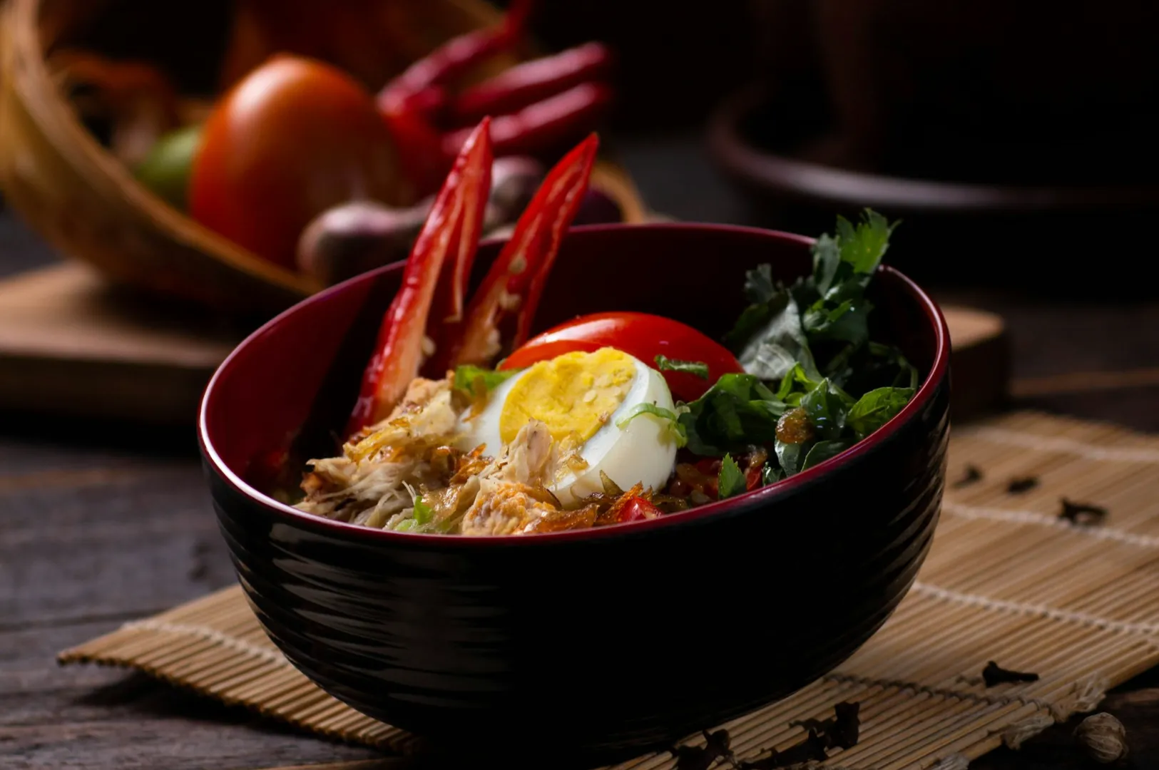
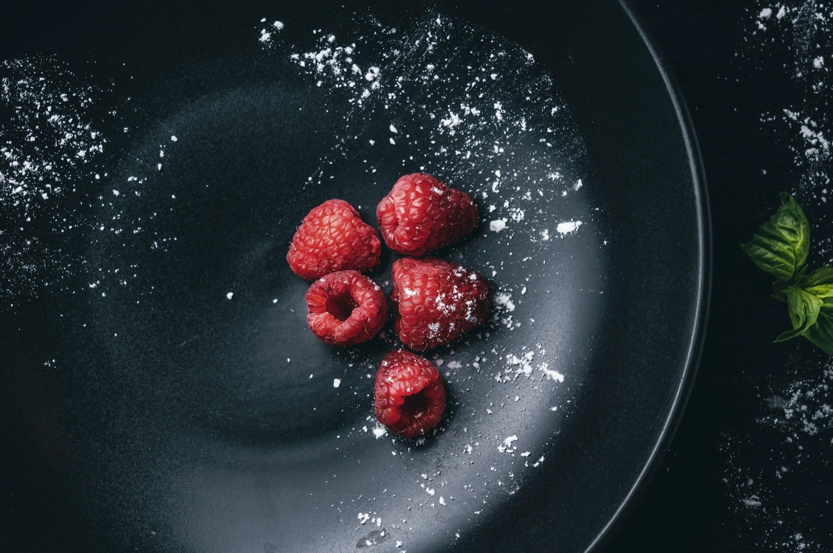
Overhead/Flat Lay (90°)
This angle offers maximum negative space, turning the table into a canvas. Ideal for multiple dishes, spreads, and text overlays: perfect for Instagram grids and menus showcasing variety.45-Degree Angle
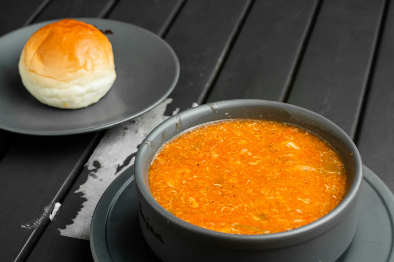
The most versatile angle, it balances depth and background space. Mimics a diner’s view, showing top and side of dishes, revealing layers and height while maintaining enough negative space to focus on the food.Eye-Level/Straight On
Highlights vertical elements like towering burgers or parfaits. Provides minimal negative space on the table but uses background for separation. Best for hero shots emphasizing height and volume.
There is a huge advantage to shooting food specifically the same dish, from multiple angles under the same lighting. It helps you build a library of assets: a flat lay for the menu background and a 45-degree shot for the delivery app thumbnail.
Platform-Specific Food Photography Composition Tips
Where your photo lives determines how you should compose it. Here is how to tailor your food photography composition tips for different platforms.
Social Media (Instagram, Facebook)
For the classic square format (1:1), centering works, but the rule of thirds with balanced negative space is often more engaging. Always leave space on one side if you plan to add a text overlay. For the vertical format (4:5 or 9:16), you need significantly more depth vertically. This format is perfect for Instagram Stories. Look at how food bloggers in the wellness space use vertical compositions to make salads look grand and aspirational.
Restaurant Menus (Print and Digital)
Overhead compositions work best here. They show the complete dish clearly. Crucially, leave negative space on the left side or right side specifically for menu item descriptions, pricing, and ingredient lists. Maintaining consistency by shooting food at the same angle throughout menu sections makes the design feel cohesive and professional.
Food Delivery Apps
On apps like GrabFood or Deliveroo, thumbnails are tiny. Close-up compositions that create negative space at the edges help the main dish stand out. The first image in your listing needs immediate visual interest to compete with dozens of other restaurants. Ensure the most delicious dish details are front and center.
Website Hero Images
These require wider compositions with substantial negative space for copy overlay (headlines, subheadings, CTAs). You must frame the photograph considering exactly where text elements will be placed. Layered compositions with foreground and background elements create depth, making the website feel immersive.
Print Marketing (Posters, Flyers)
Design these shots with large negative space areas specifically for text blocks, contact information, and promotional messaging. The strategic positioning of other elements like props or ingredients should support the message, not crowd it.
How to Create Negative Space in Your Food Photography Composition
Creating space isn’t just about what you leave out; it’s a deliberate process.
Before Shooting
Pre-plan your frame. Remove unnecessary objects from the table. Decide where you want negative space before you even pick up the camera.Styling Choices
Strategically place elements to create leading lines. Use the form and shape of props and ingredients intentionally to draw eyes toward the subject, leaving the rest of the frame open.Camera Settings
Adjust your depth of field through aperture selection. A shallow depth allows you to turn a cluttered background into a soft, non-distracting wash of color. Set the appropriate shutter speed for the shoot to ensure sharpness.Framing Decisions
Consciously leave space on specific sides of the frame. Zoom out more than you think necessary. It is easier to crop in later than to add space that isn’t there.Using Light
Light and shadow create perceived depth in the photograph. Highlights draw attention, while shadows create separation and “dead space” that guides the eye.Post-Processing
In posting, you can crop to adjust negative space ratios. This allows you to refine the composition without losing image quality, ensuring the final story is clear.
Practical Frameworks for Better Food Photography Composition
You don’t need to guess. Here are four actionable frameworks you can test immediately for better food photography.
The 60-40 Rule
Allocate approximately 60% of your frame to food (positive space) and 40% to negative space. This ratio works across most commercial food photography applications, striking a balance between appetite appeal and visual clarity.
The Triangle Method
Arrange three main elements (main dish, complementary item, prop) in a triangular composition. This creates intentional negative space between each point, keeping the eye moving in a satisfying loop.
The L-Shape Composition
Position food elements along two adjacent edges of the frame (forming an L). This leaves the opposite corner open as negative space—an ideal spot for text overlay on posters or social posts.
The Diagonal Divide
Use leading lines (a table edge, utensil, or napkin) to create a diagonal division in your frame. Balance elements on one side with negative space on the other.
Test these frameworks with your own images. Analyze the final product to see if the eye naturally flows through the composition. Taking advantage of these frameworks allows you to create lines and create balance consistently across your portfolio.
Common Composition Mistakes That Reduce Visual Impact
Even with good intentions, mistakes happen. Here are common pitfalls to avoid.
Clutter: Including too many elements that compete for the viewer’s attention with no clear main subject.
Inconsistency: Using a different composition approach for the same dish across different menu sections makes the brand look messy.
Ignoring Angles: Failing to realize how different camera angles dramatically affect the available space in the frame.
Forgetting Context: Not considering the final use case (Instagram vs. print) when shooting food.
Lack of Planning: Shooting without knowing where marketing text or logos will be placed.
Random Changes: Using the same lighting but randomly changing composition without a strategic reason.
Isolation: Not studying reference example work from established food photographers.
Testing and Refining Your Food Photography Composition
To truly improve, you must test. Shoot the same dish three times using three different compositional techniques (e.g., rule of thirds, L-shape, triangle method).
Test your images in actual use cases. Drop them into menu mockups or create dummy social media posts with text overlay. Ask for objective feedback: “What draws your eye first?” Build a reference library of your best-performing compositions. This ensures consistency for future shoots.
Remember, adapting life photography principles to food is incredibly important. Systematic testing is a huge advantage before committing to a large menu project. A simple composition guide for your restaurant ensures that even when different people shoot content, the brand look remains cohesive.
Conclusion
Composition techniques in food photography serve as the practical bridge between understanding negative space concepts and executing effective commercial photography. These specific frameworks help restaurant owners and marketers create negative space intentionally, turning accidental snapshots into strategic assets.
Better food photography results from practiced, deliberate choices, not just expensive gear. Start small—experiment with one framework at a time. As you refine your eye, you’ll find that your images not only look better but perform better for your business.
For restaurants looking to implement these proven techniques efficiently for comprehensive menu and marketing needs, professional food photographers can help you achieve that perfect balance. Visit our website for more info: https://foodphotographerstudio.com.sg/