Delivery platforms are not judged like Instagram. On a delivery menu, your photo is competing in a grid of tiny thumbnails. Customers are hungry, impatient, and scanning fast.
That changes how you should edit.
This article is about editing for conversion, not mood. If you want the full foundation first, start with our food photo editing workflow. Then come back here and apply the delivery-specific rules.
The Delivery Menu Reality: Clarity Beats Vibes
On a delivery platform, a “beautiful” edit can lose to a clear one.
A delivery photo should answer three questions instantly:
- What is it?
- What is inside?
- Does it look worth the price?
If your edit makes the dish moodier but less readable, it is working against you.
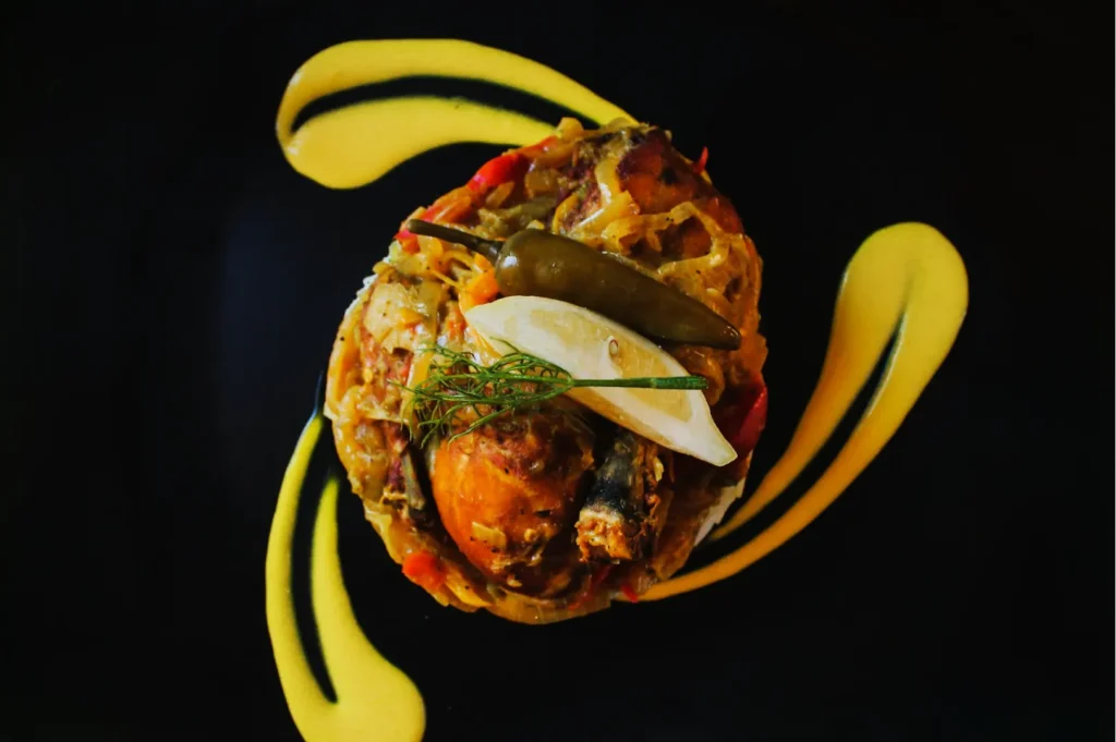
Rule 1: Crop Tighter Than You Think, But Keep Ingredients Visible
Delivery thumbnails punish wide, airy compositions. Negative space is still useful, but too much empty background makes the dish look small.
A good crop for delivery:
- fills the frame with the dish
- shows key toppings and texture
- keeps the rim clean so it looks intentional
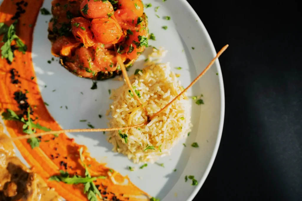
Rule 2: Keep White Balance Neutral, Not “Warm And Cozy”
Warm edits can look inviting on social. On delivery platforms, warm edits can turn rice yellow and seafood grey.
Aim for neutral whites and honest colour. If your chicken rice looks like it has been sitting under a heat lamp, you will lose trust immediately.
Rule 3: Lift Shadows, But Do Not Flatten Everything
Delivery customers need visibility. If shadows hide ingredients, the dish feels risky. Lift shadows gently, but keep enough contrast so the food still has shape.
Common mistake: brightening everything until the dish loses depth.
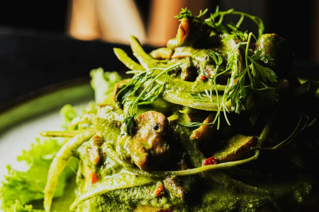
Rule 4: Texture Helps, But Over-Sharpening Looks Cheap
A touch of texture makes fried items, grilled meats, and crispy edges more tempting. Overdoing it makes food look dry.
If you are unsure, zoom in. If the food starts looking like sandpaper, you are past the point of appetite.
Rule 5: Edit For Consistency Across The Category
A delivery menu feels more trustworthy when:
- brightness is consistent
- plate colour does not change wildly
- the background tone is stable
If you have 20 dishes and each one looks like a different kitchen, the brand feels messy. Batch editing helps, but even without it, you can match each dish to one reference image.
If you need a proper menu set that matches across a full range, that is often where restaurants bring us in. It is not about “better editing”. It is about predictable consistency at scale, which is what delivery platforms reward.
You can explore what a cohesive menu set looks like on Food Photographer Studio.
Delivery Editing Is About Speed Of Understanding
A delivery image wins when it is easy to understand. Not when it is the most artistic photo in the world.
Keep the crop clear. Keep colours honest. Keep texture edible. Then keep the whole menu consistent enough that customers feel safe ordering from you.