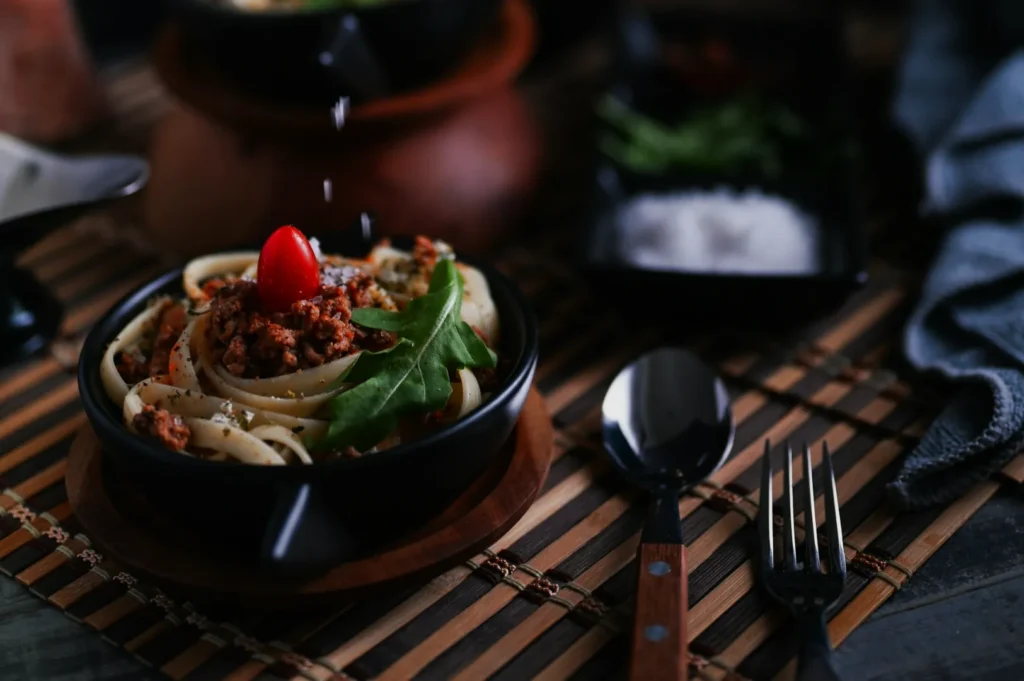
A restaurant can serve the same dish perfectly every day, yet its photos can look like they came from five different places. One post is warm and cosy. Another is cold and bluish. The next is sharp but over-saturated. To diners, that inconsistency quietly signals one thing: uncertainty.
This is why food photo editing is not “just touching up.” It is quality control for your brand. And if you want consistency across menus, delivery platforms, and social media, you also need a simple restaurant photography style guide. Not a 40-page brand book. Just a clear set of rules your team and photographers can actually follow.
This article walks you through both: a practical editing workflow that fits real Singapore restaurant lighting, and a style guide you can use to keep your visuals steady across every channel.
Why Food Photo Editing Matters More Than Most Restaurants Realise
Editing is where your images become reliable. In Singapore, it matters even more because lighting conditions are rarely clean.
You might be shooting under warm pendant lights, mixed kitchen fluorescents, neon spill from signage, or a dim dining room that looks great in person but reads muddy on camera. Your camera does not “see” the way your eyes do. It records colour casts, dull greens, and uneven exposure.
Good food photo editing fixes three problems fast:
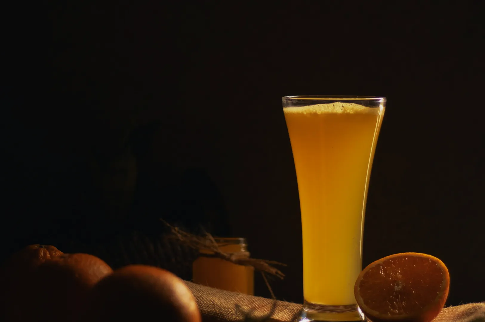
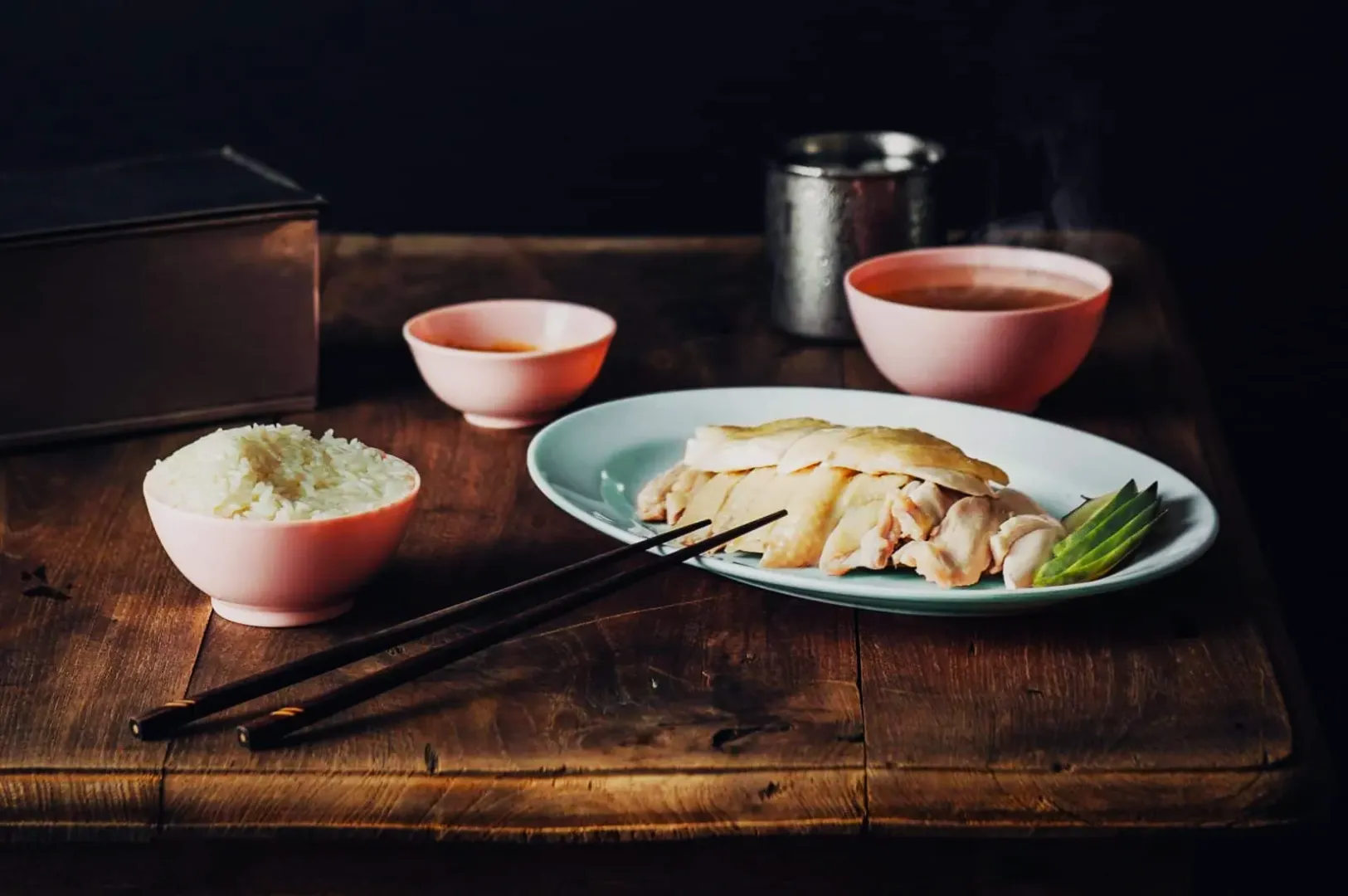
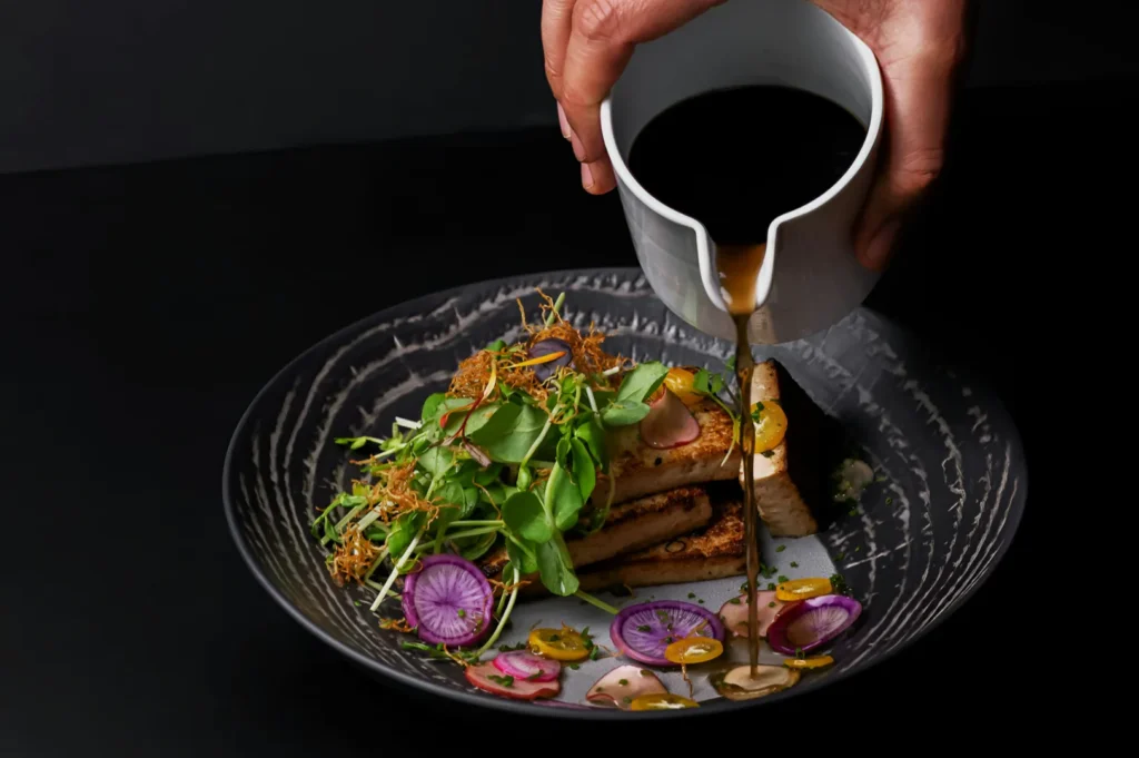
- Colour accuracy (so rice looks white, not yellow)
- Texture clarity (so fried food looks crisp, not flat)
- Brand consistency (so your feed looks intentional, not random)
The goal is not to make food look fake. The goal is to make it look like the best version of what diners will actually receive.
Start With a Restaurant Photography Style Guide, Not a Preset
Most teams start the wrong way. They download a preset, apply it to everything, then wonder why their curry looks brown and their salads look grey.
A restaurant photography style guide comes first. Presets come second.
If you need a bigger-picture foundation before you build your guide, refer to this long-form resource on restaurant photography Singapore standards and planning: a restaurant photography Singapore playbook for owners who want consistent visuals.
What Your Style Guide Should Decide (In Plain English)
1) Your “default” mood
Do you want bright and clean, or warm and intimate? Most brands can sit somewhere in between, but you must pick a home base.
2) Your colour rules
- Whites should stay neutral, not cream-yellow
- Greens should look fresh, not dull
- Reds should look rich, not radioactive
3) Your lighting preference
Even if you shoot in different places, you should aim for the same lighting feel: soft side light, controlled highlights, no harsh overhead glare.
4) Your framing rules
Pick 2–3 consistent angles your team repeats:
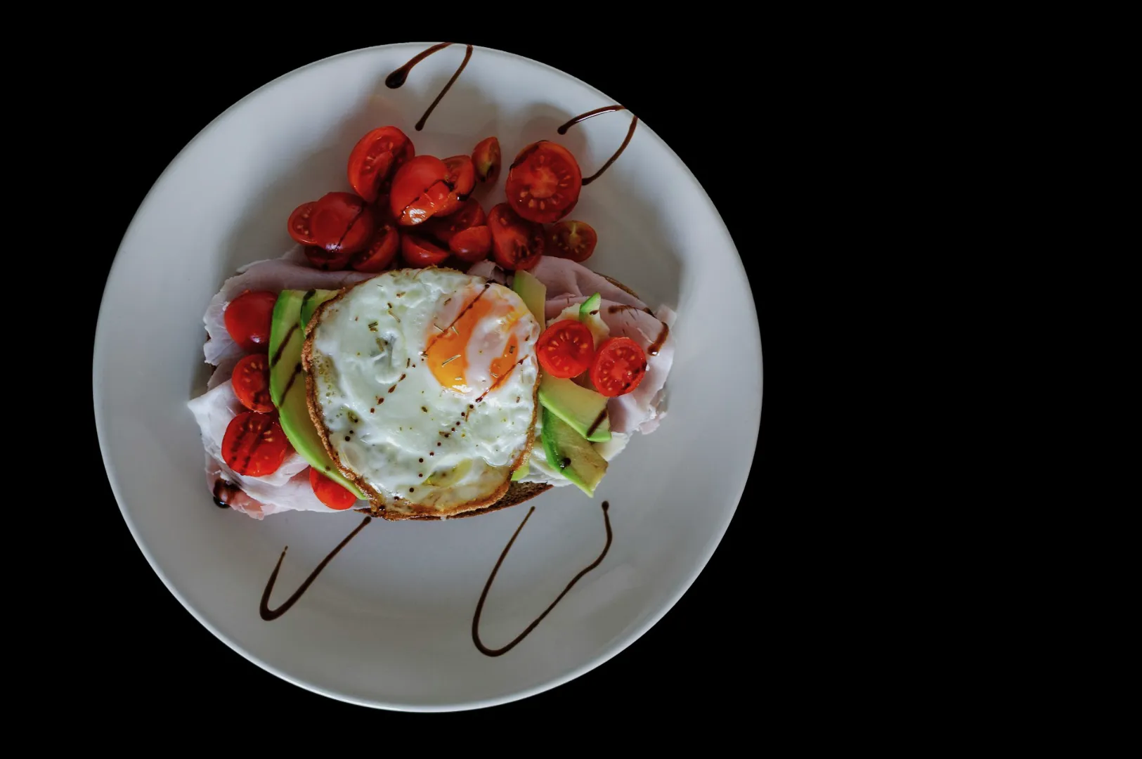
- Overhead for sets and sharing spreads
- 45-degree for bowls and layered dishes
- Eye-level for burgers, cakes, drinks
5) Your retouching limits
Decide what is allowed:
- Remove crumbs and stains: yes
- Change portion size or rebuild the dish digitally: no
This is how you protect trust.
A Clean Food Photo Editing Workflow That Works in Singapore Lighting
You can do this in Lightroom (mobile or desktop), Capture One, or even Snapseed. The software matters less than the order of operations.
Step 1: Fix White Balance First
White balance is the biggest culprit in restaurant photos. Do this before anything else.
A simple method:
- Find something that should be neutral (a white plate, a napkin, the rice)
- Adjust temperature and tint until it looks believable
If your whites look right, everything else becomes easier.
Step 2: Adjust Exposure So the Food Is the Brightest Thing
Your hero dish should feel like the brightest, most “alive” part of the frame.
- Lift exposure slightly if the dish feels heavy
- Pull down highlights if sauces or plates look blown out
- Raise shadows gently if details disappear
Avoid the common mistake of lifting shadows so much that the photo looks flat.
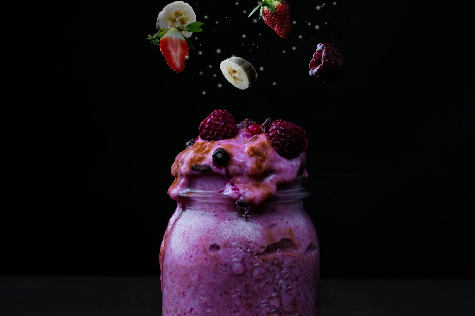
Step 3: Add Contrast for Shape, Not Drama
Contrast is not just “make it pop.” It creates shape.
- Add enough contrast to define texture (crispy skin, noodles, herbs)
- Stop before the dish starts looking harsh or oily
Step 4: Correct Colours With Restraint
This is where many edits turn fake.
- Use vibrance lightly
- Be careful with saturation, especially for reds and oranges (chilli crab, curry)
- If greens look dead, nudge them carefully without turning them neon
The best edits feel like you improved lighting, not like you applied a filter.
Step 5: Sharpen the Dish, Not the Whole Photo
If you sharpen everything, you sharpen noise too.
Sharpen selectively:
- Focus on the hero area (protein texture, garnish, surface detail)
- Keep backgrounds softer so the dish stays the main subject
The Restaurant Photography Style Guide Rules That Prevent “Random Feed Syndrome”
Once you have a basic look, your style guide should include practical rules your staff can remember.
Consistency Rules We Use Often
- One dish, one hero. Do not make the drink compete with the main.
- Backgrounds stay quiet. Keep props supportive, not loud.
- Same editing “temperature band.” Your whole feed should feel like it lives in the same room.
- Keep skin tones human. If you include hands or chefs, avoid edits that make people orange or grey.
A Simple “Do We Post This?” Checklist
Before you export:
- Does the dish look like what diners will receive?
- Are whites neutral?
- Do greens look fresh?
- Is the hero dish the clearest thing in frame?
- Does this photo match the last 9 photos on your grid?
That last one is where most brands fail. Not because the photo is bad, but because it does not belong.
Export Settings That Keep Your Photos Crisp Across Platforms
A lot of food photography gets ruined at export. The photo looks great on your screen, then turns soft online.
A safe baseline:
- Export as JPEG
- Keep the long edge around 2000px (enough for web, not bloated)
- Use standard sharpening for screen
- Save separate crops for each platform (do not rely on auto-cropping)
If you are updating delivery platform images, always check the thumbnail view. That is where the real decision happens.
When to Use a Professional Editor or Studio
If your team is spending hours “fixing” photos, it is usually a lighting problem upstream. Editing can refine, but it cannot fully rescue bad mixed lighting.
It may be time to bring in help when:
- Your menu needs 30–80 dishes to look consistent
- You are launching a new concept or rebranding
- You need photos to match both delivery platforms and printed menus
- Your visuals feel “almost there” but never premium
At Food Photographer Studio, we treat editing and style guides as one system. We do not just deliver pretty photos. We deliver a repeatable look your brand can maintain.
Consistency Is What Makes Food Photos Feel Expensive
Restaurants do not win on one viral post. They win on repeated trust.
A solid food photo editing workflow gives your images clarity and honesty. A practical restaurant photography style guide gives you consistency, which is what makes a brand feel premium even before diners taste the food.
If you want, we can help you build the style guide, shoot the hero assets, and create an editing direction your team can actually maintain after the shoot. That is how brands stay consistent in Singapore’s busiest F&B landscape.