If you have ever looked at your own feed and thought, “Why does this feel… generic?”, it is usually not the food. It is the theme.
In Singapore, diners are visually sharp. They know what chicken rice should look like. They know what a “premium café” visual language feels like. They can also smell a forced concept from one scroll. That is why a good food photoshoot theme is not just decoration. It is a shortcut to trust.
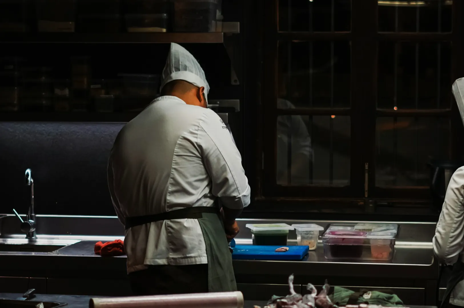
We have shot in hawker centres, shophouse cafés, hotel restaurants, and tight little kitchens where the “studio” is one clean corner near the pass. The pattern is always the same: the themes that work are the ones that match real dining behaviour here.
If you want the full framework for choosing and executing a theme without turning your restaurant into a production set, link this phrase to our pillar guide: our cool photoshoot playbook for restaurant brands.
Below are five themes that consistently land with Singapore diners, plus practical ways to shoot them fast and honestly.
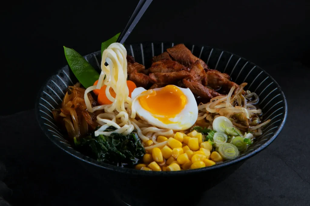
Theme 1: Hawker Heritage Realness
This theme wins because Singapore diners read authenticity like a second language. When the visuals feel too polished for a hawker-inspired dish, people start doubting. When it feels grounded, they lean in.
Best for: hawker-style concepts, zi char, noodle shops, grill brands, kopitiam-inspired cafés, heritage menus
What diners respond to: wok hei cues, steam, stainless steel, enamel, honest mess, comfort
What it looks like
- Textures that feel lived-in: worn tables, enamel plates, metal trays, chopsticks, soup spoons
- Food that looks hot: steam, gloss, char, sheen
- A little imperfection: a splash of curry, a few crumbs, a drip that looks like service, not styling
How to shoot it (without overdoing it)
- Use a 45-degree angle for most dishes. It keeps broth depth visible for noodles and soups.
- Add one context prop only. Example: a kopitiam cup beside kaya toast. Not a full “set”.
- Let the background be simple, even if it is “street”. A busy frame kills the appetite.
Common mistake
People try to “make it aesthetic” with mismatched props. A rustic European board for char kway teow looks off. It breaks the story.
Quick shot list
1 menu-clear hero shot, 1 texture close-up, 1 process or hand moment (auntie plating, ladle mid-pour)
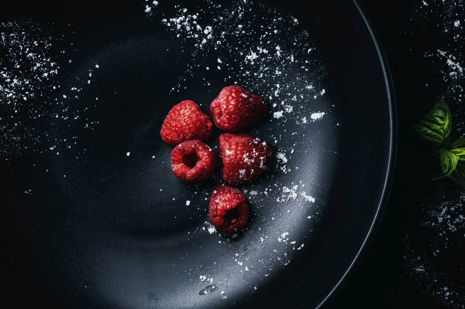
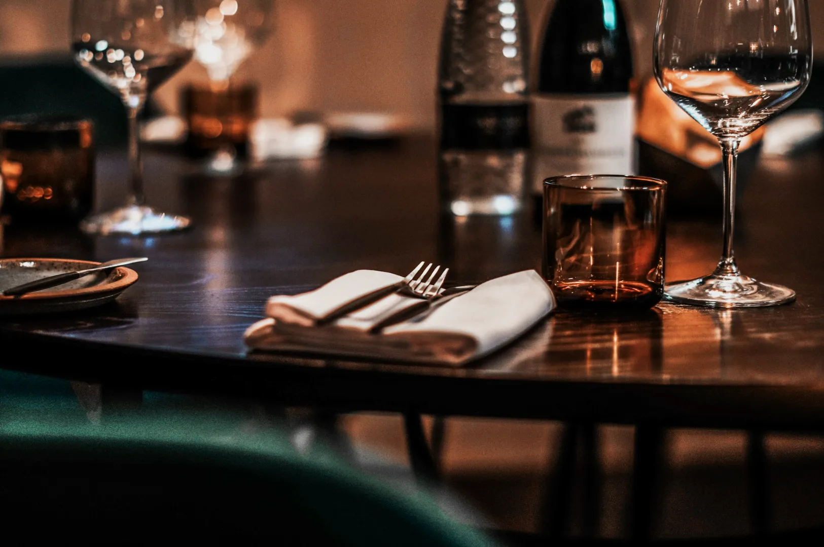
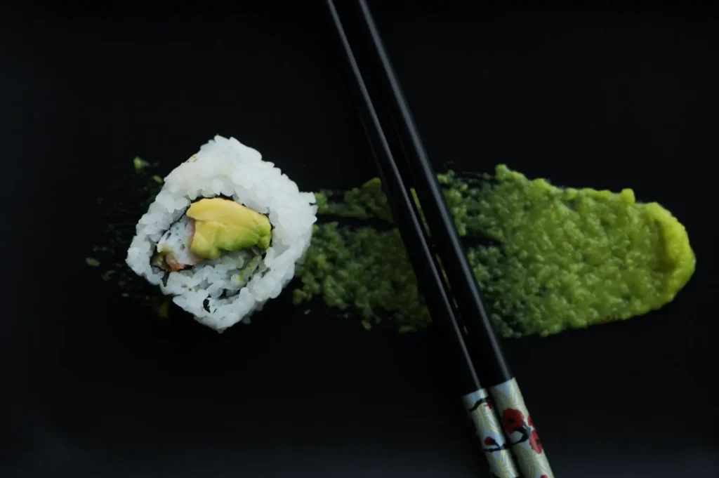
Theme 2: Modern Minimalist Premium
Minimalism does not mean boring. In Singapore, it reads as confidence, especially for cafés and modern restaurants that want to look intentional and high-quality.
Best for: specialty coffee, modern casual dining, patisseries, wellness concepts, Japanese and Korean-inspired brands
What diners respond to: clean lines, calm mood, “this feels expensive”, clarity
What it looks like
- Neutral palette: whites, stone, light wood, matte ceramics
- Generous negative space: the dish breathes
- Styling restraint: one garnish, not five “for decoration”
How to shoot it
- Overhead for graphic dishes: grain bowls, spreads, pastries, bento
- Eye-level for height: burgers, layer cakes, stacked toast
- Keep lighting clean and consistent. Natural window light is ideal, but controlled artificial light works too.
What makes it sell
Minimalism makes portion cues clearer. It also makes menus easier to scan, especially on mobile. Diners feel less friction and more confidence.
Common mistake
Sterile images that look like a catalogue. Minimal does not mean lifeless. Add one human cue occasionally: a hand holding a cup, a fork entering frame, a bite mark.
Quick shot list
1 hero, 1 overhead variation, 1 tight detail on texture (crumb, glaze, foam)
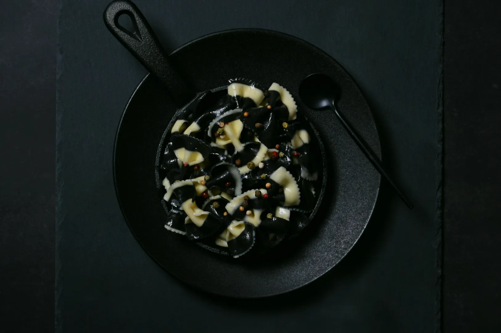
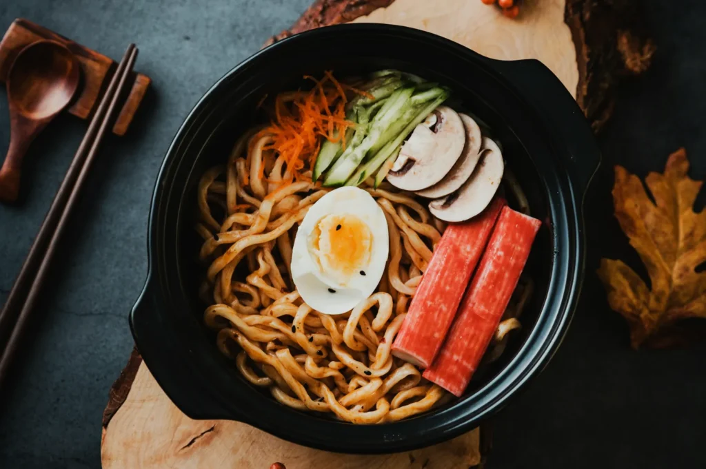
Theme 3: Rainy-Day Comfort Mood
Singapore’s weather is not “four seasons”, but our mood does shift with the monsoon months and evening dining habits. Rain makes people crave warmth. Warm visuals make people click.
Best for: soups, hotpot, claypot dishes, curry houses, ramen, comfort cafés, dinner menus
What diners respond to: warmth, steam, depth, shelter, “I want this now”
What it looks like
- Darker, moodier surfaces: charcoal, deep brown wood, slate
- Directional light: side light or back light to bring out steam and gloss
- Layers in the frame: bowl, spoon, napkin, maybe one ingredient cue
How to shoot it
- Place the dish near a window and shoot when daylight is soft. Rainy light is often perfect because it is naturally diffused.
- Use backlighting for steam, but keep it subtle. Steam should feel real, not theatrical.
- Tighten the frame. Comfort food sells through texture and depth.
Common mistake
Underexposed images where diners cannot see what they are ordering. Moody does not mean unclear. Your shadows still need detail.
Quick shot list
1 warm hero (45 degrees), 1 steam moment, 1 spoon scoop or “break” shot (egg yolk, tofu, broth lift)
Theme 4: Celebration Table, Not Just Festive Props
Singapore is built on celebratory dining. Birthdays, CNY, Hari Raya, Deepavali, Christmas, National Day. The theme that works is not “throw festive décor everywhere”. It is the feeling of a table that people want to join.
Best for: set menus, sharing platters, festive campaigns, family-style restaurants, caterers
What diners respond to: abundance, togetherness, “this is worth gathering for”
What it looks like
- Multiple dishes in one frame, but organised
- Real cues of people: hands reaching, chopsticks mid-grab, glasses lifted
- Festive colour accents used sparingly: red, gold, green, batik patterns, floral touches
How to shoot it
- Use overhead for full spreads. It reads clearly and sells abundance.
- Use a medium shot at 45 degrees to show depth and make it feel like you are seated at the table.
- Keep props grounded. Use what you actually serve with. If you do not use gold cutlery in real service, do not bring it in for the shoot.
Common mistake
Food gets lost because everything is competing. The rule here is simple: pick one hero dish even inside a spread. Build the frame around it.
Quick shot list
1 overhead spread, 1 hero dish close-up, 1 human moment (toast, lo hei toss, plating hands)
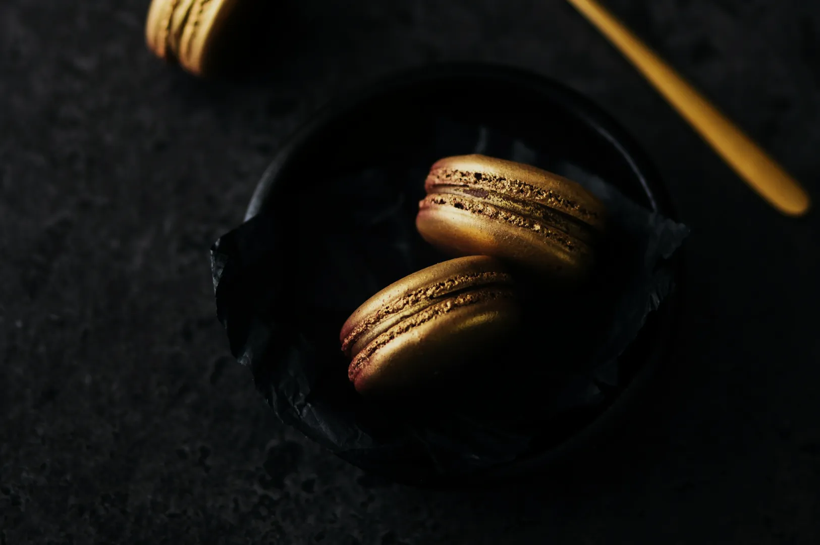
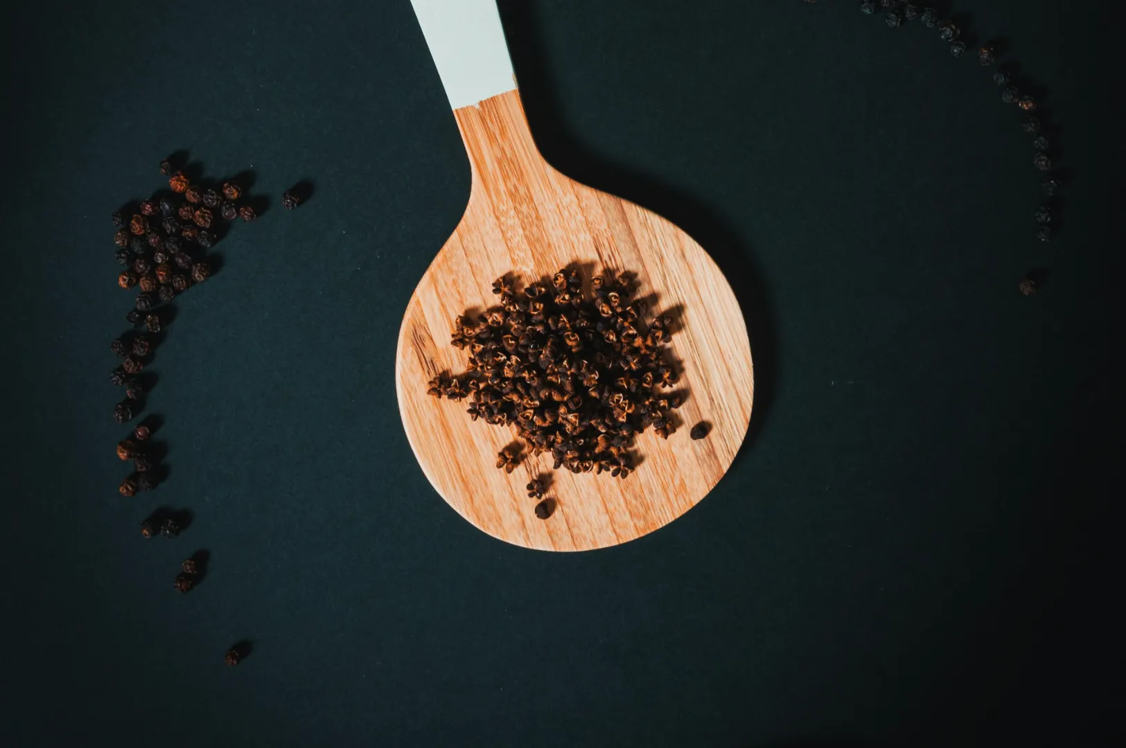
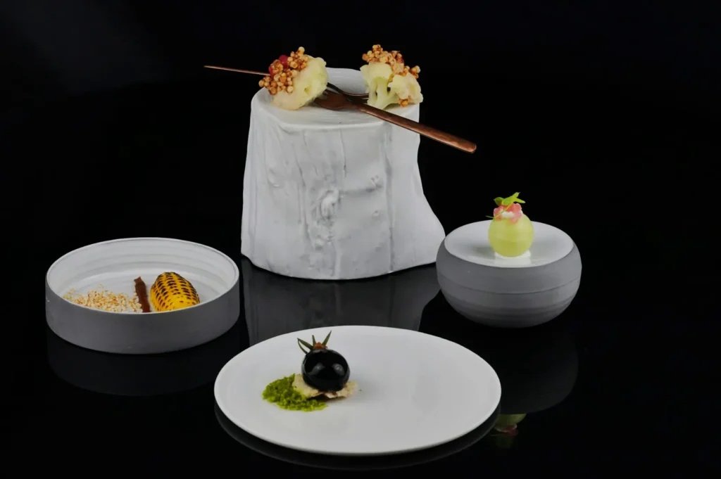
Theme 5: Ingredient Proof and Craft
Singapore diners pay attention when you show receipts of quality. They may not know the supplier name, but they recognise freshness, texture, and process. This theme is especially powerful when you want to justify premium pricing without sounding salesy.
Best for: chef-driven menus, omakase, sourdough bakeries, cocktail bars, premium grills, sustainable concepts
What diners respond to: craft, detail, “this is made with care”
What it looks like
- One or two real ingredients as supporting cast: herbs, spices, beans, flour, seafood
- Process cues: knife marks, a dusting of flour, a brush of sauce, a torch moment
- Tight framing: texture becomes the story
How to shoot it
- Use close-ups and medium close-ups. People want to see what makes it special.
- Keep surfaces natural: wood, stone, linen. The goal is honest craft, not glamour.
- Shoot a small process sequence. Three images can carry a whole post: ingredient, process, final plate.
Common mistake
Using ingredients that do not match the dish. If you sprinkle raw rosemary next to a local dish that never uses rosemary, diners notice.
Quick shot list
1 ingredient cue, 1 process moment, 1 plated hero with clean negative space
How To Choose One Theme Without Confusing Your Brand
If you are stuck, use this simple rule: pick the theme that matches how diners actually experience you.
- If your brand is built on heritage, do not force minimalism.
- If your café sells calm and clean, do not suddenly go “street gritty” for no reason.
- If your menu is premium, craft-led visuals protect your pricing.
A theme is not a costume. It is a visual promise. The best themes are the ones you can repeat for months without feeling fake.
Themes Work When They Feel True
Singapore diners do not reward effort. They reward clarity and feeling. When your theme supports the food, the images look confident. When your theme fights the food, the images look like a try-hard campaign.
If you want help choosing a theme that fits your actual restaurant, and executing it in a way that stays consistent across menus, delivery platforms, and social content, Food Photographer Studio can plan and shoot a themed set that feels real to Singapore dining culture.