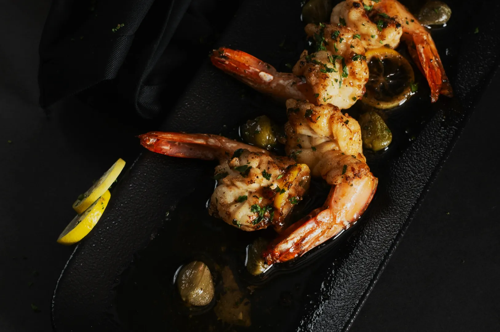
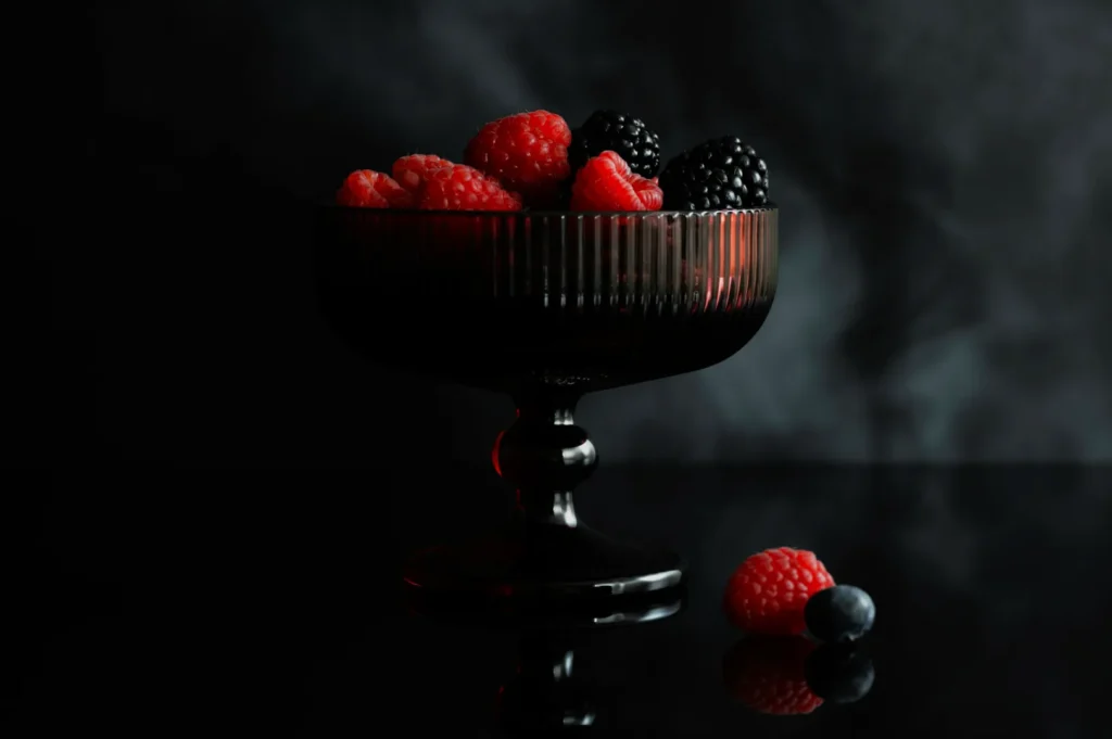
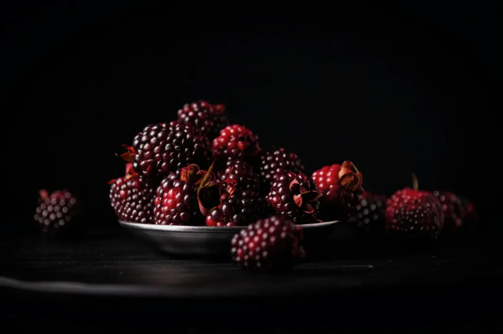
If you run a restaurant, café, or food brand in Singapore, you already know this: the photo is often the first bite. Customers see your dish on Google, Instagram, a delivery platform, or your own menu before they smell it, touch it, or taste it.
That is why how to edit photos matters more than most teams expect. Not because you need heavy filters or trendy presets, but because editing is where you fix what the camera could not. Mixed lighting. Dull colours. A plate that looks grey instead of warm. Sauce that looks flat instead of glossy. Small things that quietly decide whether someone keeps scrolling or taps “Order”.
This guide is the editing workflow we teach Singapore F&B teams when they want photos that feel real, consistent and appetising. It is designed for busy operators, small marketing teams, and owners who are doing a little of everything.
And if you want to see what “clean but still delicious” looks like in practice, you can browse our work at Food Photographer Studio as you read.
The Rule Before The Workflow: Do Not “Fix” What You Can Shoot Correctly
Editing is not magic. The best edits start with a decent file. Before you open any app, check these three basics:
- Light direction: side light or back light gives texture. Overhead downlights flatten food.
- Exposure: if the photo is too dark, brightening later can bring noise and weird colours.
- White balance: Singapore restaurant lighting can turn rice yellow and greens grey. If the base colour is off, everything feels off.
Once those are reasonable, editing becomes fast and predictable.
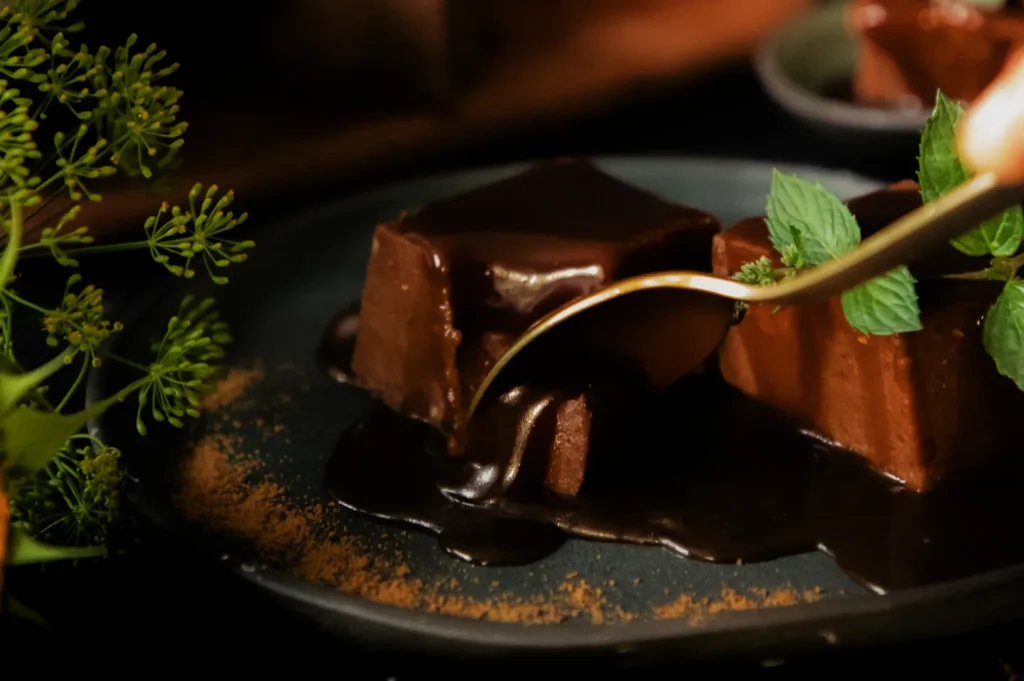
How To Edit Photos Without Making Food Look Fake
Most editing mistakes happen for one reason: people edit to make the photo “pop”, not to make the food look believable.
A good edit does four things:
- Makes the dish readable (you can see what you are ordering).
- Keeps colours honest (food looks like itself, only better).
- Builds consistency (your menu does not look like 10 different restaurants).
- Protects appetite (texture stays appetising, not plastic).
If you remember one line from this article, remember this: the goal is not a dramatic edit. The goal is a confident, natural-looking one.
The Singapore F&B Editing Workflow We Use
You can do this workflow in Lightroom Mobile, Snapseed, VSCO, or any editing app with similar controls. The steps are the same.
Step 1: Crop For The Platform Before You Adjust Anything
Cropping early stops you from editing parts of the frame you will cut away later.
Common crops we use:
- Instagram feed: 4:5
- Stories and Reels covers: 9:16
- Website banners: wide landscape
- Delivery thumbnails: tighter crops that still show key ingredients
If the dish is the main subject, give it space to breathe. If it is a conversion image (delivery apps), keep it clear and close.
Step 2: Fix White Balance First (Always)
White balance is the difference between “fresh” and “canteen lighting”.
Ask yourself: are whites actually white?
If rice, tofu, or plate edges look yellow, your photo will feel tired. If whites look blue, the food feels cold.
Adjust temperature until whites look neutral, then fine-tune tint if the image has a green or magenta cast.
Step 3: Set Exposure Like A Chef Sets Salt
Do not chase brightness. Chase clarity.
- Raise exposure until the dish feels visible and inviting.
- Pull down highlights if plates or oily spots are blowing out.
- Lift shadows gently if the dish is losing detail.
If you go too far, food starts to look flat. That is usually a sign you need better light next time, not more editing.
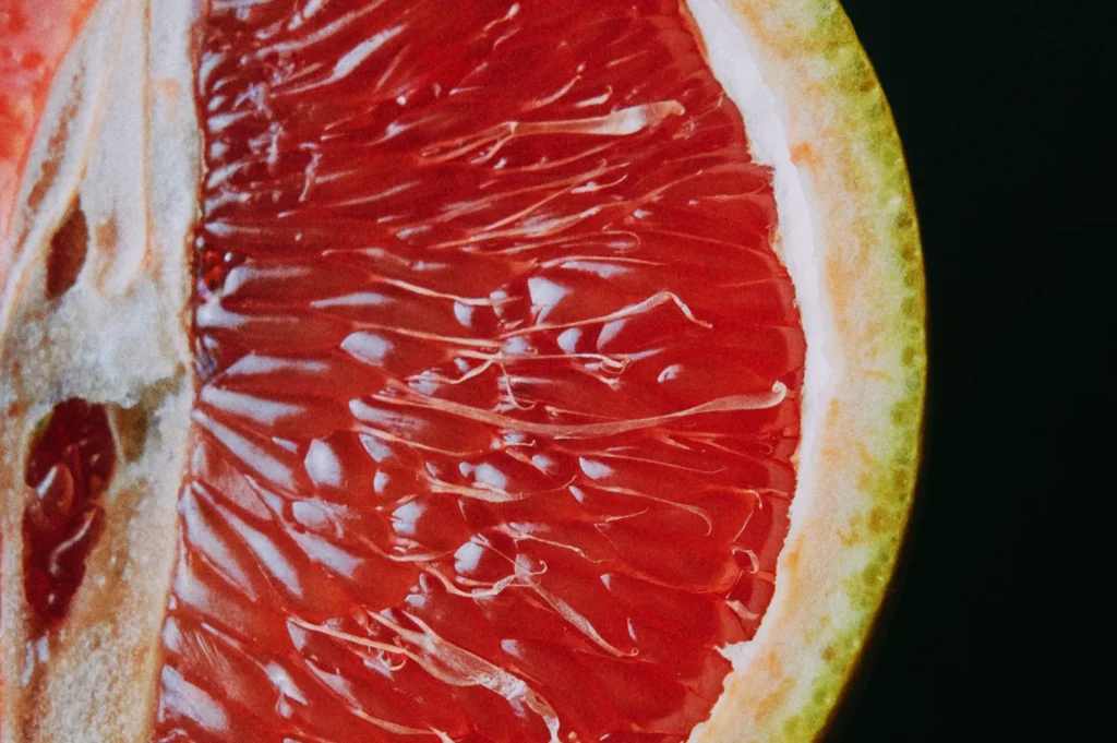
Step 4: Contrast And Texture, But With Restraint
This is where people overdo it.
A clean approach:
- Add a touch of contrast to define edges.
- Use texture or clarity lightly to bring out crispness, crumbs, grill marks, and herbs.
- Avoid sharpening until the end.
If skin looks “crunchy” in an unnatural way or sauce starts to look grainy, you have pushed it too far.
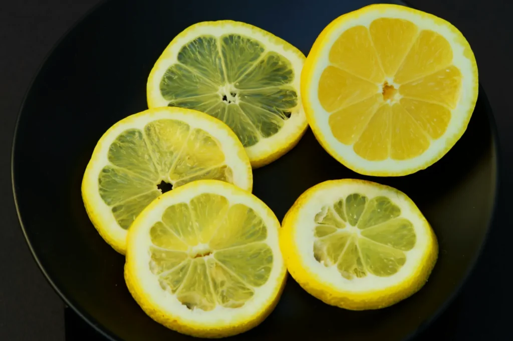
Step 5: Colour Control, Not Colour Hype
Instead of boosting saturation for everything, work dish-by-dish:
- Lift vibrance slightly for vegetables and garnishes.
- Reduce saturation if reds are screaming or if curry becomes neon.
- If greens look dull, adjust green luminance and saturation gently. Do not turn them radioactive.
If you are editing a whole menu, you want colours to look consistent across dishes, not “perfect” on a single plate.
Step 6: Clean The Frame
Remove crumbs, drips, and distractions only if they do not belong to the story.
Menu and delivery photos usually benefit from cleaner frames.
Lifestyle posts can tolerate a little mess if it feels like real dining.
Use healing tools sparingly. The more you “fix”, the more artificial the food can become.
Step 7: Sharpen Last, Export Properly
Sharpening too early makes editing decisions harsher.
At the end:
- Apply light sharpening (especially if the photo feels soft).
- Export at a size that matches the platform.
- Keep file sizes reasonable so your site loads fast.
A lot of “blurry” uploads are not bad photos. They are bad export settings.
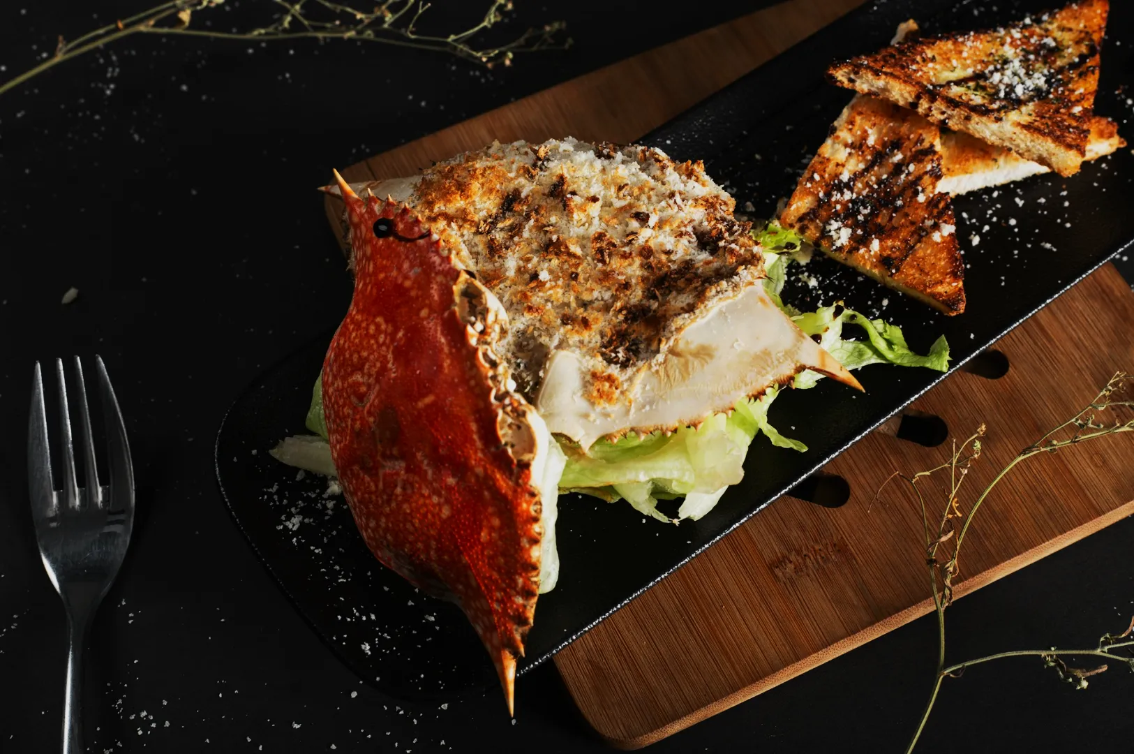
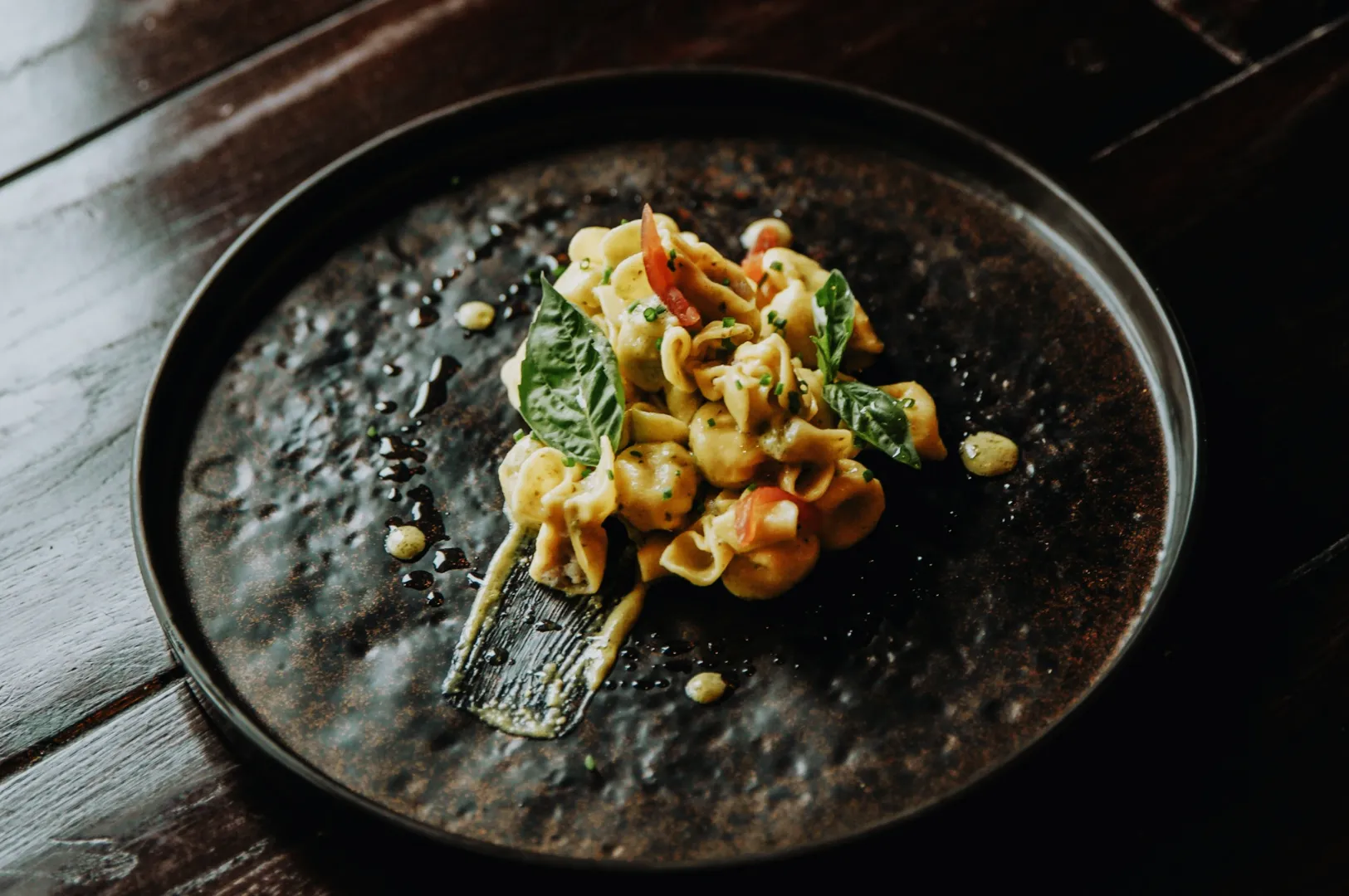
Editing For Menus, Delivery Apps, And Social Media Are Not The Same Job
This is where many teams get stuck. They edit one way and paste it everywhere.
Menu Photos
Menu photography needs consistency. That means:
- similar crops
- similar brightness
- similar colour temperature
- consistent background tone
A menu that looks cohesive feels more professional, even if each dish is simple.
Delivery Platforms
Thumbnails decide orders. You need:
- clarity over mood
- ingredients that read instantly
- tighter framing
- minimal shadows that hide details
If the customer cannot identify the dish in one second, it is not doing its job.
Social Media
Social is where you can carry atmosphere:
- warm tones for comfort food
- mood for late-night dining
- movement for pours and steam
- human hands for context
Even then, the food still needs to look like something you can order.
The Fastest Way To Look Professional Is Consistency
If you are posting often, the biggest improvement is not buying a new camera. It is repeating the same edit logic across your photos.
A simple internal rule for your team:
- One editing “look” for the brand
- One crop style for menu items
- One export standard for uploads
Once that is stable, everything feels more premium.
When To DIY, And When To Bring In A Pro
DIY editing works when you need speed and volume. Daily specials. Stories. Quick updates.
Professional editing and professional shoots matter when:
- you are refreshing a full menu
- you are launching a new concept
- you need website hero images that represent the brand
- you need consistency across 20 to 60 dishes
The difference is not only skill. It is repeatability. A professional workflow produces the same standard across an entire set.
A More Realistic Way To Think About Editing
If you only remember one thing about how to edit photos, make it this:
Editing is not about making food look different.
It is about making food look like itself, at its best, under good light.
If you want a quick next step, pick one hero dish and re-edit it using the workflow above. Compare it to your current image. If the new one feels cleaner, warmer, and easier to read, you are on the right path.
And if you want a set of images that look consistent across menus, delivery platforms, and brand campaigns, Food Photographer Studio can help you build that standard without guesswork. We do this work every week, in real Singapore kitchens, with real service constraints, and we keep the food looking honest.