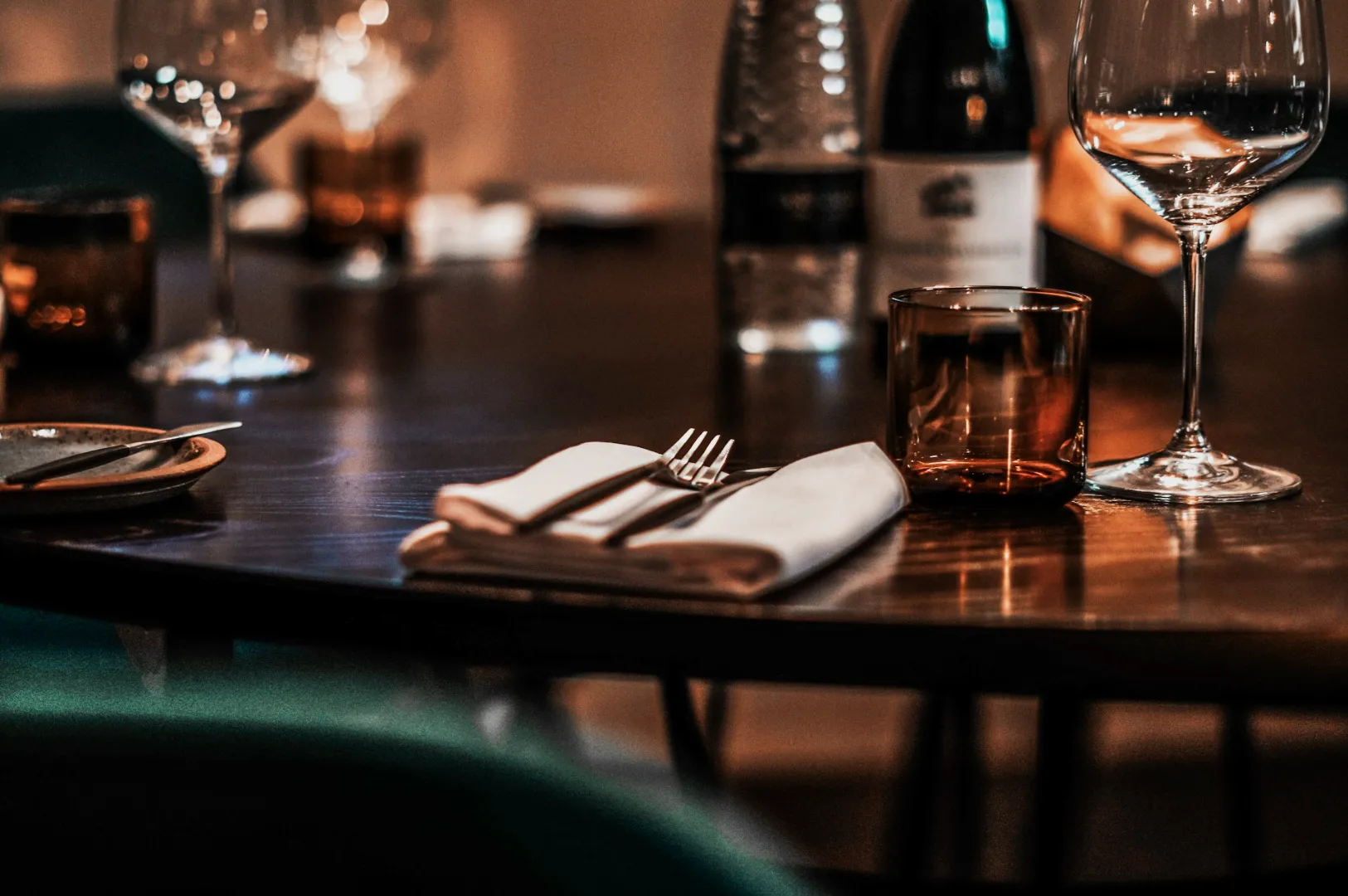
A restaurant feed looks expensive when it looks intentional. Not because every photo is perfect, but because every photo feels like it belongs to the same place.
That is what presets are for. Not to make food “more dramatic”, but to make your edits repeatable, especially when multiple staff members are posting.
This article shows you how to build a simple preset system for restaurant photos using Lightroom Mobile. If you want the full editing workflow this connects to, read our main guide on how to edit photos.
First: What A Restaurant Preset Should Actually Do
A useful preset should:
- keep colour temperature consistent
- keep contrast and exposure in a familiar range
- preserve food realism
- reduce editing time
A bad preset makes everything orange, everything sharp, and everything fake.
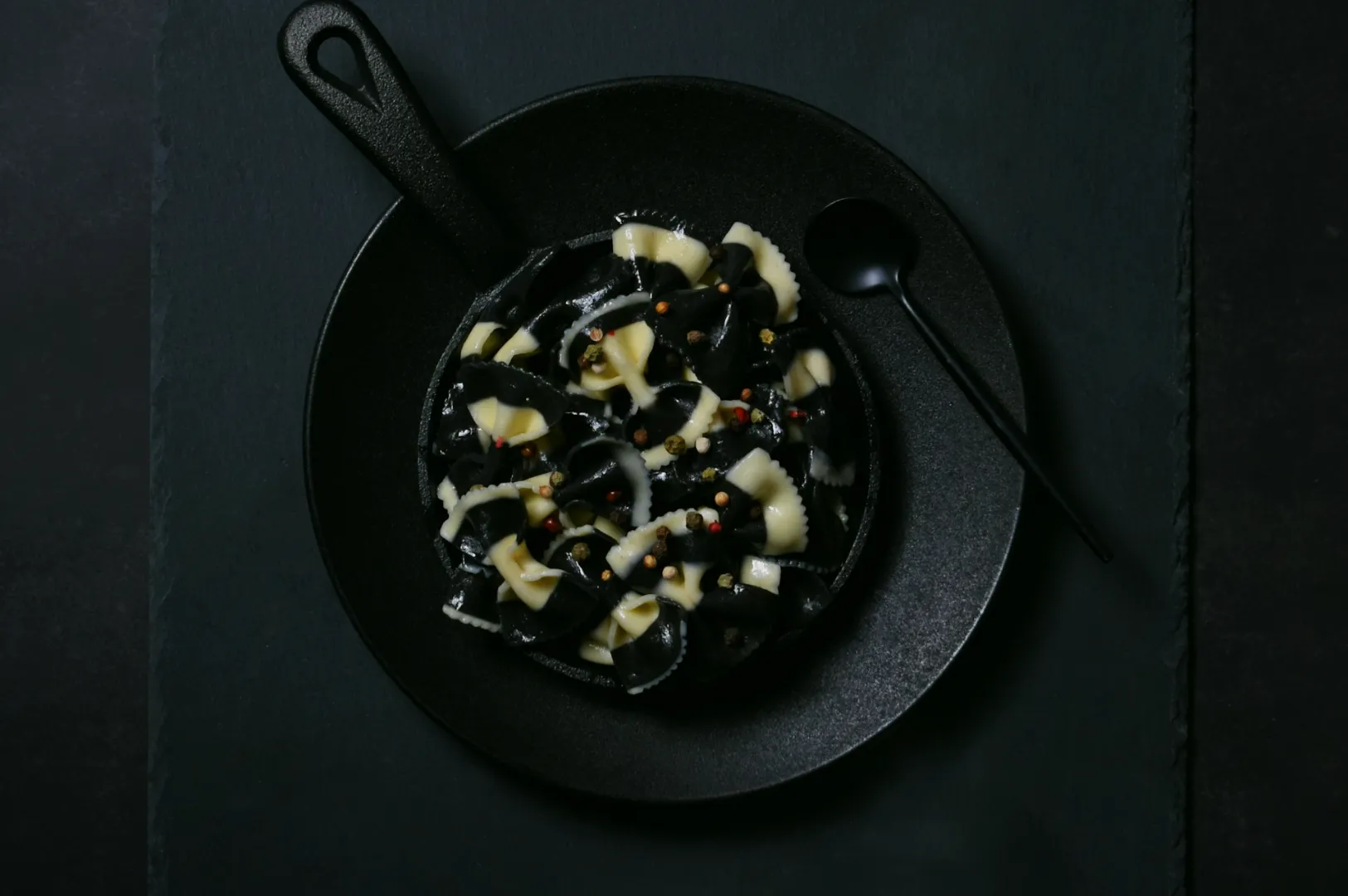
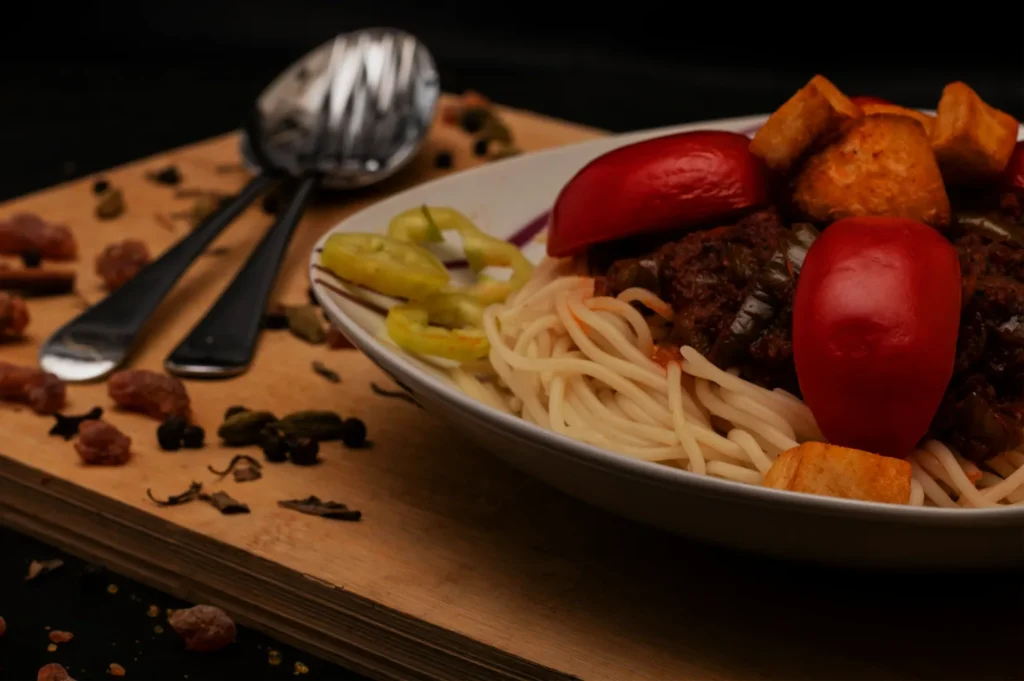
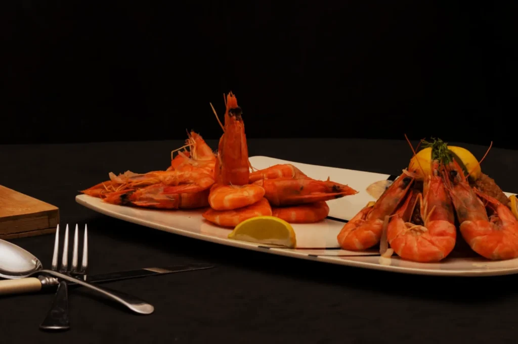
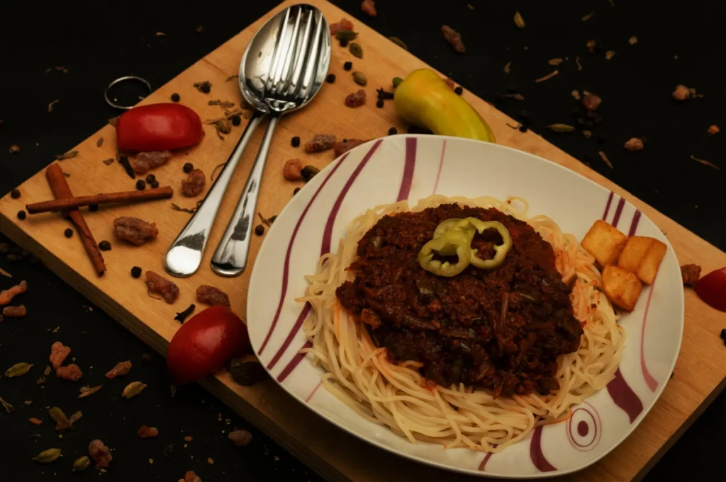
The Best Way To Build A Preset Is To Start With One Dish
Pick a dish that represents your menu well:
- something with whites (rice, plate, tofu)
- something with greens (herbs, salad)
- something with warm tones (meat, sauce)
Edit it carefully first. Then turn that edit into a preset.
Build The Preset Around These “Safe” Adjustments
The One Rule That Keeps Presets From Ruining Food
Do not lock in everything.
You want a preset to apply:
- your “look”
- your general contrast style
- your preferred warmth level
But you still need to adjust:
- exposure for each dish
- white balance if the lighting changes
- highlights if plates are blowing out
This is the difference between consistent and copy-paste.
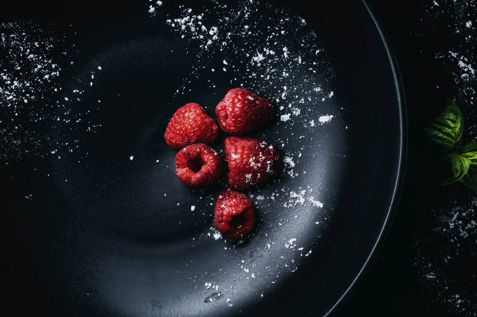
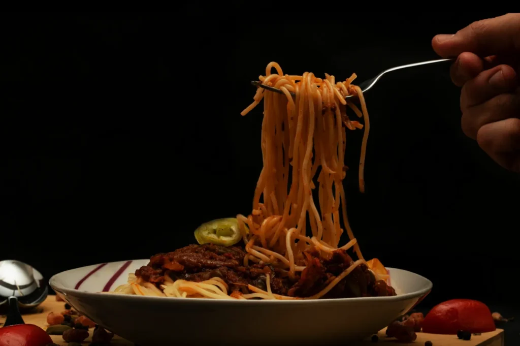
Train Your Team With A Simple “Check Before Post” Habit
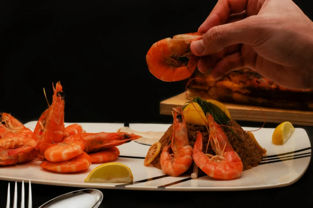
After applying the preset, ask:
- does rice still look like rice?
- do greens still look alive?
- does skin still look appetising, not crunchy?
If the answer is no, tweak. Presets are starting points, not final answers.
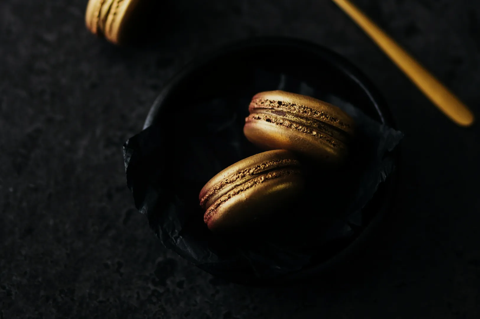
When Presets Become A Style Guide
If you have:
- a hero dish look
- a dessert look
- a drinks look
…you effectively have a small style guide, even without a document.
If you want to formalise it, create 2 to 3 preset options and name them clearly. Example: “Menu Clean”, “Warm Social”, “Night Mood”.