Color choices often make the complete difference between a flat image and an appetizing masterpiece. When you understand how colors interact, you can instantly grab a customer’s attention and trigger their appetite. Applying proper food photography color theory transforms standard macro food photography into an irresistible visual experience.
We will explore how to use complementary colors, warm tones, and strategic mood creation to elevate your menu. Mastering macro photography color techniques ensures your culinary creations always look their absolute best online.
Understanding the Color Wheel for Food Photography
The color wheel is your most powerful tool for mastering macro photography color in any professional studio setup. It helps you identify basic color relationships like complementary, analogous, and triadic color schemes. When you apply the color wheel to food styling and macro shots, you create immediate visual harmony. This harmony makes the food look naturally delicious rather than forced or artificial.
Local Singapore dishes provide perfect examples of these natural color relationships. Consider the vibrant orange broth of laksa contrasting beautifully against fresh green herbs. The rich browns of savory char kway teow pop perfectly when paired with bright red chilies.
Understanding these color relationships elevates your composition significantly. You can intentionally choose specific garnishes or plates that complete a specific color scheme. This deliberate approach to food photography color theory turns a simple plate of food into a striking visual story.
Warm vs. Cool Tones: Creating Appetite Appeal
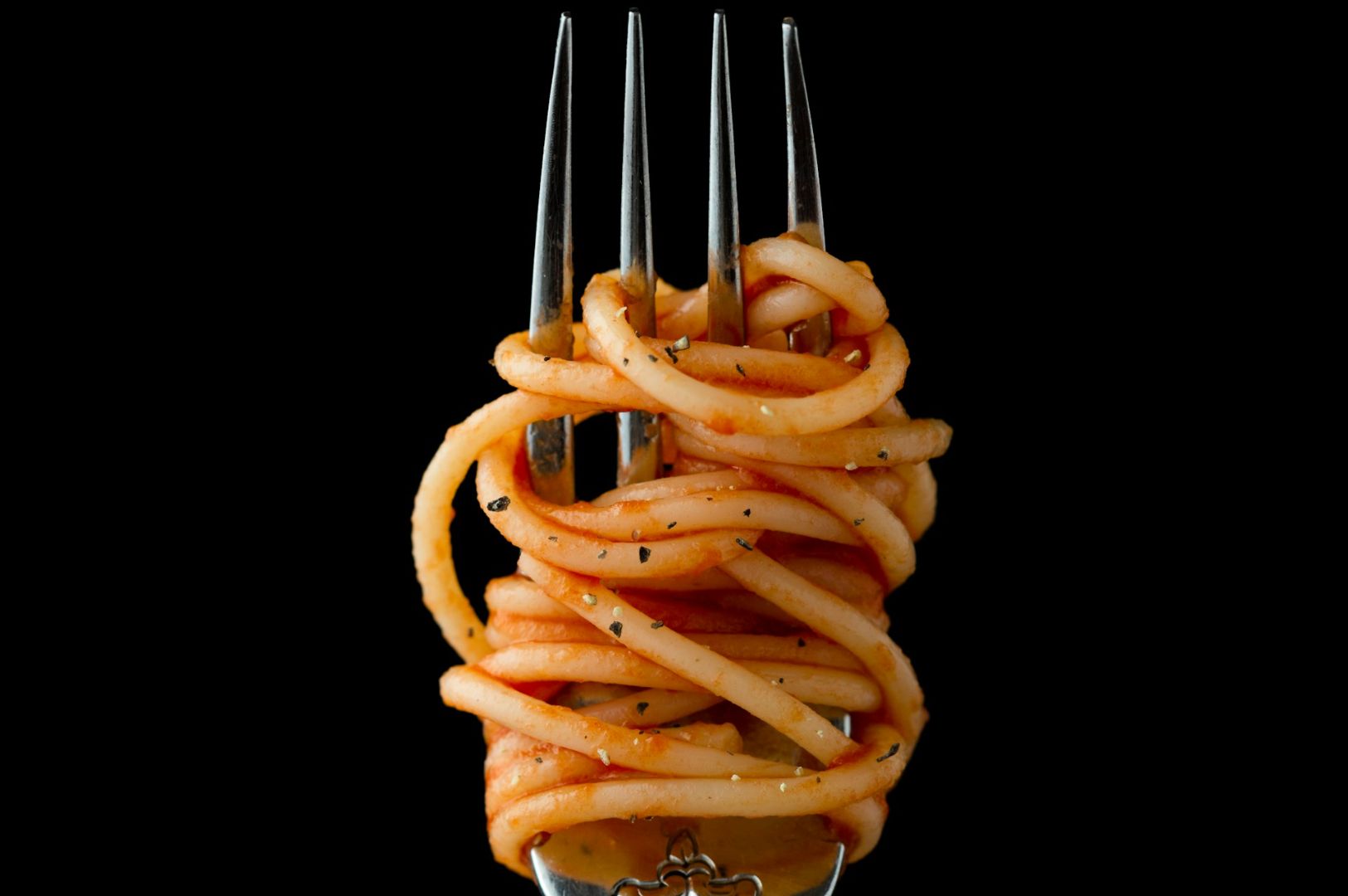
Human biology dictates that warm tones naturally trigger our appetite responses. Shades of red, orange, and yellow make food appear freshly cooked, savory, and highly comforting. This is why properly balancing these warm tones for appetite appeal is a foundational skill in food marketing.
However, you must also use cool tones strategically to provide necessary contrast and convey freshness. A cool blue plate or background can make warm, cooked food look even more appetizing by comparison. Managing your color temperature in both your studio lighting and your final image sets the entire mood.
In the Singapore F&B scene, we see this balance constantly. The warm, inviting tones of freshly grilled satay look incredible under warm light. Conversely, local shaved ice desserts require cool, crisp tones to communicate their refreshing nature. For more insights on lighting these setups, you can learn how to shoot macro photography for F&B with our comprehensive guide.
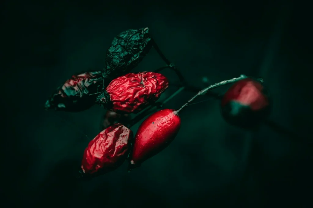
Complementary Colors in Food Styling
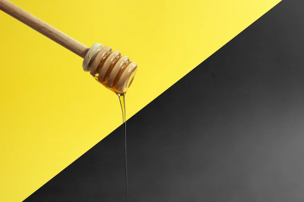
Using opposite colors on the color wheel creates an immediate visual pop in tight close-ups. This concept of complementary colors in food styling is highly effective for macro photography color strategies. Classic food pairings include bright green against vibrant red, warm orange against deep blue, and yellow against purple.
You can easily incorporate complementary colors through your choice of garnishes, styling props, and simple backgrounds. A tiny sprig of fresh cilantro on a bowl of rich red curry creates instant visual excitement. Singapore cuisine naturally features many of these striking color combinations.
The vibrant green pandan leaves used to wrap golden brown chicken provide a perfect natural contrast. Your main goal is utilizing these pairings while avoiding any harsh color clash. You want to maintain a strong, appetizing contrast without making the dish look artificial or chaotic.
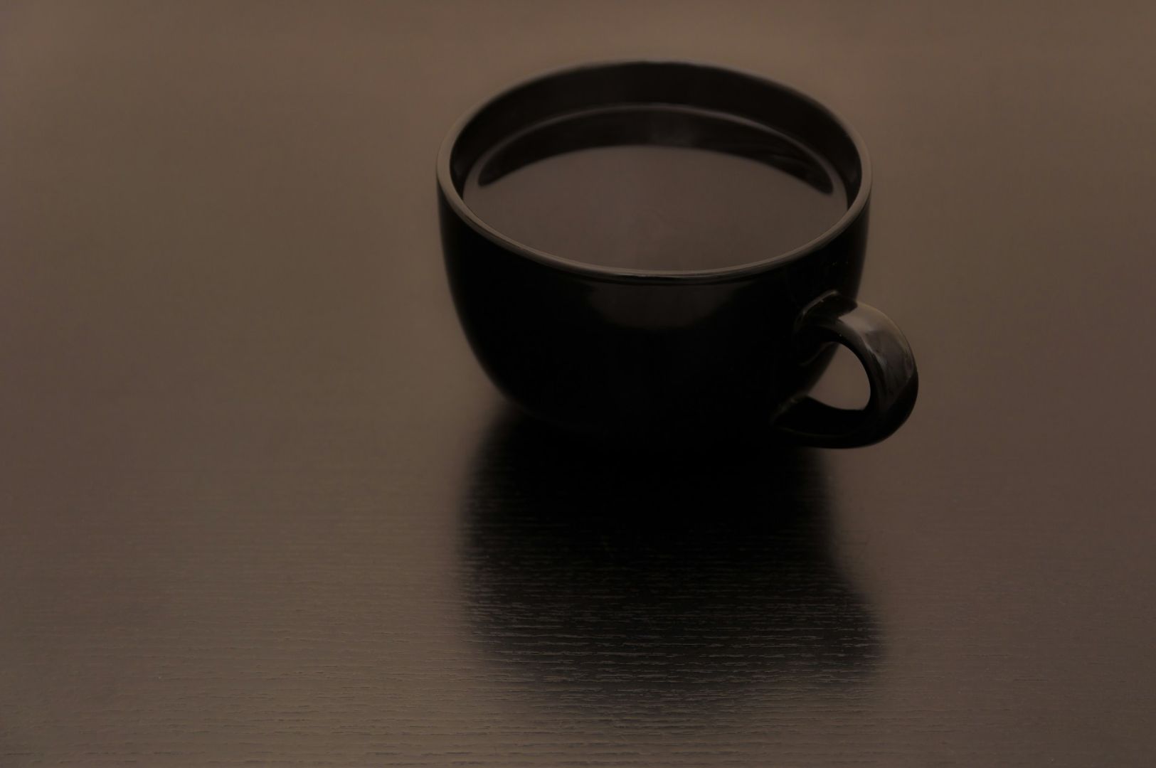
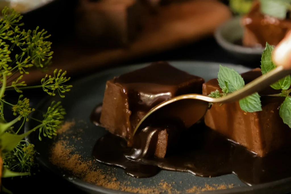
Monochromatic and Analogous Color Schemes
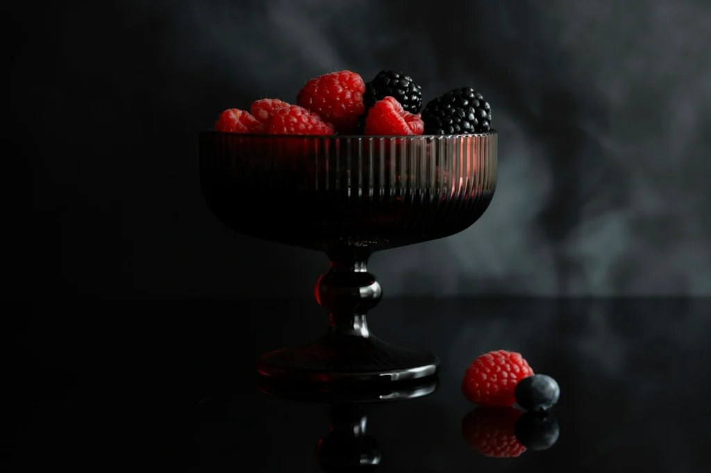
Sometimes a dish benefits from a more sophisticated and subtle color approach. Monochromatic schemes use varying shades of a single color to create a cohesive, elegant look. This technique creates incredible depth through subtle tonal variations in your macro shots.
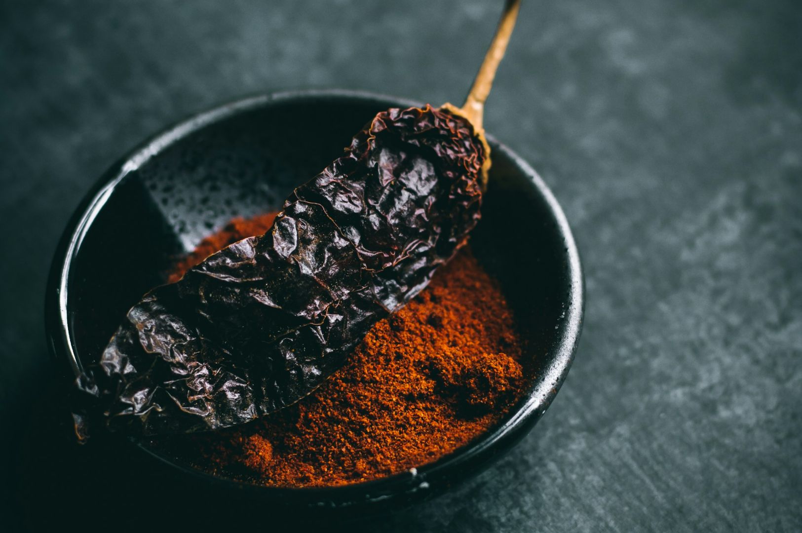
Excellent monochromatic examples include rich chocolate desserts, dark coffee drinks, and perfectly grilled meats. Analogous schemes use colors that sit next to each other on the color wheel. A perfect example is the blend of yellows, oranges, and reds found in many spicy Asian curries.
These harmonious schemes work wonderfully for highlighting the rich textures of Singapore dishes like beef rendang. You can add subtle pops of brightness to these scenes without breaking the overall color harmony. A small drizzle of golden oil on a warm brown stew adds just enough interest to captivate the viewer.
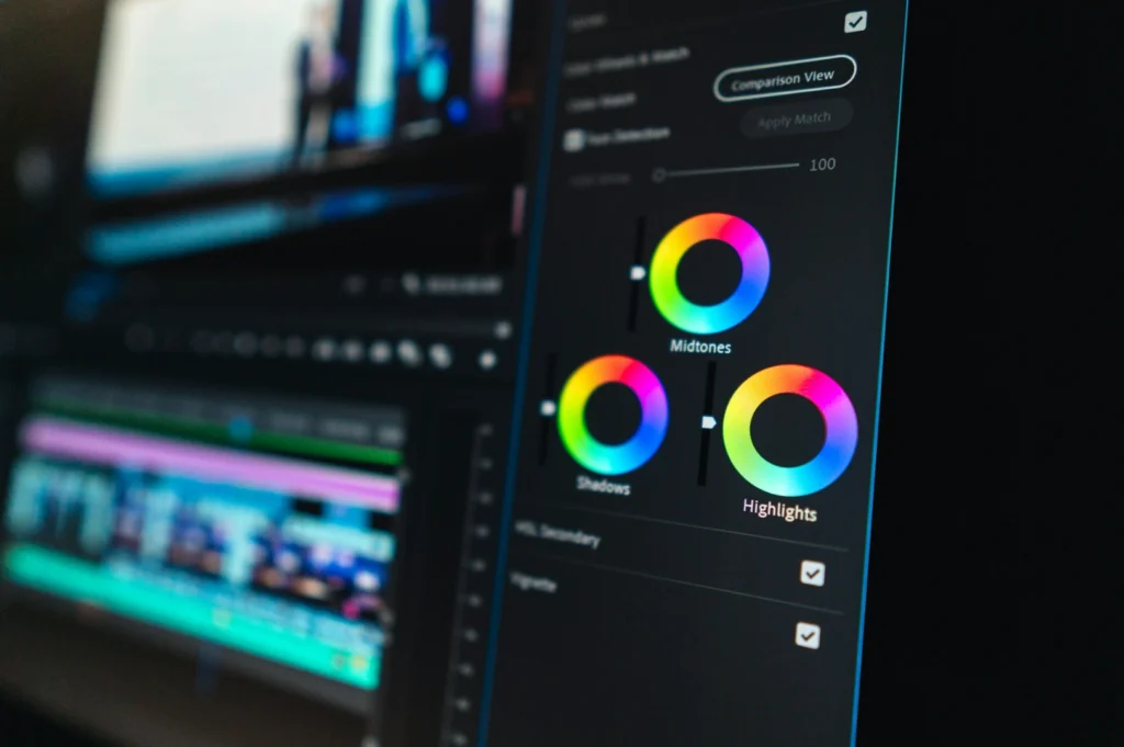
Color Grading and Post-Processing for Macro Food Images
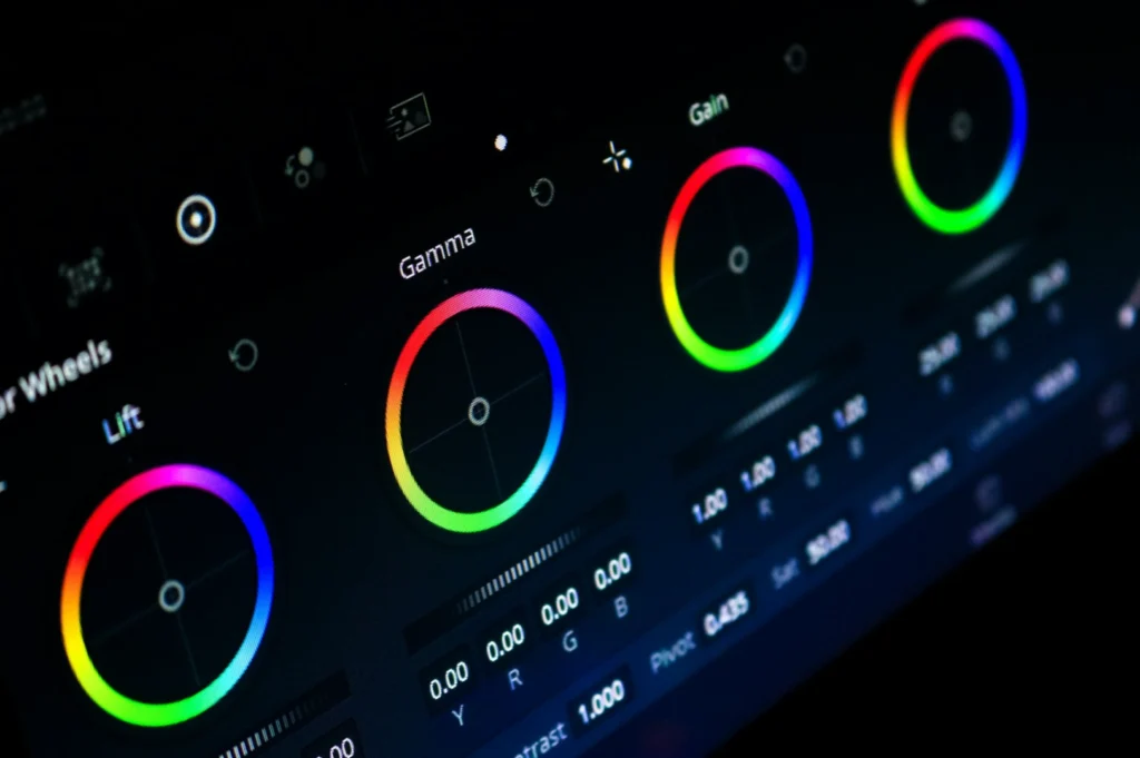
The magic of food photography color theory truly comes alive during the editing process. Color grading macro shots involves enhancing the natural colors of the food without pushing them into oversaturation. You must adjust individual color channels carefully to maximize overall appetite appeal.
Creating consistent color palettes across your entire menu photography builds a strong visual brand for your restaurant. One of the most common color grading mistakes is making the food look radioactive by pushing the vibrance slider too far. Another issue is failing to correct the ugly yellow color casts caused by mixed indoor restaurant lighting.
Professional tools and techniques for color correction help you fix these issues easily. You can use targeted hue adjustments to make the roasted skin of a chicken rice dish look perfectly golden. Proper post-processing ensures your macro photography color remains highly accurate and deeply appetizing.
Background and Prop Colors in Macro Composition
Your background heavily influences how the viewer perceives the colors of your main dish. Choosing background colors that enhance rather than compete with the food is a critical styling skill. Neutral backgrounds are universally safe, but bold color choices can make a dish truly unforgettable.
How you select your props and surfaces affects the entire color story of your close-up shot. Singapore F&B aesthetic preferences often lean toward natural, earthy tones that complement traditional local cooking. Building a versatile color palette of props prepares you for shooting many different cuisines.
A dark slate board makes the bright colors of fresh sushi pop beautifully. Meanwhile, a warm wooden table brings out the comforting tones of a classic claypot rice dish. Selecting the right background color is just as important as the food styling itself.
Cultural Color Associations in Singapore F&B
Color meaning varies greatly across different cultures, which is highly relevant in our local dining scene. Red and gold hold massive significance in Chinese cuisine presentation, symbolizing luck and prosperity. Incorporating these colors into festive dishes makes the imagery culturally authentic and highly appealing.
Green holds deep significance in many Malay and Indian dishes, often representing freshness and natural ingredients. Western F&B color trends in the Singapore market tend to favor clean whites and moody, dark tones. You must respect the cultural context of the dish while maintaining strong visual appeal.
Adapting your food photography color theory to match these multicultural expectations shows great respect for the cuisine. A plate of Nyonya kueh should proudly display its vibrant, traditional pastel colors without heavy, moody editing.
Practical Color Combinations by Cuisine Type
Different styles of cooking naturally lend themselves to specific color palettes. Here are some highly effective color combination strategies based on popular local cuisines:
- Chinese cuisine: Utilize rich reds, bright golds, and deep glossy browns with fresh green vegetable accents.
- Malay cuisine: Focus on vibrant natural greens, bright turmeric yellows, and rich chili reds.
- Indian cuisine: Highlight warm curry oranges, mustard yellows, and deep red tandoori spices.
- Western cuisine: Embrace earthy tones, fresh crisp greens, and clean white plates for contrast.
- Desserts and beverages: Play with soft pastel palettes or create bold, high-contrast pairings like chocolate and raspberry.
By applying these specific macro photography color guidelines, you ensure every menu item looks both delicious and authentic.
Conclusion
Strategic color use is the secret ingredient for creating truly irresistible food images. We highly encourage you to experiment with these color theory principles during your next menu photoshoot. Understanding how colors interact will completely change the way you style and photograph your culinary creations.
Mastering color theory in macro food photography transforms ordinary dishes into visual feasts. Professional food photographers understand how complementary colors, warm tones, and strategic color grading create appetite appeal while respecting cultural context. Whether shooting local hawker favorites or fine dining creations, expert color choices ensure your Singapore F&B business stands out with images that truly captivate. You can contact Food Photographer Studio today to elevate your visual marketing.