A diner does not fall in love with your menu the way they fall in love with a story. They scan. They compare. They decide quickly, often before they even realise they have decided. That is why menu photography matters. Not as decoration, not as “nice branding”, but as the visual proof that your food is worth ordering.
In Singapore, this is amplified. We are a food-literate market. People know what good chicken rice should look like. They can tell when a curry is rich versus flat. They can spot when a drink photo is warm, even if the glass is technically “cold”. Your menu photos are doing quiet work: reducing doubt, setting expectation, and nudging appetite.
This guide is for F&B owners who want a practical, repeatable approach. Not theory. Not gear talk. Just what makes menu photography perform, and how to build a menu photo set that looks consistent, believable, and profitable.
Why Menu Photography Is Not Just “Pretty Pictures”
A strong menu photo does three jobs at once.
First, it clarifies. Diners want to know what they are buying. What is the portion? What are the key ingredients? Does it come with sides? If your dish is unfamiliar, the photo is the translator.
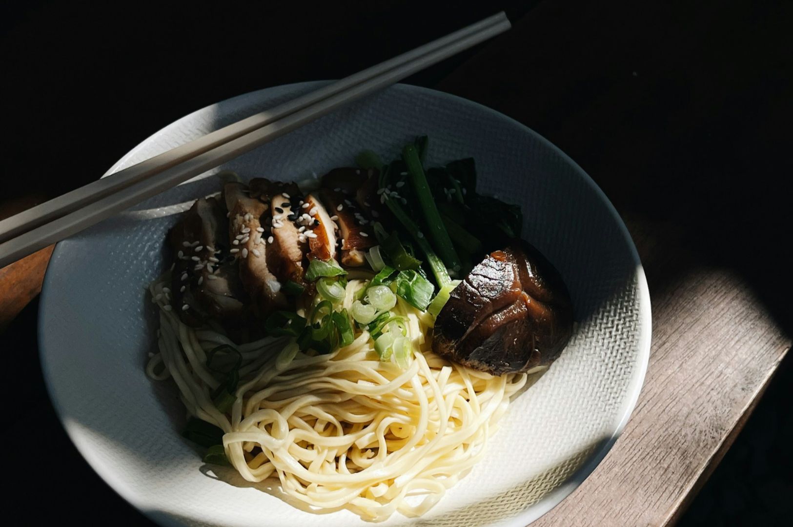
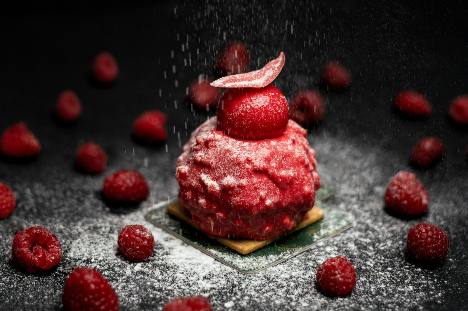
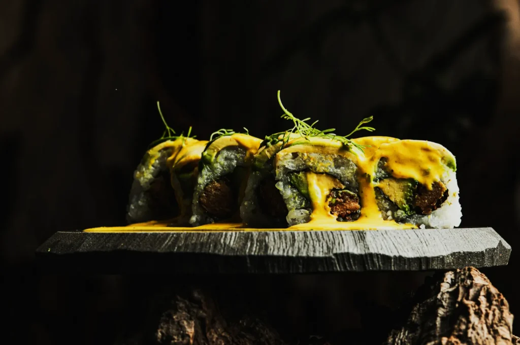
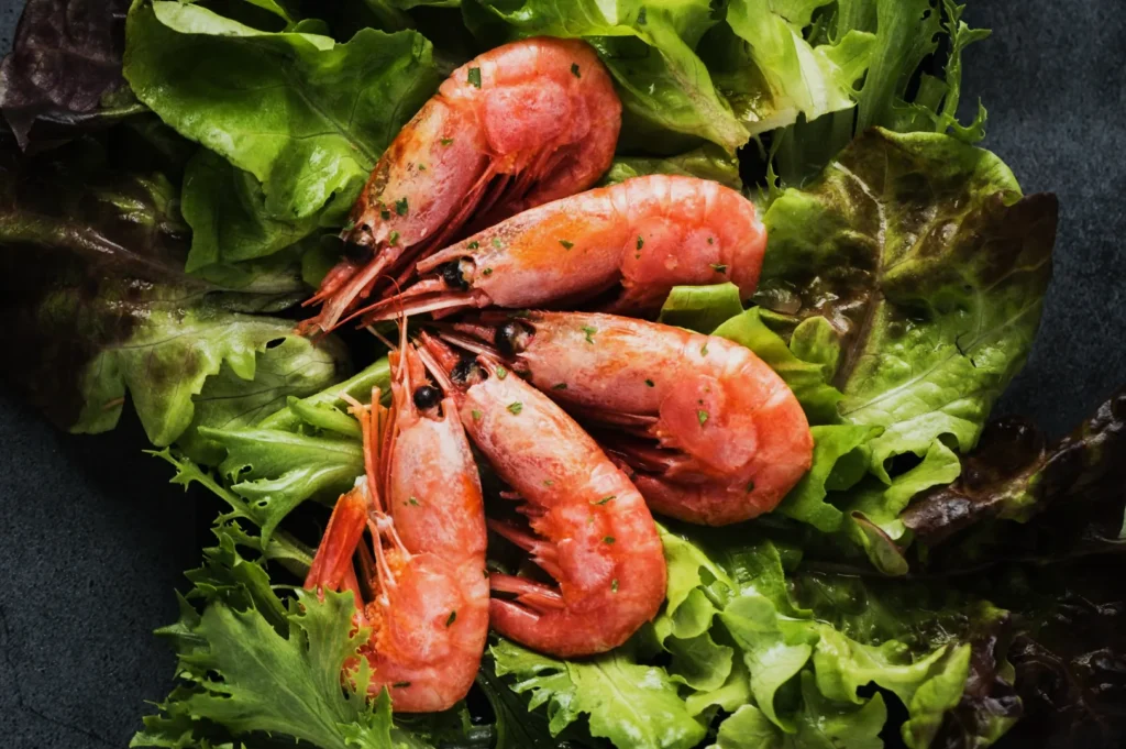
Second, it creates appetite. The brain reacts to cues like gloss, texture, steam, crisp edges, and contrast. A photo that makes food feel fresh and “alive” wins attention.
Third, it protects trust. In Singapore, diners are quick to call out photos that overpromise. If what arrives looks smaller, messier, or totally different, the cost is not only a complaint. It is a long-term hit to credibility.
Menu photography is basically expectation management with taste cues baked in.
What Actually Makes Menu Photography Work
We can talk about lighting and lenses all day, but menu photos that sell tend to share a few non-negotiables.
Clarity beats creativity
Menu photography is not the same job as social content. Your hero dish should be instantly readable. You can still have mood, but not at the expense of visibility. If diners cannot tell what the protein is, they will order something safe.
Appetite cues are deliberate
These are the cues we build intentionally in a shoot:
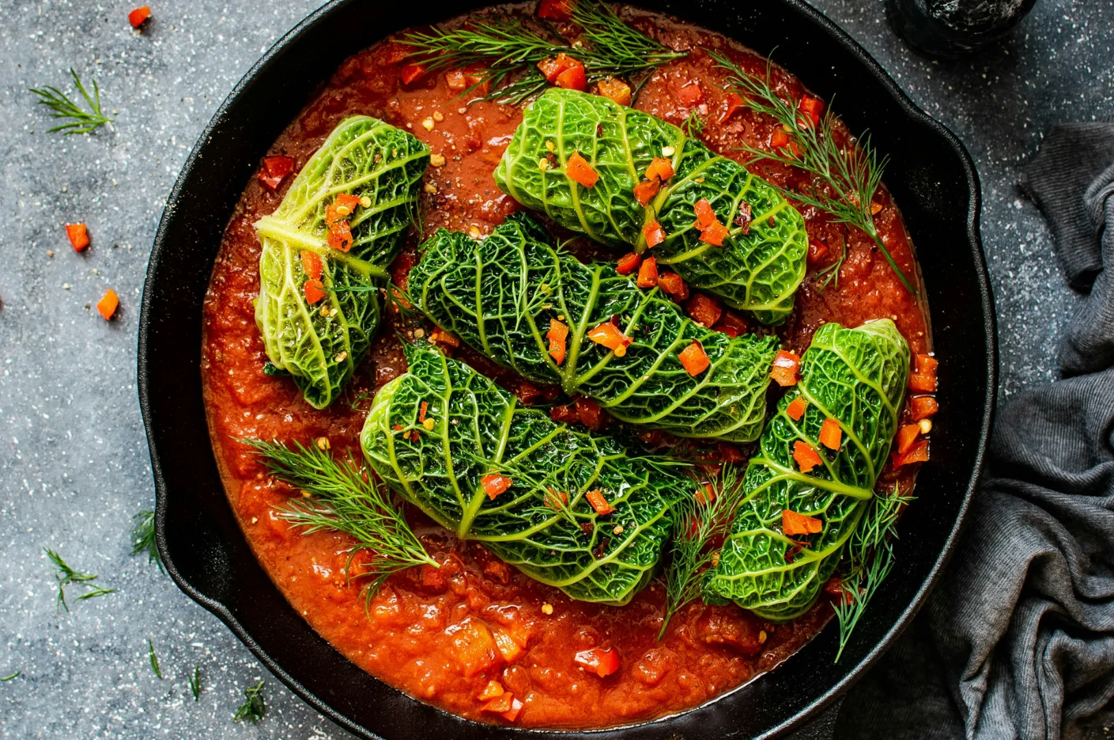
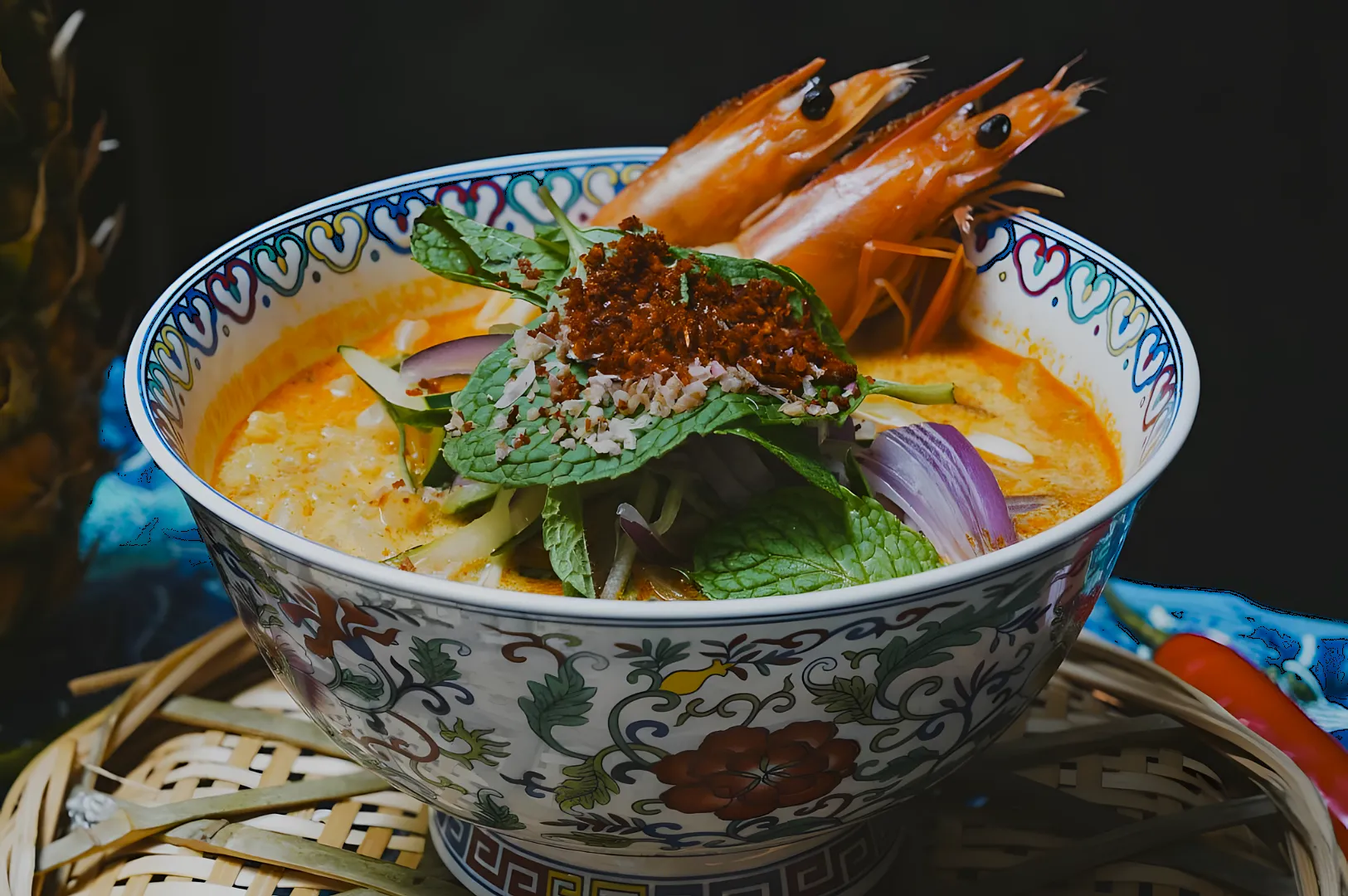
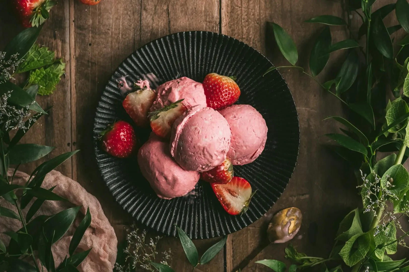
- Texture that reads on screen: crisp skin, flaky pastry, sauce sheen, char marks
- Freshness signals: bright herbs, clean highlights, condensation where it makes sense
- Depth without clutter: one clear subject, supporting elements kept quiet
- Colour that looks edible: whites are clean, greens are not dull, meat does not look grey
Accuracy matters more than perfection
The best menu photos do not look fake. They look like your dish on its best day, served the way you actually serve it. That is the difference between a photo that drives orders and a photo that creates disappointment.
The Menu Shoot Planning Most Restaurants Skip
Most menu photography problems are not “camera problems”. They are planning problems. If you plan well, you can shoot efficiently without wrecking operations.
Start with a real shot list
Not a vague list of “shoot everything”. A useful shot list includes:
- Dish name and category (mains, sides, desserts, drinks)
- Priority level (signature, high margin, new launch, always-ordered)
- Angle preference (overhead, 45-degree, eye-level)
- Styling notes (must show filling, must show broth, must show size)
This is how you avoid ending a shoot with five versions of your best seller and zero usable photos of the dish that actually needs help.
Batch by behaviour, not by menu order
Shoots move faster when you group dishes by how they behave:
- Melters: ice cream, shaved ice, whipped cream desserts
- Steam-dependent: soups, noodles, claypot, grilled items
- Gloss-sensitive: oily curries, lacquered meats, stir-fries
- Drink reflections: cocktails, iced coffees, anything in glassware
When you batch this way, you reduce rework and you keep dishes looking right at the moment you shoot.
Plan for holding and resets
Restaurants underestimate how quickly food changes under lights. If you need steam, you shoot immediately. If you need crispness, you do not let the dish sit while you rearrange props. Your team should know the sequence before the first plate lands.
Consistency Is the Real “Luxury” in Menu Photography
One great photo is nice. A menu set that looks cohesive is what builds trust.
When menu photography is inconsistent, diners feel it even if they cannot explain it. One dish is warm-toned, the next is cool. One is shot tight, the next is wide. One has moody shadows, the next is flat. The result is visual confusion, and confusion slows decisions.
Here are the consistency rules we use most often for Singapore menus:
Pick a core angle strategy
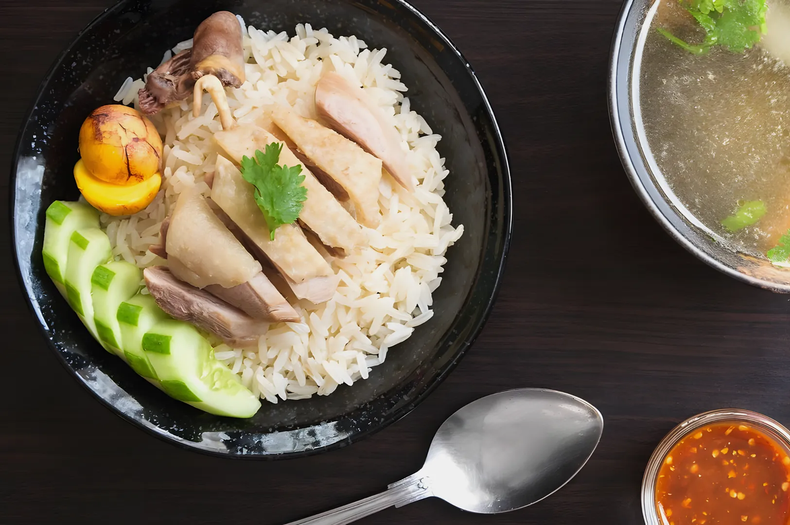
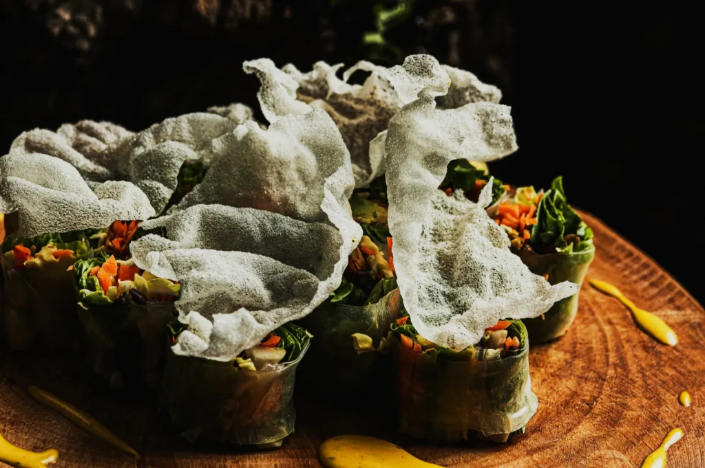
- Overhead for bowls, rice sets, sharing platters, and anything where “what comes with what” matters
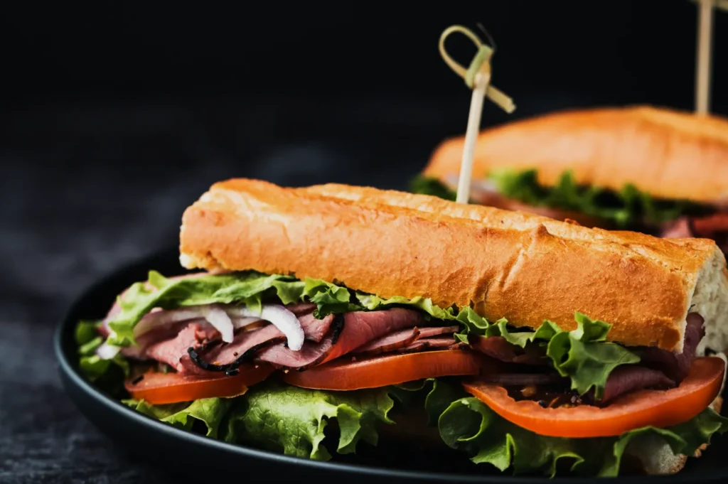
- 45-degree for dishes with height, layers, and texture
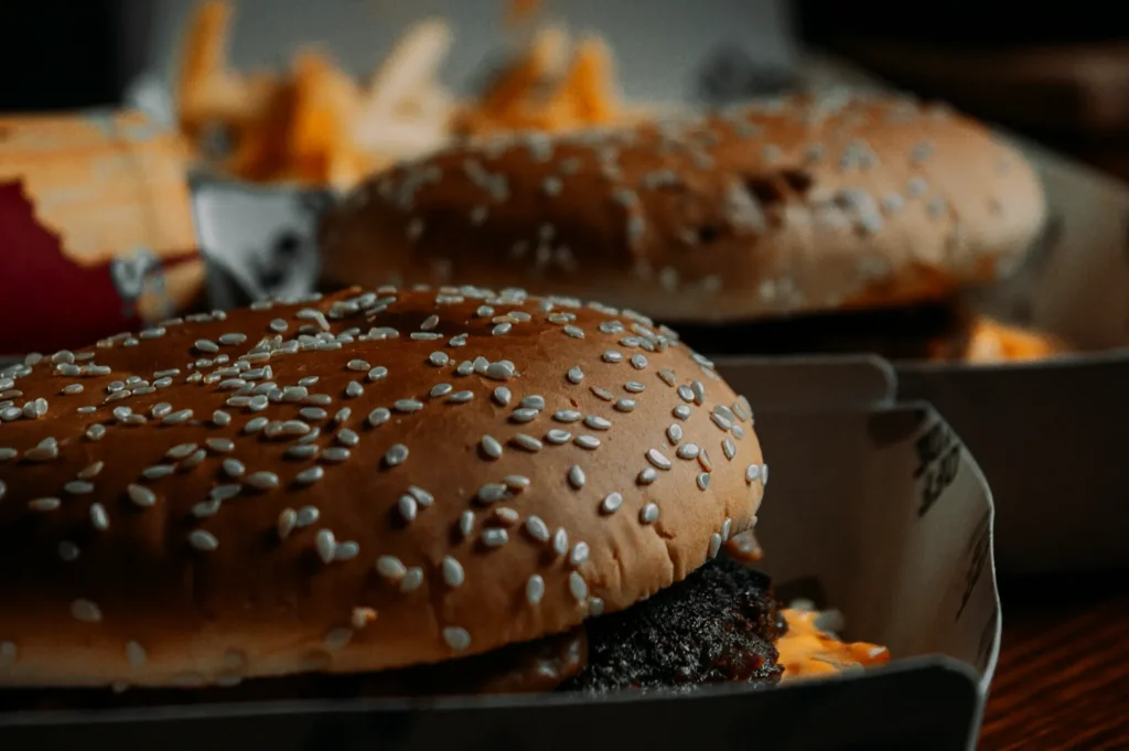
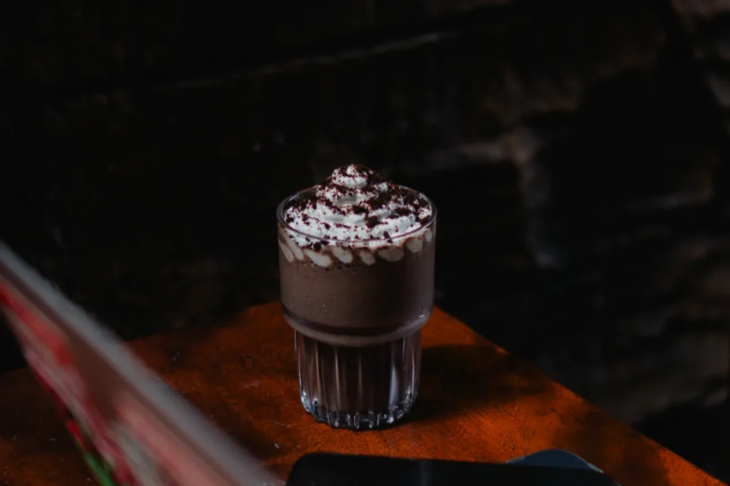
- Eye-level for burgers, sandwiches, tall desserts, and drinks where layers matter
You do not need only one angle, but you do need a repeatable logic.
Standardise background and surfaces
A menu should feel like one brand. This does not mean every dish uses the same surface forever, but it does mean the surfaces do not fight each other.
Neutral surfaces tend to be the safest for long-term use because they do not date quickly. In Singapore, we also consider cuisine context. A heritage dish can still be shot cleanly without stripping its identity. You do not need a themed prop explosion to feel “local”.
Keep colour honest
Singapore diners notice when colour looks off, especially with rice, noodles, greens, and sauces. This is where many DIY menu sets fail. The food might be good, but the photo makes it look tired.
If your menu photos are meant to represent what customers receive, colour accuracy is not optional.
Where Menu Photography Breaks in Real Life
Even good restaurants run into the same traps. If you fix these, your menu photos improve fast.
“Everything has a photo” syndrome
When every item is photographed, the menu can feel noisy. The diner stops seeing what is special. A cleaner strategy is to photograph what needs visual support:
- signatures and bestsellers
- high-margin items you want to push
- dishes that customers regularly ask questions about
The portion-size trap
Some owners want the dish to look “big” at all costs. The moment the real plate arrives, trust collapses. The better approach is to show portion honestly, then use styling and angle to make it look appetising, not inflated.
The mixed-lighting problem
Singapore restaurants often have mixed lighting: warm downlights, cool signage light, window light, kitchen light. That mix can make food look strange in photos. Menu photography needs controlled light, or at least controlled decisions about where and how you shoot.
A Practical Way to Know If Your Menu Photos Are Working
You do not need complicated tools to evaluate results. Start with what you already have:
- Which items get ordered often, and which get ignored?
- Which items do customers ask questions about before ordering?
- Which photos look “different” from the rest of the menu set?
A strong menu photo reduces questions. It makes the diner feel confident. When confidence goes up, add-ons and premium choices usually rise with it.
If you have digital menus, you can go one step further: change photos for a small group of items and watch what happens over 2 to 4 weeks. Menu photography should earn its keep.
Menu Photography That Builds Trust and Moves Orders
The best menu photography does not shout. It reassures. It makes the food feel clear, desirable, and worth the price. In Singapore’s crowded F&B scene, that matters more than ever because diners are comparing you against ten other places in the same minute.
If you want to tighten your menu photos, start with consistency and honesty. Get your core angles right. Simplify the frame. Make colour believable. Then build a menu set that looks like one brand, not a collection of random shoots.
If you want a menu photography partner who shoots with Singapore diners in mind, the team at Food Photographer Studio can help you create a menu image set that looks cohesive, reads clearly on screens, and holds up over time, without turning your dishes into something they are not.