Menu photography usually fails in a very specific way.
Not because the food looks bad. Not because the camera is weak. It fails because the set does not feel like one brand.
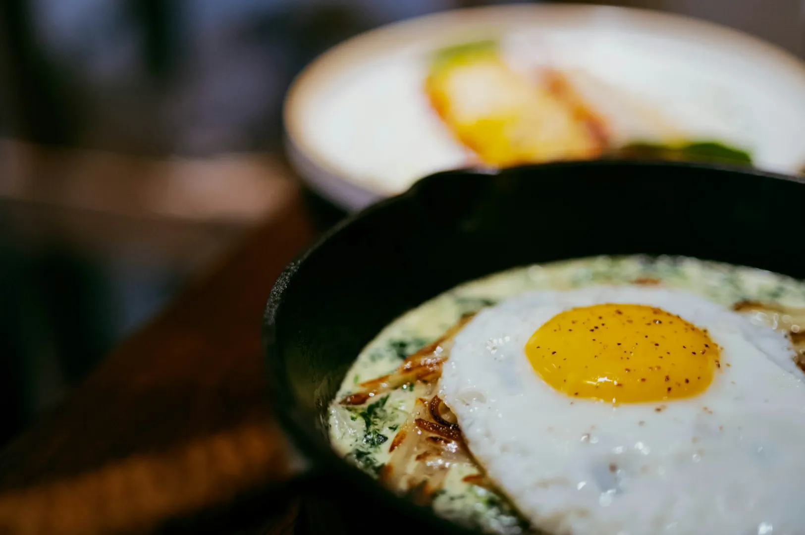
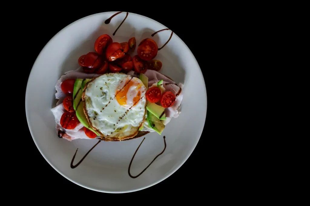
One dish is bright and airy. The next is warm and yellow. Another is moody and dark. Portions look different. Angles change randomly. Plates switch. Backgrounds jump from marble to wood to patterned tiles. Your customer might not be able to explain what feels off, but they feel it anyway. Confusion is quiet, but it is expensive.
A menu photography style guide is how you stop that drift. It is a simple document that tells your team (and your photographer) what “on brand” looks like, so every menu photo reinforces trust instead of resetting the customer’s expectations each time.
If you want the bigger picture of what makes menu images convert, start here first: our menu photography playbook for Singapore restaurants.
Why A Menu Photography Style Guide Matters More Than You Think
Most Singapore diners are making decisions fast. They are scanning thumbnails on delivery platforms, comparing set meals, checking Google before a reservation, or browsing your website on mobile. In that environment, consistency does three things:
It reduces doubt.
When your photos look like a coherent set, customers assume the kitchen is consistent too.
It helps your “hero dishes” stand out.
If every dish is styled and edited differently, nothing looks like a signature. A consistent set creates a baseline. Then your bestsellers can shine.
It protects your brand across platforms.
A menu photo is used everywhere now. Digital menus, delivery listings, social posts, signage, even press kits. If the base style is stable, repurposing becomes easy.
The Core Elements Of A Menu Photography Style Guide
A good style guide is not a creative essay. It is a short set of rules that are easy to follow on a busy shoot day.
1) Lighting Direction And “Brightness Level”
Pick one primary lighting approach and stick to it.
Most menu sets work best with a clean, natural look because it reads clearly on small screens. That usually means soft directional light that shows texture without harsh shadows.
Your guide should specify:
- Is the overall set bright, neutral, and clean, or slightly moody and premium?
- Is the light coming from the left or right?
- Do you want visible shadow for depth, or minimal shadow for clarity?
This matters because lighting is what makes two dishes look like they belong in the same menu, even if the food is totally different.
2) Colour Temperature And White Balance
Singapore restaurants often have mixed lighting. Warm downlights, cool kitchen fluorescents, daylight from windows. If you do not control colour, your menu will swing between yellow, blue, and grey.
Your guide should define:
- Whites should look white, not cream, not grey.
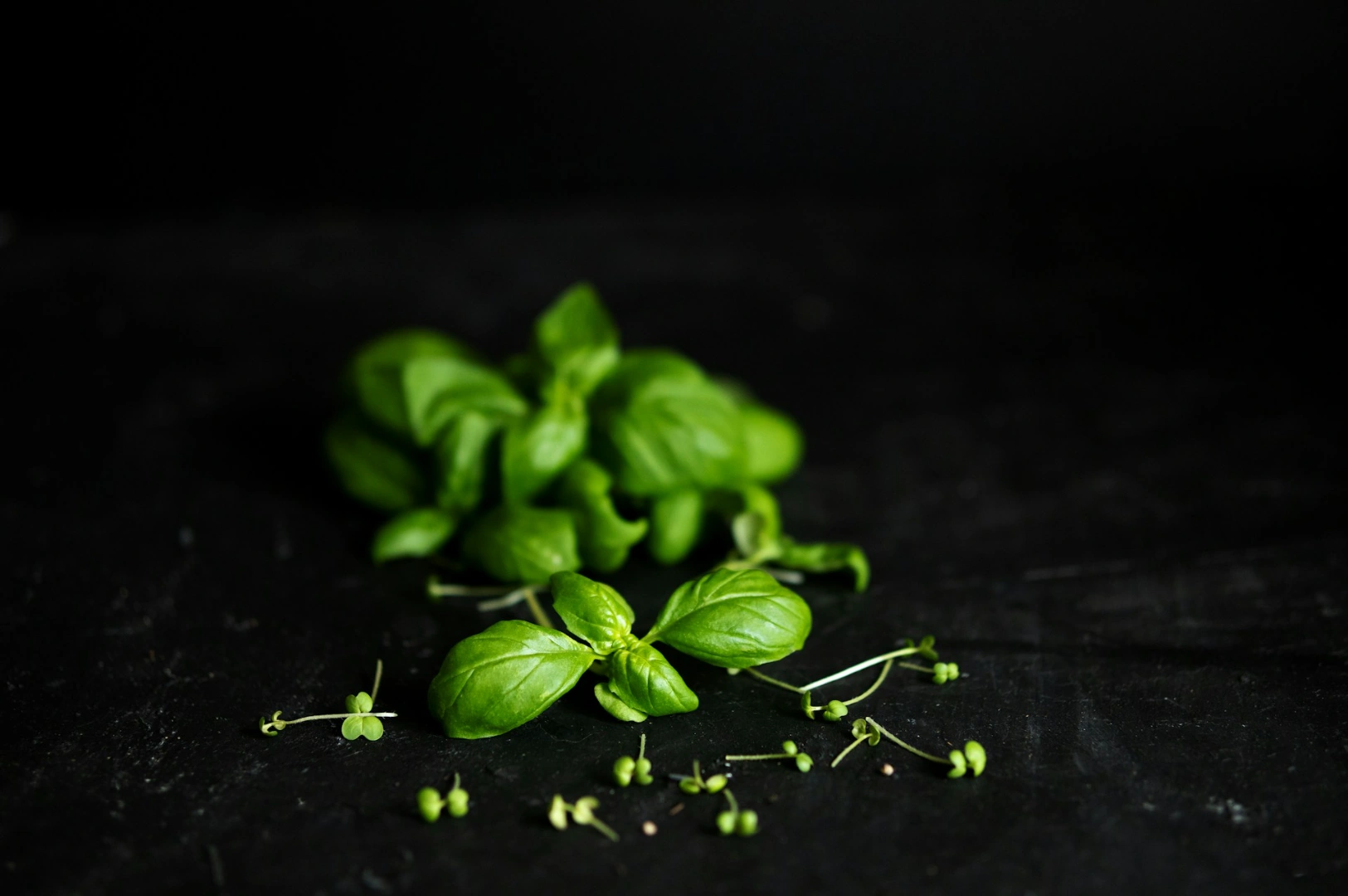
- Greens should look alive, not dull.
- Sauces should look rich, not muddy.
This is also why professional editing matters. The goal is not to “beautify” food into fantasy. The goal is to make food look like itself, consistently.
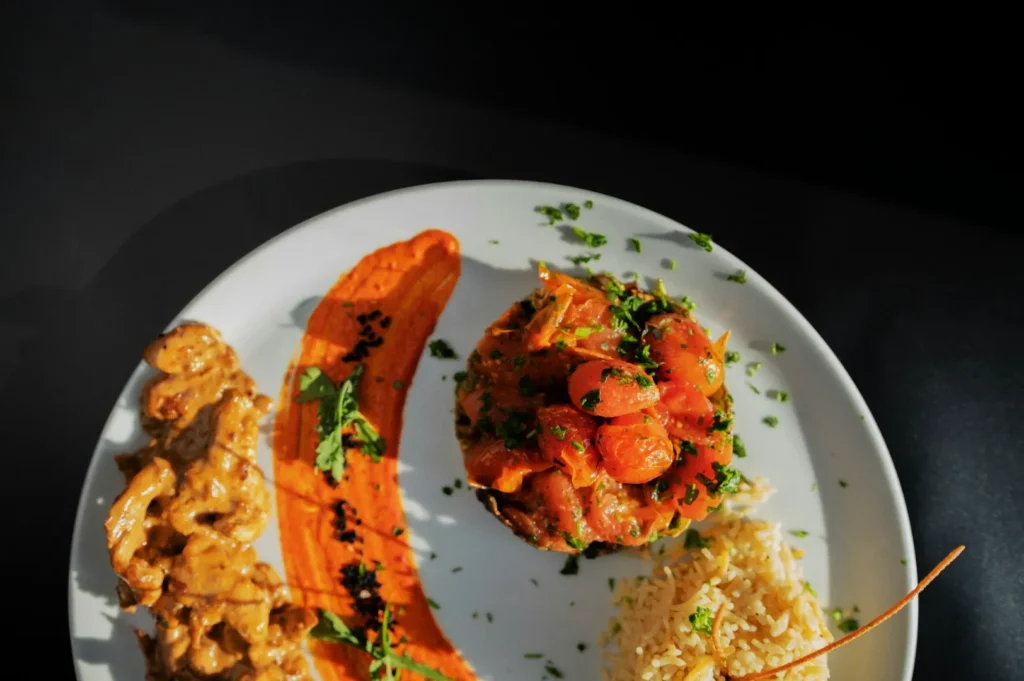
3) Angles And Framing Rules
You do not need one angle for everything, but you need a system.
A practical set of rules looks like this:
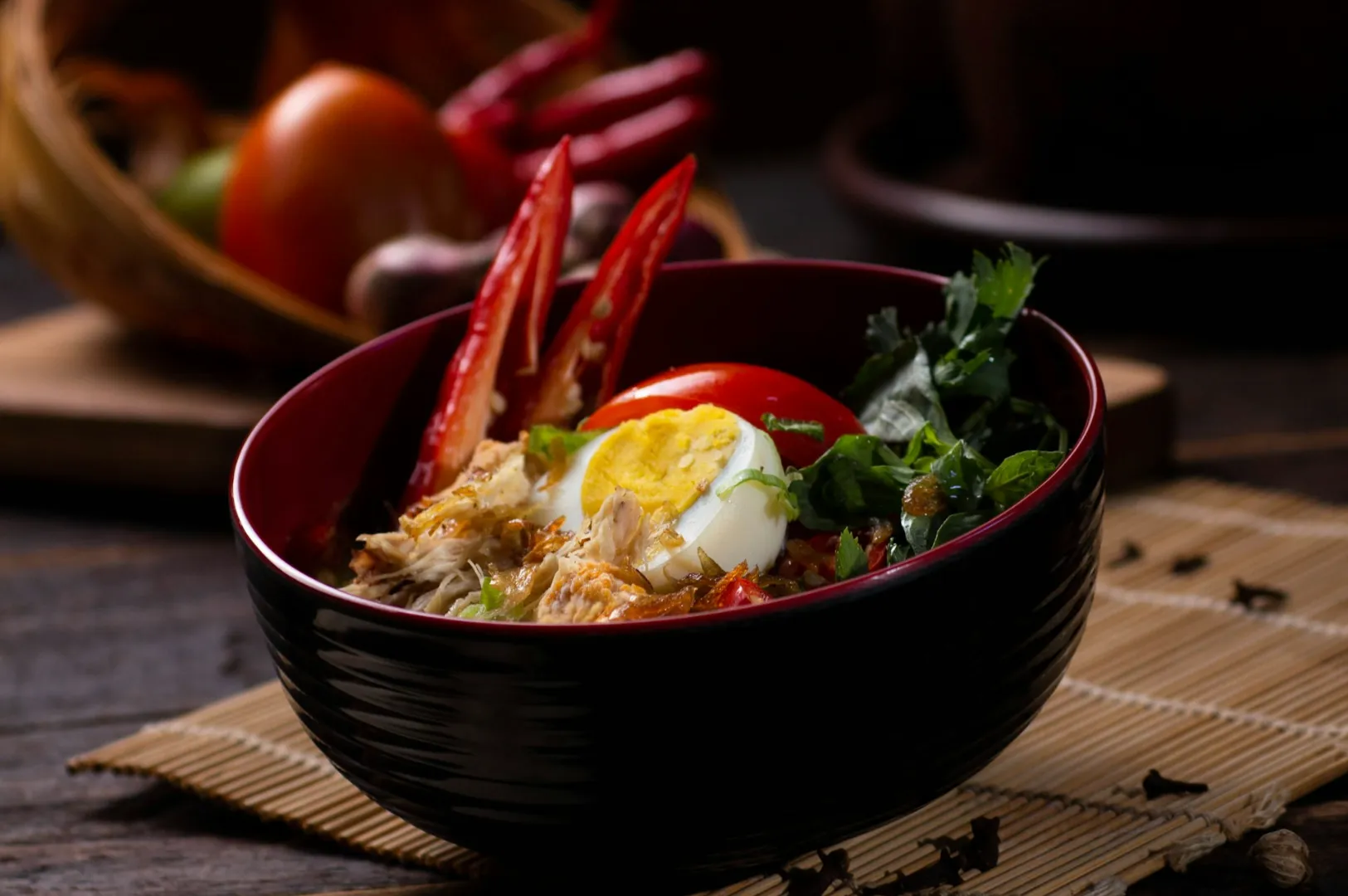
- Bowls, rice sets, and dishes with components: overhead or high-angle for clarity.
- Mains with height and texture: 45-degree for depth.
- Tall items and drinks: eye-level for layers.
Then decide how tight your crops are. Menu thumbnails usually need tighter framing than lifestyle social content. If your guide does not define crop tightness, half your photos will look “zoomed in” and the other half will feel distant.
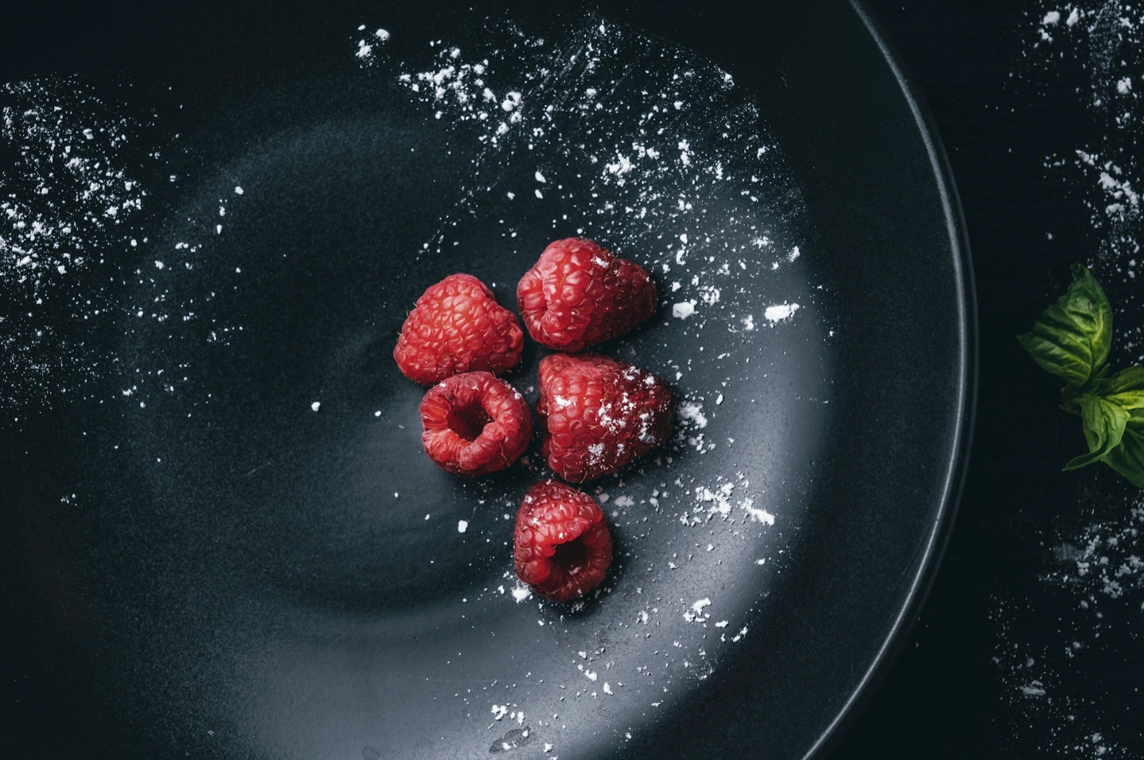
4) Plates, Backgrounds, And Surfaces
This is where many menus quietly collapse.
If your plates and backgrounds keep changing, customers cannot form a stable visual expectation. Your menu starts to look like a mood board rather than a restaurant.
Your guide should specify:
- 1 to 2 “main” plate styles for most dishes (often matte and neutral).
- 1 to 2 “main” surfaces or backgrounds that work across your cuisine.
- Any exceptions that are intentional (for example, a heritage dish shot on a classic enamel plate because it is part of your brand story).
Avoid shiny plates unless you know how to manage reflections. Shiny surfaces create glare fast, especially under restaurant lighting.
5) Food Styling Standards That Match Service Reality
This is the part that protects you from customer disappointment.
Your style guide should describe what is allowed and what is not:
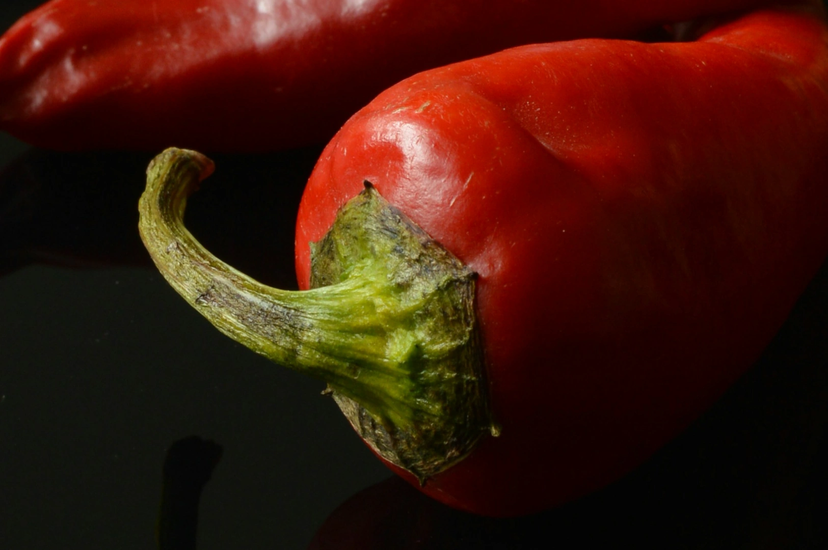
- Garnishes must be part of the actual dish.
- Portioning must match what customers receive.
- Sauces can be placed neatly, but not exaggerated beyond reality.
- “Freshness cues” like herbs and shine are encouraged, but should still look believable.
The best menu photography makes the dish look like the best version of itself, not a different dish.
6) Post-Production Rules
Editing is where consistency is either protected or destroyed.
Your guide should clarify:
- Contrast level (clean and crisp, or softer and flatter).
- Saturation level (natural, not oversaturated).
- Sharpening (enough to feel crisp, not crunchy).
- Background cleanliness (remove distracting crumbs, but do not sterilise the food into plastic).
If your menu is updated over time, these editing rules are what make new dishes blend into the old set.
How To Build A Style Guide Without Overcomplicating It
If you are starting from scratch, keep it simple.
Pick 6 to 10 reference images that feel like “your brand”. They can be your past shoots, inspiration references, or competitor examples you admire. Then define what those images have in common.
Ask:
- What is the light doing?
- How warm or cool are the whites?
- How tight is the crop?
- How much background is visible?
- What kind of plates and surfaces repeat?
Write the answers down in plain language.
Your style guide should be something a manager can read in five minutes and use to brief a shoot.
Common Mistakes That Make Menu Sets Look Unprofessional
Inconsistency disguised as “variety”
Variety is good for social. Menu photos need structure. Your customer wants to compare, not interpret.
Over-styling that changes the dish
If the dish arrives and looks simpler than the photo, trust drops. Complaints rise. Returns happen. The short-term click is not worth the long-term damage.
Editing in different directions
If your older photos are warm and your new photos are cool, the menu looks like it belongs to two restaurants.
Too many surfaces and props
Props are helpful for storytelling. Menu photos are primarily decision tools. If the customer is thinking about the napkin instead of the dish, the image is not doing its job.
Keeping The Style Guide Alive As Your Menu Changes
A menu style guide is not a one-time file. It should evolve with your brand, but slowly and intentionally.
If you refresh your menu every season, do a quick consistency check:
- Do new photos match old photos in brightness, colour, and crop?
- Do signature dishes still look like the “hero” items?
- If you changed plates or surfaces, was it a strategic rebrand, or just convenience?
This is also where working with a studio helps. At Food Photographer Studio, we keep a stable look across multiple shoots, so your menu can grow without your visuals drifting.
A Consistent Menu Set Makes Ordering Easier
Menu photography is not just about making food look good. It is about making choosing feel easy.
A style guide gives your brand that quiet confidence. The kind that makes a menu feel premium, even before the customer reads a description.
If you want help building a menu photography style guide that fits your concept and stays consistent across platforms, Food Photographer Studio can guide the process and execute the shoot with the same standards every time.