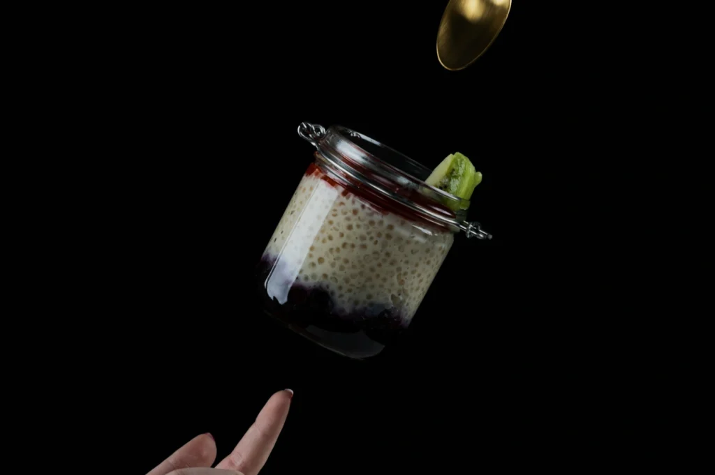
The hardest part of menu photography is not shooting one beautiful dish.
It is shooting 30 dishes and making them feel like they belong to the same restaurant.
When a menu looks inconsistent, customers may not say it out loud, but they feel it. One photo looks bright, another looks yellow, another looks moody, and suddenly the whole menu feels less trustworthy. Consistency is not a design preference. It is a sales signal.
If you are building your foundation, start here: Menu Photography.
Why a Menu Photography Style Guide Matters
A style guide is simply a set of decisions you make once, so you do not have to keep re-deciding during every shoot.
It prevents:
- inconsistent lighting and colour casts
- random backgrounds and props
- different camera angles per dish
- messy cropping across platforms
- editing that makes some dishes look fresher than others
Most menus do not need “creative variety”. They need a clean, repeatable look.
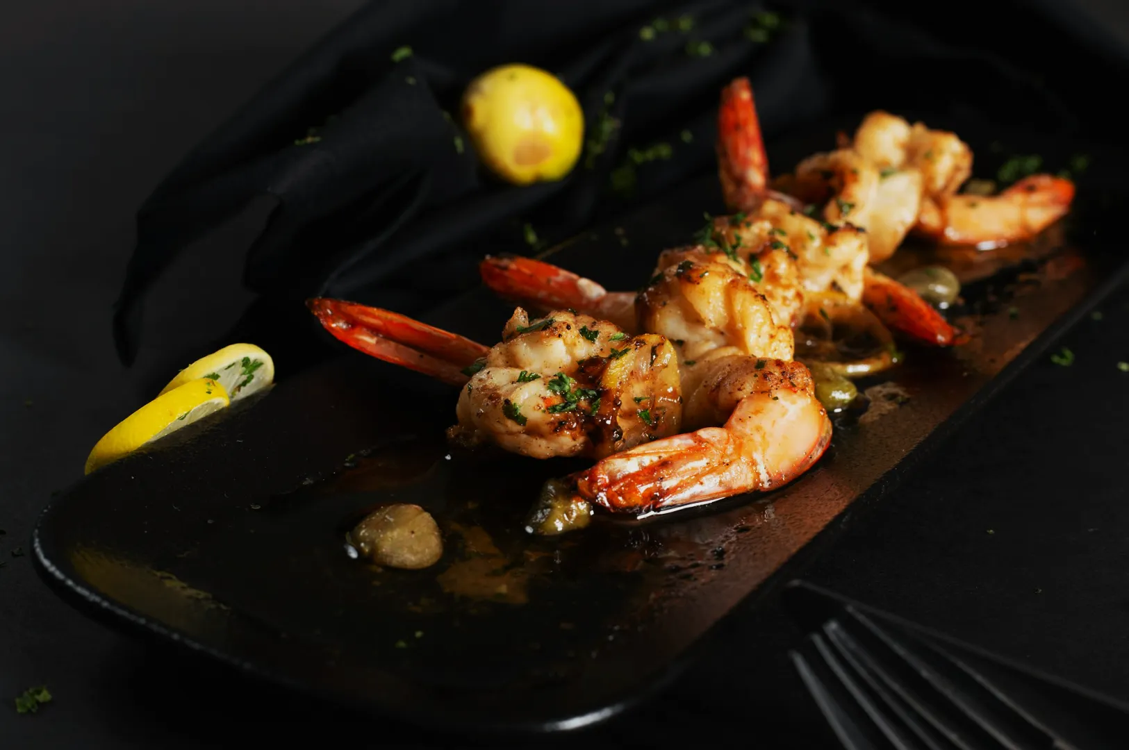
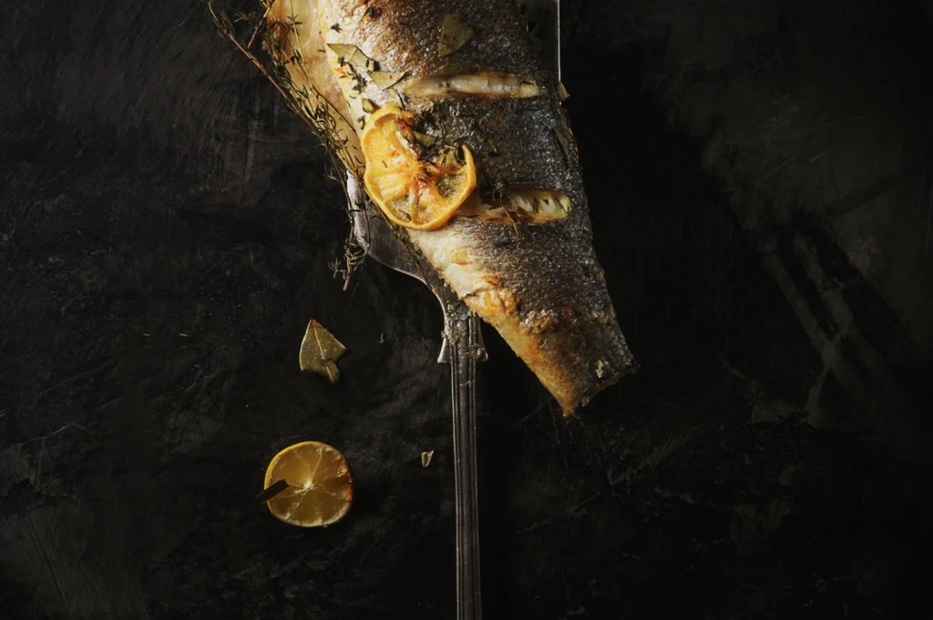
Rule 1: Lock the Camera Angle System
Pick 2 angles, max 3, and stick to them.
A common menu set:
- Overhead: bowls, rice, bento, platters
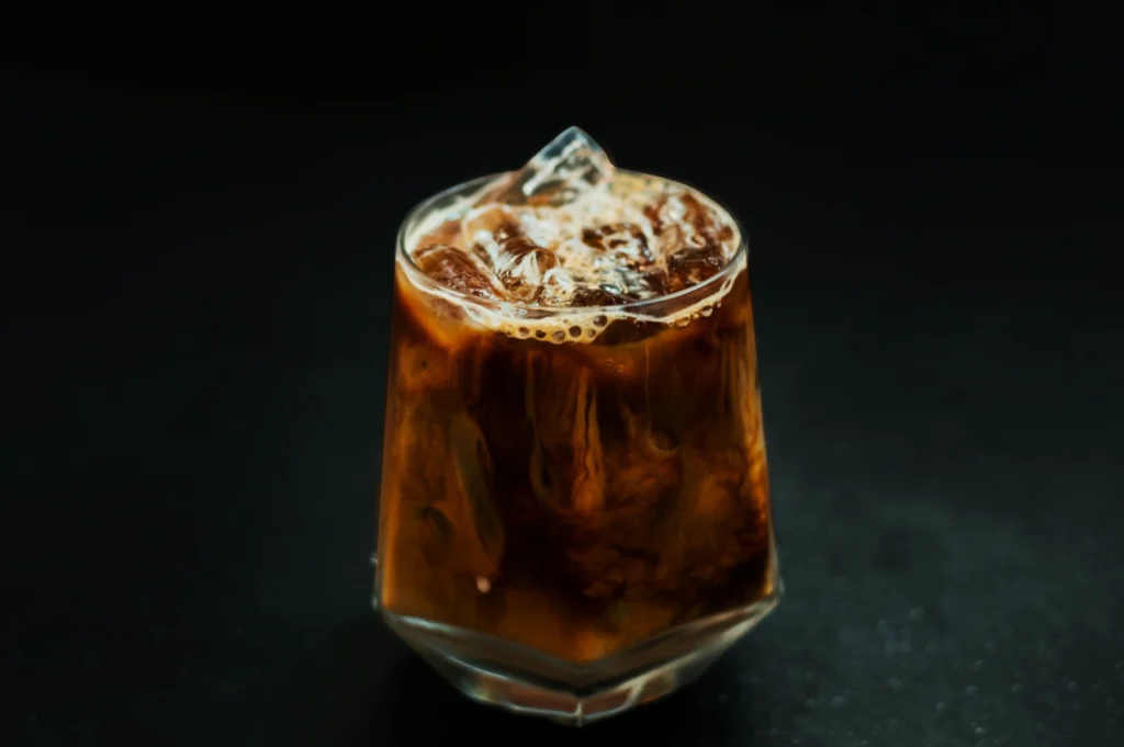
- 45-degree: layered dishes, soups with toppings, plates with height
- Eye-level (optional): burgers, tall desserts, drinks
If you change angles randomly, dishes look like they came from different brands.
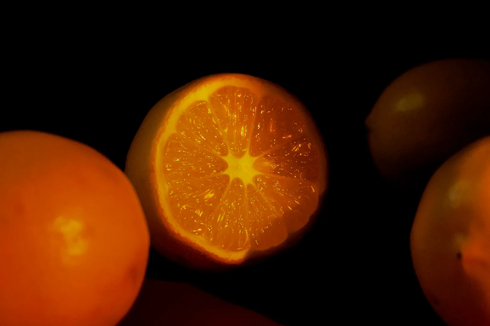
Rule 2: Standardise the Background and Surface
Choose 1–2 surfaces that work across most dishes:
- one light neutral surface for clean readability
- one darker surface for contrast-heavy dishes (optional)
Avoid busy patterns. In menus, texture should support, not compete.
A simple test: shrink the photo. If the background becomes noise, it is the wrong surface.
Rule 3: Keep Plateware Consistent
Even if your restaurant serves dishes on different plates in real life, your menu needs cohesion.
Options:
- standardise to a single neutral plate set for menu photos
- or standardise by category (all mains on the same plate style, all bowls consistent)
This reduces visual chaos, especially on QR menus and delivery grids.
Rule 4: Create a Lighting “Definition” and Do Not Drift
You do not need complicated lighting. You need repeatable lighting.
Define:
- main light direction (usually side light)
- softness level (diffused, not harsh)
- colour temperature target (so whites stay white)
Mixed lighting is the usual culprit. Restaurant downlights plus window light creates strange casts. A style guide prevents this by forcing you to shoot in a controlled setup.
Rule 5: Decide the Cropping Rules Before Shooting
Most menu headaches happen after the shoot, when someone tries to crop 16:9 hero images into 1:1 squares for a delivery menu.
Define your outputs first:
- website banners (wide)
- QR menu tiles (often 4:5 or 1:1)
- delivery thumbnails (tight, readable)
- print menu (high resolution, predictable margins)
Then shoot with safe space so cropping does not destroy the dish.
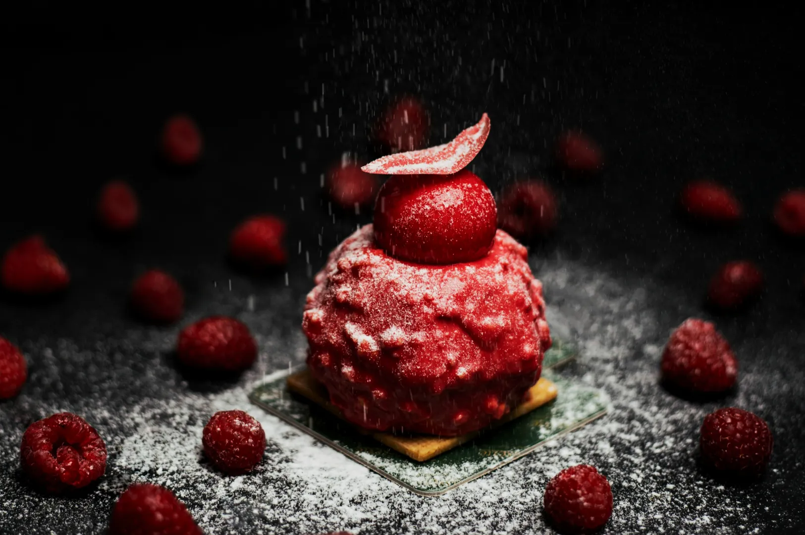
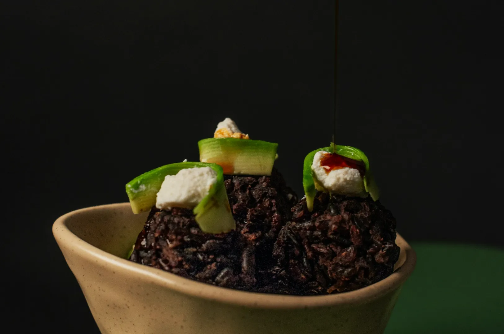
Rule 6: Keep Garnishes and Props Minimal and Repeatable
The menu is not the place for heavy storytelling props. Keep it consistent:
- one simple garnish approach (fresh herbs, sesame, chilli, where it makes sense)
- minimal props, if any
- clean edges, no random spills unless your brand is intentionally rustic
Your dish must still look like itself. Just “at its best”.
Rule 7: Standardise Editing With a Single Baseline
Editing is where menus often break.
If one dish is edited warm and another cool, customers feel inconsistency. Build one baseline preset and apply it across the set, then adjust slightly per dish if necessary.
Define:
- brightness range
- contrast level
- saturation limits (avoid neon food)
- sharpening level
- skin tones if hands appear (rare for menus)
A Simple Style Guide Template You Can Use
If you want something practical, document these decisions in one page:
- Angles: overhead + 45-degree (and when to use which)
- Surface: light neutral surface (name it)
- Plateware: set A for mains, set B for bowls
- Lighting: side light, diffused, consistent white balance
- Crops: 1:1 and 4:5 master crops, plus one wide option
- Editing: baseline preset + export settings
That is enough to keep 30 dishes looking like one brand.
If you want this built properly, Food Photographer Studio can create a menu photography system that includes the shoot, the editing baseline and the consistency rules that protect your brand long after the shoot is done.