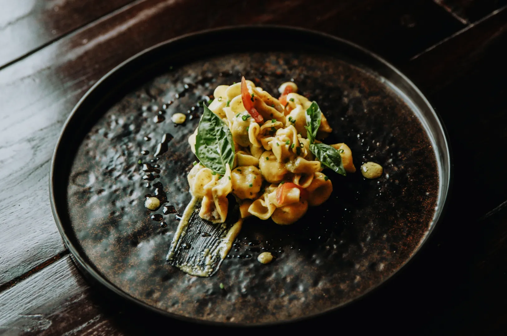
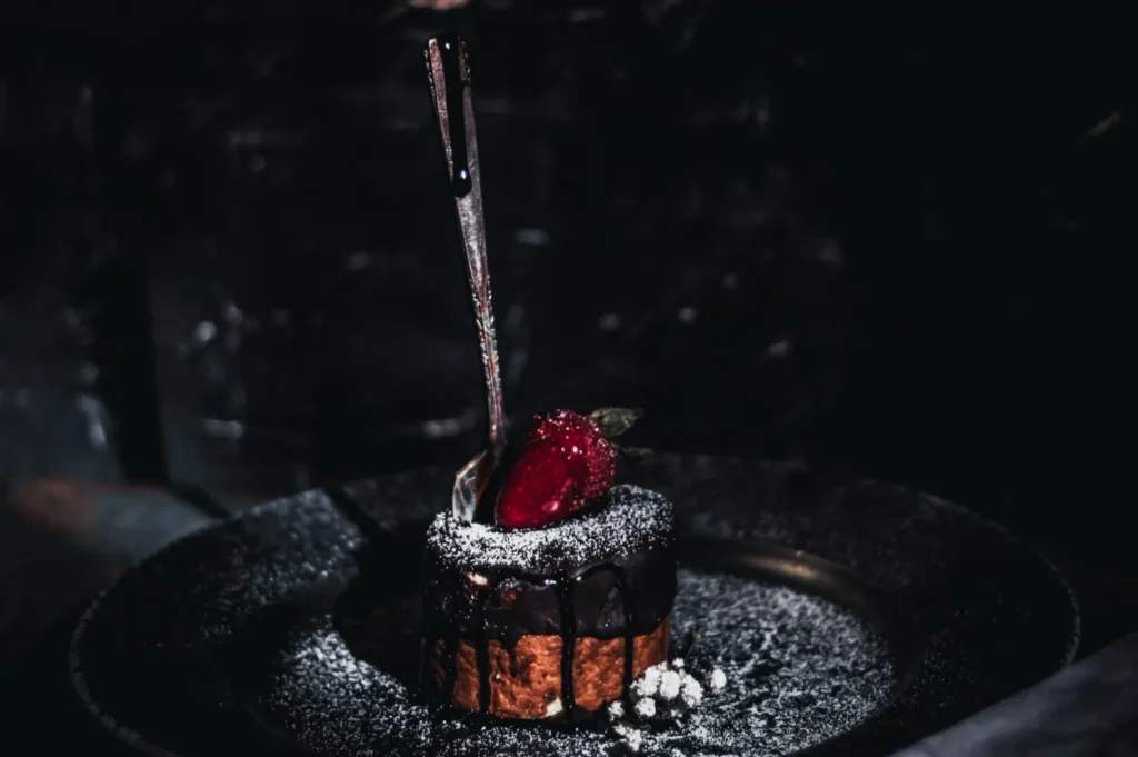
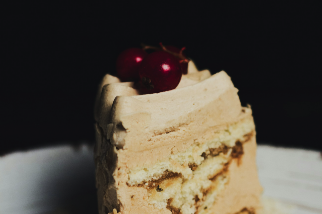
Menu photos are where brands quietly lose trust. Not because a dish is bad, but because the set feels inconsistent.
One dish is bright. One dish is warm. One dish is grey. One dish looks like it was shot in a different restaurant. Customers might not say it out loud, but the impression lands.
Batch editing is how you stop that. It is the process of making a full menu set feel like one brand, even if you shot across multiple days.
If you want the core workflow first, start with our pillar guide: how to edit photos for Singapore F&B without making food look fake.
Why Batch Editing Matters For Menus

Menu photos are not judged like a single Instagram post. They are judged as a group.
When a customer scrolls a delivery menu or opens a PDF menu:
- inconsistent brightness makes portion size feel inconsistent
- inconsistent colour makes ingredients feel unreliable
- inconsistent backgrounds make the brand feel messy
Even if each photo is “nice”, the collection can still look unprofessional. Batch editing is how you stop that.
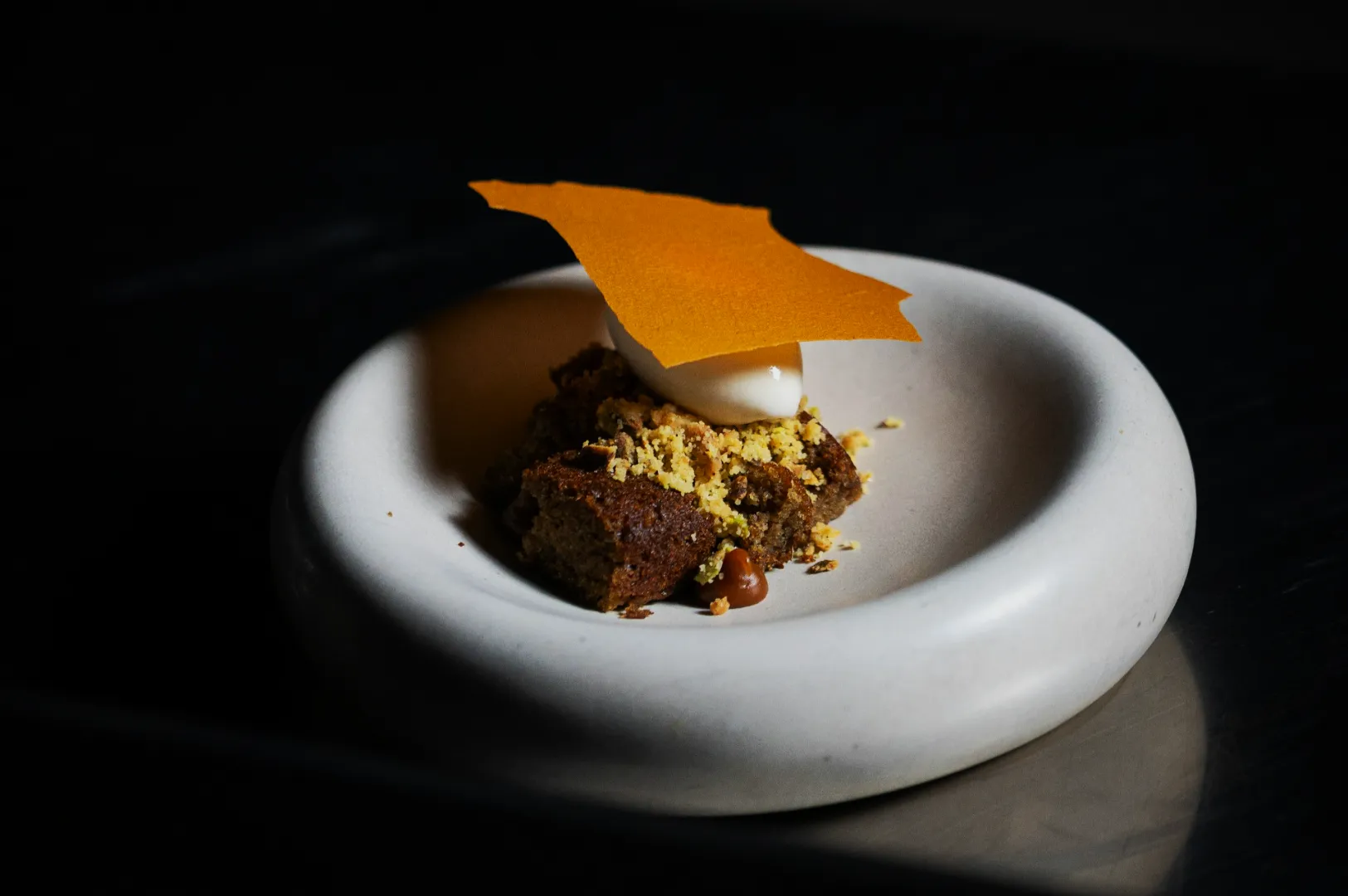
Step 1: Pick One “Reference Image” That Represents Your Brand
Choose one photo that already looks close to what you want. Ideally:
- whites look neutral, not yellow
- the dish is readable and appetising
- the background is consistent with your brand mood
This becomes your anchor. Every other dish gets edited to sit in the same visual world.
Step 2: Correct Colour First, Before Brightness
In Singapore, mixed lighting is common. Warm downlights, window light, LED strips. If you brighten first, you often brighten the colour cast too.
Your order should be:
- white balance and tint
- exposure and shadows
- contrast and texture
If you only have time to do one correction across 30 dishes, do white balance. It is the fastest way to make a set look “together”.
Step 3: Normalise Exposure So The Set Feels Even
You do not need every dish at the same brightness. You need them within the same range.
A simple rule that works:
- keep plates and highlights detailed, not blown out
- keep shadows present, not crushed
- keep the dish readable in one second
If one dish looks dramatically brighter than the rest, it will steal attention and make others look dull. That is not what you want on a menu.
Step 4: Control Texture With Restraint
Batch edits can go wrong when people over-sharpen to “make it pop”. This is where food starts looking dry, gritty, or fake.
Texture should support appetite:
- crisp edges should look crisp, not brittle
- sauces should look glossy, not sandy
- rice should look fluffy, not plasticky
If you are unsure, zoom in. If you would not want to eat it, dial it back.
Step 5: Standardise Crops For A Cleaner Menu
Cropping is part of editing. On a menu, the crop is what signals consistency.
Decide early:
- Are you showing full plates or tighter dish crops?
- Is your menu mostly overhead, mostly 45-degree, or mixed?
Then keep it consistent within categories. A set where half the dishes are wide and half are ultra-tight usually looks accidental.
Step 6: Finish With A 3-Point Checklist
Before you export the full set, do one final pass:
- Colour: do whites look neutral across the set?
- Exposure: do dishes feel equally readable?
- Style: does it look like one restaurant, not five?
If you want a practical “do not cross” list, our article on food photo editing mistakes can help you avoid the classic over-editing traps.
Batch Editing Is Not About Speed, It Is About Trust
Yes, batch editing saves time. But the real payoff is trust. When your menu looks consistent, customers feel safer ordering. When it feels safer, they order more confidently.
If you are doing this in-house, start with one reference image and keep your edits tight. If you are updating a large menu set and need everything to look cohesive without burning staff hours, this is the kind of workflow we build daily at Food Photographer Studio. Consistency at scale is one of the most valuable things professional menu photography can deliver.