A good menu is not a gallery. It is a decision tool. Your customer is not studying your typography or admiring your lighting setup. They are scanning, comparing, and trying to feel confident fast.
That is why menu photography only increases sales in specific places, at specific moments, for specific dishes. Add photos everywhere and the menu becomes noisy. Add photos nowhere and unfamiliar items stall. The sweet spot is strategic, not aesthetic.
If you are building a full system from scratch, start with the main framework on Menu Photography.
The Real Job of Menu Photos: Reduce Doubt, Not Add Decoration
When a dish name is already obvious, a photo is often optional. “Chicken Rice” does not need a photo to be understood.
But when a dish is:
- unfamiliar (to tourists, new diners, or first-time customers)
- premium-priced (needs justification)
- a signature (you want it ordered more often)
- visually differentiated (your version looks special)
…a photo becomes a confidence shortcut. The goal is not “pretty”. The goal is “I get it, I want it, I will order it.”
Where Photos Increase Sales the Most
1) Category Anchors and Section Openers
The first item in a section sets the tone. A strong hero image here functions like a visual headline. It helps customers understand what kind of food comes next.
Example: A zi char menu section called “Signature Wok Specials” performs better when the first item has a clean, appetising hero photo that signals portion, wok hei, and richness.
2) High-Margin Items That Need a Nudge
Some dishes are profitable but not naturally ordered because they sound ordinary on paper. A photo can “upgrade” perception instantly.
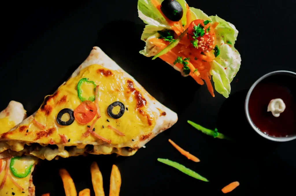
Example: A crab omelette may sound simple. A tight photo showing texture, generous crab, and sheen makes it feel like value.
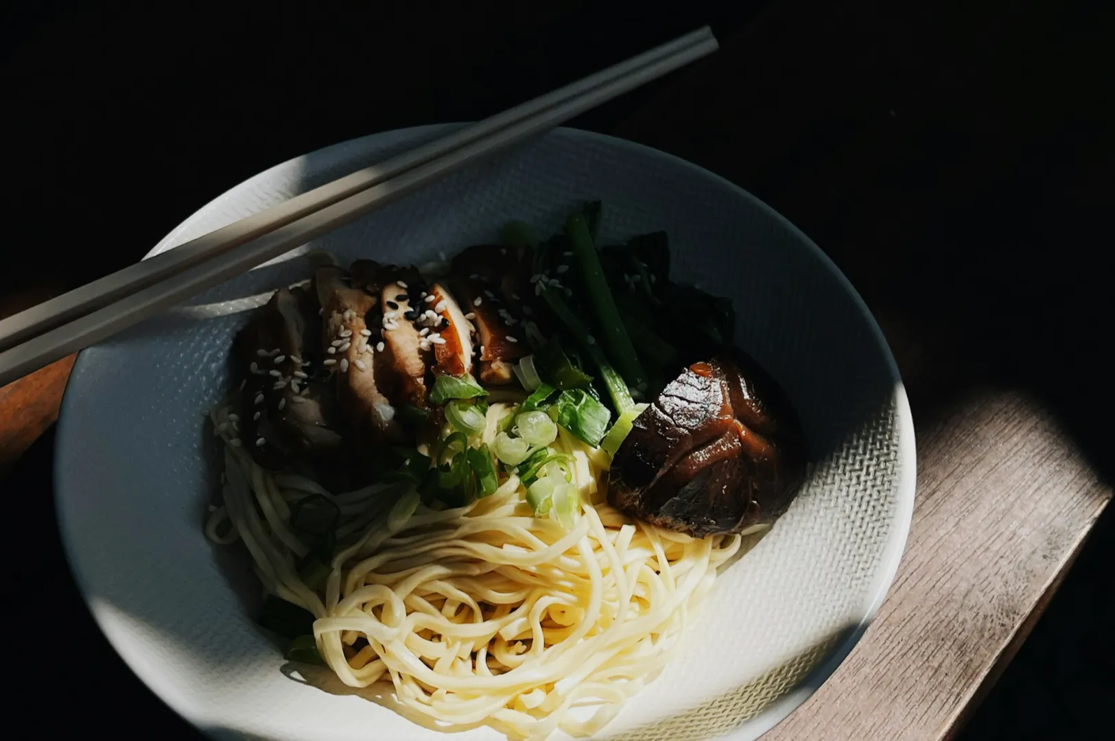
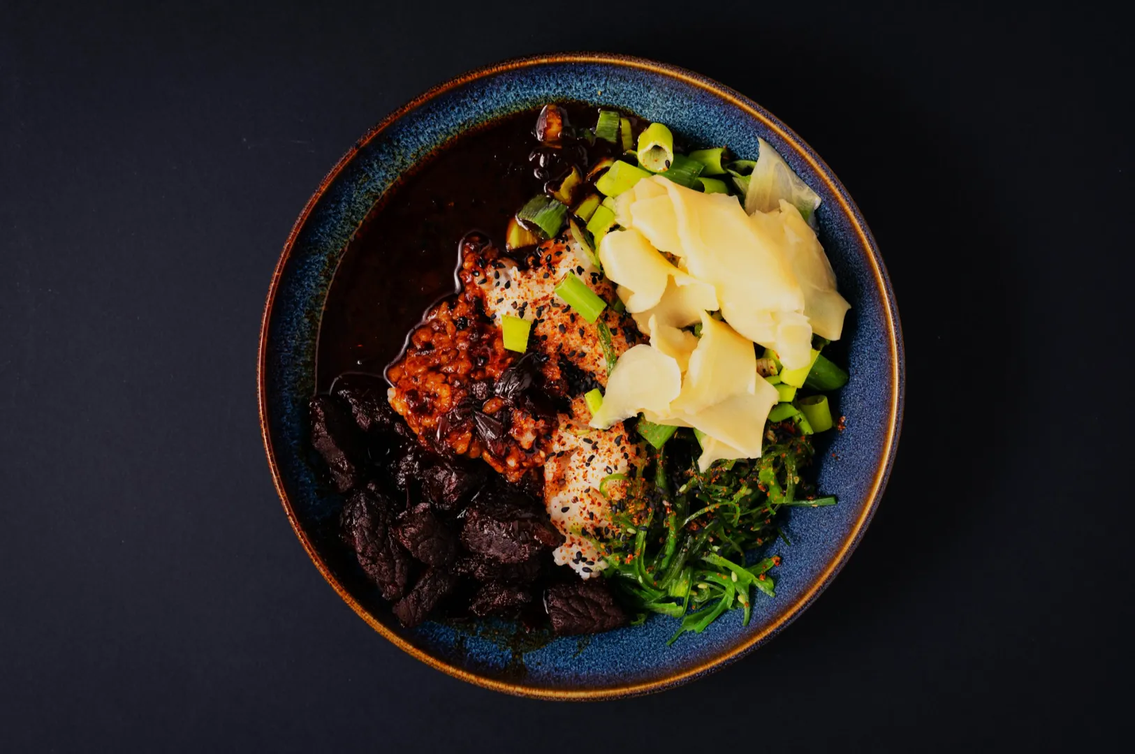
3) Signature Dishes With Clear Visual Proof
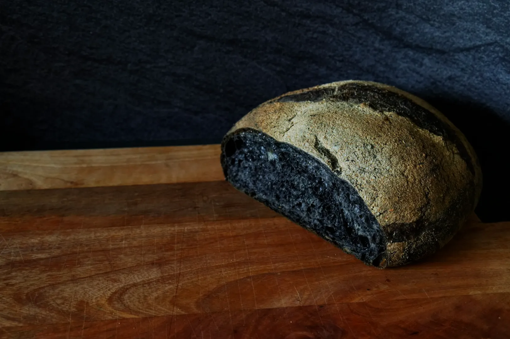
If your dish is known for a specific detail, show it. Crispy skin. Thick sambal. Melted cheese. The charcoal char on satay. These are visual triggers.
If the photo does not show the reason people should order it, it will not move sales.
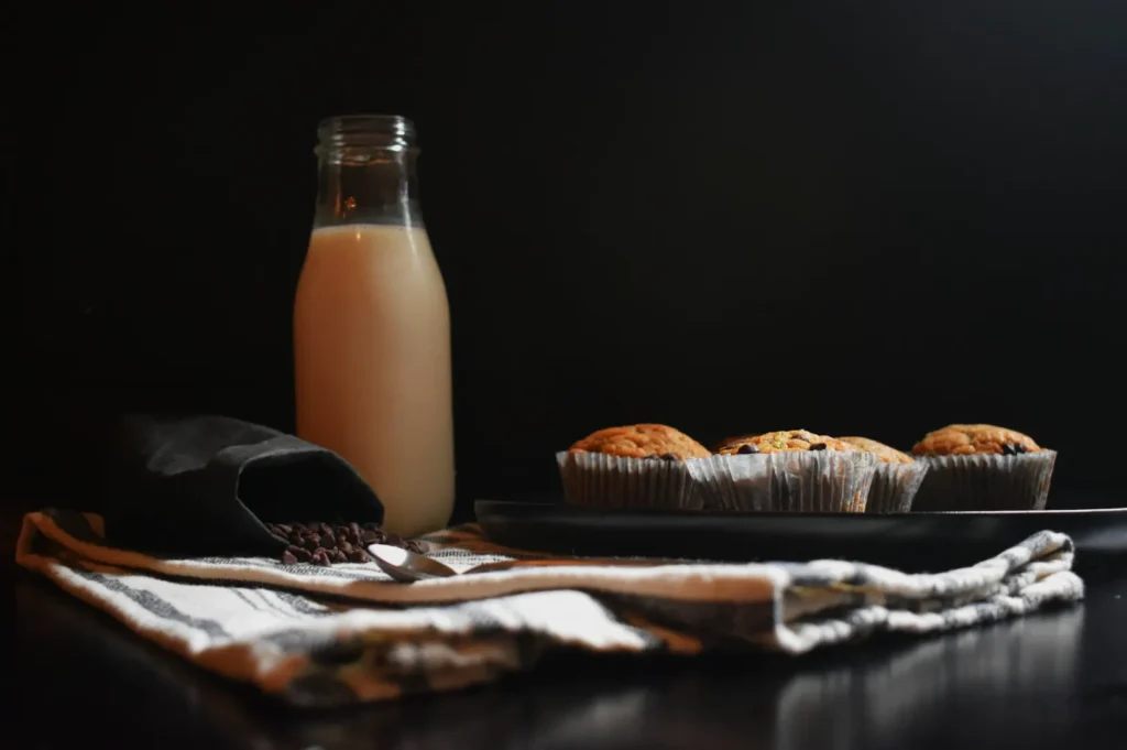
4) Set Meals and Bundles
Bundles are hard to explain in one line. One clean image that shows the full set, neatly arranged, can reduce confusion and increase conversion.
Where Photos Often Hurt Sales
Photos can reduce sales when they:
- make the menu feel cluttered
- slow down scanning
- create inconsistent expectations (some items look premium, others look casual)
- show portions poorly (too small, too spread, wrong plate size)
- look darker or “less tasty” than reality
If you have 30 photos in 30 styles, customers lose trust. They order the safest thing.
Menu Design Principles That Decide Whether Photos Work
Visual Hierarchy: Your Menu Needs a Clear “Top Layer”
A menu should have a few obvious stars. Photos help create hierarchy, but only if you keep them limited.
A practical ratio that works for many Singapore menus:
- 1 hero image per section, plus a few high-impact items
- keep most dishes text-only, especially “utility” items
This creates contrast. If everything is featured, nothing is featured.
White Space and Readability
Good menu photography needs room to breathe. Not only inside the photo, but around it. If your designer has to squeeze text and prices into awkward corners, the menu feels cheap.
This is where “photo composition” and “menu layout” become one problem. You are not shooting a dish. You are building a tile that must live beside prices and names.
Print vs QR vs Delivery Menus
The same photo does not behave the same way across formats.
- Print menus: higher attention, slower scanning, more tolerance for mood
- QR menus: small screens, faster decisions, clarity wins
- Delivery menus: thumbnail judgement, overhead and clean separation win
A strong menu system usually includes different crops for different placements.
The Sales-Driven Photo Types That Work in Menus
You do not need many styles. You need the right ones.
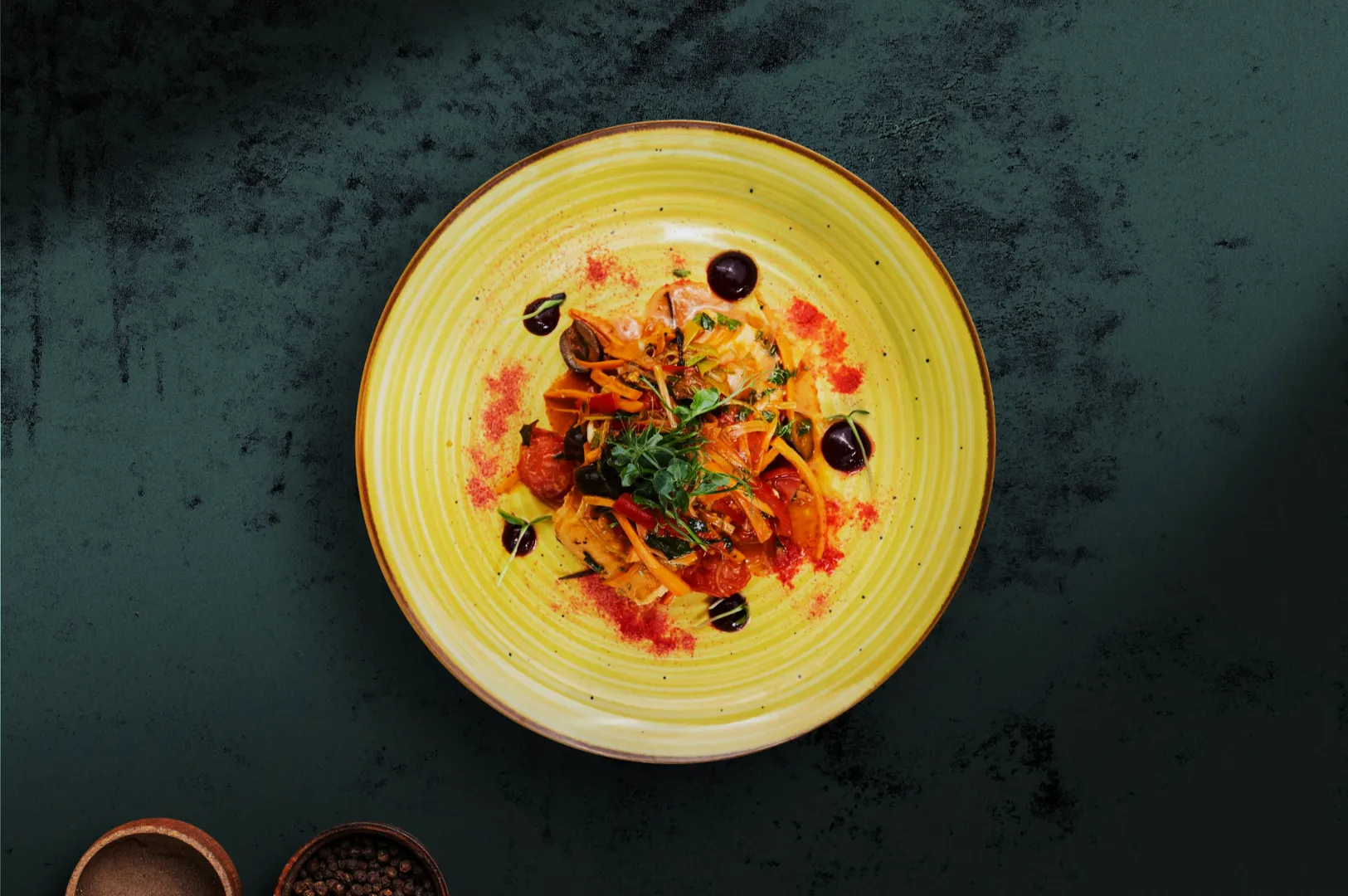
- Hero dish photo: clear, appetising, readable ingredients
- Set or bundle photo: structured, complete, not messy
- Texture close-up (sparingly): used for signature detail or premium cues
- Environment shots (rare on menus): better for websites than menu pages
In most menu design contexts, hero clarity beats moody artistry.
A Practical Way to Implement Without Overhauling Everything
If you are busy, start with one section. Pick:
- one signature dish (hero image)
- one high-margin item (needs a nudge)
- one bundle (clarity problem)
Shoot those properly, place them well, and measure.
When you are ready to scale this across the full menu, Food Photographer Studio can help you align photography and layout so your menu stays readable while your best dishes get chosen more often.