A themed photo shoot can make your restaurant look instantly memorable, but it can also make your brand look confused if the theme is louder than the food. We have seen both happen in Singapore. A café that suddenly looks like a nightclub. A modern omakase concept styled like a rustic farmhouse. A hawker-inspired brand shot with props that feel like a costume.
The goal is not to “be creative”. The goal is to choose a theme that makes sense for your food, your space, and the people you want to attract.
If you want the bigger framework for planning cohesive concepts, link this phrase to our guide: cool photoshoot strategy for restaurant brands in Singapore.
What A Theme Really Does (Beyond Looking Nice)
A good theme does three jobs at once:
It tells customers what kind of experience you are.
Not in a tagline. In a glance.
It sets expectations for price and quality.
People decide “casual” vs “premium” before they read a single word.
It gives you consistency across content.
If you shoot 30 dishes over months, the theme helps your visuals still feel like one brand.
So when you pick a theme, do not start with “what looks trendy on Instagram”. Start with “what do we want to be known for”.
Start With Your Brand Truths (The 3-Question Filter)
Before mood boards, ask these three questions:
1) What are we actually selling?
Not “food”. Is it comfort, speed, craft, theatre, tradition, novelty, wellness, indulgence?
2) Where do we live in Singapore?
A Telok Ayer lunch crowd behaves differently from a Joo Chiat brunch crowd. A mall concept reads differently from a shophouse concept.
3) What would feel fake for us?
This is your guardrail. If a theme requires styling tricks that do not match the real experience, skip it.
Your theme should amplify what is already true, not invent a new personality.
The 6 Theme Families That Fit Most Restaurants
Most themes are variations of these six. Pick one as your base, then customise.
1) Clean And Modern
Best for: specialty coffee, modern casual, minimalist brands, wellness concepts.
Look and feel: neutral surfaces, negative space, simple props, controlled colour palette.
Why it works: it makes food look intentional and premium without trying too hard.
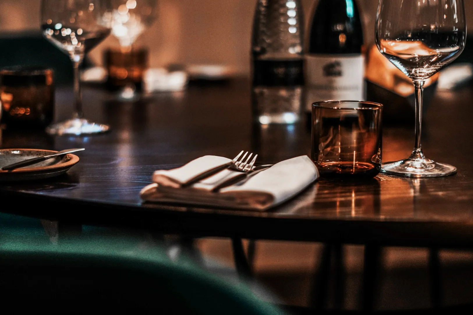
2) Warm And Comforting
Best for: bistros, bakeries, family-style concepts, heritage-inspired menus.
Look and feel: warm light, wood textures, linen, steam, “just served” cues.
Why it works: it signals generosity and familiarity, which sells in Singapore.
3) Street To Table
Best for: hawker-inspired, zi char, grilled meats, bold flavours.
Look and feel: stainless steel, enamel, chopsticks, lively context, motion.
Why it works: it protects authenticity while still looking considered.
4) Seasonal And Festive
Best for: menus tied to Ramadan, CNY, Deepavali, Christmas, National Day, durian season.
Look and feel: controlled festive cues, colour accents, ingredient storytelling.
Why it works: it creates urgency and shareability without changing your brand permanently.
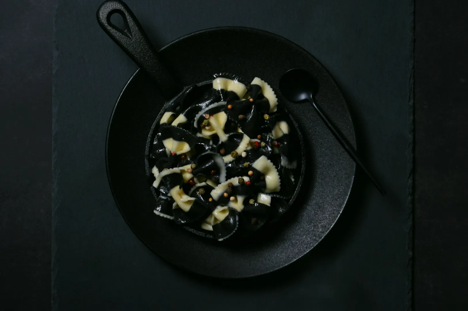
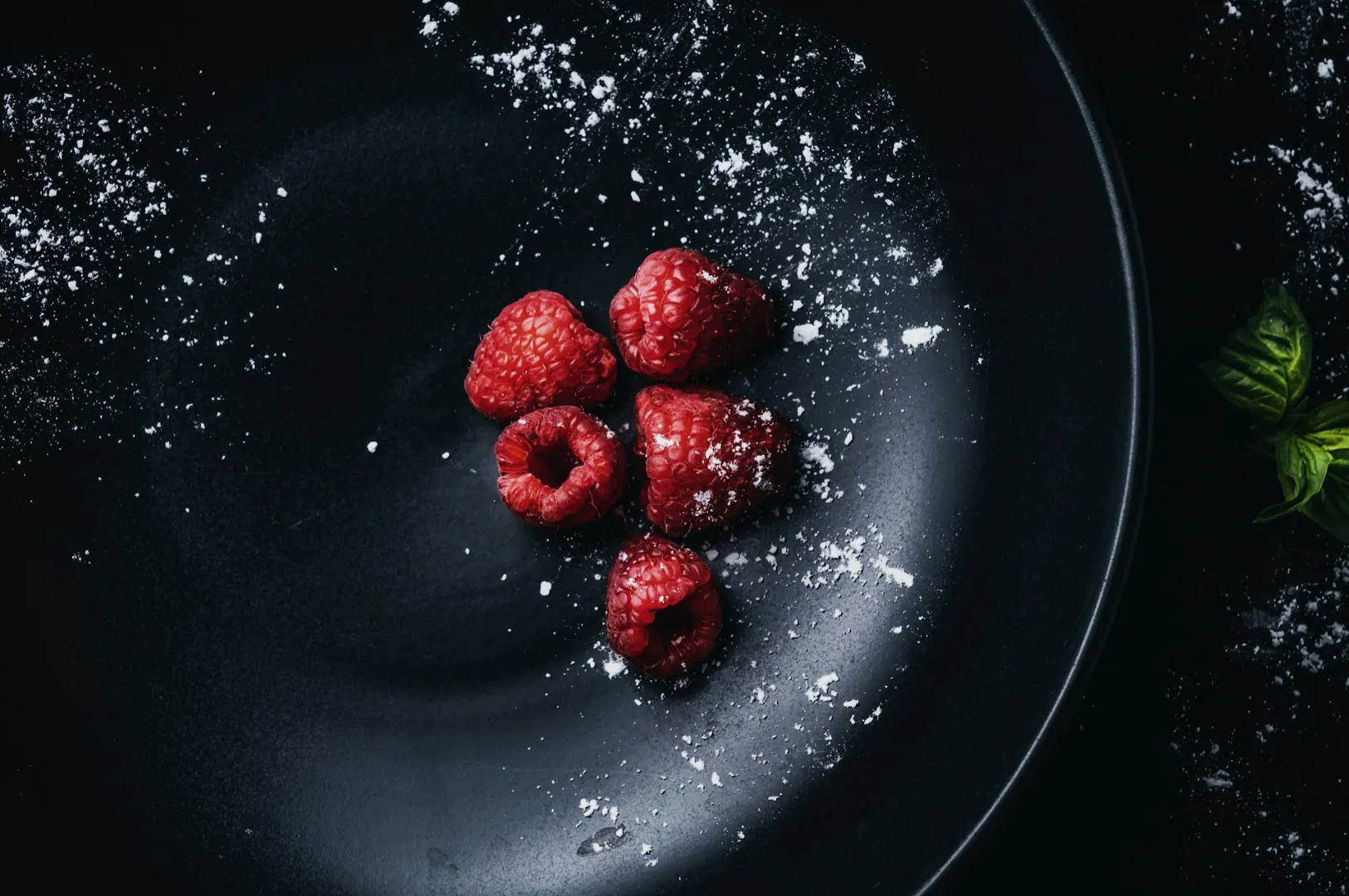
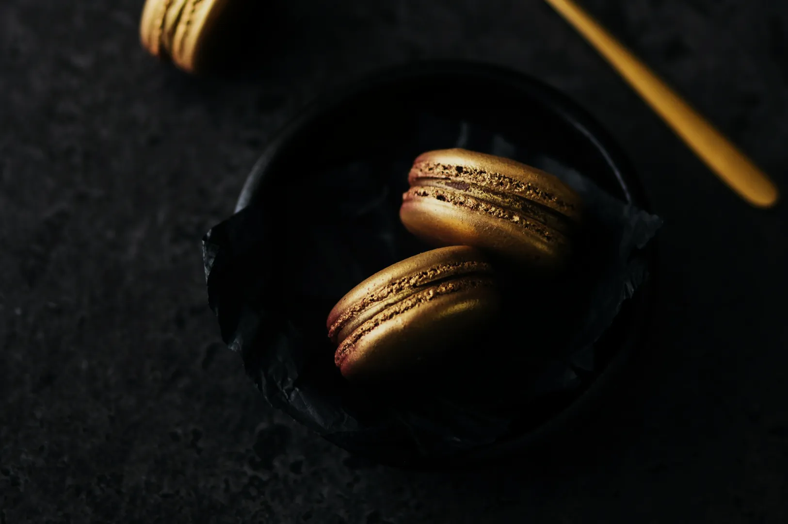
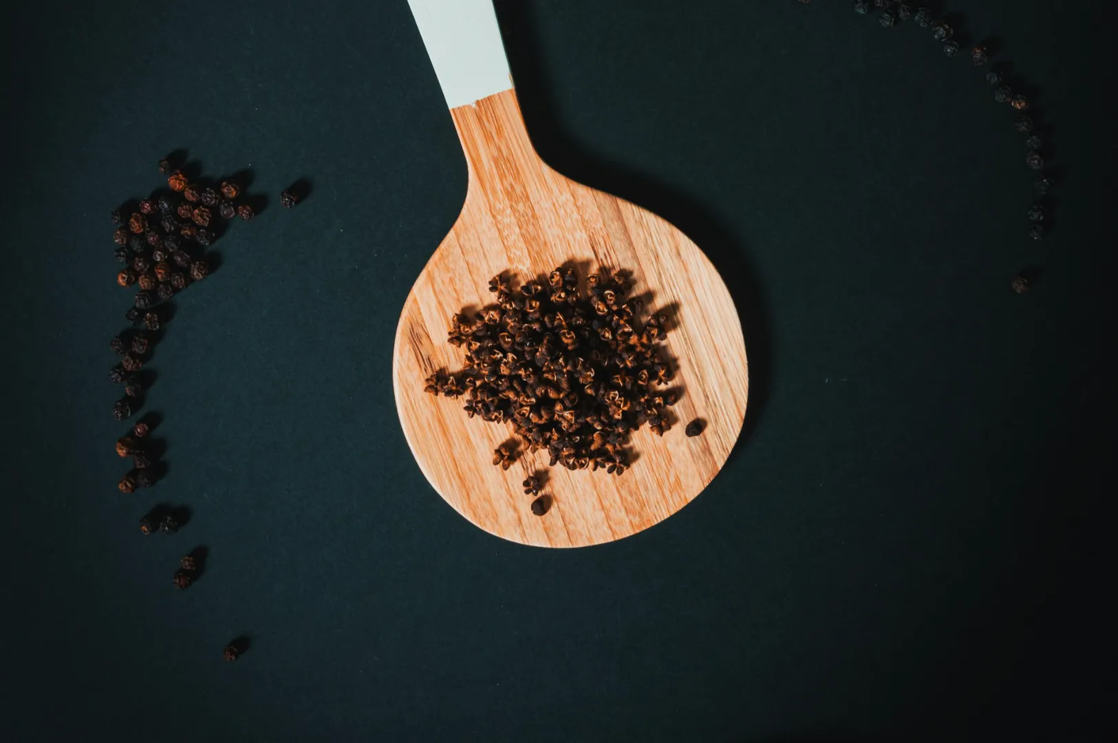
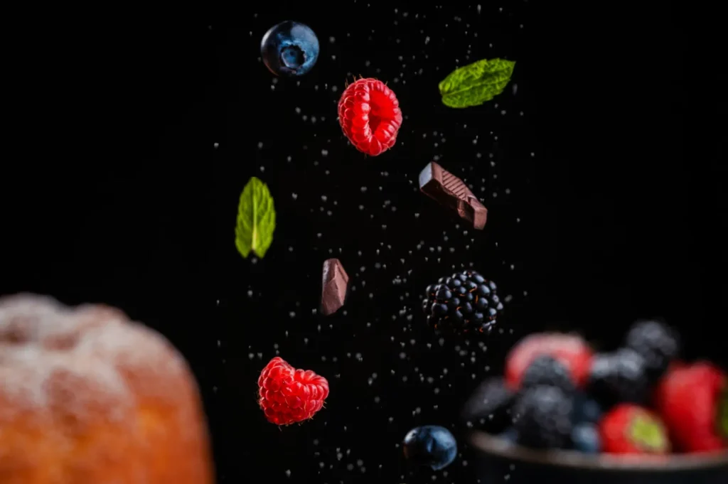
5) Ingredient-Led Craft
Best for: omakase, sourdough, charcuterie, cocktail bars, chef-driven concepts.
Look and feel: close-ups, textures, process shots, calm confidence.
Why it works: it tells customers you take quality seriously.
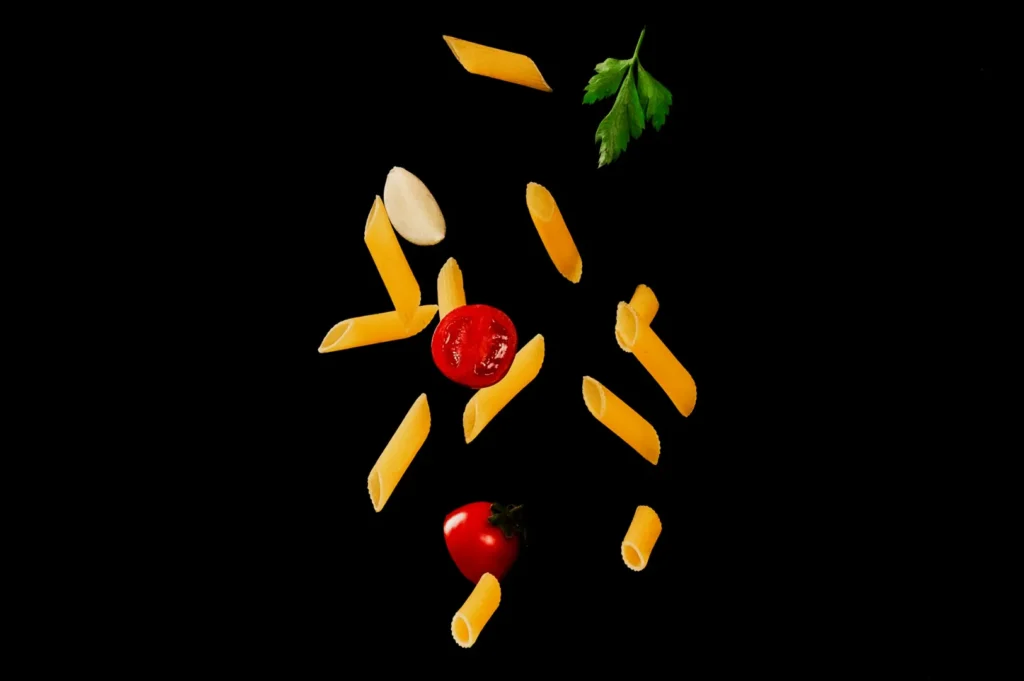
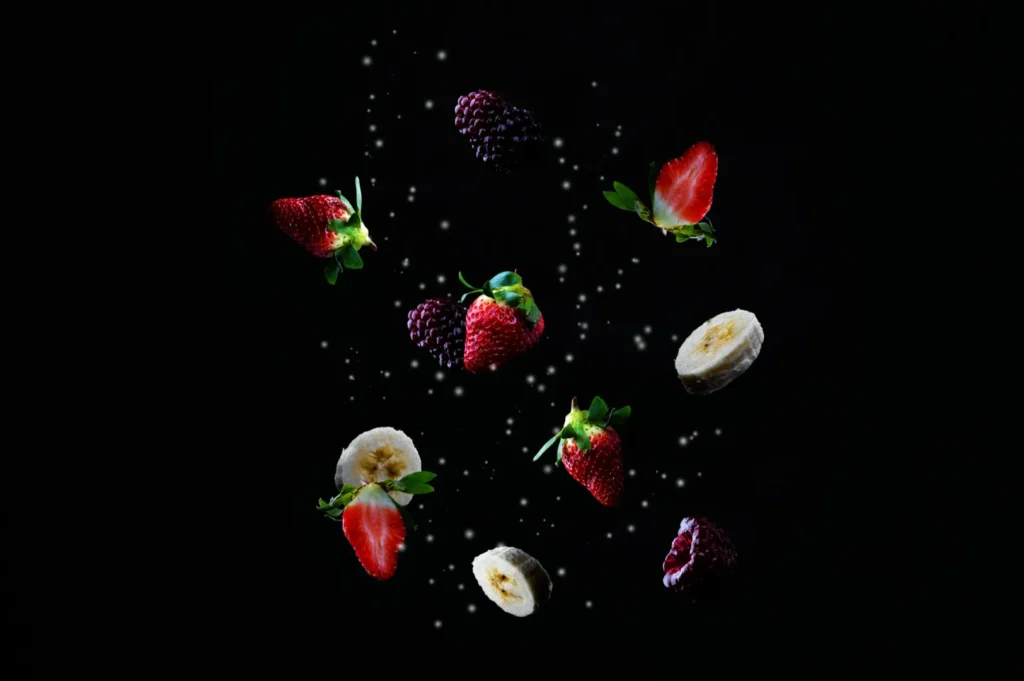
6) Playful And Pop
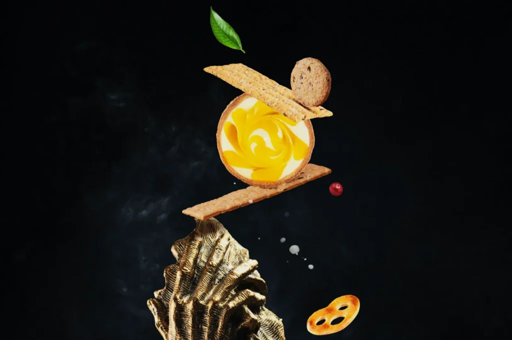
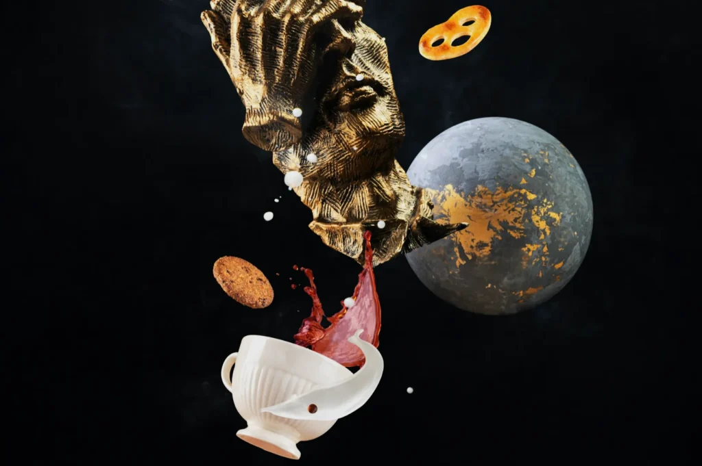
Best for: dessert brands, Gen Z drinks, collaborations, limited drops.
Look and feel: bold colours, graphic styling, fun props, high energy.
Why it works: it is made for social content, but it needs discipline to avoid looking cheap.
Pick one family first. Most brands go wrong by mixing three at once.
How To Check If A Theme Fits Your Menu
A theme must hold up across multiple dishes, not just one hero item.
Use this quick test:
- Does the theme still work for your lightest dish and your darkest dish?
- Can it handle soup, fried items, dessert, and drinks?
- Will it still look like “you” when you shoot 10 dishes in a row?
If the theme only works for one photogenic item, it is not a theme. It is a one-off idea.
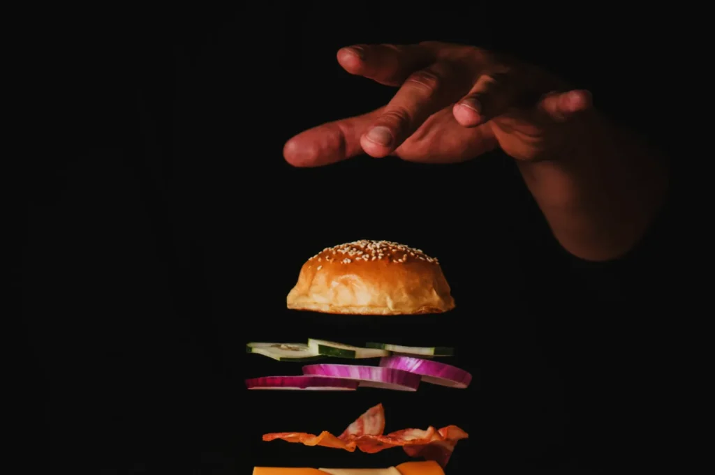
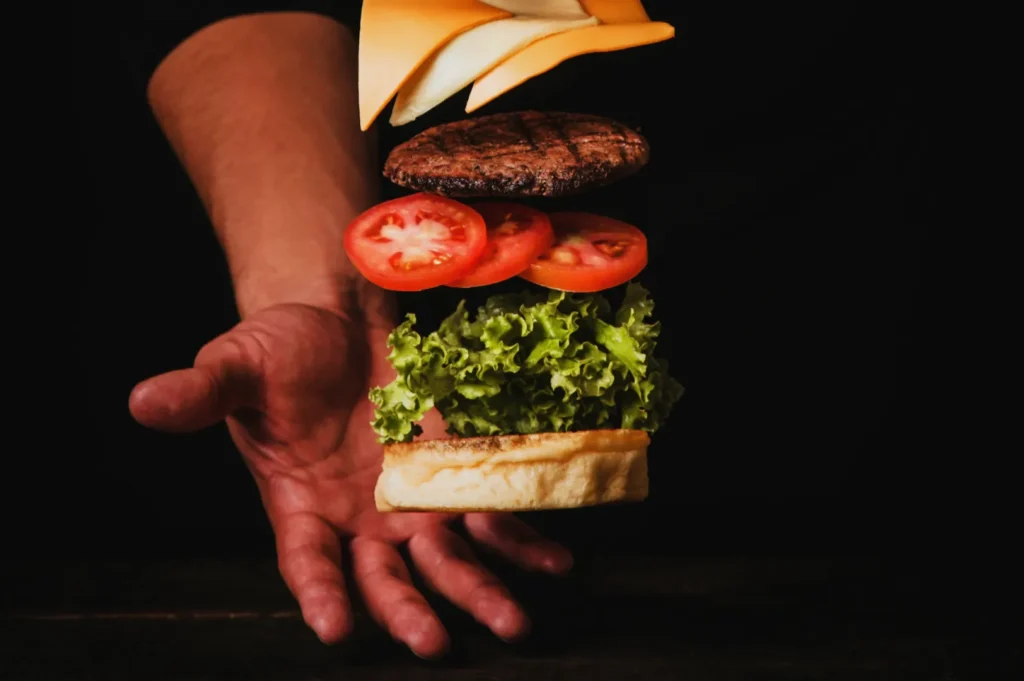
Theme Does Not Mean Props. It Means Rules.
Most restaurants think “theme” equals buying new props. That is the expensive way to do it.
A good theme is really a set of rules:
- Colour palette: 2–4 colours you repeat
- Surface choices: wood, stone, stainless steel, matte neutral
- Light direction: side light, backlight, soft frontal light
- Framing style: overhead-heavy, 45-degree-heavy, tight close-ups
- Editing style: warm, cool, contrasty, clean, film-like
When you lock these rules, your visuals stay consistent even when dishes change.
Themed Photo Shoots That Still Look Honest
Singapore diners are sharp. If your photos look like a fantasy version of the dish, customers will notice when the plate lands.
If you want the theme to feel real:
- Keep portion cues believable
- Avoid props that suggest a different cuisine or dining style
- Let the food remain the main subject, not the set dressing
- Add one human element occasionally, not in every frame
A theme should support trust, not trade it for aesthetics.
Planning A Themed Shoot Without Overcomplicating It
Here is a simple way to plan a themed shoot that does not hijack operations:
Step 1: Choose one theme family.
Do not mix families.
Step 2: Build a mini “theme kit”.
One surface, one background option, 3–5 props max.
Step 3: Pick 8–12 dishes that represent your menu.
Include at least one drink and one “problem dish” (soups, glossy curries, messy noodles).
Step 4: Decide your three must-have shot types.
For example: menu-clear, hero angle, texture close-up.
Step 5: Run a 30-minute test before the full shoot.
If the theme fails in the test, it will fail in the full shoot.
This is how you avoid spending money on a theme that looks great on a mood board but collapses in real life.
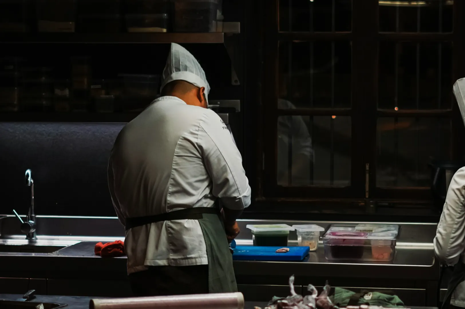
When It Makes Sense To Bring In Professionals
A themed photo shoot can make your restaurant look instantly memorable, but it can also make your brand look confused if the theme is louder than the food. We have seen both happen in Singapore. A café that suddenly looks like a nightclub. A modern omakase concept styled like a rustic farmhouse. A hawker-inspired brand shot with props that feel like a costume.
The goal is not to “be creative”. The goal is to choose a theme that makes sense for your food, your space, and the people you want to attract.
If you want the bigger framework for planning cohesive concepts, link this phrase to our guide: cool photoshoot strategy for restaurant brands in Singapore.