If your menu photos feel “random”, customers feel risk.
That sounds dramatic, but it’s how diners actually behave in Singapore. They might not say it out loud, yet they hesitate when one dish looks bright, the next looks muddy, and the third looks like it was shot in a different restaurant. When visuals don’t match, people play safe: they order familiar items only, skip add-ons, and avoid anything unfamiliar.
This is why menu photography in Singapore is not the same as “taking nice food photos”. It’s closer to documentation with persuasion: clear enough to reduce doubt, consistent enough to build trust, and attractive enough to make your best dishes feel worth the price.
If you’re still building your foundations, our broader guide on restaurant photography in Singapore covers what to prioritise across platforms. In this article, we’re going deep on menus specifically: how to plan a menu shoot, what consistency really means, and how to avoid the most common mistakes we see when restaurants refresh their photos.
Why Menu Photography Works Differently From Social Media
Instagram is forgiving. Menu pages are not.
On social media, a slightly warm tone can feel cosy. A darker image can feel “moody”. But menus (especially delivery menus) work like a decision board. People want to recognise the dish instantly and feel confident about portion, ingredients and value.
Menu photos also get used in more places than owners expect:
- delivery app listings (thumbnail-first browsing)
- QR code menus (small screens, glare, fast scanning)
- printed menus (colour shifts, resolution issues)
- websites (hero banners, category pages, promos)
If your photo set isn’t built for this mix, you’ll get mismatches everywhere. One dish looks fine on a phone but falls apart in print. Another looks great close-up but crops badly for delivery thumbnails. A third has colour casts that make your greens look tired.
Menu photography is less about “the one perfect photo” and more about a consistent set that survives different uses.
The Non-Negotiables Of A “Menu-Ready” Photo
A menu photo has a simple job: answer the diner’s questions with minimal effort.
Here’s what that usually means in practice:
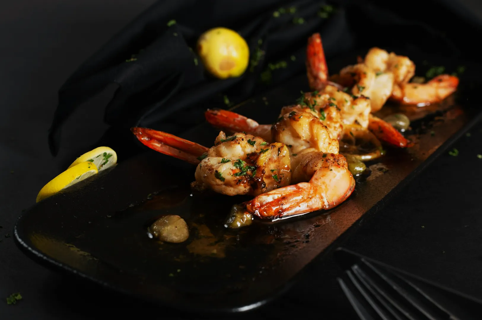
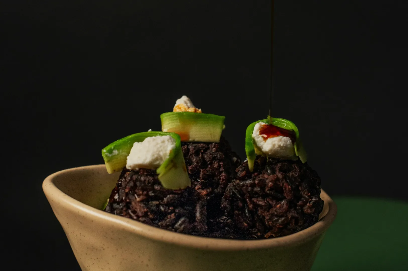
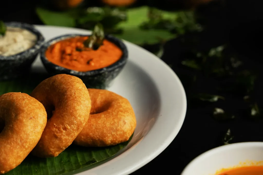
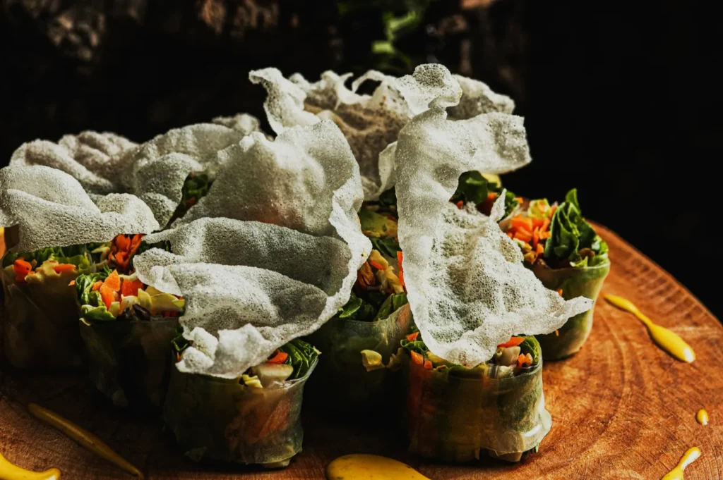
1) Ingredient readability
If it’s a prawn noodle soup, diners want to see prawns, noodles, broth depth, and key toppings. If it’s a burger, they want layers. If it’s a rice bowl, they want toppings visibility; not a flat brown surface.
2) Portion cues
This is where many restaurants accidentally create disappointment. A lens that distorts size, a tiny plate that tricks the eye, or heavy cropping that hides scale can backfire. The best menu photography makes the portion feel fair and believable.
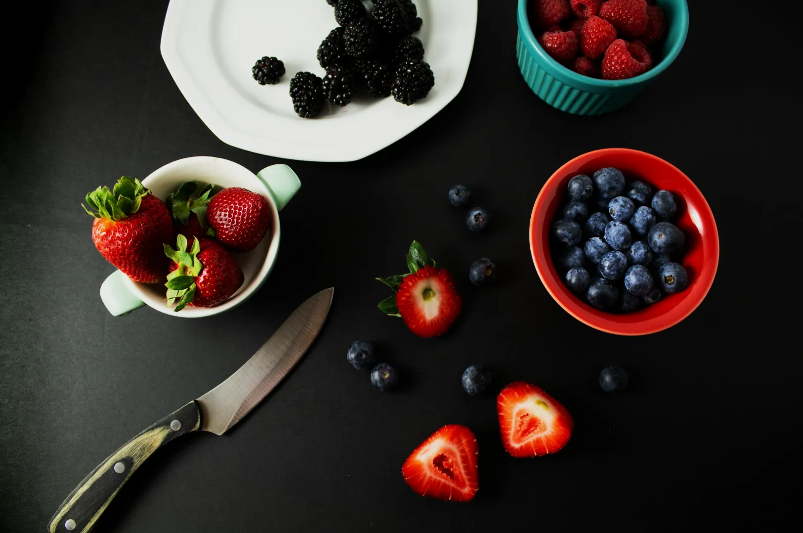
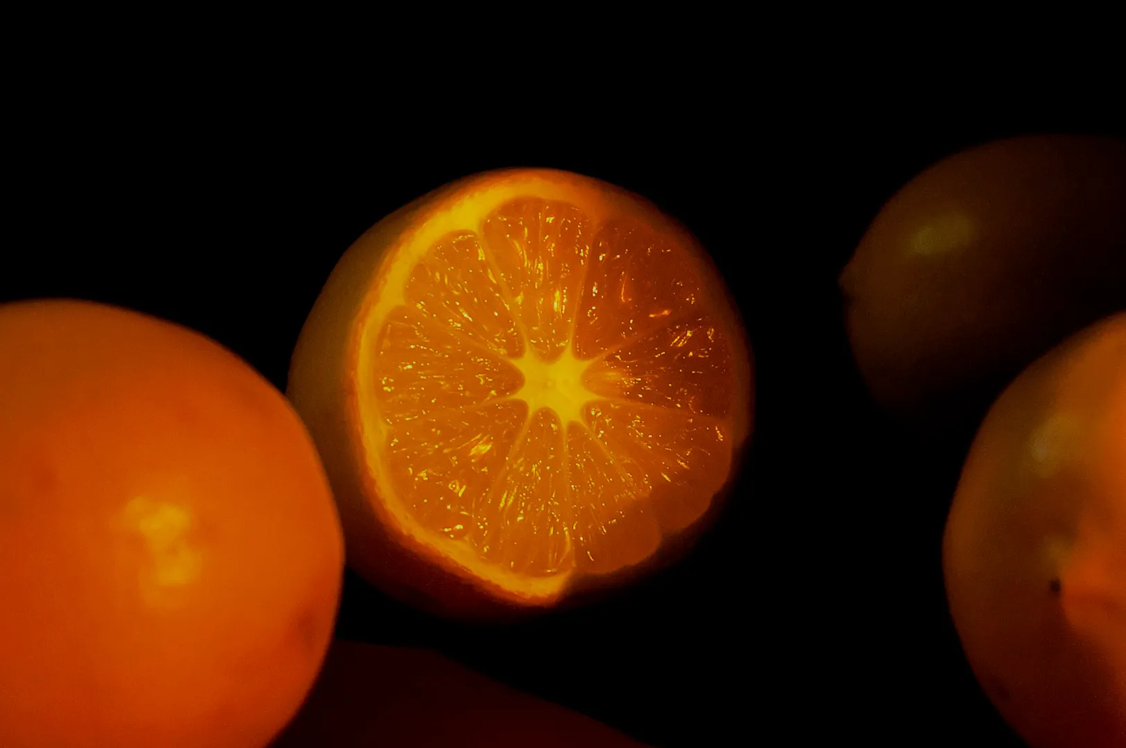
3) Colour accuracy
Singapore menus are full of colour-sensitive foods: chilli-based sauces, curry gravies, greens, sambals, soups, fried items. If your white balance is off, everything suffers. Customers read colour as freshness.
4) Consistent framing
If one dish is shot top-down, one at 45 degrees, one at eye level; your menu becomes visually noisy. The goal isn’t to remove variety; it’s to make variety look intentional.
This is why strong menu photography often looks “simple”. It isn’t boring. It’s controlled.
Planning A Menu Shoot Without Disrupting Service
A lot of menu shoots fail because they’re planned like a photo project, not an operation.
Restaurants are not studios. Food behaves on a timer. Staff have real work to do. If you want results without chaos, you need a workflow that respects kitchen rhythm.
Start with a shot list that matches your business, not your ego.
You don’t need everything. Prioritise:
- top sellers (your anchor items)
- high-margin items (where photos increase perceived value)
- signature dishes (your identity dishes)
Build your “shoot window” around off-peak reality.
Most teams do best either:
- before service starts (fresh prep, calmer kitchen), or
- between lunch and dinner (more control, less pressure)
Set the scene before the food arrives.
If the dish lands and you’re still deciding on background, angle, props or lighting, the food will degrade while you “figure it out”. For hot dishes, that’s steam gone. For fried dishes, crispness gone. For drinks, condensation wrong.
A small operational habit makes a big difference:
setup first → plate last → shoot immediately.
If you’re DIY-ing, even a consistent corner near a good window with one clean surface can dramatically improve outcomes. If you’re working with professionals, this is where we structure the shoot so the kitchen isn’t constantly waiting on photography.
Consistency: The Part Everyone Wants, Few People Systemise
“Make it consistent” is the most common instruction we hear. But consistency isn’t a vibe. It’s a set of decisions.
Here are the three consistency levers that matter most for menu photography:
1) Angle Rules By Dish Type
You don’t need one angle for everything. You need the right angle for each dish category; used consistently.
- Overhead works well for flat foods, spreads, rice bowls with visible toppings, pizzas, sets, sharing boards.
- 45-degree works well for soups (depth), noodles (lift), layered dishes, pastries, plated mains.
- Eye level works well for tall foods: burgers, stacked sandwiches, parfaits, high drinks.
Pick 1–2 angles as your “menu standard”, then use exceptions intentionally.
2) Lighting Rules That Keep Colours Honest
The biggest cause of inconsistency is mixed lighting.
If you’re shooting in-restaurant under warm downlights plus daylight spill, you’ll fight yellow casts, green casts, and patchy shadows. Editing can’t fix it cleanly across 30 dishes.
A better approach:
- decide one primary light direction (usually side light)
- keep it repeatable across dishes
- avoid multiple competing light sources
If you’re DIY, turning off overhead lights and relying on a single window often helps more than buying more gear. If you’re professional, controlled lighting is the difference between “pretty” and “repeatable”.
3) A Controlled Editing Style (Not Filters)
The goal is not “make it pop”. The goal is “make it look like our brand”.
A consistent menu set usually has:
- stable whites (white plates look white, not cream)
- controlled contrast (texture visible without harshness)
- believable saturation (greens look fresh, not neon)
If you keep changing presets, your menu looks like five different restaurants. If you keep the grade stable, your food looks reliable.
The Mistakes That Quietly Cost Orders
Most menu photo mistakes don’t look “terrible”. They look slightly off. That’s what makes them expensive because owners don’t notice, but customers feel it.
Mistake 1: Over-styling that creates expectation gaps
If the photo shows an unrealistic mound of toppings or a garnish style your kitchen doesn’t serve, the real dish feels like a downgrade. That leads to complaints, refund requests, and lower repeat orders.
Mistake 2: Inconsistent backgrounds and plate styles
A dark slate background for one dish, marble for another, a patterned table for the next; without a clear system signals inconsistency. Diners interpret that as operational inconsistency too.
Mistake 3: Cropping that hides the dish’s value cues
If the dish’s “proof points” are cut off (protein portion, toppings, texture), customers assume less value. Cropping should support clarity, not remove it.
Mistake 4: “Moody” photos for menus
Moody lighting can be beautiful on a website banner. On a menu, it often hides ingredients. If customers can’t tell what they’re buying, they don’t buy it.
Mistake 5: Too many “hero shots”
If every dish is treated like a hero, your menu becomes visually exhausting. Your top sellers should feel like the anchors; others can be clean and simple.
A Simple Menu Photo System You Can Maintain
You don’t need a perfect studio workflow. You need a maintainable one.
Here’s a simple system many Singapore F&B teams can sustain:
- Base set (quarterly or half-yearly): Professional menu refresh for your core items
- Monthly updates: New items, seasonal specials, promotions
- Weekly content: Behind-the-scenes, staff, ingredient moments for social
This system avoids the most common trap: updating your social constantly while your menu photos stay outdated for a year.
And if you’re trying to decide whether to DIY or outsource: it often makes sense to DIY the high-volume daily content, and invest professionally in menu assets that sit at your highest-conversion touchpoints.
Menu Photos Should Feel Like A Promise You Can Keep
A good menu photo doesn’t just make food look good. It makes a diner feel safe picking you.
That’s what menu photography in Singapore is really doing: building confidence at speed, especially on platforms where people compare you against ten alternatives in the same minute.
If your menu visuals feel inconsistent, don’t start by buying a new camera. Start by tightening the system: prioritise your key dishes, standardise angles, control light, and keep editing honest. When the set looks cohesive, your brand looks cohesive and orders follow.
If you want a menu photo set that works across delivery platforms, QR menus, websites, and print, Food Photographer Studio can help you build a consistent, menu-ready library that matches Singapore’s browsing behaviour and expectations. The goal is simple: photos that reduce doubt and make ordering easier.