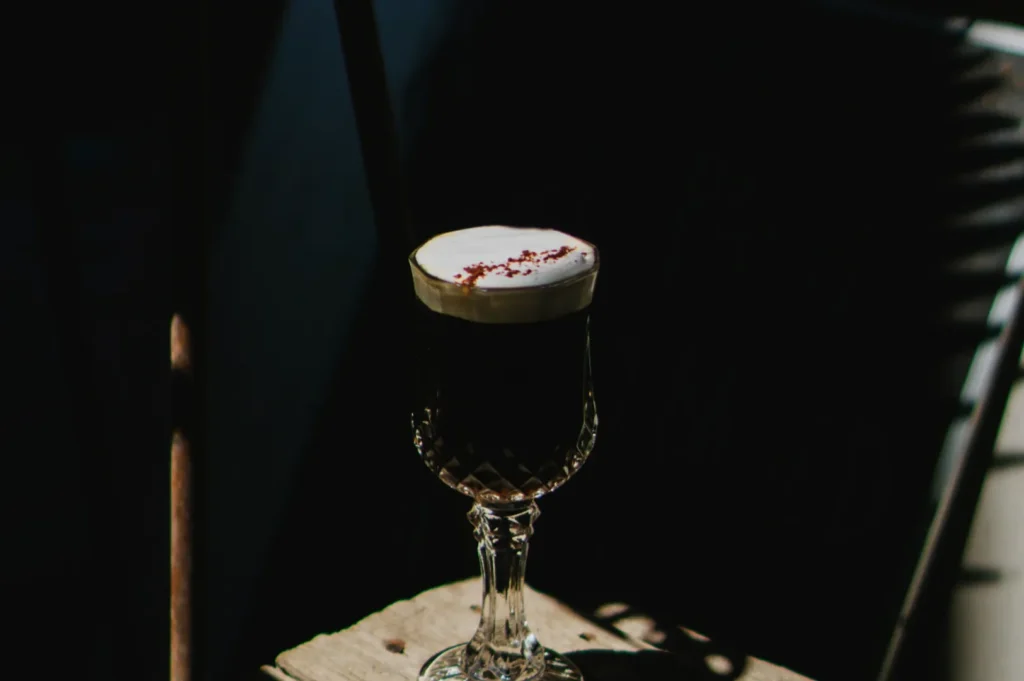
If you have ever stood behind the counter watching orders come in slowly, then swapped one set of menu photos and suddenly saw your “usual” items move again, you already know the truth. On delivery platforms, your photos are your frontage. No warm greeting, no aroma, no ambiance. Just a thumbnail and a decision.
In Singapore, that decision happens fast. A customer is comparing five bowls of laksa, three chicken rice sets, and two “chef’s specials” in the same minute. If your photo looks dark, messy, or inconsistent, the customer does not think “small business”. They think “risk”. And they scroll.
This guide is for F&B owners who want menu photos that do one job well: reduce doubt and trigger appetite. We will cover what actually works on GrabFood and Food Panda-style browsing, what usually fails, and how to plan a shoot so you do not waste time or money.
If you are looking at a bigger refresh beyond delivery menus, start with our guide on photography standards for Singapore restaurants, because the delivery menu is only one part of your visual system.
Why Delivery Menu Photos Behave Differently From Social Media
Instagram lets you “sell” with mood. Delivery platforms demand clarity.
A great social post can be moody, cinematic, even a bit abstract. A delivery menu photo cannot. It must answer practical questions immediately:
- What is it?
- What do I get?
- Does it look worth the price?
- Will it arrive looking like that?
This is why many restaurants get decent engagement on social media but still struggle on delivery. The images are built for vibes, not browsing behaviour.
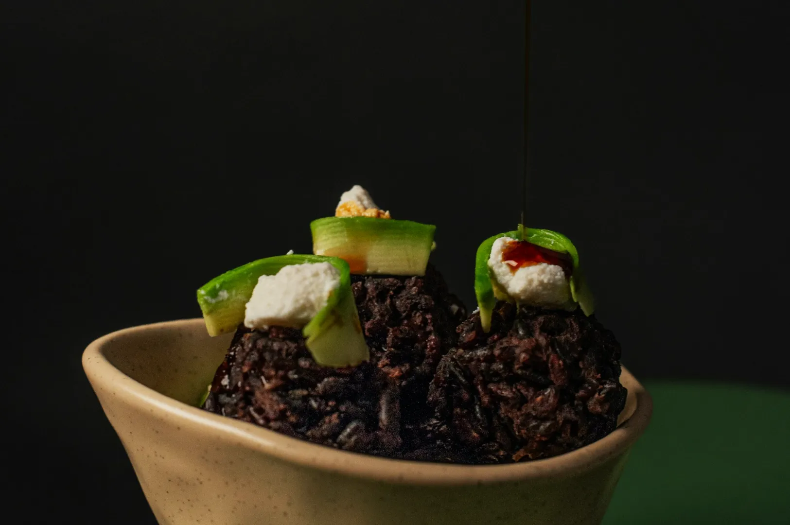
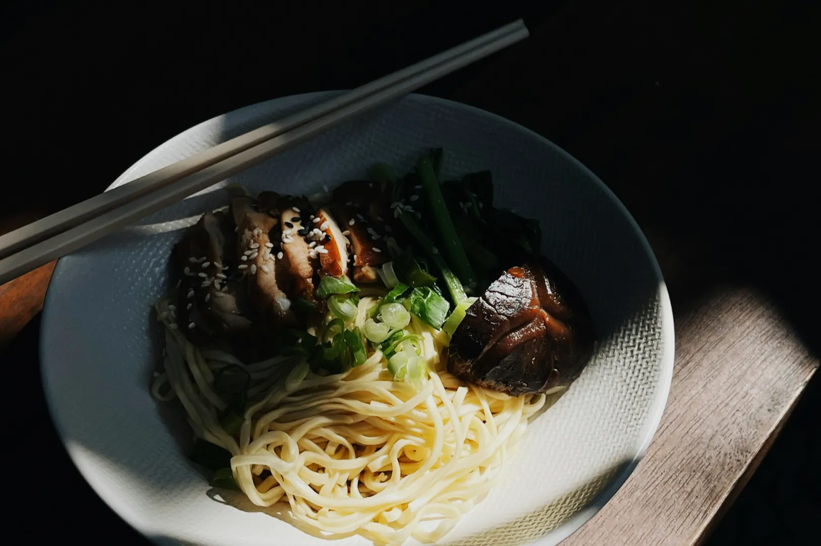
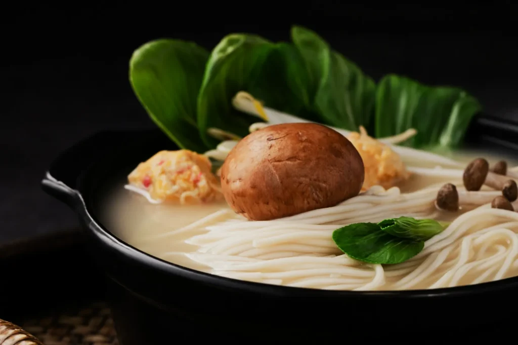
A simple rule: if your dish is unfamiliar to a customer, your photo has to be even clearer. This is especially true for dishes with mixed textures or components, like cai png sets, nasi lemak, thosai sets, or tze char mains.
The Thumbnail Test: What Customers Actually See
Most owners judge their images full-screen on a phone. But the customer often sees your food as a small tile first.
That means:
- Fine details disappear.
- Props become clutter.
- Dark editing turns into “I can’t tell what this is.”
- Busy backgrounds become visual noise.
What wins in the thumbnail
One dish, one story, one hero. If it is a set, make sure the “main subject” is obvious.
For example:
- Chicken rice: the chicken must read clearly, not blend into the rice.
- Curry dishes: the colour must look rich, not muddy.
- Fried items: crispness needs to show through texture and light.
If you are not sure, do this quick check: shrink your photo to half size and squint. If you cannot recognise it in two seconds, your customer will not either.
The “Menu Set” Standard: Consistency Is What Makes You Look Legit
A single great photo is nice. A full menu with mixed lighting and mixed angles looks careless, even if the food is good.
For delivery menus, consistency matters in three places:
1) Angle consistency
Choose a “house angle” and stick to it for most items.
- Many menus do best with a slightly elevated 45-degree view for bowls and plated dishes.
- Use overhead only when it genuinely helps, like sharing platters, bento-style layouts, or flat foods.
2) Cropping consistency
Portion size perception is real. If one dish fills the frame and another looks tiny, customers assume value is inconsistent.
3) Colour consistency
Your sambal should not look brick red on one item and neon red on another. That usually comes from mixed light sources and inconsistent white balance.
This is one reason we almost always recommend shooting delivery menus in a controlled setup, even if it is a simple one. You are not chasing “art”. You are building trust.
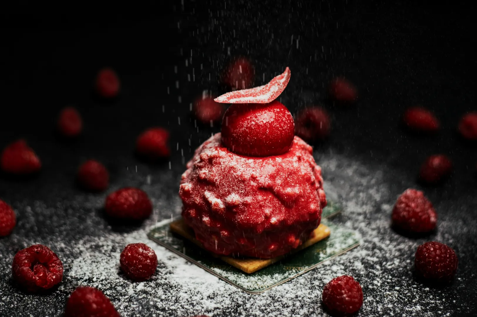
Styling For Delivery: Make It Look Like The Best Version Of Itself, Not A Different Dish
The fastest way to lose repeat customers is to oversell with styling.
Delivery photos should be styled with honest polish:
- wipe the bowl rim
- place garnishes intentionally
- show key ingredients clearly
- avoid unrealistic “towering” portions that do not match service
Common styling mistakes we see in Singapore
- Too much garnish for local dishes, especially if the dish is traditionally simple.
- Wrong props that confuse cultural context (example: plating a hawker-style dish like fine dining).
- Food cooling down before the camera is ready, especially for soups, fried items, and noodles.
If you are shooting in-house, your workflow should be: set up first, plate last. The minute your food hits the table, you are racing against time.
Lighting That Makes Food Look Reliable (Not “Edited”)
In Singapore, many kitchens and dining areas are lit by overhead warm lights. Those lights make food go yellow or worse, muddy.
For delivery menus, the safest lighting approach is:
- soft, even light
- minimal harsh shadows
- controlled reflections (especially for soups and shiny sauces)
Natural window light can work if it is consistent. If it changes rapidly, your set will drift. That is when a simple daylight-balanced LED setup makes life easier.
The goal is not drama. The goal is “this looks like what I will receive”.
The Editing Rule: Correct, Don’t Costume
When people hear “editing”, they assume filters. For menu photos, editing should be basic and clean:
- correct white balance
- lift shadows slightly (without flattening everything)
- keep colours believable
- sharpen gently for texture
A good check is this: if your photo looks “nice” but the food looks less edible, you went too far. Customers do not buy colour grading. They buy comfort, craving, and clarity.
When DIY Works, And When It Is Smarter To Bring In Pros
DIY works well when:
- you are posting daily specials
- you need quick social content
- you are testing new items before a full rollout
Professional menu photography is worth it when:
- you are building or refreshing a full delivery menu
- you want consistency across 30–80 items
- you are launching a new concept, new brand, or new pricing tier
- you are paying for traffic (ads) and need conversion to justify spend
The truth is, many Singapore operators do both. Quick in-house content for day-to-day, then a proper menu shoot when the stakes are higher.
Make Your Menu Photos Do Their Job
Good delivery menu photos are not about being “pretty”. They are about removing hesitation. When customers can recognise your dish instantly, trust the portion, and feel the craving, your menu becomes easier to buy from.
If you want results without the learning curve, professional food photography services exist for exactly this reason. At Food Photographer Studio, we build menu photo sets that are consistent, honest, and designed for how Singapore diners actually browse and order. If you are planning a delivery menu refresh, we are happy to advise on the simplest shoot plan that will move your numbers, not just your aesthetics.