
If your restaurant has more than one person touching content, you have probably seen this problem:
- one person edits warm
- one person edits cool
- one person loves heavy contrast
- one person uses a filter
The result is not “creative”. It is confusing.
A style guide sounds like a big corporate thing, but it does not have to be. For most Singapore F&B teams, a style guide can be one page. The goal is consistency, not perfection.
If you need the technical workflow first, start here. This article shows how to turn that workflow into a simple team standard.
What Your Style Guide Should Control
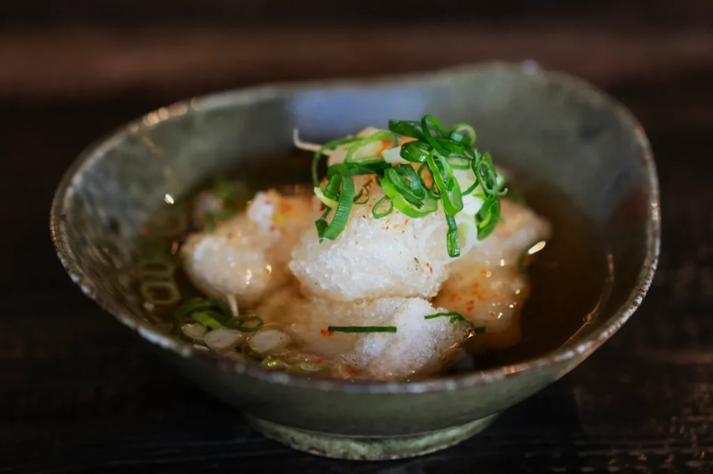
If your restaurant has more than one person touching content, you have probably seen this problem:
A useful editing style guide controls four things:
1) Colour Temperature Direction
Decide your default:
- slightly warm and cosy
- neutral and clean
Write it down. Then keep it consistent.
2) Exposure Range
Your images should feel like they were shot in the same world. Not one bright, one dark, one grey.
Define a simple rule:
- the dish is always readable
- whites are never blown out
- shadows are never crushed into black
3) Texture And Sharpening Limits
Decide what “appetising texture” means for your brand.
For example:
- light texture, no gritty sauce
- sharpening only at the end
- no aggressive clarity
4) Crops And Formats
Set your common crops:
- menu items: consistent dish framing
- Instagram feed: 4:5
- stories: 9:16
Consistency here makes your feed look professional instantly.
The One-Page Style Guide Structure
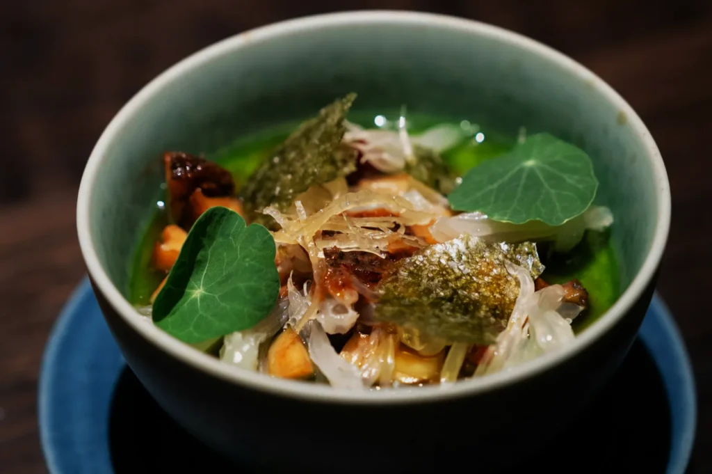
If your restaurant has more than one person touching content, you have probably seen this problem:
Keep it simple:
- 1 reference image that represents the look
- 3 “do” rules (white balance, exposure, texture)
- 3 “don’t” rules (no heavy filters, no neon saturation, no extreme sharpening)
- export rules (basic sizing and quality)
That is enough to stop chaos.
How To Make Staff Follow It Without Fighting
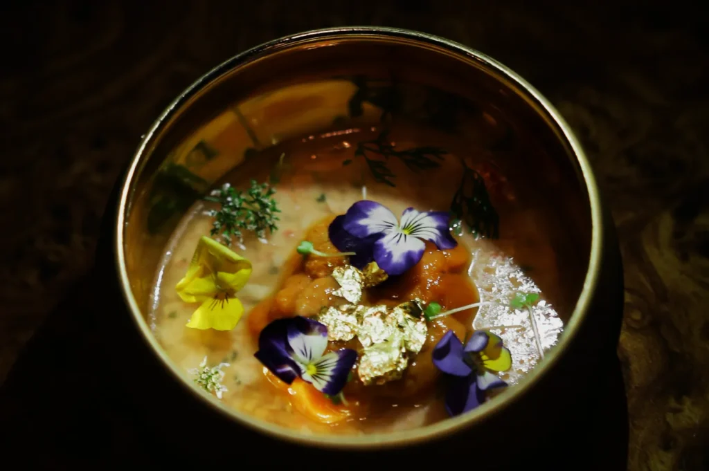
If your restaurant has more than one person touching content, you have probably seen this problem:
Make it easy:
- save one preset if you use Lightroom
- create a “checklist before posting”
- keep the reference image pinned in your team chat
People follow systems that save time.
This is also where working with a professional team can help. When we shoot and edit menu sets at Food Photographer Studio, we are not only delivering photos. We are effectively defining a visual standard. Many clients then ask us to translate that into a lightweight style guide their staff can follow for day-to-day content.
Your Brand Should Not Change Colour Every Post
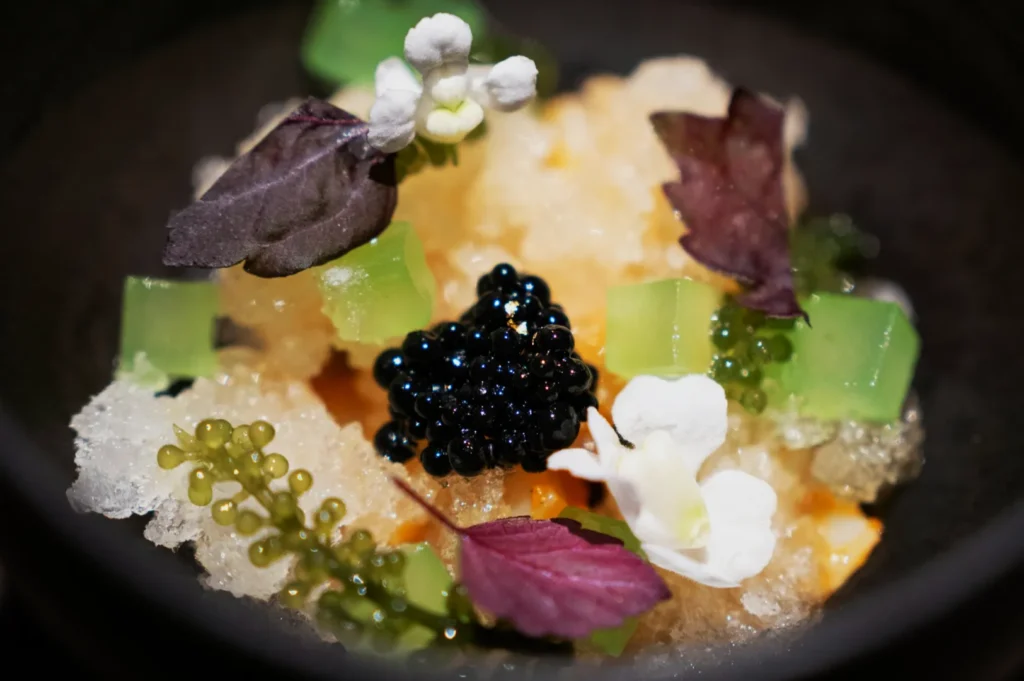
If your restaurant has more than one person touching content, you have probably seen this problem:
A restaurant brand is built through repetition. Your food can be creative, seasonal, and flexible, but your visual language should feel stable.
A simple style guide keeps your edits clean, believable, and consistent across staff and platforms. Start small, define your basics, and protect the look you want your customers to remember.
For more info about our services, visit our website: https://foodphotographerstudio.com.sg/


