
Food photography does not sell taste directly. It sells the idea of taste before anyone takes a bite.
That is where texture in photography becomes important. A diner cannot hear the crackle of fried chicken, feel the silkiness of chawanmushi, or taste the richness of laksa through a screen. But the right photo can make them imagine it. That imagination is what moves someone from scrolling to wanting.
For Singapore F&B brands, texture is not just a nice visual detail. It is a commercial signal. It tells customers whether a dish is crispy, tender, creamy, fresh, juicy, soft, or dry. It helps menus feel more appetising, delivery listings feel more trustworthy, and social content feel less flat.
Good food texture photography is not about making food look dramatic for the sake of it. It is about making the food feel real.
What Texture In Photography Means For Food Brands
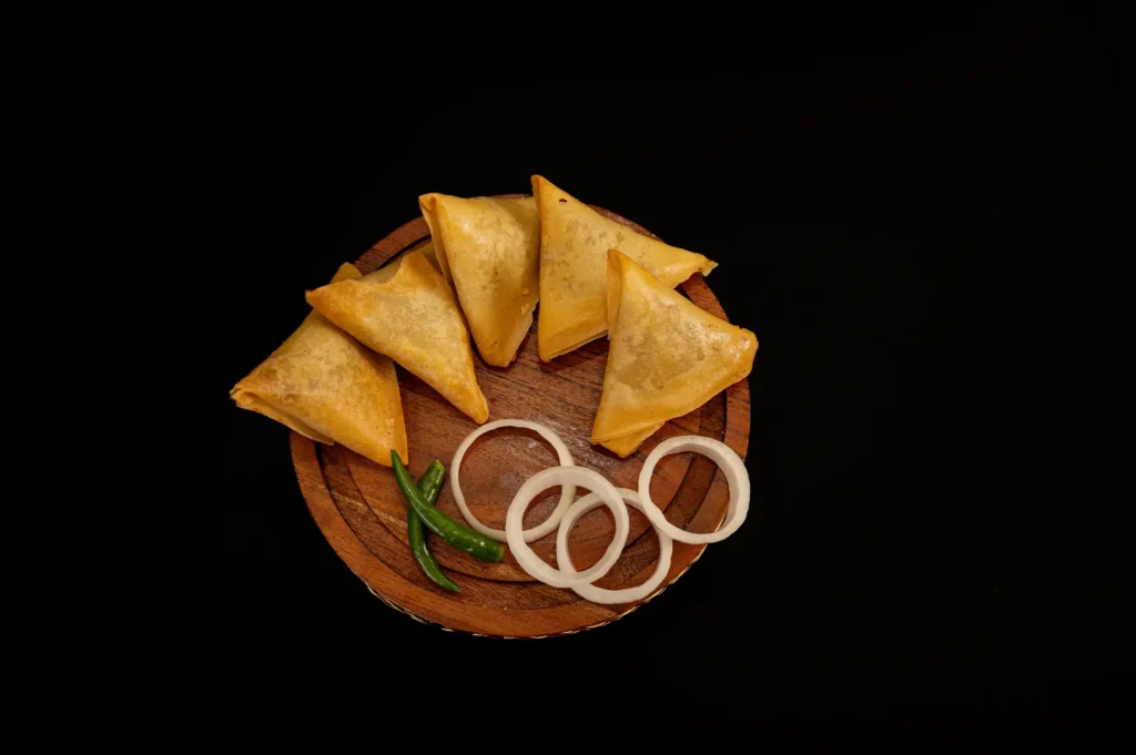
Texture in photography refers to how a photo shows surface, structure, and tactile quality. In food, that means the crisp edge of a prata, the glossy skin of roast chicken, the grain separation in fried rice, the wobble of tofu, or the soft crumb of a pastry.
These details matter because customers use them to judge quality. A burger bun that looks dry feels cheap. A curry that looks flat feels tired. A bowl of noodles without shine looks like it has been sitting too long.
For F&B brands, texture helps answer questions quickly:
- Is this fresh?
- Is this crispy?
- Is this rich?
- Is this worth the price?
Will this arrive looking close to the photo?
The stronger the texture cues, the easier it is for customers to understand the dish.
Why Texture Sells Before Taste Happens
Taste is private. Texture is visible.
Before a customer reads your menu description, they are already reacting to the image. They see the crunch on a fried item, the moisture in a roast meat, the creaminess of a sauce, or the freshness of herbs. These cues create expectation.
This is especially important in Singapore, where food decisions are fast. People compare restaurants on Google, delivery apps, Instagram, and websites within seconds. A photo that shows texture clearly gives them confidence. A photo that hides texture makes the dish feel uncertain.
Texture also affects perceived value. A $24 pasta looks more convincing when the sauce clings properly, the garnish looks fresh, and the noodles have shape. A $6 hawker dish can still look deeply appetising if the wok hei, sheen, and ingredient contrast read well.
Texture is not about making food look expensive. It is about making food look worth eating.
The Main Food Texture Families: Crisp, Creamy, Glossy, Fresh, Grainy, Layered
Different dishes need different texture treatment. A one-size-fits-all photography style rarely works across a full menu.
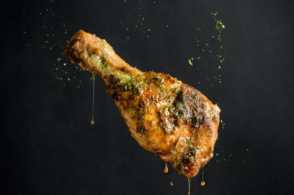
Crisp textures include fried chicken, tempura, prata, waffles, roast pork skin, and pastries. These need directional light so edges, bubbles, flakes, and cracks are visible. Flat lighting kills crispness.
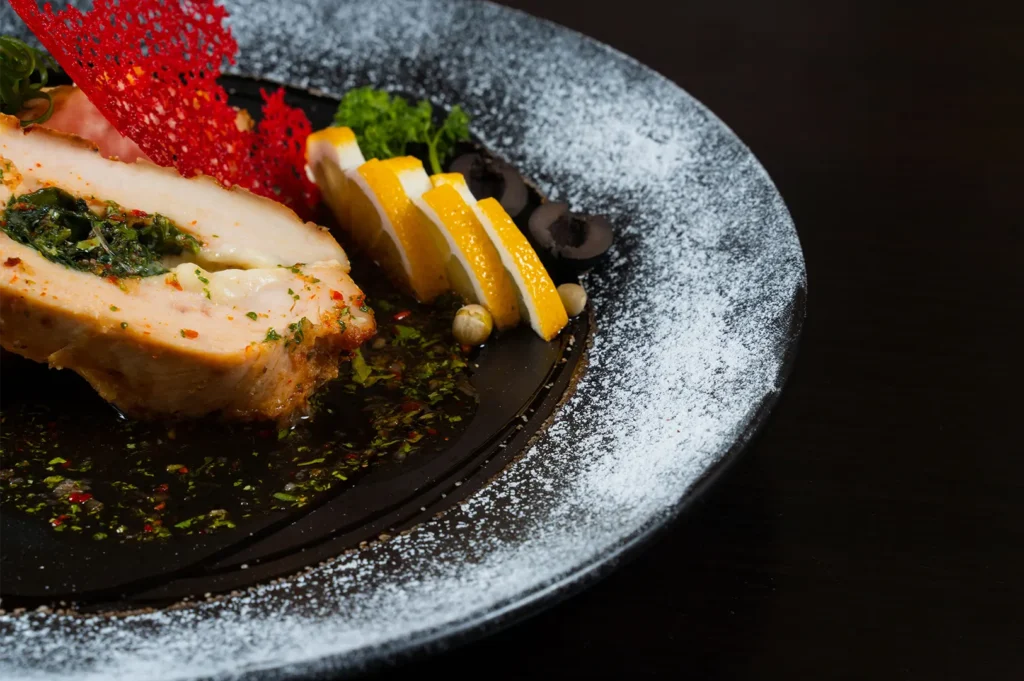
Creamy textures include pasta sauces, custards, soft eggs, tofu, mashed potato, and desserts. These need gentle highlights and smooth gradients. Too much contrast makes them look lumpy. Too little makes them look flat.
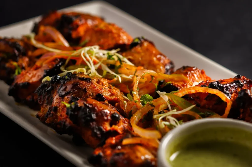
Glossy textures include broths, glazes, gravies, curries, and lacquered meats. These need controlled shine. Gloss should suggest moisture and richness, not oiliness.
Fresh textures include vegetables, herbs, fruit, salads, and garnishes. These depend on clean colour, crisp edges, and timing. Tired greens can ruin an otherwise good dish photo.
Grainy textures include rice, crumbs, minced toppings, toasted sesame, and ground spices. These need enough detail to show separation without making the dish look messy.
Layered textures include burgers, cakes, sandwiches, lasagna, kueh, croissants, and plated desserts. These usually need a side or 45-degree angle so customers can see structure.
Once you know the texture family, the photo becomes easier to plan.
How Singapore F&B Brands Should Use Texture Across Menus, Delivery Apps, And Social
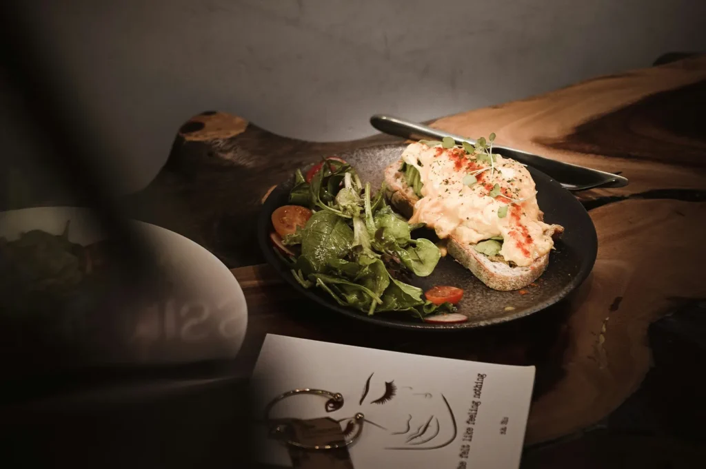
Texture should be used differently depending on the platform.
For menus, clarity comes first. The diner needs to understand the dish quickly. Texture should support recognition, not distract. A menu photo should show portion, main ingredients, and the most important appetite cue.
For delivery apps, texture has to survive the thumbnail test. A close-up of crispy chicken can work well if the product is clear. But a messy texture-heavy crop can confuse customers. Delivery photos need strong contrast, simple backgrounds, and obvious food structure.
For social media, texture can become the hook. This is where close-ups, sauce pulls, steam, char marks, and layered shots can do more work. A good social image does not need to explain the whole dish immediately. It needs to make someone pause.
For websites and brand campaigns, texture helps set positioning. A premium restaurant may use restrained texture cues, soft gloss, clean plating, and tactile detail. A casual F&B brand may use bolder crunch, steam, and generous close-ups.
The mistake is using the same photo everywhere. One dish may need a clear menu shot, a tighter texture detail, and a wider lifestyle frame.
How Light, Angle, Styling, And Editing Affect Texture
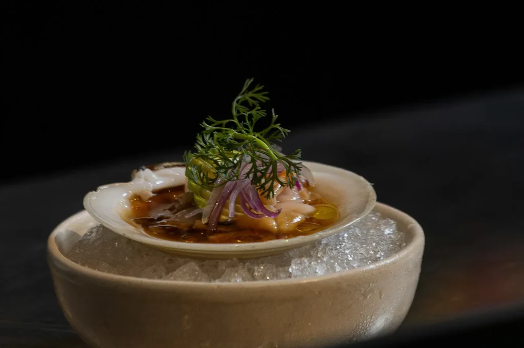
Texture is built through four main decisions: light, angle, styling, and editing.
Light controls whether texture appears or disappears. Side light is usually best for showing texture because it creates small shadows across the surface. Overhead light often flattens food or creates harsh glare. Backlight can help steam, drinks, and glossy dishes feel alive.
Angle controls what texture the viewer can see. Overhead works for flat arrangements and component clarity. A 45-degree angle works for bowls, noodles, rice plates, and saucy dishes. Eye-level works for height, layers, burgers, pastries, and stacked foods.
Styling controls whether texture looks natural. A sauce should cling, not flood. Garnish should look fresh, not decorative for no reason. Fried food should look crisp, not oily. Texture styling is usually about restraint. The food should still look like what the customer will receive.
Editing should protect texture, not invent it. Too much clarity makes food look harsh. Too much smoothing makes it look plastic. Too much saturation makes fresh ingredients look fake. Good editing keeps texture readable while still feeling honest.
Common Texture Problems That Make Food Look Less Appetising
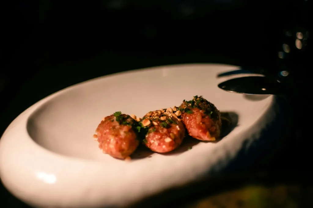
Several texture mistakes appear again and again in restaurant photos.
The first is dry-looking food. Meat, noodles, rice, and fried items can all look dry when lighting is too flat or the shoot takes too long. A small controlled highlight can make the dish feel fresher.
The second is mushy food. This happens when everything has the same colour, same shape, and same surface. Noodles, stews, and rice bowls need ingredient separation so the viewer can understand what they are seeing.
The third is greasy food. Gloss is good. Random shine is not. If the highlight looks uncontrolled, customers may read the dish as oily rather than rich.
The fourth is plastic-looking food. This usually comes from over-editing. When every surface is too smooth, too sharp, or too saturated, the image loses trust.
The fifth is dead freshness cues. Herbs wilt. salads collapse. fruit dries. Garnishes should be added last and photographed quickly.
Texture mistakes do not always scream “bad photo”. They quietly make people less hungry.
When To Use Professional Food Photography For Texture-Heavy Menus
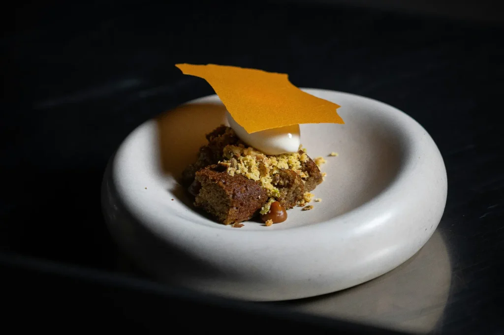
Some menus are more texture-dependent than others. If your brand sells fried food, grilled meats, pastries, ramen, hotpot, desserts, rice bowls, or drinks, texture is a major part of the customer decision.
This is where professional food photography becomes useful. A proper shoot is not just about having a better camera. It is about knowing how to control light, timing, plating, colour, and texture so every dish looks consistent across platforms.
For example, a ramen brand needs broth, noodles, toppings, steam, and shine to work together. A bakery needs crumb, crust, layers, and softness to read clearly. A grill concept needs char and juiciness without making the meat look burnt or greasy.
If texture is central to what you sell, it should not be left to random phone shots taken during service. Working with our team at Food Photographer Studio can help to turn texture into a clear visual system, so your dishes look appetising, consistent, and usable across menus, delivery apps, websites, and campaigns.
Make Food Feel Real Before It Is Tasted
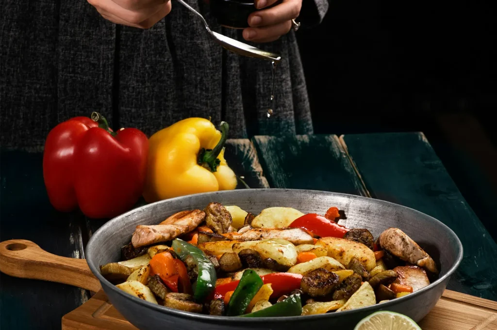
Texture in photography is not a technical detail reserved for photographers. It is one of the most direct ways food brands communicate quality.
Customers cannot taste your food from a screen. But they can see crispness, softness, gloss, grain, freshness, and structure. They can imagine the bite before ordering. That is the real job of food texture photography.
When texture is handled well, food does not just look nice. It feels believable. It feels appetising. It feels worth choosing.


