
Aesthetic photography is great for branding. It sets mood, signals price point, and makes your restaurant feel like a place people want to be seen at.
But menus and delivery apps are not brand moodboards. They are decision screens.
On GrabFood, Deliveroo, Foodpanda, and even QR-code menus, customers do not “browse” the way they browse Instagram. They scan fast, compare faster, and choose what looks obvious. If your photo is too dark, too styled, too wide, or too clever, the dish becomes harder to read. And when a dish is hard to read, it becomes hard to order.
If you are building a consistent aesthetic, keep it. Just make sure it does not sabotage the job your menu photos are supposed to do: reduce doubt and drive confident clicks. This article breaks down where aesthetic photography helps, where it hurts, and how to shoot “pretty” in a way that still converts. If you want the deeper framework behind this approach, refer to our aesthetic style system for Singapore F&B photography.
Why “Pretty” Can Lose on Menus
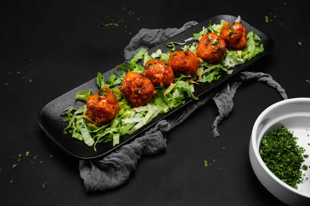
A menu photo has one job: communicate the dish clearly enough that a customer feels safe ordering it.
Aesthetic photography often prioritises other things:
- mood over clarity
- atmosphere over ingredients
- styling over portion truth
- cinematic darkness over readable colour
None of these are “wrong”. They are just risky in the wrong place.
Think about a signature bowl of laksa. On a feed, a moody, backlit shot with lots of negative space can look premium. On an app thumbnail, the same photo can become a brown-orange circle with mystery toppings. Mystery rarely wins when people are hungry.
On delivery platforms, customers are not only deciding what looks tasty. They are deciding:
- what they are actually getting
- whether it feels worth the price
- whether it looks similar to what they expect
- whether they can tell what is inside, fast
When your photo makes them think too hard, they scroll.
The Delivery App Reality: Your Photo Is a Thumbnail First
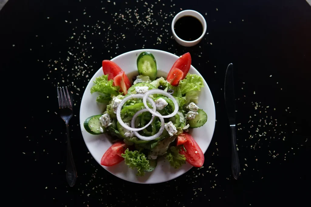
Most “pretty-but-not-selling” photos fail at the thumbnail test.
Your image gets reduced, cropped, and surrounded by competitors. It is not seen in full-screen. It is seen as a small square or rectangle, often with price, promo tags, and UI elements crowding it.
So before you ask “Is this aesthetic?”, ask:
- Can I identify the dish in two seconds?
- Can I see the main protein or key ingredient?
- Does the colour look appetising, not muddy?
- Does the portion look fair for the price?
- If I blur my eyes, does it still read as food?
If the answer is no, it does not matter how beautiful the full-size image is.
This is why certain “Instagram aesthetics” underperform on menus:
- heavy shadows that hide ingredients
- very wide frames that make portions look small
- glossy highlights that blow out sauces and broths
- busy props that steal attention from the main dish
- colour grading that makes food look unnatural
Singapore diners are visually literate. They know what chicken rice, nasi lemak, mala, and prawn noodles should look like. If your photo drifts too far from that expectation, it triggers doubt.
The Most Common Aesthetic Mistakes That Hurt Orders
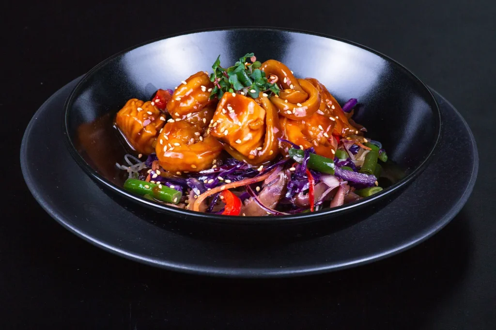
1) Moody Lighting That Makes Food Unreadable
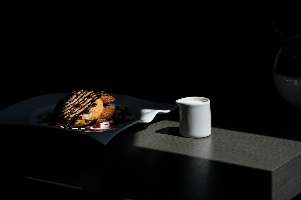
Dark and dramatic lighting can be beautiful. It is also a common conversion killer on menus.
If the dish is already dark (char kway teow, braised meats, black pepper items), moody lighting can turn it into a single brown mass. Your customer cannot see texture, ingredients, or value.
Fix: Keep the mood, but raise readability. Use directional light that reveals texture. Lift shadows enough that the main subject is clear, even when small.
2) Too Much Negative Space for a Sales Context
Negative space makes food feel premium. It also makes portions look smaller if overused.
On menus, especially delivery menus, customers want reassurance. A lot of empty space can unintentionally signal “tiny portion” even when the real plate is generous.
Fix: Use negative space, but keep the dish dominant in-frame. For menu images, the dish usually needs to occupy more of the frame than it would on a brand campaign shot.
3) Styling That Looks Better Than Real Life
Aesthetic photography can drift into “editorial fantasy” without meaning to.
Perfectly stacked toppings, exaggerated garnish, ultra-clean edges, or sauces positioned purely for looks can set up disappointment. When the dish arrives and looks simpler, customers feel misled.
Fix: Style the best version of the real dish, not a different dish. The goal is “itself, only better”, not “a version that only exists in photos”.
4) Props That Compete With the Food
Props tell a story, but delivery menus are not where the story should be complicated.
If the chopsticks, napkins, drinks, flowers, and textured boards are louder than the food, the food stops being the hero. In a thumbnail, the props often become visual noise.
Fix: For menu and app images, use props like seasoning. Light touch, high intention.
5) Colour Grading That Breaks Appetite
The most common “aesthetic edit” mistake is pushing tones too far.
Greens go dull, whites go grey, meats go cold, sauces go neon. The image may look “stylised”, but the food stops looking edible.
Fix: Keep colour grading subtle for sales assets. Prioritise accurate whites, believable warmth, and natural ingredient colour.
What “Conversion-Safe Aesthetic” Actually Looks Like
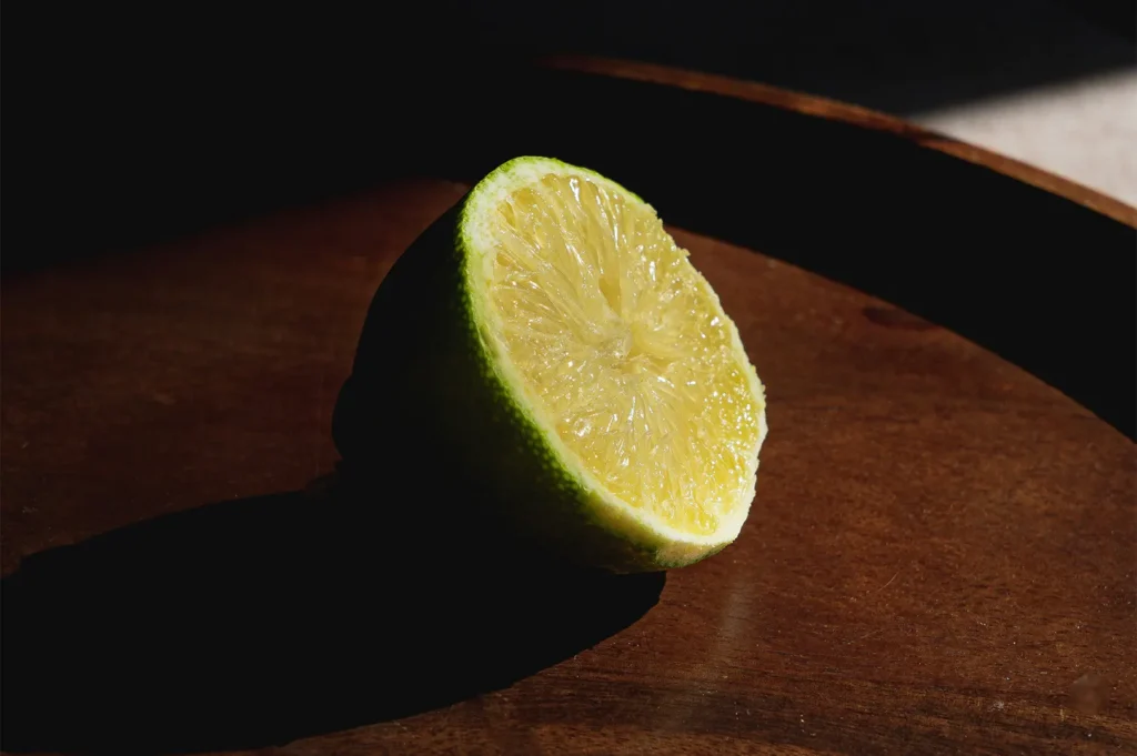
You do not have to choose between pretty and profitable. You just need a clearer rule set.
Conversion-safe aesthetic photography tends to have:
- one obvious main subject with a clean silhouette
- lighting that shows texture, not just mood
- colours that look true and appetising
- minimal props, used only to support context
- framing that makes the dish look worth its price
- consistency across the full menu set
A practical way to think about it is this: your menu photos should feel like your brand, but behave like a sales tool.
For example:
- A cafe can keep its airy, minimalist look while tightening framing so the pastry looks generous.
- A modern-Asian restaurant can keep its darker mood while ensuring the main protein is clearly visible.
- A hawker-inspired concept can keep its “real” vibe without letting mixed lighting turn everything yellow-green.
The Two-Set Strategy Most Restaurants Should Use
If you only take one thing from this article, let it be this: separate your brand visuals from your ordering visuals.
Most restaurants benefit from two distinct photo sets:
Set A: Menu + Delivery Assets (Clarity First)
These are your conversion photos:
- clear framing
- visible ingredients
- consistent lighting
- minimal distractions
- built for small screens
Set B: Brand + Campaign Assets (Mood and Story)
These are your aesthetic builders:
- wider scenes
- more atmosphere
- human moments
- creative styling
- environmental context
When restaurants force one image set to do both jobs, the photos usually underperform somewhere. The menu looks too “artsy”, or the brand looks too flat. Two sets solve that tension.
This is also where a proper style system matters. When both sets share some visual DNA (palette, surfaces, direction of light), your brand still feels coherent.
How to Know If Your “Pretty” Photos Are Hurting Sales
If you want a quick diagnostic without overthinking:
- Pick 10 dishes that sell well.
- Pick 10 dishes that should sell but do not.
- Compare the photos side by side.
You will often see a pattern:
- the weak sellers have darker photos
- the protein is less visible
- the dish occupies less of the frame
- the colours are less appetising
- the styling is inconsistent with the rest of the menu
If you are on digital menus, you can go one step further and test:
- update only 5 photos
- track click-to-order change over 2 to 4 weeks
- keep price and naming consistent so the photo is the main variable
This is not “creative theory”. This is practical behaviour.
Make Your Photos Easy to Order From
Aesthetic photography is powerful when it supports your brand. It becomes a problem when it slows decisions down.
Your menu and delivery photos are not there to impress other photographers. They are there to help hungry people choose quickly and feel good about the choice. If your visuals are clear, consistent, and honest, customers order with confidence.
If you want a menu photo set that still feels stylish but performs like a sales tool, that is exactly the kind of work we build at Food Photographer Studio. We obsess over the small details that affect conversion, like framing, ingredient visibility, glare control, and consistency across 30 dishes, so your “pretty” never gets in the way of orders.


