
“Aesthetic” is a tricky word in food photography because it gets misused. For some brands, it means warm, creamy tones and soft shadows. For others, it means crisp whites, clean colours, and modern contrast. Either way, the goal is the same: your photos should look like they belong to the same restaurant, the same menu, and the same brand.
The problem is that many F&B teams in Singapore try to “make it aesthetic” with heavy filters. The result looks dramatic for one post, then weird for the next. Whites turn yellow, greens go dull, sauces go orange, and suddenly your signature dish looks like it came from a different kitchen. This is where editing should be boring, consistent, and controlled. Not loud.
If you want your feed, menu, and delivery listings to look cohesive, here’s the approach we use to keep an aesthetic look consistent without over-filtering.
The Real Job of Editing Isn’t “Style”, It’s Control
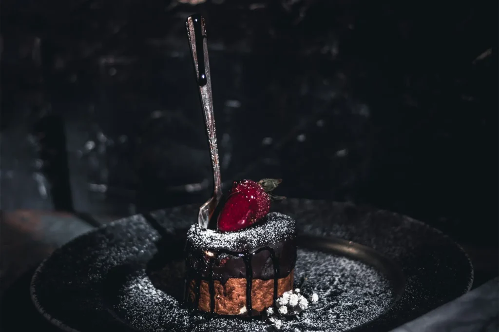
Aesthetic photo editing starts with fixing what Singapore lighting does to food:
- Warm downlights make rice look yellow and plates look beige.
- Mixed lighting (window + ceiling) creates strange colour patches.
- Reflective tables and glossy sauces blow out highlights.
- Dark interiors force phones to over-sharpen and over-saturate.
If you skip correction and jump straight to a preset, you’re stacking style on top of a colour problem. Consistency becomes impossible because every photo starts from a different “wrong”.
So the clean workflow is always: correct first, then style.
If you’re still figuring out what “aesthetic” should mean for your brand, start with this photography guide before you build your editing preset.
Step 1: Decide What “Aesthetic” Means for Your Brand
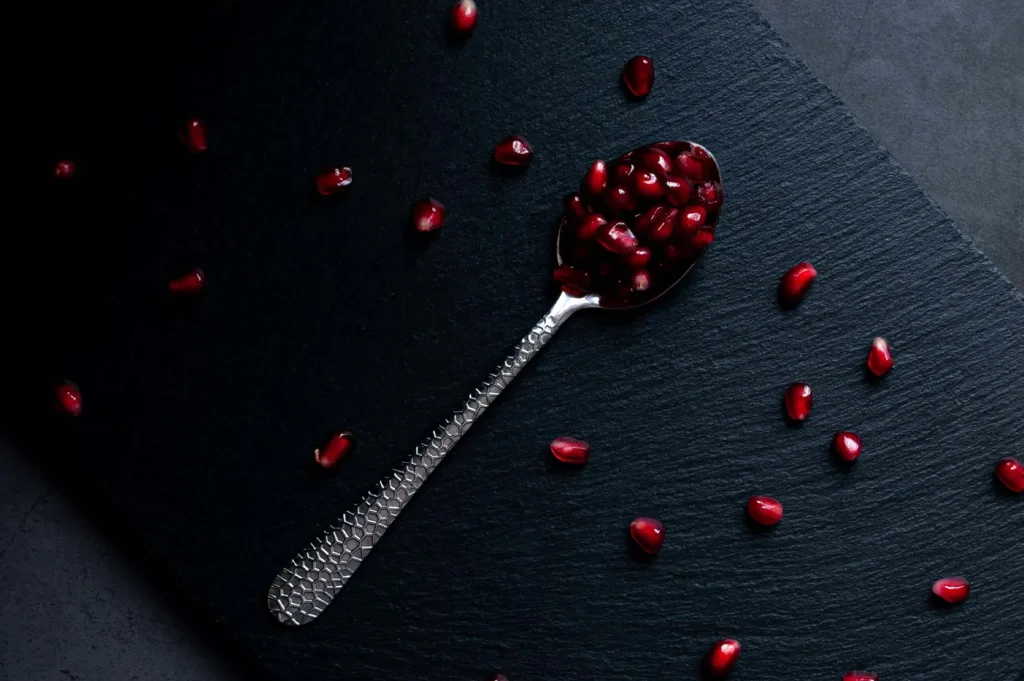
Before you touch sliders, you need a reference. Not a moodboard of 50 random Pinterest photos. You need 3–5 images that already feel like your brand, even if they are imperfect.
Ask yourself:
- Are your whites meant to be neutral white, or slightly warm?
- Do you want deep, moody shadows or bright, open tones?
- Are your colours punchy (more contrast), or calm (more muted)?
- Do you want texture to feel crisp, or soft and creamy?
If you can’t answer these, editing becomes guesswork. This is also why we always build a simple style system first. If you need a starting point, link your team back to this photography guide so everyone is working from the same definition of “aesthetic,” not personal taste.
Step 2: Start With a “Baseline Edit” You Can Repeat
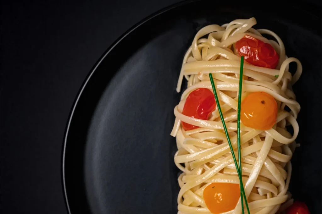
A baseline edit is your safety net. It is the clean, repeatable correction that makes every photo usable before you add any look.
In most editing apps (Lightroom Mobile, Lightroom Classic, VSCO, Snapseed), your baseline is:
- White Balance first
Get plates to look like plates again. If your “white” plate is cream today and blue tomorrow, your brand will look unstable even if the food is great.
- Exposure and contrast
Do not chase drama. Bring exposure to a natural level, then add contrast gently. Over-contrast is one of the fastest ways to make food look dry and harsh.
- Highlights and shadows
Shiny food in Singapore loves blown highlights. Pull highlights down slightly so sauces and broth keep detail. Lift shadows only enough to keep the dish readable.
- True colour check
Look at your greens and skin tones (if hands are in the shot). If coriander turns grey or hands turn orange, you’ve pushed too far.
Baseline editing is the “housekeeping” nobody wants to do, but it is what makes your look repeatable.
Step 3: Build Your Look With Small, Consistent Moves
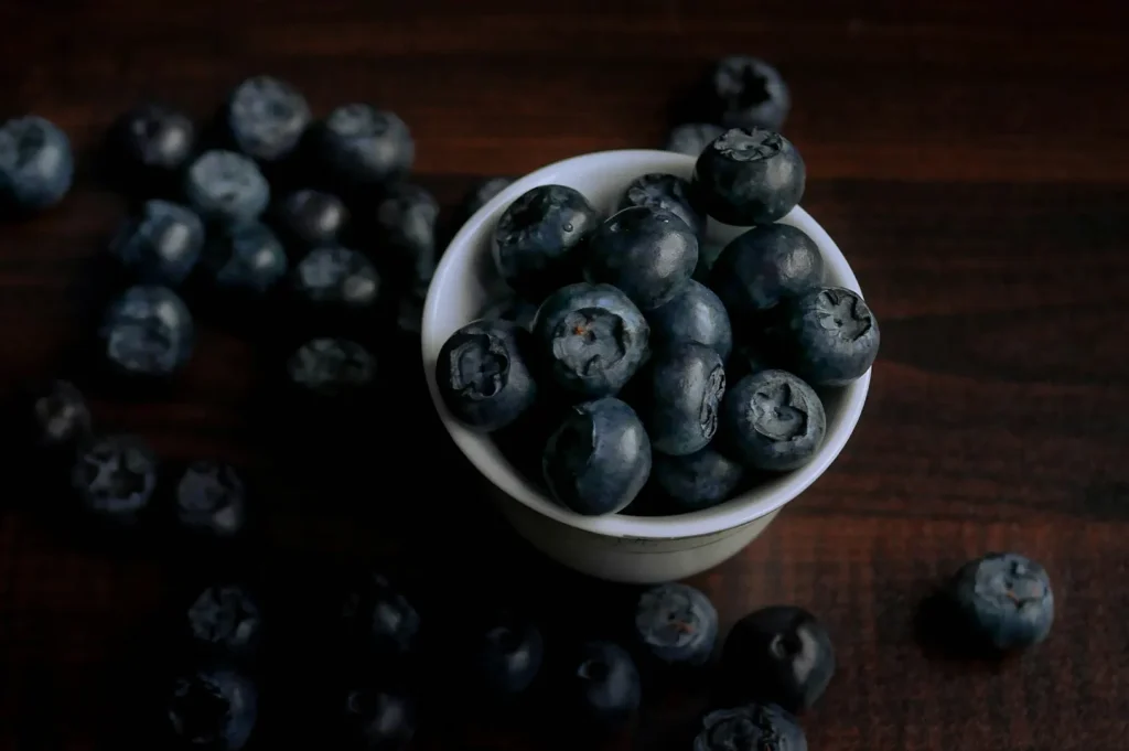
Once the photo is corrected, style should be subtle. Think of it as a seasoning, not a marinade.
Use contrast as your main “aesthetic lever”
If you want a premium, modern feel, contrast control is usually more important than saturation. A slight lift in contrast can make food feel sharper and more intentional without turning colours radioactive.
Touch saturation with care
Most over-filtering happens here. A little saturation can help chilli crab pop, but too much makes food look fake. If you want colour control, use HSL (colour mix) instead of global saturation:
- Reduce yellow saturation slightly if rice or noodles look too warm.
- Reduce green saturation if salads look neon.
- Adjust orange luminance gently if skin tones or sauces look too heavy.
Keep blacks and whites consistent across the set
This is the quiet trick behind “brand consistency.” If your blacks are deep in one photo and grey in another, your feed will feel messy even if every dish is beautiful.
A simple practice: pick one “hero photo” and match your next edits to it by eye. Not perfectly, but close enough that the set feels like one shoot.
Step 4: Don’t Let Presets Make Decisions for You
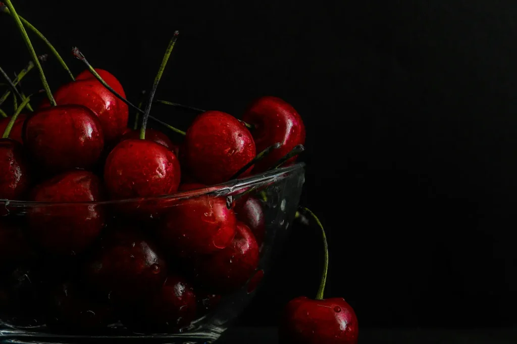
Presets can be useful, but only if you treat them like a starting point.
A preset should never be “one tap and done” for restaurants because every environment shifts:
- Lunch light vs dinner light
- Window side table vs interior table
- Dark wood background vs white marble background
If a preset is pushing your whites, crushing your shadows, or turning everything warm, it’s not a good preset. It’s just a strong filter.
If you want to use presets responsibly, create your own:
- One preset for bright, clean daylight
- One preset for warm indoor light
- One preset for moody, dark surfaces
And keep them mild. Your “look” should survive minor lighting changes without falling apart.
Step 5: Batch Editing Is Where Consistency Actually Happens
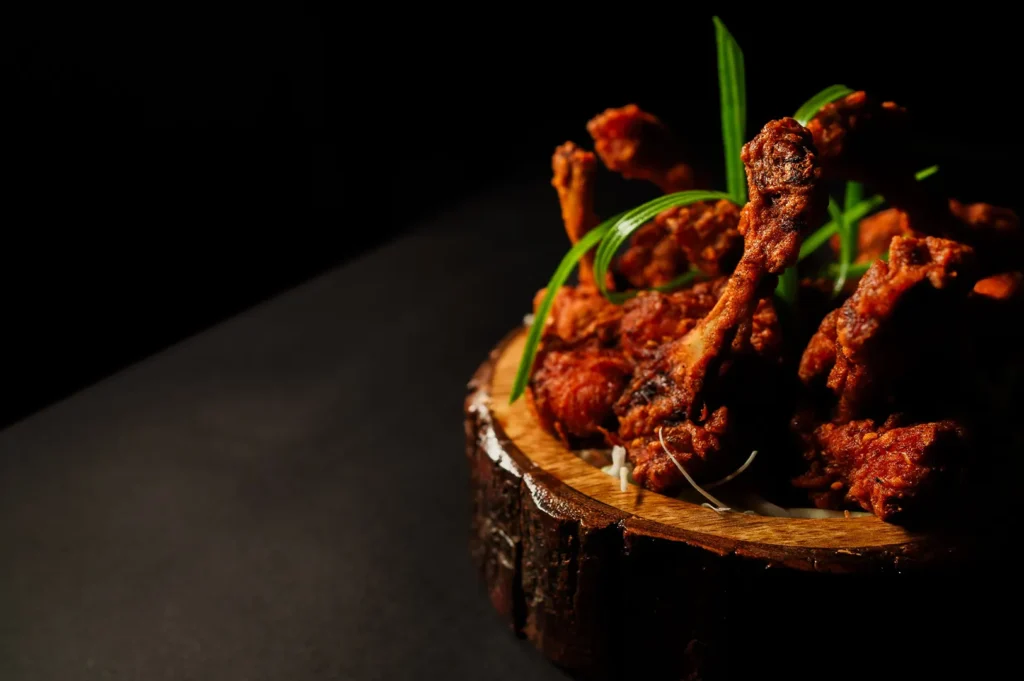
Most teams edit photo-by-photo, which is how inconsistency sneaks in.
Instead, batch edit like this:
- Pick 1 “reference photo” from the shoot
- Edit it carefully until it feels right
- Sync or copy settings to the rest
- Then do tiny fixes per photo (usually exposure, white balance, and a selective highlight control)
This is exactly how we handle multi-dish menus at Food Photographer Studio, because a menu set needs to look like one brand, not 30 different moods.
Step 6: Know When “Aesthetic” Hurts Sales
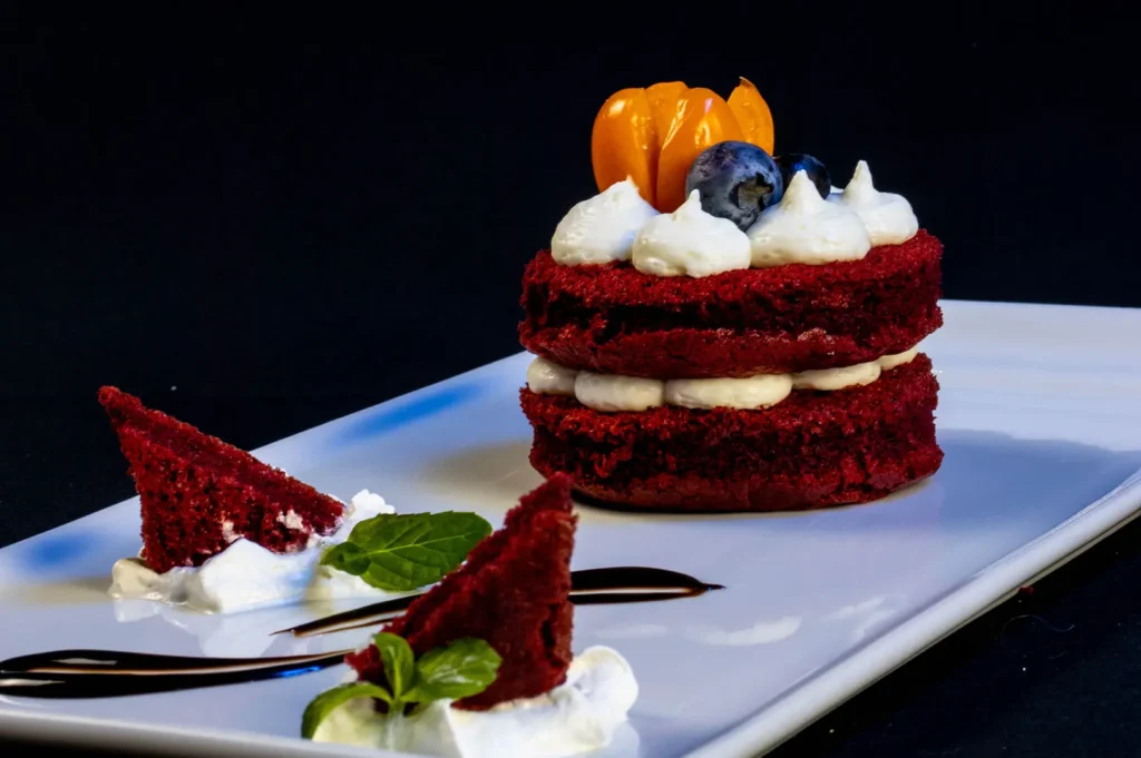
This matters for Singapore restaurants because a lot of traffic is transactional. People are deciding fast. If your look is so moody that ingredients are unclear, it may be stylish but it can reduce orders.
A quick rule:
- For menus and delivery apps: clarity first, style second.
- For social and brand pages: you can lean more aesthetic and atmospheric.
If your aesthetic edit makes noodles look brown-grey, soup look flat, or meat look cold, you have crossed into “pretty but not appetising.”
A Simple Consistency Checklist
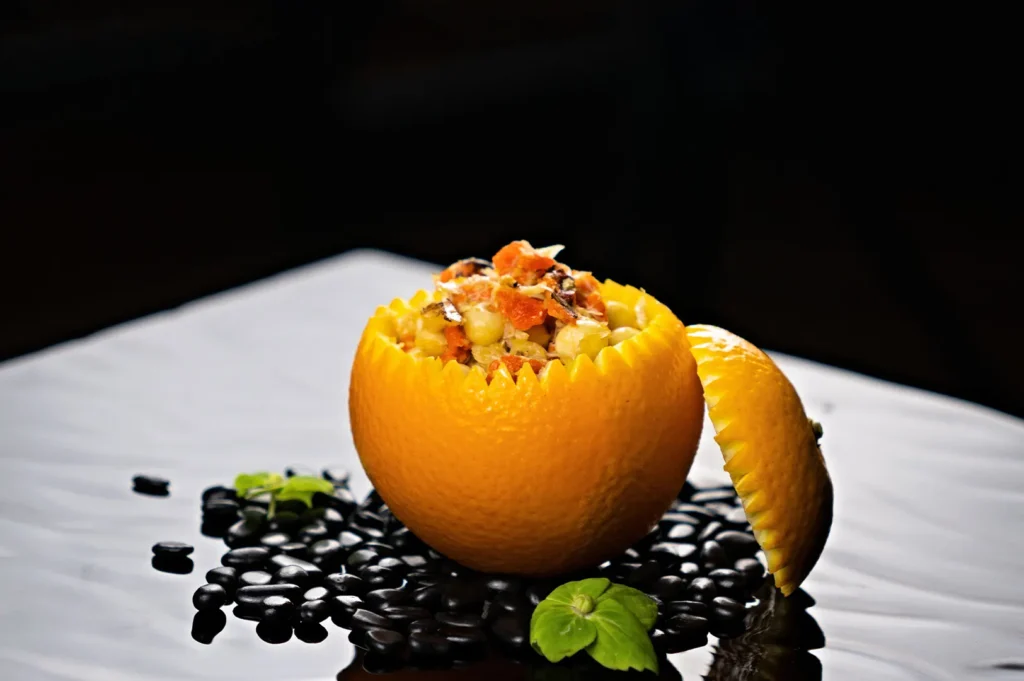
Before you export, check:
- Do whites look neutral and consistent across photos?
- Do greens still look fresh (not grey, not neon)?
- Are highlights controlled on sauces, broth, and plates?
- Does the set feel like it belongs to one restaurant, one day, one brand?
- If you place 9 images in a grid, do any look like they came from a different camera?
If one image looks “off,” it usually is. Fix that one, and your whole set becomes more credible.
Keep the Look, Keep the Food Real
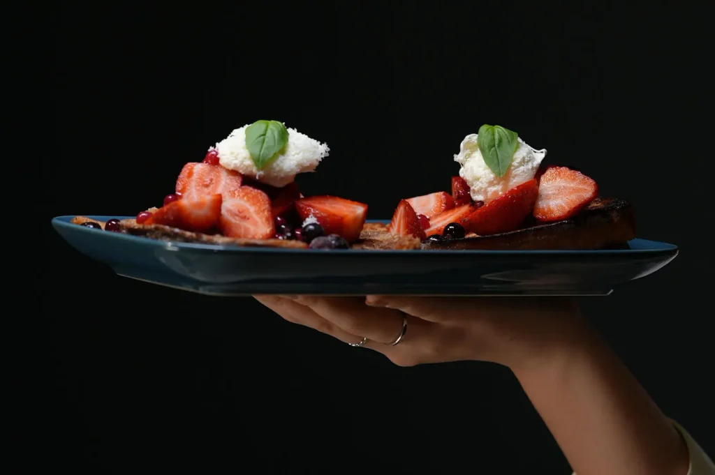
Aesthetic photo editing is not about turning every dish into an “art photo.” It’s about building a consistent visual identity that still respects what the customer will receive. The best edits are the ones diners don’t notice. They just feel the food looks more inviting, more premium, and more worth ordering.
If you’re editing in-house, focus on correction first, then style with restraint. If you want a consistent menu set without trial-and-error (especially across mixed lighting, shiny dishes, and different locations), that’s where working with a team that does this daily can save you time and stress.


