
There is a line every restaurant eventually bumps into.
You want your food to look its best. Of course you do. But if your edited photo promises something your kitchen does not serve, you pay for it later in refunds, complaints, and bad reviews. The cost is not just reputation. It is repeat business.
This is why the best editing standard is simple: make the dish look like itself, only better.
If you want the full editing workflow that supports this, start with our guide on how to edit photos for Singapore F&B. This article focuses on the ethics and practical guardrails, so your edits stay honest and still look premium.
Why “Honest Editing” Sells More Over Time
Short-term hype can get clicks. Long-term trust gets reorders.
In Singapore, diners are visually sharp. They compare your delivery photo to what arrives. They notice:
- portion size differences
- colour differences
- garnish that never appears
- textures that look “impossible” in real life
When the photo feels like a fantasy, the brand feels unreliable.
The “Looks Like Itself” Standard
Making Portions Look Bigger With Tricks
Tighter crops and smaller plates can be fair, but if every dish looks like it feeds two and arrives as a single portion, trust drops.
A safer approach is to show the dish clearly and consistently, instead of relying on optical tricks.
Over-Saturating Colour
Boosting reds and oranges can make curry and chilli crab look punchy, but it can also make food look unreal. Some customers read extreme colour as “edited to hide something”.
Aim for appetising, not neon.
Editing Out “Real” Elements Customers Expect
Removing oil sheen completely can make some dishes look dry and strange. Removing chilli flakes can make spicy food look mild. Removing char marks can erase the point of grilled items.
Food does not need to be sterile to be premium. It needs to be believable.
Over-Smoothing Texture
Smoothing can erase pores, crumbs, crispness, and steam detail. The dish starts looking like plastic.
Texture is part of appetite. Keep it.
A Simple Honest Editing Checklist
Before you post, ask:
- If a customer ordered this, would they recognise it instantly?
- Would a staff member be comfortable serving this dish next to the photo?
- Did we improve clarity, or did we change reality?
If you answer “change reality”, roll it back.
Where Professional Editing Helps Without Becoming “Fake”
Professional editing is not about heavy manipulation. Most of our work is about:
- controlling colour across mixed Singapore lighting
- keeping whites neutral across a full set
- protecting texture while reducing noise
- delivering consistency across 20 to 60 dishes
That is why professional menu sets often feel “cleaner”, not “more edited”.
If you want to see what this looks like in practice, you can browse the menu and campaign work on Food Photographer Studio. You will notice the food still looks like food. Just photographed properly.
The Best Food Photos Win Because They Are Trusted
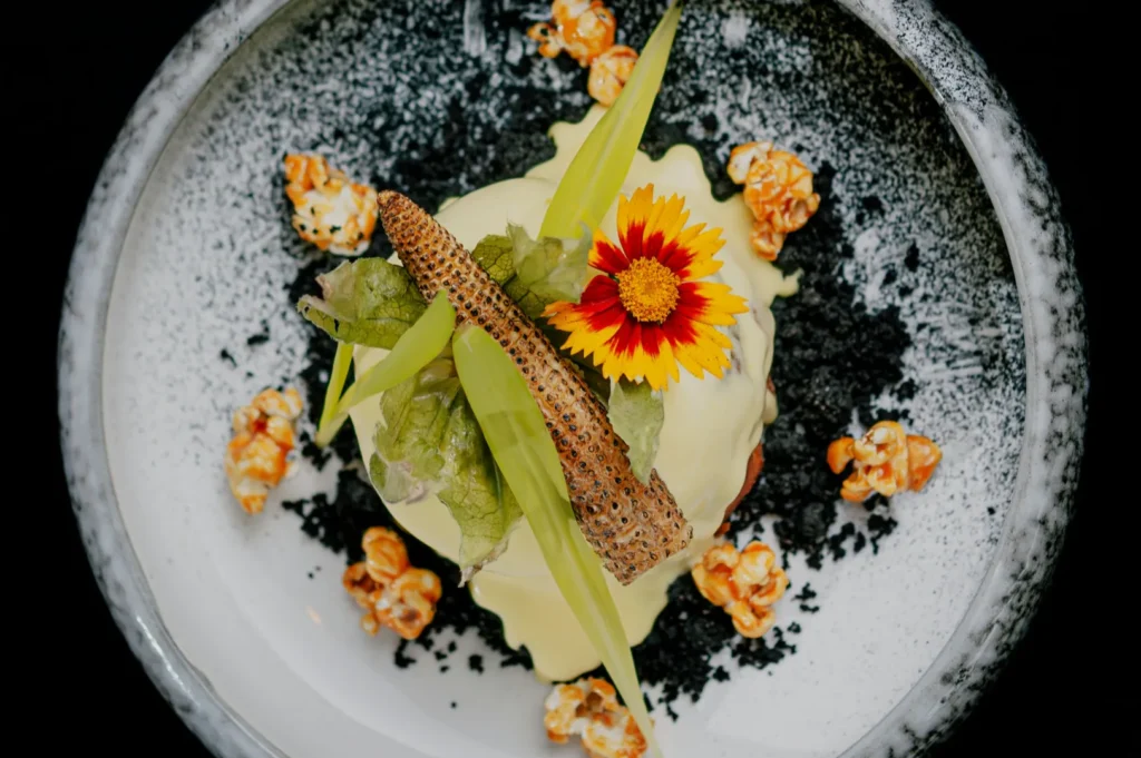
Editing is not just polishing. It is expectation-setting.
When your images look like your real plates, customers order with confidence. Confidence is what drives conversion now, and loyalty later.
Use the “looks like itself” rule as your guardrail. Pair it with a repeatable editing workflow, and your visuals will improve without creating customer disappointment. And if you ever need a high-stakes menu refresh where consistency and trust matter across dozens of items, Food Photographer Studio is built for exactly that kind of work.


